Ten Billion Data-points Tech Demo
Following the successful release of SciChart WPF v6, and the warm reception by our users for the massively improved performance, […]
Recently one of our earliest customers post a case-study about SciChart on their blog. We are re-posting here as a case study with permission from BlueShift. Thanks BlueShift! We love working with you! – SciChart Team
From the developers: “BlueShift’s ONE System brings together account management, demand planning and financial control to deliver a unified forecast from volume down to gross margin. Their software provides a “one number” approach to promotional plans management and demand forecasting, and it is in this respect that SciChart plays such an important role to provide transparency and flexibility in performing these roles.”
A great charting tool is a necessity to allow us to provide users of the ONE solution with information in a fast and efficient manner. We spent quite a while in analysis, pushing the best third-party charting software to their limits before deciding on implementing the SciChart tool.
We spent quite a while in analysis, pushing the best third-party charting software to their limits before deciding on implementing the SciChart tool.
SciChart is an extremely fast and flexible solution for building charts of many different varieties, and it has allowed us to construct graphs that users can interact with and customise on the fly in a number of ways. With the ability to render millions of data points in an endless array of measures, we can show live data from our database to users nearly instantly.
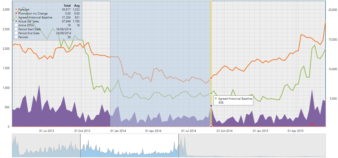
In the image above we can identify a chart containing various measures, a legend that has been customised to show aggregated data over a selection made by the user, and a Time Navigator underneath to give the user context on what time range they are currently seeing. We have taken advantage of SciChart’s “ChartModifier” extensions to write our own modifications that specify exactly how the chart behaves when interacted with by the mouse or keyboard. The result is a chart that the user can very accurately pan and zoom, make selections over (for editing or analysis), and other proprietary/secret BlueShift stuff.
With the ability to render millions of data points in an endless array of measures, we can show live data from our database to users nearly instantly.
Our charts support user run-time specification around the measures that are shown and in what order. Options around the style of each measure range from whether it is a line, column or area type, to what colour it is, how thick it is and whether the line is dashed are also available. The chart above also supports two Y-axes, and it also allows aggregation to different time levels.
![]()
In this image we see a very different chart that shows data points that have been customised to display a different type of circle based on a summary of the data under that period. To get this result, we had to blend a set of tools, including the ScatterChart renderable series, hard-coded Y-axes ranges and a suite of optimised images to represent each type of summary circle.
As far as visually representing information in meaningful ways, we are very pleased with how seamlessly our charts integrate with the rest of the ONE system.
Would you like a case-study linking back to your website? Contact-us as we would love to hear from you!
[SciChart Team]
Related Posts
![]()
Queens Award for Innovation
Proud winners of the Queens Award for Innovation, 2019. Awarded on account of our innovative graphics engine which underpins the SciChart library and enables our world-beating charting performance
![]()
National Business Awards
Highly Commended for Lloyds National Business Awards, 2019. Awarded on account of our innovative graphics engine and impressive customer base

Reviews
SciChart has received hundreds of verified, 3rd party reviews