
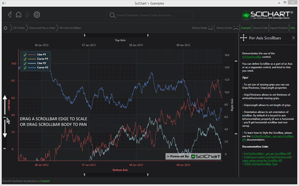
SciChart features templatable, stylable, per-axis Scrollbars which can be attached to the Left, Right, Top or Bottom X or Y Axes.
Declaring a Scrollbar in XAML
| Declaring a Scrollbar |
Copy Code |
|---|---|
<!-- where xmlns:s="http://schemas.abtsoftware.co.uk/scichart" --> <s:SciChartSurface> <s:SciChartSurface.XAxis> <s:NumericAxis> <s:NumericAxis.Scrollbar> <!-- The default height is 16. You can set it to any value --> <s:SciChartScrollbar Height="16"/> </s:NumericAxis.Scrollbar> </s:NumericAxis> </s:SciChartSurface.XAxis> </s:SciChartSurface> | |
Declaring a Scrollbar in Code
| Declaring a Scrollbar |
Copy Code |
|---|---|
var sciChartSurface = new SciChartSurface(); var numericAxis = new NumericAxis(); numericAxis.Scrollbar = new SciChartScrollbar() { Height = 16; } sciChartSurface.XAxis = numericAxis; | |
Putting a Scrollbar Outside of the SciChartSurface
The scrollbar doesn’t have to be declared on the Axis.Scrollbar property. It can be declared anywhere in your View, and simply bound to the axis via the SciChartScrollbar.Axis property. For instance:
| Putting a Scrollbar Outside of the SciChartSurface |
Copy Code |
|---|---|
<Grid> <Grid.RowDefinitions> <RowDefinition Height="*"/> <RowDefinition Height="32"/> </Grid.RowDefinitions> <s:SciChartSurface Grid.Row="0"> <!-- RenderableSeries omitted for brevity --> <s:SciChartSurface.YAxis> <s:NumericAxis x:Name="yAxis"/> </s:SciChartSurface.YAxis> <s:SciChartSurface.XAxis> <s:NumericAxis x:Name="xAxis"/> </s:SciChartSurface.XAxis> </s:SciChartSurface> <!-- Declare a scrollbar and bind to XAxis by ElementName binding --> <s:SciChartScrollbar Grid.Row="1" Margin="6,5,4,5" Axis="{Binding ElementName=xAxis}"/> </Grid> | |
Getting an Event on Scrollbar Scrolled
If you want to be notified when the scrollbar is scrolled by a user, you can subscribe to the SciChartScrollbar.SelectedRangeChanged event:
XAML
| Getting an Event on Scrollbar Scrolled |
Copy Code |
|---|---|
<s:SciChartScrollbar SelectedRangeChanged="OnScrollbarSelectedRangeChanged"/> | |
Code
| Getting an Event on Scrollbar Scrolled |
Copy Code |
|---|---|
// SciChartScrollbar.SelectedRangeChanged fires whenever the SelectedRange changes (e.g. programmatic or user scroll) private void OnScrollbarSelectedRangeChanged(object sender, SelectedRangeChangedEventArgs e) { // valid SelectedRangeEventTypes include: // SelectedRangeEventType.ExternalSource (Axis range was updated) // SelectedRangeEventType.Drag (scrollbar dragged without resizing) // SelectedRangeEventType.Resize (Scrollbar was resized) // SelectedRangeEventType.Moved (viewport was moved by click on the non selected area) Debug.WriteLine("Scrollbar Scrolled: EventType={0}, VisibleRange={1}", e.EventType, e.SelectedRange); } | |
Styling the SciChartScrollbar
In the Xaml Styling Example in the SciChart v4 WPF Examples Suite, we have a sample showing how to style various parts of the chart.
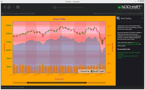
Our Scrollbar style is defined as follows:
| Styling the SciChartScrollbar |
Copy Code |
|---|---|
<!-- Define style for the SciChartScrollbar --> <Style x:Key="ScrollbarStyle" TargetType="s:SciChartScrollbar"> <Setter Property="GripsThickness" Value="10"/> <Setter Property="Background" Value="Transparent"/> <!-- Define style for resizing grips --> <Setter Property="GripsStyle"> <Setter.Value> <Style TargetType="Control"> <Setter Property="VerticalAlignment" Value="Bottom"/> <Setter Property="Template"> <Setter.Value> <ControlTemplate TargetType="Control"> <Border BorderThickness="2,2,2,2" CornerRadius="2" BorderBrush="Black" Background="#A90F0F" Height="15"> <Line Stroke="Black" X1="0" Y1="0" X2="0" Y2="1" Stretch="Fill" StrokeThickness="2"/> </Border> </ControlTemplate> </Setter.Value> </Setter> </Style> </Setter.Value> </Setter> <!-- Define style for viewport area --> <Setter Property="ViewportStyle"> <Setter.Value> <Style TargetType="Control"> <Setter Property="Template"> <Setter.Value> <ControlTemplate TargetType="Control"> <Border BorderThickness="0,1,0,1" BorderBrush="Black" Background="#FF5A9AE0"/> </ControlTemplate> </Setter.Value> </Setter> </Style> </Setter.Value> </Setter> <!-- Define style for non selected area --> <Setter Property="NonSelectedAreaStyle"> <Setter.Value> <Style TargetType="Path"> <Setter Property="Fill" Value="#33000000"/> </Style> </Setter.Value> </Setter> </Style> | |
Breaking this down as follows:

SciChartScrollbar.GripsStyle
To customize the resizing grips you should change SciChartScrollbar.GripsStyle. You can set different properties such as Background, BorderBrush, BorderThickness etc... Please note that GripsStyle is used for all resizing grips (vertical and horizontal) so you should consider this if you want to change grips template. You can use relative source binding and bind visibility of some parts in template to scrollbar orientation.
| SciChartScrollbar.GripsStyle |
Copy Code |
|---|---|
<!-- Define style for resizing grips --> <Setter Property="GripsStyle"> <Setter.Value> <Style TargetType="Control"> <Setter Property="VerticalAlignment" Value="Bottom"/> <Setter Property="Template"> <Setter.Value> <ControlTemplate TargetType="Control"> <Border BorderThickness="2,2,2,2" CornerRadius="2" BorderBrush="Black" Background="#A90F0F" Height="15"> <Line Stroke="Black" X1="0" Y1="0" X2="0" Y2="1" Stretch="Fill" StrokeThickness="2"/> </Border> </ControlTemplate> </Setter.Value> </Setter> </Style> </Setter.Value> </Setter> | |
SciChartScrollbar.ViewportStyle
To customize the viewport (the central area of the SciChartScrollbar), you should set the SciChartScrollbar.ViewportStyle property. The usage of this property is the same as usage of GripsStyle:
| SciChartScrollbar.ViewportStyle |
Copy Code |
|---|---|
<!-- Define style for viewport area --> <Setter Property="ViewportStyle"> <Setter.Value> <Style TargetType="Control"> <Setter Property="Template"> <Setter.Value> <ControlTemplate TargetType="Control"> <Border BorderThickness="0,1,0,1" BorderBrush="Black" Background="#FF5A9AE0"/> </ControlTemplate> </Setter.Value> </Setter> </Style> </Setter.Value> </Setter> | |
SciChartScrollbar.NonSelectedAreaStyle
To style non selected area of scrollbar you can use the SciChartScrollbar.NonSelectedAreaStyle property:
| SciChartScrollbar.NonSelectedAreaStyle |
Copy Code |
|---|---|
<!-- Define style for non selected area --> <Setter Property="NonSelectedAreaStyle"> <Setter.Value> <Style TargetType="Path"> <Setter Property="Fill" Value="#33000000"/> </Style> </Setter.Value> </Setter> | |
Other SciChartScrollbar Properties
There are also some other properties which allow further customization of scrollbar.
To set size of resizing grips you can use GripsThickness and GripsLength properties. GripsThickness allows to set thickness of vertical/horizontal resizing grips. GripsLength allows to set length of grips. By default it has double.NaN value and in this case grips are stretched to scrollbar size. But if you want to change this you can use this property.
Orientation allows you to set orientation of scrollbar. By default it is bound to the axis.IsHorizontalAxis property ( if axis is horizontal – you will get a horizontal scrollbar and vice versa).
Height and Width by default are set to 16, depending on the Orientation of the ScrollBar.