 You don't need a SciChartGroup for that. SciChartGroup was designed to allow creation of multi-pane stock charts. It will work for other chart types but some of the features of SciChartGroup (abililty to resize panes, ability to collapse and tab panes) might be undesirable. Basically to allow dynamic adding/removing of charts in code you simply need a WPF ItemsControl. To allow static multiple charts, you simply need a WPF Grid. To synchronize multiple charts in terms of mouse events have a look at https://www.scichart.com/synchronizing-chartmodifier-mouse-events-across-charts/ and to sync YAxis sizes have a look at https://www.scichart.com/questions/question/stop-autosizing. Does that help?
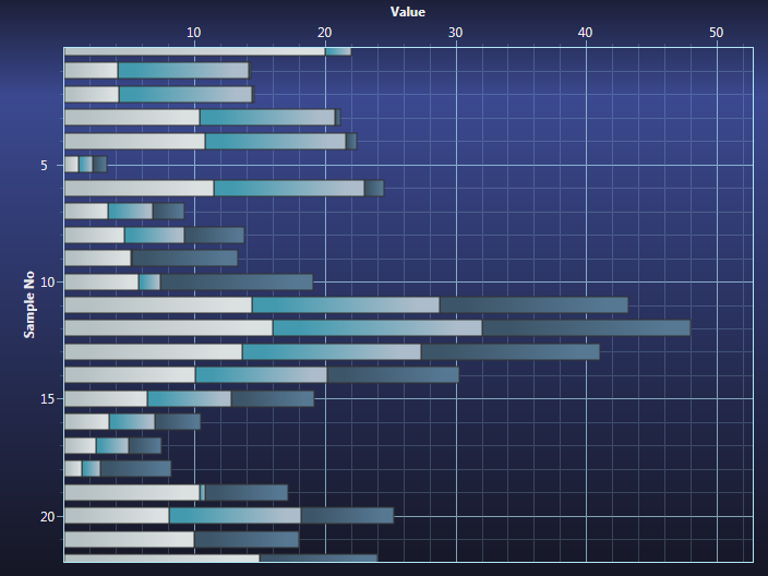
 Andrew, thank you very much for your fast help. I've already discovered that the scichartgroup might not be the best option. But not because of the reasons you describe. The screenshot is maybe with another wpf charting lib then scichart and is going to be converted to scichart. I'm looking at the best way to do this and I thought the scichartgroup might offer additional features that are interesting (like the pane resizing, collapsing, tabbing, ..). However, it seems that the scichartgroup needs a principal chart and in my app, all charts are created equal. for the moment, the application is made with a simple wpf grid. I will probably implement scichart the same way. But the question in this topic is about the topmost chart in the screenshot, this I quickly made with paint. Is there a way to create this with a scichartsurface?
- Hi Mathias, You can try horizontal stacked bar chart https://www.scichart.com/wp-content/uploads/2014/04/stackedbarcharts2.png In the WPF Examples Suite go to Multi Series Charts and have a look at the stacked bar charts examples. Alternatively, you could create it with a Custom Renderable Series (you can draw basically anything in SciChart), or annotations, but the most 'out of the box' way would be stacked bar chart. Hope this helps!
- Will the stacked bar chart be able to deal with recurrent values in that it will set the same color for the bar or do I need to tell it to do this?
- Ahh no, it's designed to stack several series. Like I said, visually, it's the closest thing we have out of the box, but other than that your options are Custom Renderable Series http://support.scichart.com/index.php?/Knowledgebase/Article/View/17253/41/customrenderableseries-api-overview or annotations. Actually, you might be able to create the same effect using FastMountainRenderableSeries and the PaletteProvider API http://support.scichart.com/index.php?/Knowledgebase/Article/View/17187/28/change-series-colour-dynamically-paletteprovider Hope this has given you some food for thought!
- Thank you!
1
![]()
Queens Award for Innovation
Proud winners of the Queens Award for Innovation, 2019. Awarded on account of our innovative graphics engine which underpins the SciChart library and enables our world-beating charting performance
![]()
National Business Awards
Highly Commended for Lloyds National Business Awards, 2019. Awarded on account of our innovative graphics engine and impressive customer base

Reviews
SciChart has received hundreds of verified, 3rd party reviews
Try SciChart Today
Start a trial and discover why we are the choice
of demanding developers worldwide