Hi there,
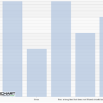
I would like to use a column chart with labels. Our client tends to use really long names for these labels, so I was wondering if it is possible that these labels wrap. I could find no property in the docs or source that achieves this. The attached screenshot shows the current (and undesired) rendering.
The current behavior seems to be that labels in between are hidden when longer labels overlap them. Is this a configurable property? In our case, the labels may never be hidden.
Kind regards,
Tim Havinga
- Tim Havinga asked 3 years ago
- You must login to post comments
Hi Tim,
There is no way to achieve axis label wrapping or axis label rotation in SciChart.js at the moment, however we are doing a deep refactor on the Axis APIs to allow a lot more flexibility in the next major version. Shall I add this to our task board?
In the meantime I would suggest your only workaround is to clip or trim long labels with … ellipsis but maybe use our RolloverModifier to show the full label when the data-point is hovered.
How you can do this:
- Use the LabelProvider API to create a new labelprovider
- Override FormatLabel and clip/trim the returned string if it is greater than 5 characters to xyzw…
- Override FormatCursorLabel and return the full length string
- Add a RolloverModifier to the chart
Does it work as expected?
Some documentation links:
Best regards,
Andrew
- Andrew Burnett-Thompson answered 3 years ago
 Hello Andrew, Thanks for your reply. Alas, the rollover option is not a viable one in our case, as the labels need to be present at all times. I would like to take you up on your suggestion to add this to a next major version, please keep me informed! Kind regards, Tim
- You must login to post comments
Hi Tim,
Wrapping labels is not possible right now. But we have plans to allow rotating labels in version 2.0. You can find the link to the task here.
In the meantime you can:
- Use vertical chart and have title for the columns on the left instead of having them at the bottom.
- Use annotation to display any text you need.
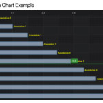
Here is the code sample and the image:
import {MouseWheelZoomModifier} from "scichart/Charting/ChartModifiers/MouseWheelZoomModifier";
import {RolloverModifier} from "scichart/Charting/ChartModifiers/RolloverModifier";
import {ZoomExtentsModifier} from "scichart/Charting/ChartModifiers/ZoomExtentsModifier";
import {ZoomPanModifier} from "scichart/Charting/ChartModifiers/ZoomPanModifier";
import {XyDataSeries} from "scichart/Charting/Model/XyDataSeries";
import {ECoordinateMode} from "scichart/Charting/Visuals/Annotations/AnnotationBase";
import {TextAnnotation} from "scichart/Charting/Visuals/Annotations/TextAnnotation";
import {NumericAxis} from "scichart/Charting/Visuals/Axis/NumericAxis";
import {FastColumnRenderableSeries} from "scichart/Charting/Visuals/RenderableSeries/FastColumnRenderableSeries";
import {SciChartSurface} from "scichart/Charting/Visuals/SciChartSurface";
import {EHorizontalAnchorPoint, EVerticalAnchorPoint} from "scichart/types/AnchorPoint";
import {EAxisAlignment} from "scichart/types/AxisAlignment";

const { sciChartSurface, wasmContext } = await SciChartSurface.create(divElementId);
const xAxis = new NumericAxis(wasmContext);
xAxis.labelProvider.formatLabel = dataValue => `label text ${dataValue.toString(10)}`;
xAxis.axisAlignment = EAxisAlignment.Left;
sciChartSurface.xAxes.add(xAxis);
const yAxis = new NumericAxis(wasmContext);
yAxis.axisAlignment = EAxisAlignment.Top;
yAxis.flippedCoordinates = true;
sciChartSurface.yAxes.add(yAxis);

const columnSeries = new FastColumnRenderableSeries(wasmContext, {
    fill: "rgba(176, 196, 222, 1)",
    stroke: "#4682b4",
    strokeThickness: 2,
    dataPointWidth: 0.5,
    opacity: 0.7
});
sciChartSurface.renderableSeries.add(columnSeries);

const dataSeries = new XyDataSeries(wasmContext);
for (let i = 0; i < 10; i++) {
    const x = i;
    const y = Math.sin(i * 0.1);
    dataSeries.append(x,y);
    const text = `Annotation ${i}`;
    const annotation = new TextAnnotation({
        xCoordShift: 6,
        x1: x,
        y1: y,
        xCoordinateMode: ECoordinateMode.DataValue,
        yCoordinateMode: ECoordinateMode.DataValue,
        horizontalAnchorPoint: EHorizontalAnchorPoint.Left,
        verticalAnchorPoint: EVerticalAnchorPoint.Center,
        textColor: "yellow",
        fontSize: 16,
        fontFamily: "Times New Roman",
        text
    });
    sciChartSurface.annotations.add(annotation);
}
columnSeries.dataSeries = dataSeries;

sciChartSurface.chartModifiers.add(new ZoomPanModifier());
sciChartSurface.chartModifiers.add(new ZoomExtentsModifier());
sciChartSurface.chartModifiers.add(new MouseWheelZoomModifier());
sciChartSurface.chartModifiers.add(new RolloverModifier({isVerticalChart: true}));
sciChartSurface.zoomExtents();
I hope it hepls.
- Michael Klishevich answered 3 years ago
- last edited 3 years ago
 Hello Michael, I did take a look at the annotations, very interesting stuff. However, annotations are clipped at the edge of the graph viewport, as can be seen in your screenshot also. So I cannot use annotations to create custom column labels, for example. Rotating labels is nice, but this hurts readability and is not a good solution when the labels become increasingly long, as in my case. Text wrapping would really help me out here. Apparently, you can see when the labels will overlap each other (as the labels to the left and right of a longer one are omitted), imho it would not be that hard to set a max-width to the label and wrap the text in that case (optionally, of course). Good luck with the next version, keep me posted! Kind regards, Tim
- You must login to post comments
Please login first to submit.


