Pre loader

iOS - Increasing Required Culling Distance Between Axis Labels

Welcome to the SciChart Forums!

  • Please read our Question Asking Guidelines for how to format a good question
  • Some reputation is required to post answers. Get up-voted to avoid the spam filter!
  • We welcome community answers and upvotes. Every Q&A improves SciChart for everyone

WPF Forums | JavaScript Forums | Android Forums | iOS Forums

0
0

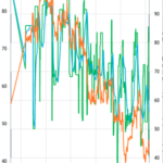
I have a simple chart using a an SCIDateTimeAxis to display dates along the x-axis. In some situations, the labels displayed along this x-axis are way too close together. Please see attached screenshot. I was wondering whether there is a property somewhere I can configure to increase the required “culling” space between labels? Or, failing that, what would I need to implement myself to somehow drop some of the displayed labels in order to make them more readable?

Version
2.2.2.2299
Images
  • You must to post comments
Showing 0 results
Your Answer

Please first to submit.

Try SciChart Today

Start a trial and discover why we are the choice
of demanding developers worldwide

Start TrialCase Studies