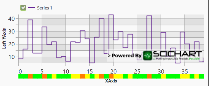
I’m trying to put together a chart that adds a bar at the bottom, to visualise Y values going over specific thresholds (in this example, below 20 is Green, 20 to 30 range is Yellow, and over 30 is Orange), as shown here:
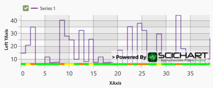
The bar scales along with the line when zooming the chart
The version pictured builds the bar using box annotations, each defined as below:
new BoxAnnotationViewModel()
{
    X1 = currentXValue,
    X2 = currentXValue, + xValuesStepSize,
    Y1 = 0.96,
    Y2 = 1,
    Background = backgroundColor, //Colour calculated based on Y value
    AnnotationCanvas = AnnotationCanvas.AboveChart,
    CoordinateMode = AnnotationCoordinateMode.RelativeY
};
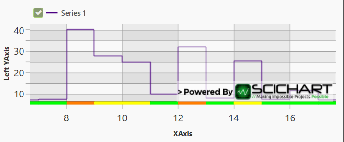
This implementation works, but the issue is that the bar is drawn inside the main chart area, and so covers some of the chart itself; if this could just be moved onto the X axis, rather than the chart canvas, then this would be exactly what I need.
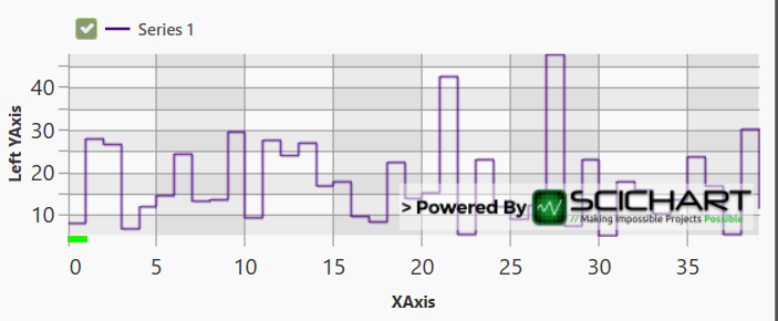
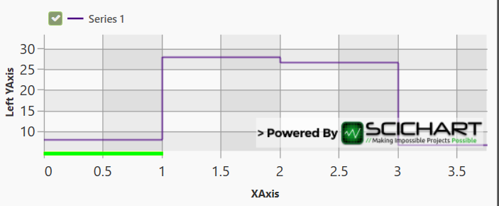
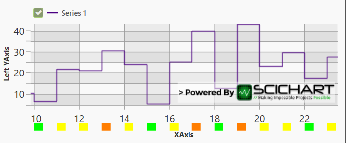
I tried to just switch the canvas on the BoxAnnotations to use AnnotationCanvas.XAxis, but when doing this the annotations don’t seem to be getting the right X / Y coordinates for positioning – the width and height of each block looks correct, and the width scales when the chart is zoomed in, but every block appears to be positioned at 0,0 on the XAxis canvas (it looks like X1/Y1 values are ignored, so all blocks are stacked on top of each other in the same position rather than appearing alongside each other as a bar)
With a bit of searching I found an old post (https://www.scichart.com/questions/wpf/annotation-on-axis) stating that ‘AxisMarkerAnnotation’ is the only supported annotation for display on an axis canvas, so I tried using this instead, which does seem to respect the X1 position. Here though, the X2 value seems be be interpreted as just a static pixel width, and the width of the annotations does not scale when the chart is zoomed, so the blocks stay as whatever width is initially drawn and get moved further apart the more the chart is zoomed in.
I’m new to SciChart so hopefully I’m missing something obvious; is there any way of either getting the BoxAnnotation to work on an axis canvas, or of setting an AxisMarkerAnnotation’s width to be the width between two points on the X axis, scaling along with the chart when zooming?
I hope the above makes sense, thanks in advance for your help.
- Tony Murphy asked 4 years ago
- last edited 4 years ago
- You must login to post comments
Hi Tony
We get questions like this a lot, so I created a few samples over at our Github page to show you how to create a ‘state series’ or ‘signal series’ using SciChart.
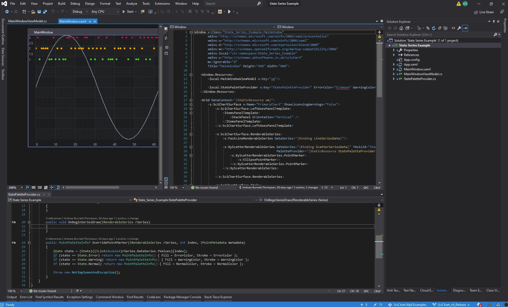
There are three methods in here presented to create a series like this.
- Chart in a chart (Chartception). This uses two charts, with one placed over another to place series. I have used Scatter series but you could just as easily use Column Series or Mountain Series with PaletteProvider – which lets you change colour based on value.
- AxisPanelTemplate. By templating the axis panel you can move some series to the top or bottom of the chart
- Custom series. This method is by far the most flexible but it became difficult to do the many colours.
Anyway, check out the samples and see if they help you. Any questions please ask!
Best regards,
Andrew
- Andrew Burnett-Thompson answered 4 years ago
- last edited 4 years ago
 Hi Andrew, Thanks for your response, I’ve taken a look at the examples but unfortunately they don’t cover what I’m trying to do. I’ve got the bar implemented how I want and it already works fine if I do this in the chart canvas (top two screenshots in original post), the issue is that ideally I’d want to draw this bar as part of the X Axis (so on AnnotationCanvas.XAxis), rather than on the main chart canvas where it covers the series it is based on. If I do change the AnnotationCanvas that I’m adding the annotations to, they don’t seem to be getting the correct position data any more, so each block just ends up at the 0, 0 point, on the top left of the X Axis canvas (third and fourth screenshots – the small green block is actually the full group of blocks that I’m trying to draw, but all stacked on top of each other rather than appearing one after the other). I hope the above makes sense, let me know if you need any more detail though. Thanks
 Drawing on the actual axis is a bit difficult (we obviously draw ourselves on the axis), it is possible but not something that we’ve supported in the public-facing API. If say drawing on axis meant 10x harder is it worth it? If so, we could build it for you as consultants. If not, the built-in APIs can do the job and you’ll be done in a day or so.
- Just to clarify, are you saying that drawing on the axis would be harder but still possible for me to do, or that it would only be possible to do that work on your side (having you build the functionality for us)? Also, I’m not sure what you mean when you say that if it’s not worth the extra work then the built-in APIs can do the job; do you mean that if it’s not worth the extra work I could just run with the version I already have, where the bar appears on the main chart canvas? Apologies for the confusion, and thanks again for your help.
- Hi Tony, it gets harder to do this on the axis, the solution I’ve given you will work out the box on the main chart surface. To move to the axis requires investigation, as it’s not standard use of SciChart.
- No problem, thanks for letting me know
- You must login to post comments
Please login first to submit.
