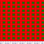
I want to draw a chart like the attached picture (SHMOO_EXAMPLE.jpg)…
And I find the most closest example is stacked bar chart.
However there is one color in each column series in the example of bar chart.
But I want to modify each cell in the chart’s color according to the other value (maybe need three or four colors in each column)
Can I do this?
thank you
- ychch yang asked 8 years ago
- You must login to post comments
Hi there,
Thanks for your question. Unfortunately, it isn’t possible to have several colors per column unless you use a gradient brush for a series. But even in this case, each column in the same series will be filled with the same brush. It is possible to override fill for a single column, but not with a gradient brush. So I’m not sure if StackedColumnSeries is the best option for you to use.
I would suggest checking out FastHeatMapRenderableSeries. Please take a look at our “Heatmap chart with text” example, it looks quite similar to what you want to implement. Is it suitable for your purposes?
Best regards,
Yuriy
- Yuriy Zadereckiy answered 8 years ago
- You must login to post comments
Thank you~~
I have already survey HeatMap~~
- ychch yang answered 8 years ago
- You must login to post comments
Please login first to submit.

