Hello SciCharts Team,
I have multiple data series of <date, double> Type with no:of sample points ranging in the magnitude of Millions (Not realtime). Is there a way to have a blanket model graph fitting available for the data out of the box? Right now even with default resampling provided by the Sci charts, the number of points plotted on the screen is more than what is optimal. I looking for a solution, where I can keep a constant n data points on the screen irrelevant of the zoom state.
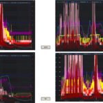
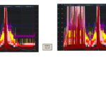
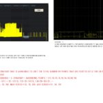
I have attempted to use the resampling on the IRenderableSeries as provided by default by the Sci charts. Please find the screenshots for those graphs attached. The graph is not visually appealing or hard to analyze because of the high data point density. This is the major reason why I’m requesting an alternative/method to improve the visualization.
I have achieved this previously by a resampling strategy to show a maximum of n points on the screen. Let’s say the screen accommodates 2k points (n = 2k) for example, (sample total) 2M points will be aggregated to 6000k points, 2k as average, 2k as max, and 2k as min. Just an idea for thought. I’m sure there might be better ways of doing this. Please provide me with some suggestions to improve this scenario.
Thanks,
Arjun
- Arjun Sivaprasadam asked 1 year ago
- last edited 1 year ago
- You must login to post comments
Hi Arjun
Ok so what you want to do is deliberately down sample or reduce the data for smoother appearance. Is that right?
Have you thought about using the filters API?
This lets you do any kind of data transform on data. We typically use it for curve fitting or smoothing like moving averages.
Something like a Douglas-Peucker line simplification algorithm would reduce data but maintain key features making the graph less cluttered or busy. However there may be some data loss.
Try that! Look at our filters api docs to see how to implement a custom filter.
Douglas Peucker in c# is here
- Andrew Burnett-Thompson answered 1 year ago
- last edited 1 year ago
- You must login to post comments
Hello Dr. Andrew,
You’re right I wanted to deliberately downsample or reduce the data for a smoother appearance on the full overview and fall back to the original data points gradually on a fully zoomed-in view.
Yes, this solution would perfectly fit our scenario. I’ll try out using filters API to achieve a moving average and also the Douglas-Peucker line simplification algorithm too. Choose the best fit!
Thanks for pointing out the resources this was amazingly helpful.
- Arjun Sivaprasadam answered 1 year ago
- last edited 1 year ago
- You must login to post comments
Wonderful, I’m really glad that solution helped.
I have an idea actually. If you create a custom filter using our Filters API and some line simplification algorithm like Douglas-Peucker, this uses a simple boxing method to group points. It’s going to be hard to do that given that the grouping should be done as pixels and your data is in data-coordinates.
You could pass an pointsPerPixel variable to the filter (assuming you have linear axis) by calculating (xAxis.VisibleRange.Max - xAxis.VisibleRange.Min) / xAxis.ActualWidth (or similar for y-axis). You’ll need to use this pointsPerPixel factor to determine how close data-points are in X for the grouping/simplification algorithm.
Next, group the points, if they are closer than say 2-5 pixels, skip. This will reduce the data on the screen however it could result in peaks & troughs getting lost.
Lastly, if you put the output of that into a spline series instead of a normal line series, you will get a smoothed line but simplified version of the original data.
I’m curious how this works out! If you end up creating a featurette out of this we’d be interested to see the code, and perhaps include something similar into the scichart library for line smoothing, to create better looking charts but with the caveat that data has been transformed.
Best regards,
Andrew
- Andrew Burnett-Thompson answered 1 year ago
- last edited 1 year ago
- You must login to post comments
Please login first to submit.


