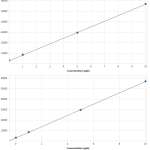
I’m rendering a chart that uses a bound VisibleRange. You can see in the supplied screenshot that there has been a fairly small change to second chart’s X-axis “Min” value, resulting in the X-axis labels/ticks changing from 1.2.3.4… to 0.2.4.6.8…
What options are available to control how labels/ticks are generated, i.e. to make them more consistent? The first chart in the screenshot would also benefit from having a label at “0”.
FYI the screenshot shows a chart with four points, and X values of 0,1,5,10. In reality there could be more points or fewer, and the X values could range into the millions (e.g. if the user chooses “parts-per-trillion”, or even “parts-per-quadrillion”!).
Another feature (as seen in the supplied screenshot) allows the user to extend the trend line to see where it intercepts the X-axis. In this sample it’s quite close to 0, but in reality it could intercept at a much lower (or higher) value.
- andyste1 asked 11 years ago
- You must login to post comments
Hi Andy,
Please see this Knowledge Base article on Altering the Tick Frequency of an Axis. Those are the options we have at the moment for defining tick frequency. Unfortunately all the auto-tick generation is internal and cannot be altered (without adjusting the source code). Perhaps we could expose this as an API (Similar to IViewportManager, or ILabelFormatter)?
Update June 2014
In SciChart v3.0 we introduced TickProvider API which allows customization of tick generation via implementation your own tick generation algorithm. For more information please take a look our TickProvider tutorial.
What do you think?
Best regards,
Andrew
- Andrew Burnett-Thompson answered 11 years ago
 That's useful to know. Am I right in saying that labels are always rendered next to major ticks? I can imagine tick/label auto-generation can be a potentially complex area, but an API might be useful, or at least some kind of structure/properties to control its behaviour. Speaking for my own requirements, I would like to be able to specify the value of the first and last label/tick to display, and the total number to show. So in my first screenshot this would be 0-10, 11 ticks. If I change to "parts-per-trillion" then this range would change to 0-10000, but still 11 ticks (i.e. every 1000). Having a "static" number of ticks/labels may result in more consistent looking charts, in my scenario at least. I could also see a need for ticks/labels at specific points. E.g. in my first screenshot I might want X-axis ticks/labels aligned with the plotted points. Perhaps this could be accomplished by providing SciChart with a collection of "tick values" (in my case [0,1,5,10]). Thanks again, Andrew
- You must login to post comments
Please login first to submit.

