I want to display a palette next to the axes, using colors to represent different energy levels
Like in the picture below
Version
6.4
Images

- hundun wds asked 1 year ago
- You must login to post comments
This looks a lot like the HeatmapLegend control, which is included in the SciChart library.
You can find examples of the heatmap legend in our 3D Lidar Point Cloud demo, our Realtime Spectrogram demo the Tenor Curves 3D Plot demo and the Realtime Heatmap demo.
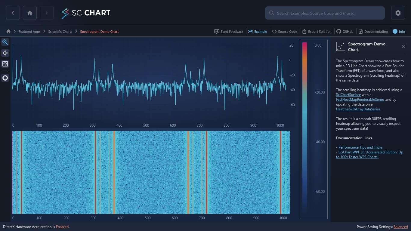
Each of the links above is a link to our examples suite showing where to find this in the SciChart WPF Examples app. There is also a link to github code on page.
Let me know if that helps!
Best regards,
Andrew
- Andrew Burnett-Thompson answered 1 year ago
- last edited 1 year ago
- You must login to post comments
Your Answer
Please login first to submit.
