
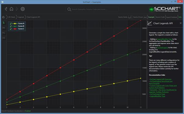
SciChart features a rich, customisable legend API which is based on our powerful ChartModifier API. To add a Legend to a chart, you need two elements – a LegendModifier – which is the datasource, and a SciChartLegend, or ItemsControl, to show the data.
SciChart legends support the following:
- Placement of legend Top, Left, Right, Bottom, Inside the chart
- Auto-creation of Legend UI and binding to Legend Data Source via the LegendModifier.
- Horizontal or Vertical orientation of Legends
- Showing SeriesName, Line Color/Marker, Visibility Checkboxes
- Templating of Legend Items to allow full customization of the legend including adding color-pickers or other controls
- Placing legends anywhere in your application
Showing a Legend with ShowLegend=True
The simplest way to declare a legend is to declare a LegendModifier and set LegendModifier.ShowLegend=True. This will autocreate a SciChartLegend control and place it inside the chart automatically.
XAML
| Showing a Legend with ShowLegend=True |
Copy Code |
|---|---|
<s:SciChartSurface> <!-- XAxis, YAxis, RenderableSeries omitted for brevity --> <!-- Declare ChartModifiers --> <s:SciChartSurface.ChartModifier> <s:ModifierGroup> <s:LegendModifier ShowLegend="True" Orientation="Horizontal" Margin="10" LegendPlacement="Inside" GetLegendDataFor="AllSeries" ShowVisibilityCheckboxes="True"/> </s:ModifierGroup> </s:SciChartSurface.ChartModifier> </s:SciChartSurface> | |
Code
| Showing a Legend with ShowLegend=True |
Copy Code |
|---|---|
var sciChartSurface = new SciChartSurface(); sciChartSurface.ChartModifier = new ModifierGroup(new LegendModifier() { ShowLegend = true, Orientation = Orientation.Horizontal, Margin = new Thickness(10, 10, 10, 10), LegendPlacement = LegendPlacement.Inside, GetLegendDataFor = SourceMode.AllSeries, ShowVisibilityCheckboxes = true, }); | |
Excluding a Single Series from the LegendModifier
You can exclude a series from the LegendModifier by setting the LegendModifier.IncludeSeries property on the LegendModifier:
| Include Series in XAML |
Copy Code |
|---|---|
<s:SciChartSurface> <s:SciChartSurface.RenderableSeries> <s:FastLineRenderableSeries s:LegendModifier.IncludeSeries="False"/> </s:SciChartSurface.RenderableSeries> </s:SciChartSurface> | |
| Include Series in Code |
Copy Code |
|---|---|
var sciChartSurface = new SciChartSurface(); var lineSeries = new FastLineRenderableSeries(); sciChartSurface.RenderableSeries.Add(lineSeries); LegendModifier.SetIncludeSeries(lineSeries, false); | |
Placing the Auto-Generated Legend Inside or Outside the SciChartSurface
When using auto-generated legend (when LegendModifier.ShowLegend = True), you can place the legend Inside, Outside, Left, Top, Right and Bottom on the SciChartSurface by using the LegendModifier.LegendPlacement property. Note that the legend placement can also be adjusted with the LegendModifier.Margin property.
Showing only Visible or Selected series in the Auto-Generated Legend
You can change which series the legend displays data for by using the LegendModifier.GetLegendDataFor property.
Showing a Horizontal or Vertical Auto-Generated Legend
You can change the orientation of the legend from Vertical to Horizontal by using the LegendModifier.Orientation property.
Showing or Hiding the Visibility Checkboxes in the Auto-Generated Legend
You can show or hide the Visibility Checkboxes in the legend by using the LegendModifier.ShowVisibilityCheckboxes property.
Showing or Hiding the Scrollbars in the Auto-Generated Legend
You can show or hide the Scrollbars in the legend by using the ScrollViewer.HorizontalScrollBarVisibility and ScrollViewer.VerticalScrollBarVisibility properties.
| Showing or Hiding Scrollbars |
Copy Code |
|---|---|
<s:LegendModifier ShowLegend="True" ScrollViewer.HorizontalScrollBarVisibility="Auto" ScrollViewer.VerticalScrollBarVisibility="Auto"/> | |
Setting the Font properties, Brushes and Border for the Auto-Generated Legend
The Font properties – including FontSize, FontWeight, FontFamily, and FontStyle – as well as the Background, Foreground, BorderBrush and BorderThickness properties of the Legend can be configured by setting the respective properties on the LegendModifier.
NOTE: The Font properties on the LegendModifier are supported in version 8.10.x or later. In older versions (or as an alternative approach), you can change the Font properties by templating the Legend Item Row or SciChartLegend Control (see more information below)
| Customizing Auto-Generated Legend using the LegendModifier |
Copy Code |
|---|---|
<s:SciChartSurface> <s:SciChartSurface.ChartModifier> <s:ModifierGroup> <s:LegendModifier ShowLegend="True" Orientation="Horizontal" LegendPlacement="Inside" GetLegendDataFor="AllSeries" ShowVisibilityCheckboxes="True" FontSize="14" FontWeight="Bold" FontFamily="Consolas" FontStyle="Normal" Background="#FF1B2036" Foreground="#FFA6A7AC" BorderBrush="#FF6F88B4" BorderThickness="2"/> </s:ModifierGroup> </s:SciChartSurface.ChartModifier> </s:SciChartSurface> | |
| Customizing Auto-Generated Legend using the LegendModifier |
Copy Code |
|---|---|
var sciChartSurface = new SciChartSurface(); sciChartSurface.ChartModifier = new LegendModifier { ShowLegend = true, Orientation = Orientation.Horizontal, LegendPlacement = LegendPlacement.Inside, GetLegendDataFor = SourceMode.AllSeries, ShowVisibilityCheckboxes = true, FontSize = 14, FontWeight = FontWeights.Bold, FontFamily = new FontFamily("Consolas"), FontStyle = FontStyles.Normal, Background = new SolidColorBrush(Color.FromRgb(27, 32, 54)), Foreground = new SolidColorBrush(Color.FromRgb(166, 167, 172)), BorderBrush = new SolidColorBrush(Color.FromRgb(111, 136, 180)), BorderThickness = new Thickness(2) }; | |
Templating the Legend Item Rows
The appearance of the Legend Item Rows can be customized by creating a custom Data Template and applying it using the LegendModifier.LegendItemTemplate property. Each Legend Item Row is bound to an object of type SeriesInfo.
By defining a custom template, you have the flexibility to modify individual template parts and completely redefine how the Legend Item Row appears. For instance, you can customize the series name TextBlock control by setting the Font properties (FontSize, FontWeight, etc.), changing the Foreground brush, or applying any other changes.
See the example of using LegendItemTemplate
| Templating the Legend Item Rows |
Copy Code |
|---|---|
<!-- May be set to the LegendModifier.LegendItemTemplate property --> <!-- Allows per legend item styling. For instance, this template includes the visibility CheckBox, PointMarker and series name TextBlock--> <!-- Each item is bound to a SeriesInfo. If you look at our docs on SeriesInfo you will see all the possibilities, including direct access to SeriesInfo.RenderableSeries --> <DataTemplate x:Key="SciChartLegendItemTemplate" DataType="s:SeriesInfo"> <Grid> <Grid.ColumnDefinitions> <ColumnDefinition Width="Auto"/> <ColumnDefinition Width="Auto"/> <ColumnDefinition Width="Auto"/> </Grid.ColumnDefinitions> <CheckBox Width="16" Margin="5,0,0,0" HorizontalAlignment="Left" VerticalAlignment="Center" IsChecked="{Binding RenderableSeries.IsVisible, Mode=TwoWay}" Visibility="{Binding LegendData.ShowVisibilityCheckboxes, RelativeSource={RelativeSource AncestorType=visuals:SciChartLegend}, Converter={StaticResource BooleanToVisibilityConverter}}"/> <r:PointMarker Grid.Column="1" Margin="5,0,0,0" Width="40" Height="10" VerticalAlignment="Center" HorizontalAlignment="Center" DataContext="{Binding RenderableSeries}" DeferredContent="{Binding LegendMarkerTemplate}" Visibility="{Binding ShowSeriesMarkers, RelativeSource={RelativeSource AncestorType=visuals:SciChartLegend}, Converter={StaticResource BooleanToVisibilityConverter}}"/> <TextBlock Margin="5,0,5,0" Grid.Column="2" VerticalAlignment="Center" HorizontalAlignment="Left" Text="{Binding SeriesName}" FontSize="14" FontWeight="Bold" FontFamily="Consolas" FontStyle="Normal" Foreground="#FFA6A7AC"/> </Grid> </DataTemplate> | |
Templating the SciChartLegend Control
When the legend is auto-generated, you cannot access its instance directly, but you can control its creation and adjust all the SciChartLegend control’s properties – including the Font properties (FontSize, FontWeight, etc.), Background, Foreground, BorderBrush and BorderThickness. Use the following code to change how the auto-generated legend is instantiated.
| Templating the SciChartLegend Control |
Copy Code |
|---|---|
<s:LegendModifier ShowLegend="True" Orientation="Horizontal"> <s:LegendModifier.LegendTemplate> <ControlTemplate> <!-- Change the Auto-Generated SciChartLegend --> <s:SciChartLegend ItemTemplate="{Binding LegendItemTemplate}" LegendData="{Binding LegendData}" Orientation="{Binding Orientation}" ScrollViewer.HorizontalScrollBarVisibility="Auto" ScrollViewer.VerticalScrollBarVisibility="Auto" ShowSeriesMarkers="True" ShowVisibilityCheckboxes="True" FontSize="14" FontWeight="Bold" FontFamily="Consolas" FontStyle="Normal" Background="#FF1B2036" Foreground="#FFA6A7AC" BorderBrush="#FF6F88B4" BorderThickness="2"/> </ControlTemplate> </s:LegendModifier.LegendTemplate> </s:LegendModifier> | |
Alternatively – Binding LegendModifier.LegendData to SciChartLegend
You can alternatively bind LegendModifier.LegendData to a SciChartLegend and place anywhere in your application. You can also bind to an LegendModifier.LegendData to an ItemsControl.ItemsSource and template it as you wish.
| Alternatively – Binding LegendModifier.LegendData to SciChartLegend |
Copy Code |
|---|---|
<s:SciChartSurface x:Name="sciChart" s:ThemeManager.Theme="Chrome"> <!-- XAxis, YAxis, Omitted for brevity --> <!-- Declare ChartModifiers --> <s:SciChartSurface.ChartModifier> <s:ModifierGroup> <s:LegendModifier x:Name="legendModifier" GetLegendDataFor="AllSeries" ShowLegend="False"/> </s:ModifierGroup> </s:SciChartSurface.ChartModifier> </s:SciChartSurface> <!-- Somewhere else in your application, you can declare a SciChartLegend and bind to LegendModifier.LegendData --> <s:SciChartLegend x:Name="legendControl" s:ThemeManager.Theme="Chrome" Margin="23,23" ScrollViewer.HorizontalScrollBarVisibility="Auto" ScrollViewer.VerticalScrollBarVisibility="Auto" LegendData="{Binding LegendData, ElementName=legendModifier, Mode=OneWay}" ShowVisibilityCheckboxes="True" /> | |
The ControlTemplate for the SciChartLegend control
The auto-generated SciChartLegend control is simply an ItemsControl. The default Control Template for the SciChartLegend is included below:
| The ControlTemplate for the SciChartLegend control |
Copy Code |
|---|---|
<ControlTemplate TargetType="s:SciChartLegend"> <Border HorizontalAlignment="{TemplateBinding HorizontalAlignment}" VerticalAlignment="{TemplateBinding VerticalAlignment}" Background="{TemplateBinding Background}" BorderBrush="{TemplateBinding BorderBrush}" BorderThickness="{TemplateBinding BorderThickness}" Padding="{TemplateBinding Padding}"> <ScrollViewer Common:CompatibleFocus.IsFocusable="False" HorizontalScrollBarVisibility="{Binding (ScrollViewer.HorizontalScrollBarVisibility), RelativeSource={RelativeSource TemplatedParent}}" VerticalScrollBarVisibility="{Binding (ScrollViewer.VerticalScrollBarVisibility), RelativeSource={RelativeSource TemplatedParent}}"> <ItemsPresenter /> </ScrollViewer> </Border> </ControlTemplate> | |