
In addition to the standard way of linking multiple charts presented in Section 4.19.1, you can also create multi-pane Stock Charts using the SciChartGroup control and multiple SciChartSurfaces.
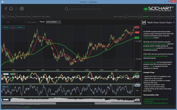
Examples > 2D Charts > Create Stock Charts > Multi-Pane Stock Charts
Declaring a SciChartGroup control in XAML
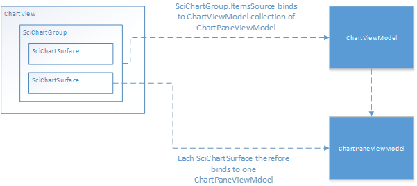
The SciChartGroup derives from ItemsControl, so it needs an ItemSource (binding via MVVM) and an ItemTemplate (data template which defines the chart panes).
We recommend an MVVM application with an architecture resembling the following to declare a SciChartGroup:
In XAML this looks something like this:
| Declaring a SciChartGroup control |
Copy Code |
|---|---|
<!-- Databinds a SciChartGroup to a list of ChartPaneViewModels --> <!-- Child chart panes are generated using the ItemTemplate below --> <!-- Assumes your ViewModel exposes a collection of 'ChartPaneViewModels' --> <!-- Each of which contains the DataSeries / RenderableSeries for a single chart pane --> <s:SciChartGroup ItemsSource="{Binding ChartPaneViewModels}"> <s:SciChartGroup.ItemTemplate> <DataTemplate> <!-- DataTemplate instantiates this View per ChartPaneViewModel --> <!-- DataContext is ChartPaneViewModel --> <s:SciChartSurface> <!-- Omitted XAxis, YAxis, RenderableSeries, --> <!-- Modifiers for brevity --> </s:SciChartSurface> </DataTemplate> </s:SciChartGroup.ItemTemplate> </s:SciChartGroup> | |
NOTE: For a full sample, see the Examples > 2D Charts > Create Stock Charts > Multi Pane Stock Charts
Synchronizing the Multiple Charts in a SciChartGroup
The technique to synchronize charts is the same as presented in Synchronizing Multiple Charts. You need to:
- Declare a MouseManager.MouseEventGroup on the root ChartModifier on the chart inside your item template.
- Bind XAxis.VisibleRange on the chart in your item template to a common ViewModel property.
- (Optionall) share SciChartGroup.VerticalChartGroup on the SciChartSurface itself to synchronize Y-Axis sizes
The xaml to do this looks something like this:
| Synchronizing the Multiple Charts in a SciChartGroup |
Copy Code |
|---|---|
<!-- Databinds a SciChartGroup to a list of ChartPaneViewModels --> <!-- Child chart panes are generated using the ItemTemplate below --> <!-- Assumes your ViewModel exposes a collection of 'ChartPaneViewModels' --> <!-- Each of which contains the DataSeries / RenderableSeries for a single chart pane --> <s:SciChartGroup ItemsSource="{Binding ChartPaneViewModels}"> <s:SciChartGroup.ItemTemplate> <DataTemplate> <!-- DataTemplate instantiates this View per ChartPaneViewModel --> <!-- DataContext is ChartPaneViewModel --> <!-- VerticalChartGroup binds to property "ChartGroupId" on ChartPaneViewModel --> <!-- All charts which share this ID will have synchronized YAxis sizes --> <s:SciChartSurface s:SciChartGroup.VerticalChartGroup="{Binding ChartGroupId}"> <!-- You'll need to bind to a Shared property on the parent Viewmodel --> <s:SciChartSurface.XAxis> <s:NumericAxis VisibleRange="{Binding Parent.SharedXRange, Mode=TwoWay}/> </s:SciChartSurface.XAxis> <s:SciChartSurface.YAxis> <s:NumericAxis/> </s:SciChartSurface.YAxis> <s:SciChartSurface.ChartModifier> <!-- MouseEventGroup binds to property "ChartGroupId" on ChartPaneViewModel --> <!-- All charts which share this ID will have synchronized mouse events --> <s:ModifierGroup s:MouseManager.MouseEventGroup="{Binding ChartGroupId}> <s:RubberBandXyZoomModifier ReceiveHandledEvents="True"/> <s:ZoomExtentsModifier/> </s:ModifierGroup> </s:SciChartSurface.ChartModifier> </s:SciChartSurface> </DataTemplate> </s:SciChartGroup.ItemTemplate> </s:SciChartGroup> | |
NOTE: For a full sample, see the Examples > 2D Charts > Create Stock Charts > Multi Pane Stock Charts
Defining and Persisting the Height of Chart Panes
The first chart pane occupies the maximum amount of space. Subsequent chart panes are set to a pixel height. You can change this by declaring the following style and binding to a property in your viewmodel:
Styling the Collapse / Tab Buttons
To style the Collapse / Tab buttons, you can change the SciChartGroupPane.HeaderTemplate via a style. The default style is defined below:
| Styling the Collapse / Tab Buttons |
Copy Code |
|---|---|
<!-- SciChartGroupPane --> <Style TargetType="tradeChart:SciChartGroupPane"> <Setter Property="HeaderTemplate"> <Setter.Value> <DataTemplate> <Grid VerticalAlignment="Center" Background="{x:Null}"> <TextBlock Margin="10, 2" HorizontalAlignment="Left" VerticalAlignment="Center" Text="{Binding PaneViewModel.Title}"> <TextBlock.Style> <Style TargetType="TextBlock"> <Setter Property="Foreground" Value="{me:ThemeBinding TickTextBrush}" /> </Style> </TextBlock.Style> </TextBlock> <StackPanel Margin="10, 2" HorizontalAlignment="Right" VerticalAlignment="Center" Background="Transparent" Orientation="Horizontal"> <Button HorizontalContentAlignment="Center" VerticalContentAlignment="Center" Background="Transparent" Command="{Binding ChangeOrientationCommand}"> <Grid> <Path Data="M 0,0 L 10,0 5,8" Visibility="{Binding IsTabbed, Converter={StaticResource BooleanToVisibilityConverter}, ConverterParameter='inverse'}"> <Path.Style> <Style TargetType="Path"> <Setter Property="Fill" Value="{me:ThemeBinding TickTextBrush}" /> <Setter Property="Stroke" Value="{me:ThemeBinding TickTextBrush}" /> </Style> </Path.Style> </Path> <Path Data="M 0,8 L 10,8 5,0" Visibility="{Binding IsTabbed, Converter={StaticResource BooleanToVisibilityConverter}}"> <Path.Style> <Style TargetType="Path"> <Setter Property="Fill" Value="{me:ThemeBinding TickTextBrush}" /> <Setter Property="Stroke" Value="{me:ThemeBinding TickTextBrush}" /> </Style> </Path.Style> </Path> </Grid> </Button> <Button HorizontalContentAlignment="Center" VerticalContentAlignment="Center" Background="Transparent" Command="{Binding ClosePaneCommand}" CommandParameter="{Binding PaneViewModel}"> <Grid> <Path Data="M 0,0 L 10,8" StrokeThickness="2"> <Path.Style> <Style TargetType="Path"> <Setter Property="Stroke" Value="{me:ThemeBinding TickTextBrush}" /> </Style> </Path.Style> </Path> <Path Data="M 0,8 L 10,0" StrokeThickness="2"> <Path.Style> <Style TargetType="Path"> <Setter Property="Stroke" Value="{me:ThemeBinding TickTextBrush}" /> </Style> </Path.Style> </Path> </Grid> </Button> </StackPanel> </Grid> </DataTemplate> </Setter.Value> </Setter> </Style> | |
The SciChartGroupPane style can then be set on the SciChartGruop.ItemContainerStyle property.
Styling the Grid Splitter
The GridSplitter style is defined by the SciChartGroupPane ControlTemplate. The default Template is defined below:
| Styling the Grid Splitter |
Copy Code |
|---|---|
<!-- SciChartGroupPane --> <Style TargetType="tradeChart:SciChartGroupPane"> <Setter Property="Template"> <Setter.Value> <ControlTemplate TargetType="tradeChart:SciChartGroupPane"> <Grid> <Grid.RowDefinitions> <RowDefinition Height="Auto" /> <RowDefinition Height="Auto" /> <RowDefinition /> </Grid.RowDefinitions> <!-- Splitter --> <Thumb x:Name="PART_TopSplitter" Height="5" HorizontalAlignment="Stretch" BorderThickness="0,1,0,1" Cursor="SizeNS"> <Thumb.Style> <Style TargetType="Thumb"> <Setter Property="Background" Value="{me:ThemeBinding RubberBandFill}" /> <Setter Property="BorderBrush" Value="{me:ThemeBinding RubberBandStrokeBrush}" /> </Style> </Thumb.Style> </Thumb> <!-- Surface --> <ContentPresenter x:Name="PART_ContentHost" Grid.Row="1" Grid.RowSpan="2" Content="{TemplateBinding Content}" /> <!-- Header --> <Grid x:Name="PART_Header" Grid.Row="1"> <Grid.RowDefinitions> <RowDefinition Height="Auto" /> </Grid.RowDefinitions> </Grid> </Grid> </ControlTemplate> </Setter.Value> </Setter> </Style> | |
The SciChartGroupPane style can then be set on the SciChartGruop.ItemContainerStyle property.