
A Band Series, or High-Low Fill between two lines can be created using the FastBandRenderableSeries type.
The JavaScript Band Chart Example can be found in the SciChart.Js Examples Suite on Github, or our live demo at demo.scichart.com
Above: The JavaScript Band Chart example from the SciChart.js Demo.
Create a Band Series
To create a Javascript Band Chart with SciChart.js, use the following code:
In the code above:
- A Band Series instance is created and added to the SciChartSurface.renderableSeries collection.
- We set the stroke, fill properties for when Y1 > Y2 and vice versa (more info over at FastBandRenderableSeries in TypeDoc).
- We assign a DataSeries - in this case an XyyDataSeries which stores X, Y1, Y2 data.
This results in the following output:
<div id="scichart-root" ></div>
body { margin: 0; }
#scichart-root { width: 100%; height: 100vh; }
async function simpleBandChart(divElementId) {
// #region ExampleA
// Demonstrates how to create a band chart using SciChart.js
const {
  SciChartSurface,
  NumericAxis,
  FastBandRenderableSeries ,
  XyyDataSeries,
  SciChartJsNavyTheme
} = SciChart;

// or, for npm, import { SciChartSurface, ... } from "scichart"

const { wasmContext, sciChartSurface } = await SciChartSurface.create(divElementId, {
  theme: new SciChartJsNavyTheme()
});
sciChartSurface.xAxes.add(new NumericAxis(wasmContext));
sciChartSurface.yAxes.add(new NumericAxis(wasmContext));

const xValues = [];
const yValues = [];
const y1Values = [];
const POINTS = 1000;
const STEP = (3 * Math.PI) / POINTS;
for (let i = 0; i <= 1000; i++) {
  const k = 1 - i / 2000;
  xValues.push(i);
  yValues.push(Math.sin(i * STEP) * k * 0.7);
  y1Values.push(Math.cos(i * STEP) * k);
}

const dataSeries = new XyyDataSeries(wasmContext, { xValues, yValues, y1Values });

const bandSeries = new FastBandRenderableSeries(wasmContext, {
  dataSeries,
  stroke: "#F48420",
  strokeY1: "#50C7E0",
  fill: "#F4842033",
  fillY1: "#50C7E033",
  strokeThickness: 2,
});

sciChartSurface.renderableSeries.add(bandSeries);
// #endregion
// Optional: add zooming, panning for the example
const { MouseWheelZoomModifier, ZoomPanModifier, ZoomExtentsModifier } = SciChart;
sciChartSurface.chartModifiers.add(new MouseWheelZoomModifier(), new ZoomPanModifier, new ZoomExtentsModifier());
};
simpleBandChart("scichart-root");
async function builderExample(divElementId) {
// #region ExampleB
// Demonstrates how to create a band chart with SciChart.js using the Builder API
const {
  chartBuilder,
  ESeriesType,
  EThemeProviderType
} = SciChart;

// or, for npm, import { chartBuilder, ... } from "scichart"

const xValues = [];
const yValues = [];
const y1Values = [];
const POINTS = 1000;
const STEP = (3 * Math.PI) / POINTS;
for (let i = 0; i <= 1000; i++) {
  const k = 1 - i / 2000;
  xValues.push(i);
  yValues.push(Math.sin(i * STEP) * k * 0.7);
  y1Values.push(Math.cos(i * STEP) * k);
}

const { wasmContext, sciChartSurface } = await chartBuilder.build2DChart(divElementId, {
  surface: { theme: { type: EThemeProviderType.Dark } },
  series: [
    {
      type: ESeriesType.BandSeries,
      xyyData: {
        xValues,
        yValues,
        y1Values
      },
      options: {
        stroke: "#FF1919FF",
        strokeY1: "#279B27FF",
        fill: "#279B2733",
        fillY1: "#FF191933",
        strokeThickness: 2,
      }
    }
  ]
});
// #endregion
};
// Uncomment this to use the builder example
//builderExample("scichart-root");
Gradient Fills in Band Series
New to SciChart.js v3.4, the Band Series chart type now supports gradient fills as well as solid color fills.
To use this, you need to set the FastBandRenderableSeries.fillLinearGradient & fillLinearGradientY1 properties with a GradientParams object: a type which defines gradients by a number of gradient stops, with a start and end point.
Here's a code example:
Try adjusting the CodePen above with the code to set a fillLinearGradient and see the result!
Render a Gap in a Band Series
It is possible to have null points or gaps in a Band Series by passing a data point with a NaN value as the Y value. Please refer to the Common Series Features - Draw Gaps in Series article for more details.
Add Point Markers onto a Band Series
It is possible to put scatter point markers of varying type (Ellipse, Square, Triangle, Cross, Custom) onto a Band Series via the PointMarker API. To learn more, see the documentation page Drawing PointMarkers on Series.
To learn more about the types of Point Marker in SciChart.js, see the Point Markers API documentation.
There is also a dedicated Scatter Series type and a Bubble Series type with some more options.
Painting Band Segments with Different Colors
It is possible to define the colour of line segments individually using the PaletteProvider API.
For more info on how to do this, see the PaletteProvider - Per-point colouring of Band Charts documentation page.
Use Cases
Displaying horizontal thresholds
The Band Series Chart can be used to display a mountain or area with a horizontal threshold. For example, if you want to see a series which has a green mountain above zero and red below, to track PnL or profit and loss, you can also use a band series.
For instance, the following code:
Results in this
<div id="scichart-root" ></div>
body { margin: 0; }
#scichart-root { width: 100%; height: 100vh; }
async function bandChartThresholds(divElementId) {
// Demonstrates how to create a band chart using SciChart.js
const {
SciChartSurface,
NumericAxis,
FastBandRenderableSeries ,
XyyDataSeries,
SciChartJsNavyTheme
} = SciChart;
// or, for npm, import { SciChartSurface, ... } from "scichart"
const { wasmContext, sciChartSurface } = await SciChartSurface.create(divElementId, {
theme: new SciChartJsNavyTheme()
});
sciChartSurface.xAxes.add(new NumericAxis(wasmContext));
sciChartSurface.yAxes.add(new NumericAxis(wasmContext));
// #region ExampleA
// Use a Band series to render a mountain chart with horizontal threshold.
const xValues = [];
const yValues = [];
const y1Values = [];
const POINTS = 1000;
const threshold = 0.4;
const STEP = (3 * Math.PI) / POINTS;
for (let i = 0; i <= 1000; i++) {
  const k = 1 - i / 2000;
  xValues.push(i);
  yValues.push(threshold); // constant value for Y
  y1Values.push(Math.cos(i * STEP) * k);
}

const bandSeries = new FastBandRenderableSeries(wasmContext, {
  dataSeries: new XyyDataSeries(wasmContext, { xValues, yValues, y1Values }),
  stroke: "Transparent", // render Y stroke as transparent
  strokeY1: "#50C7E0",   // render Y1 transparent as blue
  fill: "#FF191933",     // have different fills above/below the threshold. This is fill above
  fillY1: "#50C7E033",   // fill below
  strokeThickness: 2,
});

sciChartSurface.renderableSeries.add(bandSeries);
// #endregion
// Add this label & annotation to the chart
const { HorizontalLineAnnotation, ELabelPlacement } = SciChart;
sciChartSurface.annotations.add(new HorizontalLineAnnotation({
y1: threshold,
stroke: "#FF1919",
axisLabelFill: "White",
strokeThickness: 1,
strokeDashArray: [5, 5],
opacity: 0.6,
labelPlacement: ELabelPlacement.BottomRight, labelValue: "Values above this line are red",
showLabel: true
}));
// Optional: add zooming, panning for the example
const { MouseWheelZoomModifier, ZoomPanModifier, ZoomExtentsModifier } = SciChart;
sciChartSurface.chartModifiers.add(new MouseWheelZoomModifier(), new ZoomPanModifier, new ZoomExtentsModifier());
}
bandChartThresholds("scichart-root");
async function builderExample(divElementId) {
// #region ExampleB
// Demonstrates how to create a band chart with SciChart.js using the Builder API
const {
  chartBuilder,
  ESeriesType,
  EThemeProviderType
} = SciChart;

// or, for npm, import { chartBuilder, ... } from "scichart"

const xValues = [];
const yValues = [];
const y1Values = [];
const POINTS = 1000;
const threshold = 0.4;
const STEP = (3 * Math.PI) / POINTS;
for (let i = 0; i <= 1000; i++) {
  const k = 1 - i / 2000;
  xValues.push(i);
  yValues.push(threshold); // constant value for Y
  y1Values.push(Math.cos(i * STEP) * k);
}

const { wasmContext, sciChartSurface } = await chartBuilder.build2DChart(divElementId, {
  surface: { theme: { type: EThemeProviderType.Dark } },
  series: [
    {
      type: ESeriesType.BandSeries,
      xyyData: {
        xValues,
        yValues,
        y1Values
      },
      options: {
        stroke: "Transparent", // render Y stroke as transparent
        strokeY1: "#50C7E0",   // render Y1 transparent as blue
        fill: "#FF191933",     // have different fills above/below the threshold. This is fill above
        fillY1: "#50C7E033",   // fill below
        strokeThickness: 2,
      }
    }
  ]
});
// #endregion
};
// Uncomment this to use the builder example
//builderExample("scichart-root");
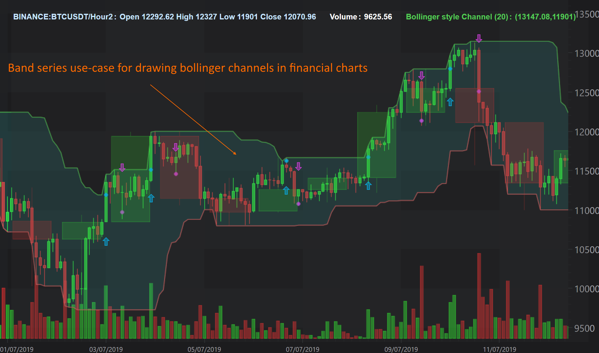
Bollinger Bands & MACD Indicators
The Band Series chart primary use is in financial markets, when you want to display things like Bollinger Bands, MACD. For example, our Create Multi Pane Stock Charts demo has a band series for the MACD indicator, which you can see below.
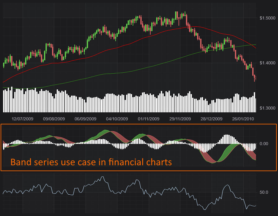
Above: a complex visualisation using Band Series. This image is taken from a SciChart WPF sample but all the features are available in SciChart.js as well.