Styling and Themes
Every colour SciTrader draws with comes from one theme: an ISciTraderTheme object. One theme styles the chart, its candles and indicators, the drawings, the market depth ladder, and every toolbar and control around them, so they always match.
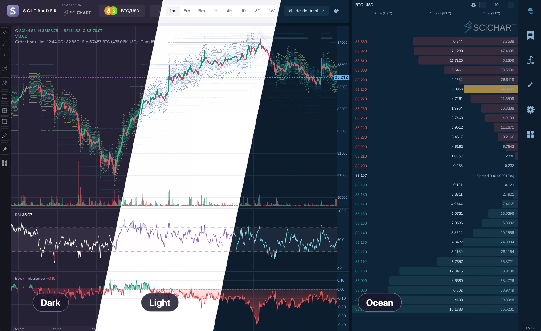
SciTrader's three built-in themes, Dark, Light and Ocean, on a candlestick chart with an order book heatmap, RSI and a market depth ladder
The Three Built-In Themes
| Theme | Constant | Key in SCITRADER_ | Look |
|---|---|---|---|
| Dark | SCITRADER_ | dark | SciTrader's dark purple-grey. Charts use it unless given another |
| Light | SCITRADER_ | light | A white chart, with darker, more saturated candles and indicators |
| Ocean | SCITRADER_ | ocean | Deep navy, with sky-blue accents and teal and coral candles |
SCITRADER_THEME_LIST lists all three, in that order, e.g. for a theme picker. To make your own, see Creating a Custom Theme.
TypeScript Example: Switching Between the Three Themes
BTC-USD from Coinbase with SMA, RSI and MACD. The buttons switch between the three built-in themes with setTheme, and write the theme’s CSS variables on the page, so the toolbar follows too.
The code for this example is found below.
- TS
import "scichart-scitrader/scitrader.css";
import {
    applyThemeCssVariables,
    CandleInterval,
    CoinbaseExchange,
    defaultExchangeProvider,
    idbPriceStore,
    ISciTraderTheme,
    MACDStudy,
    OHLCStudy,
    RSIStudy,
    SciFinanceChartPanel,
    SCITRADER_DARK_THEME,
    SCITRADER_THEME_LIST,
    SMAStudy,
    themeDisplayName,
    VolumeStudy,
} from "scichart-scitrader";

// This example expects this HTML:
// <div style="display: flex; flex-direction: column; height: 100%">
//     <div id="toolbar"></div>
//     <div id="chart" style="flex: 1; min-height: 0"></div>
// </div>

// Register a data source, once, at app startup
defaultExchangeProvider.registerExchange(CoinbaseExchange, idbPriceStore);

async function createChart() {
    // 1. Create the chart with a theme. Leave `theme` out for SCITRADER_DARK_THEME
    const financeChartPanel = await SciFinanceChartPanel.create(document.getElementById("chart"), {
        exchangeName: CoinbaseExchange.name, // name="Coinbase" matches the built-in CoinbaseExchange
        symbol: "BTC-USD",
        interval: CandleInterval.SIX_HOURS,
        period: "3M",
        theme: SCITRADER_DARK_THEME,
        studies: [new OHLCStudy(), new VolumeStudy(), new SMAStudy({ length: 20 }), new RSIStudy(), new MACDStudy()],
    });
    const chart = financeChartPanel.financeApi;

    // 2. Switch theme. setTheme restyles the live chart in place: backgrounds, axes, candles,
    // studies, legend, crosshair and the pane controls
    function applyTheme(theme: ISciTraderTheme) {
        chart.setTheme(theme);
        // HTML outside the chart, like this toolbar, reads the theme from CSS variables
        // (--st-ui-text, --st-ui-accent, …): write them on a parent of it
        applyThemeCssVariables(document.body, theme);
        renderToolbar(theme);
    }

    // The three built-in themes: Dark, Light and Ocean
    function renderToolbar(current: ISciTraderTheme) {
        const toolbar = document.getElementById("toolbar");
        Object.assign(toolbar.style, toolbarStyle);
        toolbar.replaceChildren(
            ...SCITRADER_THEME_LIST.map((theme) => {
                const button = document.createElement("button");
                button.textContent = themeDisplayName(theme); // the name without "SciTrader "
                Object.assign(button.style, buttonStyle(theme === current));
                button.onclick = () => applyTheme(theme);
                return button;
            })
        );
    }

    applyTheme(SCITRADER_DARK_THEME);

    // When the page goes away: financeChartPanel.cleanup();
    return financeChartPanel;
}

// The toolbar's colours are the theme's CSS variables, so it follows the theme too
const toolbarStyle: Partial<CSSStyleDeclaration> = {
    display: "flex",
    gap: "4px",
    padding: "8px 12px",
    background: "var(--st-ui-toolbar-background)",
    borderBottom: "1px solid var(--st-ui-divider)",
};

const buttonStyle = (selected: boolean): Partial<CSSStyleDeclaration> => ({
    padding: "4px 14px",
    border: "1px solid var(--st-ui-divider)",
    borderRadius: "4px",
    background: selected ? "var(--st-ui-accent)" : "var(--st-ui-button-background)",
    color: selected ? "#ffffff" : "var(--st-ui-toolbar-text)",
    font: "13px var(--st-font-family, sans-serif)",
    cursor: "pointer",
});

createChart();
React Example: Switching Between the Three Themes
The same in React. SciTraderThemeProvider holds the theme for the toolbar, and the picker uses useSciTraderThemeSwitch. The chart takes the theme through setTheme.
The code for this example is found below.
- React
import "scichart-scitrader/scitrader.css";
import * as React from "react";
import {
    CandleInterval,
    CoinbaseExchange,
    defaultExchangeProvider,
    idbPriceStore,
    ISciFinanceChartPanelApi,
    ISciFinanceChartPanelConfig,
    ISciTraderTheme,
    MACDStudy,
    OHLCStudy,
    RSIStudy,
    SCITRADER_DARK_THEME,
    SMAStudy,
    themeDisplayName,
    VolumeStudy,
} from "scichart-scitrader";
import {
    SciFinanceChartView,
    SciTraderThemeProvider,
    useSciTraderTheme,
    useSciTraderThemeSwitch,
} from "scichart-scitrader-react";

// Register a data source, once, at app startup
defaultExchangeProvider.registerExchange(CoinbaseExchange, idbPriceStore);

export function ThemedChart() {
    // 1. Your app holds the theme. SciTraderThemeProvider writes it as CSS variables for the HTML
    // components, and onThemeChange lets a theme picker inside it change it
    const [theme, setTheme] = React.useState<ISciTraderTheme>(SCITRADER_DARK_THEME);

    return (
        <SciTraderThemeProvider theme={theme} onThemeChange={setTheme}>
            <div style={{ display: "flex", flexDirection: "column", height: "100%" }}>
                <ThemePicker />
                <Chart />
            </div>
        </SciTraderThemeProvider>
    );
}

// 2. A theme picker: useSciTraderThemeSwitch gives the current theme, the themes on offer (the
// three built-in ones unless you pass `themes`) and setTheme
function ThemePicker() {
    const themeSwitch = useSciTraderThemeSwitch();
    if (!themeSwitch) return null; // no onThemeChange on the provider
    return (
        <div style={toolbarStyle}>
            {themeSwitch.themes.map((theme) => (
                <button
                    key={theme.name}
                    style={buttonStyle(theme === themeSwitch.theme)}
                    onClick={() => themeSwitch.setTheme(theme)}
                >
                    {themeDisplayName(theme)}
                </button>
            ))}
        </div>
    );
}

function Chart() {
    // 3. The chart is drawn by WebGL, which can't read CSS variables, so it takes the theme
    // itself: in `config` when it is created, then through setTheme
    const theme = useSciTraderTheme();
    const [api, setApi] = React.useState<ISciFinanceChartPanelApi>();
    React.useEffect(() => api?.financeApi.setTheme(theme), [api, theme]);

    // Create the config once per mounted chart: studies are live objects bound to one chart
    const config = React.useMemo<ISciFinanceChartPanelConfig>(
        () => ({
            exchangeName: CoinbaseExchange.name, // name="Coinbase" matches the built-in CoinbaseExchange
            symbol: "BTC-USD",
            interval: CandleInterval.SIX_HOURS,
            period: "3M",
            theme,
            studies: [new OHLCStudy(), new VolumeStudy(), new SMAStudy({ length: 20 }), new RSIStudy(), new MACDStudy()],
        }),
        // eslint-disable-next-line react-hooks/exhaustive-deps
        []
    );

    return (
        <div style={{ flex: 1, minHeight: 0 }}>
            <SciFinanceChartView config={config} onInit={setApi} />
        </div>
    );
}

// The toolbar's colours are the theme's CSS variables, so it follows the theme too
const toolbarStyle: React.CSSProperties = {
    display: "flex",
    gap: 4,
    padding: "8px 12px",
    background: "var(--st-ui-toolbar-background)",
    borderBottom: "1px solid var(--st-ui-divider)",
};

const buttonStyle = (selected: boolean): React.CSSProperties => ({
    padding: "4px 14px",
    border: "1px solid var(--st-ui-divider)",
    borderRadius: 4,
    background: selected ? "var(--st-ui-accent)" : "var(--st-ui-button-background)",
    color: selected ? "#ffffff" : "var(--st-ui-toolbar-text)",
    font: "13px var(--st-font-family, sans-serif)",
    cursor: "pointer",
});
Applying a Theme
Give the chart a theme when you create it:
import { SCITRADER_LIGHT_THEME, SciFinanceChartPanel } from "scichart-scitrader";

const financeChartPanel = await SciFinanceChartPanel.create(element, { /* … */ theme: SCITRADER_LIGHT_THEME });
Each part of the SDK takes the theme in the way it is drawn:
| Part | Drawn with | How it gets the theme |
|---|---|---|
| The chart: candles, indicators, axes, legend, crosshair | WebGL | config., then finance |
| The chart's own controls: pane control bars, dividers, loading states | HTML | From the chart, which writes the theme's CSS variables on its container |
| The market depth ladder | Canvas | Market's theme option, then set. Market follows the React provider |
| Toolbars and other controls outside the chart | HTML, styled by the stylesheet | The theme's CSS variables on an element above them: apply, or Sci in React |
So for one theme everywhere, give it to each: the example above does this for the chart and its toolbar.
Switching Theme
financeChartPanel.financeApi.setTheme(SCITRADER_OCEAN_THEME);
applyThemeCssVariables(document.body, SCITRADER_OCEAN_THEME); // toolbars outside the chart
setTheme restyles a live chart in place, with no reload: backgrounds, axes, candles, every study, the legend, the crosshair, the current-price line and the pane controls. themeChanged fires afterwards, and studies added later use the new theme.
What a theme switch leaves alone. A colour or style someone chose keeps its value:
- axis options passed in
axisDefaults, or toapplyAxisStyle; - a background set by
surfaceConfig; - colours passed to a study's constructor, such as
new SMAStudy({ renderOptions: { stroke: "#F59E0B" } }); - colours the user edited in a study's settings form.
It works by comparing values: a colour that still equals the old theme's value follows the theme, and any other colour stays. "Reset to defaults" in a study form resets to the current theme's colours.
Themes in React: SciTraderThemeProvider
Wrap the React components in SciTraderThemeProvider, and give the chart the same theme:
import { SciFinanceChartView, SciTraderThemeProvider } from "scichart-scitrader-react";

<SciTraderThemeProvider theme={theme}>
    <SciFinanceChartView config={{ /* … */ theme }} onInit={setApi} />
    <MarketDepthView source={source} symbol="BTC-USD" />
</SciTraderThemeProvider>

// The chart is drawn by WebGL, which can't read CSS, so it takes later changes through setTheme
React.useEffect(() => api?.financeApi.setTheme(theme), [api, theme]);
- The provider writes the theme as CSS variables on a wrapper element (
display: contents), and on:root, so menus and pickers attached to<body>follow it too. Setglobal={false}on a nested provider that should theme only its own part of the page. It is safe to render on the server. - Changing
themerestyles every component at once, without a remount. useSciTraderTheme()gives the theme to components that need a colour in code.- A theme picker: give the provider
onThemeChange(andthemes, which defaults to the three built-in ones). Inside it,useSciTraderThemeSwitch()returns the current theme, the themes on offer andsetTheme, as the example's picker uses.
With MUI. The SDK doesn't use MUI. If your app does, build its MUI theme from the same ISciTraderTheme, mapping the background, paper, text, accent and light or dark mode, so both match.
SciTraderThemeProvider, useSciTraderTheme and useSciTraderThemeSwitch, with their TSDoc
interface ISciTraderThemeProviderProps {
    theme?: ISciTraderTheme;
    /** Extra styles for the wrapper element. It uses `display: contents` by default, so it takes no space in the layout. */
    style?: React.CSSProperties;
    className?: string;
    /**
     * Also publish the theme's variables on `:root`. Default `true`. Needed by anything rendered
     * outside this element in the DOM: menus, pickers and dialogs attached to `<body>`, such as
     * the SDK's candle-type menu and colour picker, or an app's MUI dialogs.
     * Set `false` on a nested provider that should theme only its own subtree.
     */
    global?: boolean;
    /**
     * Makes the theme switchable from inside: a theme picker built with `useSciTraderThemeSwitch`
     * calls this with the theme picked. The host owns the state: store the new theme and pass it
     * back as `theme`. Without it, `useSciTraderThemeSwitch` returns `undefined`.
     */
    onThemeChange?: (theme: ISciTraderTheme) => void;
    /** The themes a theme control offers, when {@link onThemeChange} is set. Default: the built-in themes. */
    themes?: readonly ISciTraderTheme[];
    children?: React.ReactNode;
}

interface ISciTraderThemeSwitch {
    theme: ISciTraderTheme;
    themes: readonly ISciTraderTheme[];
    setTheme: (theme: ISciTraderTheme) => void;
}

/** Makes a SciTrader theme available to the React components inside it. */
function SciTraderThemeProvider(props: ISciTraderThemeProviderProps): JSX.Element;
/** The theme from the nearest provider, or the dark theme outside one. */
function useSciTraderTheme(): ISciTraderTheme;
/** The current theme, the themes on offer and setTheme; `undefined` under a provider without onThemeChange. */
function useSciTraderThemeSwitch(): ISciTraderThemeSwitch | undefined;
Remembering the User's Theme
Store a theme's id, not the object, and look it up when the page loads:
import { builtInThemeId, SCITRADER_DARK_THEME, SCITRADER_THEMES } from "scichart-scitrader";

localStorage.setItem("theme", builtInThemeId(theme)); // "dark", "light" or "ocean"

const saved = SCITRADER_THEMES[localStorage.getItem("theme") as keyof typeof SCITRADER_THEMES];
const theme = saved ?? SCITRADER_DARK_THEME;
No flash of the wrong theme. With server rendering, keep the choice in a cookie instead, so the server renders the chosen theme on the first paint. The SciTrader app does this.
What a Theme Contains
| Group | What it colours |
|---|---|
chart | Background, axis strip, gridlines, axis labels and their size, crosshair and its labels, legend text and its size, current-price line, forming-candle wash, zoom rectangle, loading tint, indicator reference lines and bands |
candles | The line and mountain candle types, and point & figure X and O |
studies | Each study's default colours, by study type, then by the name of the colour in its settings form: studies., studies.. studies. holds the candles' colours |
market | The market depth ladder: bid, ask, depth bars, the flash for pulled liquidity, text |
ui | Toolbars, menus, pane controls, buttons, dividers, icons, backgrounds, text, accent, scrollbars, and the gradient of selected icons and primary buttons |
drawing | The default colours of drawings. Worked out from ui and chart unless you set them |
is, font | Whether the theme is dark, for colours that differ on dark and light backgrounds; the font of the HTML controls |
The ISciTraderTheme interface reference on Creating a Custom Theme has every member, with its TSDoc.
Pages in This Section
| Page | What it covers |
|---|---|
| The CSS Stylesheet | Importing it, its CSS variables, overriding its rules, and every class |
| Creating a Custom Theme | Your own theme, in code or from your CSS |
| Styling the Chart | Candles, indicators, axes, fonts, legend, crosshair, background, drawings |
| Styling the UI Components | Toolbars, the market depth ladder, forms and icons |
| Mobile and Responsive Styling | Touch-sized controls, larger text, and following the device's light or dark setting |