I’m seeing a delay the first time I add a chart to scichart:SciChartSurface. Subsequent loads are much faster. It looks like the initial initialization is taking time—what can I do to reduce or eliminate this first-load delay?
where ChartDocumentControl
- Karthikeyan Rajendran asked 3 days ago
- last active 21 hours ago
I’m trying to find a way to apply a colour gradient to an existing FastLineRenderableSeries in the app. We want the colours in the gradient to align to specific y-axis values (see attached image)
- Marcela Guerra asked 1 week ago
- last active 2 days ago
3D Surface charts accept a MeshColorPalette provided by a GradientColorPalette or SolidColorPalette but both of these seem to be driven by the Y values of the chart itself.
Is there a way to configure a palette based on another series / set of data points? If no such palette exists can an example be provided of how to implement one?
- Mark Barlow asked 2 weeks ago
- last active 4 days ago
Why is there such a huge difference between the 3D charts available in Javascript versus WPF?
If the charts are meant to use the same engines behind the scenes, why are the available charts not equivalent?
- Mark Barlow asked 2 weeks ago
- last active 3 days ago
How to change background and text color of the boxes with the values appearing when presenting tooltip?
Currently the box is green and text color is white as shown in the picture.
- Paweł Gleń asked 2 weeks ago
- last active 3 days ago
Hi scichart team,
is there any way i can render an overview chart with Stacked column chart ?
im getting the following error
Error: dataSeries property is not supported for BaseStackedCollection
at StackedColumnCollection2.get
i tried rendering some other type of series in overview but does not seem to work with stacked columns
- Rahul Kathayat asked 3 weeks ago
- last active 2 weeks ago
Hello!
SciChart JS v3.
> sciChartSurface.renderableSeries.get(1).stroke = scoreColor;
where series is FastLineRenderableSeries.
Legend color box has still initial color.
Should we fire color sync manually somehow?
Legend placed in external container.
Many thanks
- Manfred Wieser asked 1 month ago
- last active 4 weeks ago
Hello SciChart Team,
I’m experiencing an unexpected behavior when using a BoxAnnotation with a LogarithmicAxis on the Y axis.
When I drag the annotation by its body, it does move across the chart as expected. However, at the same time, the annotation also changes its size (it increases or decreases while being dragged).
This behavior does not occur when using a NumericAxis. With NumericAxis, dragging the body moves the annotation without altering its dimensions.
I Use the official BoxAnnotation example as reference:
https://www.scichart.com/documentation/js/v5/2d-charts/annotations-api/box-annotation/
Change only the Y axis from NumericAxis to LogarithmicAxis.
Drag the annotation by its body.
Observe that while the annotation moves, its height changes simultaneously.
Here is a minimal CodePen demonstrating the issue:
https://codepen.io/gaulions/pen/jErgZmL
The only changes from the official example are:
Switching the Y axis to LogarithmicAxis
Adding isEditable: true
Could you please confirm whether this is the expected behavior when using a LogarithmicAxis, or if this might be a bug?
Thank you.
- Julio Soares asked 1 month ago
- last active 3 weeks ago
Hello SciCharts team,
I would like to request a feature,
currently paletteProvider is not supported by FastBoxPlotRenderableSeries, which is useful for our case for visual feedback on selected box plots.
Kindly requesting you to add this feature,
Thanks, Regards
- Rahul Kathayat asked 1 month ago
- last active 4 weeks ago
I have noticed in official demos as well that when using DataPointSelectionModifier with drag select the last index point wont get selected. This is really annoying as the click functionality works but only drag for last index does not
- Rahul Kathayat asked 1 month ago
- last active 1 month ago
Hello SciChart Team,
I would like to report an issue regarding WebGL1 support in SciChart v5+.
I am aware that WebGL1 support was removed starting from v5, and that the engine now requires WebGL2.
However, in my environment this is a hard limitation, and WebGL1 is still required due to legacy hardware and GPU constraints.
I performed multiple tests and can confirm the following:
SciChart v3 works correctly using WebGL1
SciChart v5+ does not render or fails to initialize on the same machine
The browser reports that WebGL2 is not available, only WebGL1
The same chart logic and dataset work perfectly in v3, but fail in v5+
This confirms that the issue is not related to the chart configuration, data, or memory usage — the only difference is the WebGL backend requirement.
Unfortunately, in my case, upgrading the hardware or enabling WebGL2 is not possible at the moment, so WebGL1 compatibility is still necessary.
I would like to ask:
Is there any official or experimental fallback to WebGL1 in v5+?
Is there any internal flag, build option, or legacy bundle that still supports WebGL1?
If not, is there any recommended migration path for environments that do not support WebGL2?
Thank you very much for your attention and support.
Best regards,
Júlio Soares
- Julio Soares asked 2 months ago
- last active 2 months ago
Hello,
I have a wpf application that has several SciChartSurface, each of which has a DateTime axis for the x-axis.
I am currently using MVVM to bind data to the axes.
I want to display a custom band on the x-axis but am having difficulty. depending on the data there could be one or more bands to display.
For example if the date range is from 2/3/2026-2/4/2026, there may be a band that needs to be shown from 2/3 10:00-11:00 and one from 2/3 14:00-14:25.
Can you point me to any examples that may show how to accomplish this?
Regards.
- Aaron Douglas asked 2 months ago
- last active 4 weeks ago
Many years ago, SciChart tech support provided me with code for a RollerMarkerHelper class. I implemented this in VB.net, but I’ve attached a C# version which I just created using an automated translator. This code takes as arguments a RenderableSeries and a style template. I used this, along with a very simple style template such as the one shown below, so that I could display a gray circle over whatever point the cursor was over. (This is useful in my particular application.)
But I’m implementing a new application in C# using the MVVM approach (e.g., LineRenderableSeriesViewModel). How can I modify the RollerMarkerHelper class to handle this, or is there another approach I should use?
    <ControlTemplate x:Key="SpectrumRolloverMarkerTemplate">
        <Ellipse Width="7" Height="7" Fill="SlateGray" Stroke="SlateGray" StrokeThickness="1" />
    </ControlTemplate>
- yefchak asked 2 months ago
- last active 2 months ago
Hi,
In XAML for axes bind I need to write into s:SciChartSurface just
XAxes="{s:AxesBinding FrcLayerChartXAxes}"
If I write in C# code as I see I need to make in cycle like this (but is doesn’t worked)
FrcLayerChart.XAxes.Add(FrcLayerChartXAxes[i]);
here FrcLayerChartXAxes is ObservableCollection
Can I add all axes by 1 step?
- Fedor Iudin asked 2 months ago
- last active 2 months ago
Hi,
I’m working on a feature for wpf application where there will be multiple tab controls and each tab control can be able to plot the graphs . So I have a usercontrol with scichartsurface which is bound to dataseries of type LineRenderableSeriesViewModel. User should be able to close all the tabs one by one. But when we are closing the last tab the application is getting crashed with no logs being caught at wpf level unhandled exception. But getting the below message while debugging, for –
Exception {“Attempted to read or write protected memory. This is often an indication that other memory is corrupt.”} System.AccessViolationException
The usage of the scichart is as follows:
this scichartsurface is being placed inside an usercontrol and the user control is used as template to document page for docking manager control
Package used for scichart:
SciChart3D-8.5.0.28148
SciChart.DirectX-8.5.0.28148
Any guidance on the correct disposal/teardown pattern for SciChart in a multi-tab scenario, or known workarounds for last-surface shutdown, would be greatly appreciated.
- Jitendra Dash asked 2 months ago
- last active 2 months ago
Hi folks,
I’m using MVVM and need to implement hit tests. I found this post from nine years ago, saying it’s not yet implemented:
https://www.scichart.com/questions/wpf/hit-testing-a-renderableseriesviewmodel
Surely you have a solution by now? What is it?
Thanks,
–George
- yefchak asked 3 months ago
- last active 2 months ago
Hey,
I’m working on a feature where users can edit DataPoint position directly on a chart by dragging them with the mouse, and I would like to ask for guidance, best practices, or existing examples. I see one example for SciChart WPF but couldn’t apply that to JS because many things differ between WPF and JS.
Goal
Allow users to change the point positions of a LineSeries by dragging individual points on the chart.
Given
An FastLineRenderableSeries (XyDataSeries) with EllipsePointMarker.
When
The user clicks and holds the left mouse button on a point (EllipsePointMarker)
Then
The selected point changes its appearance (e.g., bordered or highlighted) and it is possible to move the point to change the position of it.
On Mouse Release
The point position is updated
Line and point styling return to their default state
- Marvin Jaworski asked 3 months ago
- last active 3 months ago
Hi,
I’m experiencing an issue after upgrading to SciChart v4.0.923.
It seems that the font registration for NativeTextAnnotation is not rendering correctly, especially regarding numeric characters. The rendered text appears distorted or improperly shaped.
This behavior did not occur in SciChart v3, where the same annotations and fonts rendered correctly.
I’ve attached screenshots comparing the output in version 4 vs version 3 to illustrate the difference.
Could you please check whether this is a known issue in the new rendering pipeline, or if any additional configuration is required for custom font registration in SciChart 4?
Thank you!
If you need any additional information or a reproduction snippet, I can provide it.
- rocket trade asked 4 months ago
- last active 2 months ago
Hi,
I’m building a chart with Candlestick data and I’d like to show a heatmap background under the candles (orderflow / volume-by-price style visualization).
Right now I have a working but ugly workaround:
I take my candlestick series (which has timestamps on the X axis)
I convert all timestamps to a simple numeric index (0, 1, 2, …)
I use those numeric indexes both for the candlestick series and for the heatmap, so that they line up
This works, but it’s not great for several reasons:
Candlestick data is naturally time-based (UNIX timestamp / Date) and I’d like to keep using a CategoryDateAxis / DateTimeAxis instead of an artificial numeric axis.
I’m worried about performance and maintainability: converting back and forth between timestamps and indexes adds an extra mapping layer and makes the code more complex.
With indexes, handling gaps in time (weekends, missing candles, etc.) becomes less intuitive than using the real timestamps.
- geppetto cruciani asked 4 months ago
- last active 4 months ago
Hi,
I upgraded scichart.js from 3.5.774 to 4.0.918, my chart now has a padding on the right side even though it was not there before.
I only added yAxis to the left side of the chart and not the right (please see attached image).
I’ve already set padding to 0:
sciChartSurface.padding = Thickness.fromString(‘0 0 0 0’)
If I want to get rid of the padding, I now have to change it to:
sciChartSurface.padding = Thickness.fromString(‘0 -11 0 0’)
The breaking changes page only mention padding change to the SciChartSubSurface, but I am not using that. https://www.scichart.com/documentation/js/v4/whats-new/breaking-changes-v3-v4/
I only have one sciChartSurface.
const { sciChartSurface, wasmContext } = await SciChartSurface.create(divElementId)
Please let me know what might be causing this, thanks.
- Edwin Liu asked 4 months ago
- last active 4 months ago
I’m attempting to create a custom CursorModifier to display series information aggregated across multiple SciChart surfaces into a single tooltip. These surfaces are synced via the VerticalChartGroupId with the charts displayed as part of an ItemsControl using MVVM. The default behavior only shows information for the series in the subpane where the mouse is. This makes sense given the CursorModifier is local to the subpane and set via a DataTemplate assigned to the ItemsControl.ItemTemplate.
To create a “global” CursorModifier, I’m guessing I need to override the GetSeriesInfoAt method of CursorModifier. I have access to all the IRenderableSeriesViewModels across all the subpanes via the parent view model. My question is how can I access the appropriate SeriesInfo object for each of these renderable series in order to return an enumerable of SeriesInfo objects? These should be the appropriate derived type (e.g. OhlcSeriesInfo, BandSeriesInfo, etc.) so that my template selector can do its thing. Thank you!
Lawson
- Lawson McWhorter asked 4 months ago
- last active 2 months ago
Hello,
I am new to SciChart and wanted to try to implement one in a new test project for later projects.
I want to add a new chart to the normal blazor homepage.
I almost got it done and it currently looks like in the attached picture.
But I still get this error message: Unhandled exception rendering component: Cannot read properties of undefined (reading ‘SCRTDoubleVector’)
TypeError: Cannot read properties of undefined (reading ‘SCRTDoubleVector’).
I want the SciChart to initialize in my Home.razor file.
This is the code in my .js:
window.initializeSciChartWithSettings = async function () {
const {
SciChartSurface,
NumericAxis,
FastLineRenderableSeries,
XyDataSeries,
NumberRange
} = SciChart;

const { sciChartSurface, wasmContext } = await SciChartSurface.create("sciChartSurface");

sciChartSurface.xAxes.add(new NumericAxis(wasmContext));
sciChartSurface.yAxes.add(new NumericAxis(wasmContext));

const dataSeries = new XyDataSeries(sciChartSurface.engine, {
xValues: [1, 2, 3, 4, 5],
yValues: [1, 2, 3, 4, 5]
});

const lineSeries = new FastLineRenderableSeries(sciChartSurface.engine, {
dataSeries: dataSeries,
strokeThickness: 2,
stroke: "#2596BE"
});
sciChartSurface.renderableSeries.add(lineSeries);

window.sciChartSurface = sciChartSurface;
window.sciChartDataSeries = dataSeries;

return { sciChartSurface };
};
I really don´t know what to do and would be thankful for every awnser!
- Fabian Mutschler asked 4 months ago
- last active 4 weeks ago
Hi folks,
In the old days, text annotations were implemented using a CustomAnnotationsChartModifier which would bind to a collection of TextAnnotationViewModels. The TextAnnotationViewModel included tool tip text in addition to the main text and the coordinates.
In the current SciChart, eventualy we now bind a collection of IAnnotationViewModels to the SciChartSurface’s built-in Annotations property. But these viewmodels do not implement a member for tool tip text.
How can I replicate my old code, which dynamically created and displayed text annotations which implement a ToolTip as well?
- yefchak asked 5 months ago
- last active 2 months ago
Hi folks,
I have this code in an old app:
                            <s:CursorModifier x:Name="MainCursor" ShowAxisLabels="True" ShowTooltip="False"
                                            ReceiveHandledEvents="True" LineOverlayStyle="{x:Null}">
                            <s:CursorModifier.AxisLabelTemplate>
                                <!-- This empty template hides Themes cursor labels -->
                                <ControlTemplate TargetType="s:TemplatableControl" />
                            </s:CursorModifier.AxisLabelTemplate>
                        </s:CursorModifier>
This used to work. But unfortunately, this produces the following error after upgrading (I’m not on WPF v8):
Property ‘AxisLabelTemplate’ does not support values of type ‘ControlTemplate’.
I need this feature because I want to display data from the CursorModifier in a corner of my plot, but not in the built-in axis labels. Setting ShowAxisLabels to False evidently prevents the data from being generated, so I need ShowAxisLabels to be True. The empty AxisLabelTemplate above worked to hide the axis labels, but not this code produces the error above. What can I do?
- yefchak asked 5 months ago
- last active 4 months ago
Hi,
When I create an ImpulseRenderableSeriesViewModel and set its PointMarker to null, the PointMarker still appears. I can hide markers by setting the PointMarker Width and Height to 0. But this seems like the wrong approach.
What am I missing?
Thanks,
–George
- yefchak asked 5 months ago
- last active 4 months ago
I’m implementing a SciChart WPF (v8.6.30610) control that displays a single column within a SciChartSurface, which correctly stretches to fill the available width (≈800px). The chart is bound via MVVM using a ColumnRenderableSeriesViewModel and a UniformXyDataSeries(0, 1d) containing one data point. However, the column remains narrow (~50px) regardless of the chart’s actual width.
To investigate further, I modified the VisibleRange to (-1 ,1) and changed the data setup to UniformXyDataSeries(0, 20d). With this configuration, the column width increased slightly (to around 100px), but it still doesn’t scale proportionally to the SciChartSurface width. Adjusting properties like DataPointWidth or AutoRange has no effect on the column’s width.
My goal is for the single column to span the entire available chart width, effectively filling the space similar to a full-width bar.
Is DataPointWidth the correct property to control column width in this scenario?
Does the UniformXyDataSeries spacing or X-axis VisibleRange inherently restrict the rendered column size?
What is the recommended approach to achieve a full-width single column in SciChart?
Any guidance or clarification on the expected behavior would be greatly appreciated.
Attached is the working project (zip file) and also the image attached gives a clarity on the above ask.
- abilash katkuri asked 5 months ago
- last active 5 months ago
Hi,
I’m trying to implement a selected BoxPlotDataPointmarker. What would be the best solution to do so?
Basically I have one series with multiple boxplot data points, which are colored by a custom pallete provider. Now I want to highlight selected data points. The idea was to change StrokeThickness. But I dont know how to do so for one specific data point of the series.
- Robert Martin asked 5 months ago
- last active 4 months ago
Hello Team,
I am using Sci 2D chart(version 8.9.0.28766) in c# .net WPF MVVM. I have 3 Fastline series with more than 16400 points changing every 2 sec with fixed x and y axis. I am following the SciChart_PointMarkersSelection example to use point markers.
Issue I am facing,
- the point disappears as the data changes. I want the points to be persistent and moving with the new y values.
- I want to add the fixed x values and changing y values of the selected points in a data grid
- The user should be able to change the x values in the data grid and the point should move accordingly.
- I want to get the data back to the observable collection in the View model.
The example is does not have realtime data changing every 2 min and the point marker x and y values are displayed on the UI as List.
Is this the right option to use PointMarkersSelection modifier? If not please suggest any alternative method to achieve the above goals.
I was thinking of putting the selected points in to a scatter chart and add it to the same IRenderableSeriesViewModel and update the corresponding y values as the new data comes in.
But my problem is, how should i get the nearest actual point in the data set and send it from UI to the view model to populated the scatter chat?
- Priyanka Asawa asked 5 months ago
- last active 2 months ago
Hello,
Gaps can be displayed using XyDataSeries<DateTime, double>() and double.NaN.
But how to do display gaps with XyDataSeries<DateTime, int>() ?
Cheers,
François
- François Tanguy asked 6 months ago
- last active 5 months ago
I have a quite extensive code where I am able to draw a SVG annotation on top of heatmap. (please see video).
I am noticing strange behavior when I load the saved annotation and draw them on the screen. All of the them render out of place and remain there till one hovers with the mouse. as seen in video.
https://youtu.be/RiinjbGc6K8?si=u0BTL_B1Qz92ZiXt
strange behavior
my draw annotation code is below,
const drawAnnotation = (annotationList) => {
sciChartSurfaceRef?.current.suspendUpdates()
try {
annotationList.map(annotation => {
if (!sciChartSurfaceRef.current?.annotations?.getById(annotation.Id)) {
//console.log(annotation.Id, annotation.SVG)
annotation.createSVG(zoomdiff.current)
sciChartSurfaceRef.current?.annotations.add(
new ScalableAnnotation({
id: ${annotation.Id},
x1: annotation.DataBounds.shortestXinData,
x2: annotation.DataBounds.longestXinData,
y1: annotation.DataBounds.shortestYinData,
y2: annotation.DataBounds.longestYinData,
isEditable: ((annotation.UserId ? (annotation.UserId === userIdRef.current || annotationAuditor.current) : true) && annotation.Type === regionTypeRef.current),
isSelected: annotation.Selected,
yCoordinateMode: ECoordinateMode.DataValue,
xCoordinateMode: ECoordinateMode.DataValue,
verticalAnchorPoint: EVerticalAnchorPoint.Top,
horizontalAnchorPoint: EHorizontalAnchorPoint.Left,
svgString: annotation.SVG ? new XMLSerializer().serializeToString(annotation.SVG.node()) : undefined,
isHidden: false,
selectionBoxStroke: “#FFFF00FF”,
selectionBoxThickness: 1,
metaData: [heatmapSeriesRef.current.dataSeriesProperty.arrayWidth, heatmapSeriesRef.current.dataSeriesProperty.arrayHeight]
})
)
} else {
sciChartSurfaceRef.current.annotations.getById(annotation.Id).svgString = new XMLSerializer().serializeToString(annotation.createSVG().node())
}
})
} finally {
sciChartSurfaceRef.current.resumeUpdates({ invalidateOnResume: true })
//sciChartSurfaceRef.current.invalidateElement({ force: true });
}
- pramod butte asked 6 months ago
- last active 5 months ago
Hello
I am trying to introduce 3D chart to my application and render SurfaceMeshRenderableSeries3D.
The thing is that my dataset can get quite big, for UniformGridDataSeries3D yValues it can be dimension of
65 536 x 100. Because of WebGL size limitation I use data tilling and render multiple series that connect to each other. Similar how it is done in docs example for heat maps https://www.scichart.com/documentation/js/current/webframe.html#The-Uniform-Heatmap-Chart-Type.html
The chart renders, but when zooming/moving the performance is pretty poor. FPS drops down to 8-10 making it hard to work with.
This is my current series params:
      const surfaceMeshSeries = new SurfaceMeshRenderableSeries3D(wasmContext!, {
        dataSeries: heatMapDataSeries,
        meshColorPalette: colorMap,
        minimum: min,
        maximum: max,
        cellHardnessFactor: 0,
        shininess: 0,
        lightingFactor: 0,
        highlight: 0,
        strokeThickness: 2.0,
        contourInterval: 2,
        contourOffset: 0,
        contourStrokeThickness: 2,
        drawSkirt: false,
        drawMeshAs: EDrawMeshAs.SOLID_MESH,
      });
Is there any option that might help my achieve better performance? It would be fine to disable as much as needed just to make it more optimized for large dataset.
I would really appreciate any help with that
- Cezary Szymanski asked 6 months ago
- last active 6 months ago
Hi Team,
We’re exploring the use of SciChart for data visualization in our Angular application, primarily because of its superior performance.
We have a specific business requirement to create a stacked line chart. The design requires each stack to have its own Y-axis, while all stacks share a common X-axis. We’ve attached a design mockup of the chart we want to achieve.
Our main questions are:
Is this type of stacked chart with independent Y-axes feasible using the SciChart library?
If so, what’s the best approach to implement it?
We’re looking forward to your guidance on how to make this happen.
Thanks,
Viswanath.
- Viswanath Alikapalli asked 6 months ago
- last active 6 months ago
Hi,
We have some small images (typically 7×7 pixels) we’d like to use with SpritePointMarkers, but when rendered on a series they appear blurred. The same images rendered to the HTMLImageElements above the chart in the sample image look sharp. Is there a way of switching off the anti-aliasing used to render point markers in the chart?
Many thanks!
- Graham Stoneman asked 6 months ago
- last active 6 months ago
I’m working on a charting program for financial markets, and trying to develop a drawing system that uses SciChartJS annotations.
The initial implementation allowed annotations to be “naturally” selected, but leaving them editable to be selected resulted in users accidentally ‘snagging’ one annotation while trying to draw another, or while trying to pan the chart. To get around this, we implemented a “right-click -> edit” function to activate an annotation for editing, that programmatically sets isEditable and isSelected to true. I understand that this is not advised, but I’m not familiar with another way to exert the necessary control/restraint over annotations. (we DO let them de-select “naturally” and that seems to work)
This has worked with LineAnnotation and HorizontalLineAnnotation with no issues. But when implementing BoxAnnotations, we found that, while the annotation looks to be in “selected” state, the adorners don’t “fully open”. I can click them inside the box and drag to re-size, but if I click them on the box border or outside the box, they don’t respond and the box de-selects.
The adorners DO fully open if I click the annotation anywhere, or if I drag it or drag an adorner from the inside. After that, I can click anywhere on the adorner circle and drag properly.
Based on other posts in this forum, I’m assuming that this has to do with the AdornerLayer selection information not being set by a programmatic “isSelected = true”. Can you provide sample code for how to set an annotation as selected at the AdornerLayer?
(I asked an LLM to try to interpret this prior post https://www.scichart.com/questions/js/programmatically-select-customannotation and generate code, but I’m not sure it’s implementing the AdornerLayer change properly)
Thank you!
-Mark
- Mark Wieczorkowski asked 6 months ago
- last active 6 months ago
Scichart use SelectedPointMarker to change the selected data point style in xaml. Now I need change the selected point in back-end codes. I wish to create a method like void HighlightSelectDataPoint(int index) to do this. The index is the point’s index on the series. I don’t know how to implement this method. I’m not sure if scichart provides this feature.
- ling yang asked 7 months ago
- last active 7 months ago
I am working with the OilAndGasExample solution from the customer examples. I want to take all the charts in the vertical chart section and display them horizontally. I am having a problem with the legends, which must be displayed on their side. As an example, I have added a RenderTransform to the resistivity legend, which provides the proper orientation. My problem is that the width and height no longer match the space allotted next to the chart. I assume I have to reverse how the width and height are bound. How do I do that?
<Grid x:Key="ResistivityChartAxisLegend" Style="{StaticResource AxisLegendGridStyle}" RenderTransformOrigin="0.5,0.5">
    <Grid.RenderTransform>
        <RotateTransform Angle="-90"/>
    </Grid.RenderTransform>
    <Grid.RowDefinitions>
        <RowDefinition Height="*"/>
        <RowDefinition Height="Auto"/>
        <RowDefinition Height="20"/>
        <RowDefinition Height="Auto"/>
        <RowDefinition Height="20"/>
    </Grid.RowDefinitions>
    <Grid.ColumnDefinitions>
        <ColumnDefinition Width="*"/>
        <ColumnDefinition Width="*"/>
    </Grid.ColumnDefinitions>

    <Line Grid.Row="1" Grid.ColumnSpan="2" Stroke="OrangeRed" X1="0" X2="1" Stretch="Fill" StrokeThickness="1" StrokeDashArray="5,5"/>

    <TextBlock Grid.Row="2" Grid.Column="0" Text="0" HorizontalAlignment="Left" Style="{StaticResource AxisLegendTextBlockStyle}"/>
    <TextBlock Grid.Row="2" Grid.ColumnSpan="2" Text="AVRG 40" HorizontalAlignment="Center" Style="{StaticResource AxisLegendTextBlockStyle}"/>
    <TextBlock Grid.Row="2" Grid.Column="1" Text="1" HorizontalAlignment="Right" Style="{StaticResource AxisLegendTextBlockStyle}"/>

    <Line Grid.Row="3" Grid.ColumnSpan="2" Stroke="DeepSkyBlue" X1="0" X2="1" Stretch="Fill" StrokeThickness="2"/>

    <TextBlock Grid.Row="4" Grid.Column="0" Text="0" HorizontalAlignment="Left" Style="{StaticResource AxisLegendTextBlockStyle}"/>
    <TextBlock Grid.Row="4" Grid.ColumnSpan="2" Text="RESISTIVITY" HorizontalAlignment="Center" Style="{StaticResource AxisLegendTextBlockStyle}"/>
    <TextBlock Grid.Row="4" Grid.Column="1" Text="1" HorizontalAlignment="Right" Style="{StaticResource AxisLegendTextBlockStyle}"/>
</Grid>
- Stephen Painchaud asked 7 months ago
- last active 6 months ago
Hello!
When I use renderContext.fillRects(with: brush, points: rectsBuffer.itemsArray) rectangles draws correctly
If I use renderContext.drawRoundedRects(with: pen, brush: brush, topRadius: 0, bottomRadius: 0, points: rectsBuffer.itemsArray), rectangle is drawing, but with a strange border
If I use renderContext.drawRoundedRects(with: pen, brush: brush, topRadius: 2, bottomRadius: 2, points: rectsBuffer.itemsArray) with any non zero radius, rectangle is not drawing at all
Is it bug or I use function in wrong way?
- Georgiy Georgiy asked 7 months ago
- last active 6 months ago
Hello, I’m facing an issue with the new version of SciChart (4.0.833), specifically with the LegendModifier. In previous versions, even if a renderableSeries had isVisible: false, it would still appear in the chart legend. However, in the new version, if isVisible is set to false, it is no longer shown.
I looked into the code and noticed there’s now a validation that only includes series where isVisible === true. Is there a new property or some different way to achieve the previous behavior?
As you can see in the attached screenshots, the behavior is different in version 3 compared to version 4.
- rocket trade asked 7 months ago
- last active 7 months ago
Good day,
I could use some assistance in properly handling legend selections between chart updates. What I want is to maintain user legend selection through DataSeries changes. See images.
You can see originally we have a StackedColumnRenderableSeries chart with component-based breakdowns on the x-axis. In the “WaterFiltered” image, we see that the bars containing water are hidden; however, when I update the underlying dataseries, the legend is reset and water bars are seen again. I do not desire this behavior. The water should remain unchecked. If the legend changes it is fine to allow the whole thing reset, but in this case I am only changing the underlying data series. Could you suggest some techniques to achieve my desired idea?
Here is some additional xaml resources in order to help:
Item Template:
Control Template:
In SciChartSurface’s ChartModifier Group:
Thank You,
Nicholas Louks
- Nicholas Louks asked 7 months ago
- last active 7 months ago
Hello,
I am running the same application on my MAC device as my windows device and I am receiving an error on the MAC but not the windows. The error looks like it is related to the UpdateSuspend class but I cannot figure out why it works on windows but not on MAC.
Attached is the screen shot of the console error I receive in my MAC device. We recently switched to v4 and that is when the issue arose. Are any MAC users experiencing this issue and have found a work around?
- preston truong asked 7 months ago
- last active 7 months ago
Hello,
Using SciChart WPF 2D at runtime the following binding error appears:
System.Windows.Data Warning: 40 : BindingExpression path error: 'MajorGridLinesBrush' property not found on 'object' ''CustomSeriesMvvmViewModel' (HashCode=66572856)'. BindingExpression:Path=MajorGridLinesBrush; DataItem='CustomSeriesMvvmViewModel' (HashCode=66572856); target element is 'Line' (Name=''); target property is 'Stroke' (type 'Brush')
Easy reproducible with SciChart.Wpf.Examples\Sandbox\CustomerExamples\CustomSeriesMvvm
How to fix this problem ?
Thank you :)
- Mike Wonder asked 7 months ago
- last active 6 months ago
To whom this may concern:
Attached is an issue I am having with the styling of the RolloverModifiers. As you can see, it’s pretty difficult to read the modifier tooltip text. There is no documentation on how to use the Builder API to change the font or background color, using either the IRolloverModifierOptions or the BaseRenderableSeriesOptions documentation.
Can you please advise on how to address this using the Builder API?
Thank you, kindly!
— Ari
- Ari Sagiv asked 7 months ago
- last active 7 months ago
如何在unity里面·使用scichart,导入进去老是报错,一会什么事件注册不了,一会同名,unity版本2022,scichart版本最新
- 君松 刘 asked 8 months ago
- last active 7 months ago
Hello,
I am currently attempting to use the newly released version (4.0.828). However, I have encountered an issue where both the axisLabelFill and axisLabelStroke properties in the CursorModifier are not functioning as expected. The colors are not being applied.
In version 3, according to the documentation, these properties work correctly, but in version 4 they do not. Please find the attached screenshots for reference.
- rocket trade asked 8 months ago
- last active 8 months ago
Hi all
Has there been any consideration for supporting Flutter? Currently, the popularity of Flutter applications is quite high, and at the same time, the Flutter ecosystem lacks excellent graphics library support. This might become a growth point for the company.
- chen weihan asked 8 months ago
- last active 8 months ago
I would like to filter time series data based on specific date and time ranges, rather than skipping entire days or just specific times within a day.
Currently, the base calendar implementation seems to only support skipping entire days, but it doesn’t allow for partial days to be excluded.
It would be helpful to have a SkipDateRanges property, where we could define a list of start and end DateTime pairs. For example, this would allow specifying date ranges like:
From 2025-08-01 06:00 to 2025-08-05 11:00
From 2025-08-08 08:30 to 2025-08-09 01:00
This would give us the flexibility to skip specific date and time ranges rather than just entire days.
- Nathan Landrum asked 8 months ago
- last active 8 months ago
We need to make heatmaps of our data and don’t know the type of data variables until runtime. Because of this I am switching the axes like so in XAML:
…
The key is that I’m a custom LabelProvider class to convert any categorical values into the appropriate label for the axes. I would have liked to use a CategoryNumericAxis for both axes, but for some reason it seems you can’t so I’m using a NumericAxis.
All data values are coming in as 0, 1, 2,… for the categorical variables.
I am running into two issues with the axes. First is that the last category is cutoff prematurely and I’d like to align the labels with the center of the category not the left edge. These issues appear with the CategoryNumericAxis.
The second issue is that I’m having issues aligning both the values and controlling the number of what I guess are the tickmarks for the Y axis since it doesn’t know it is categorical data. Is there any (easy) way to handle the Y axis for categorical data?
Attached is an image of what the plots are looking like:
- Robert Rommel asked 8 months ago
- last active 3 months ago
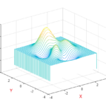
How do I draw a waterfall 3D chart with the Z-axis as the height instead of the Y-axis, similar to the waterfall chart in MATLAB?
- anders chen asked 8 months ago
- last active 7 months ago
I’m plotting the binding series using scatter points. When I mouse left-button down on a point, I want to get the X and Y values for that point. However, because my data is so large, it doesn’t show the correct result without zooming in. That’s my code.
private void sciChart_MouseLeftButtonDown(object sender, MouseButtonEventArgs e)
{
// Mouse pozisyonunu al
var mousePoint = e.GetPosition(sciChartSurface);

// SciChart eksenlerinden gelen double veri değerlerini al
double xValueDouble = xAxis.GetDataValue(mousePoint.X);
double yValueDouble = yAxis.GetDataValue(mousePoint.Y);

// Double veri değerlerini int'ye çevir
int xValueInt = (int)Math.Round(xValueDouble);
int yValueInt = (int)Math.Round(yValueDouble);

// Bilgiyi göster veya işleyin
Console.WriteLine($" X = {xValueInt}, Y = {yValueInt}");
}- merve akçakaya asked 8 months ago
- last active 6 months ago
