Performance Optimisation of JavaScript Applications & Charts
I started programming a long while ago, in 1987 I wrote my first lines of code in Basic on a […]
We created our JavaScript Chart Library to make impossible projects possible. The reasons users choose SciChart are Flexibility, customisability, creating complex interactions and excellent docs & tech support.
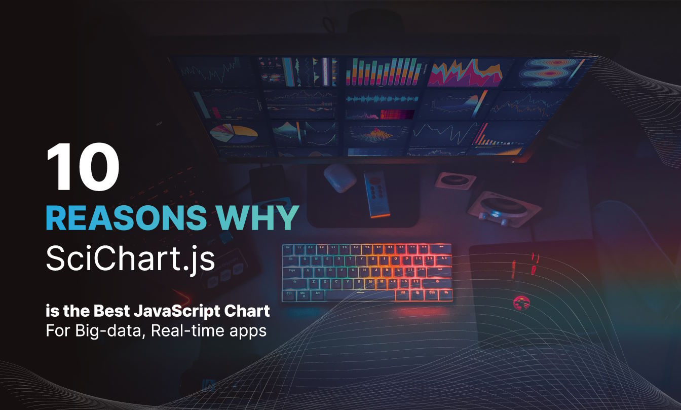
In this blog post we’re going to go through ten compelling reasons why SciChart.js is the Best JavaScript Chart library in 2024 for complex, big-data visualisation applications, and why it’s consistently rated number 1 for medical, aerospace, motorsport and financial use.
Now with a FREE Community Edition why not try out this exciting new library?
Ten Reasons at a glance:
- #1 The Fastest, Highest Precision WebGL Charts
- #2 Rich Interactions
- #3 Complex Axis Options and Layouts
- #4 Link Multiple Charts together
- #5 Add Many Annotations, Labels to charts
- #6 Create Scientific 3D Charts
- #7 Customize Zooming, Panning
- #8 Modify data by Point & Click
- #9 Style & Animate everything
- #10 Fully Documented, Rich Demos & Tech Support
- What else sets SciChart apart?
Other chart libraries struggle with datasets beyond a few thousand points. Many use standard technologies like Canvas or SVG where real-time or dynamic charts are difficult or impossible. Some use WebGL but suffer with limits of WebGL context (max 2-16 contexts per page) or have precision issues limiting the amount of zoom into scientific data.
Here are some things you can do with SciChart that you cannot do with other chart libraries:
Above: A selection of real-time, big data, high performance charts made with SciChart.js
SciChart uses a proprietary WebAssembly & WebGL engine but is not limited by the maximum WebGL context issue – a hard limit in the browser which is device dependent.
Let’s show this with a quick test in Google Chrome browser (16 WebGL context limit):
What you’ll notice is as follows.
Once the WebGL context limit is hit, old charts are erased. They can be recovered but only if contexts become available.
The WebGL context limit is browser & device dependent. On Google Chrome / Windows it is currently 16, but on a mobile device it may be as low as 2. That means more than 2 charts or 2 usages of WebGL across all tabs and your application won’t work. This makes WebGL charting useless on mobile for libraries that hit this limit.
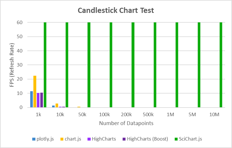
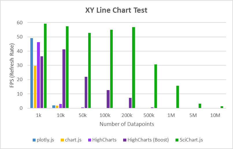
We tested SciChart.js vs. a variety of competitors and found it outperformed them all by 1-2 orders of magnitude. With performance as a number-one requirement when developing new features, we’re always maintaining or improving this aspect of the library.
Here’s some graphs from the blog post comparing JavaScript Charts showing just how dramatic this performance difference is.
 JavaScript Spline Chart
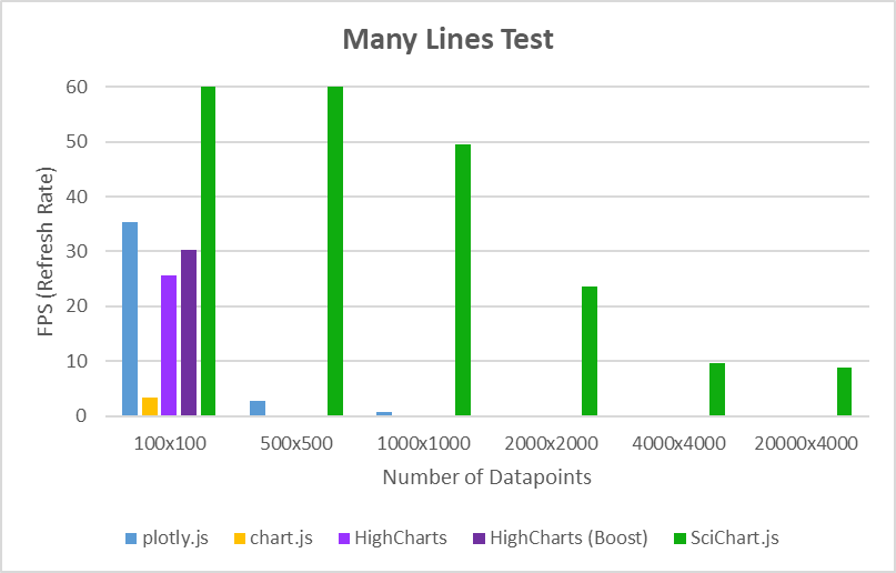
Even against LighningChart.js, a competing WebGL chart library, SciChart.js was able to load a huge dataset of 100,000,000 points considerably faster.
Really nothing else compares to the performance of SciChart.js. With WebGL and WebAssembly, the tech stack is unique, and plus with the expertise of the SciChart team, we’re always improving.
Other JavaScript charts will show you a drill down demo, where clicking on a chart element fires an event to load a new chart.
With SciChart we take this to a new level. It goes further than most by providing APIs for:
This means you can create any kind of interaction on the chart. Not only that but cursors, crosshairs, tooltips and customisable legends are available out of the box.
What if you needed to add behaviour to click, select, hover and dynamically update data like in this waterfall chart demo? Or interact with annotations to change simulation parameters like on this Heatmap Interactions demo.
For scientific, engineering or business applications which require interactions this shouldn’t be a chore. With SciChart.js complex requirements become simple.
Above: SciChart.js Interactive Waterfall Chart demo and Rich Interactions Showcase demo
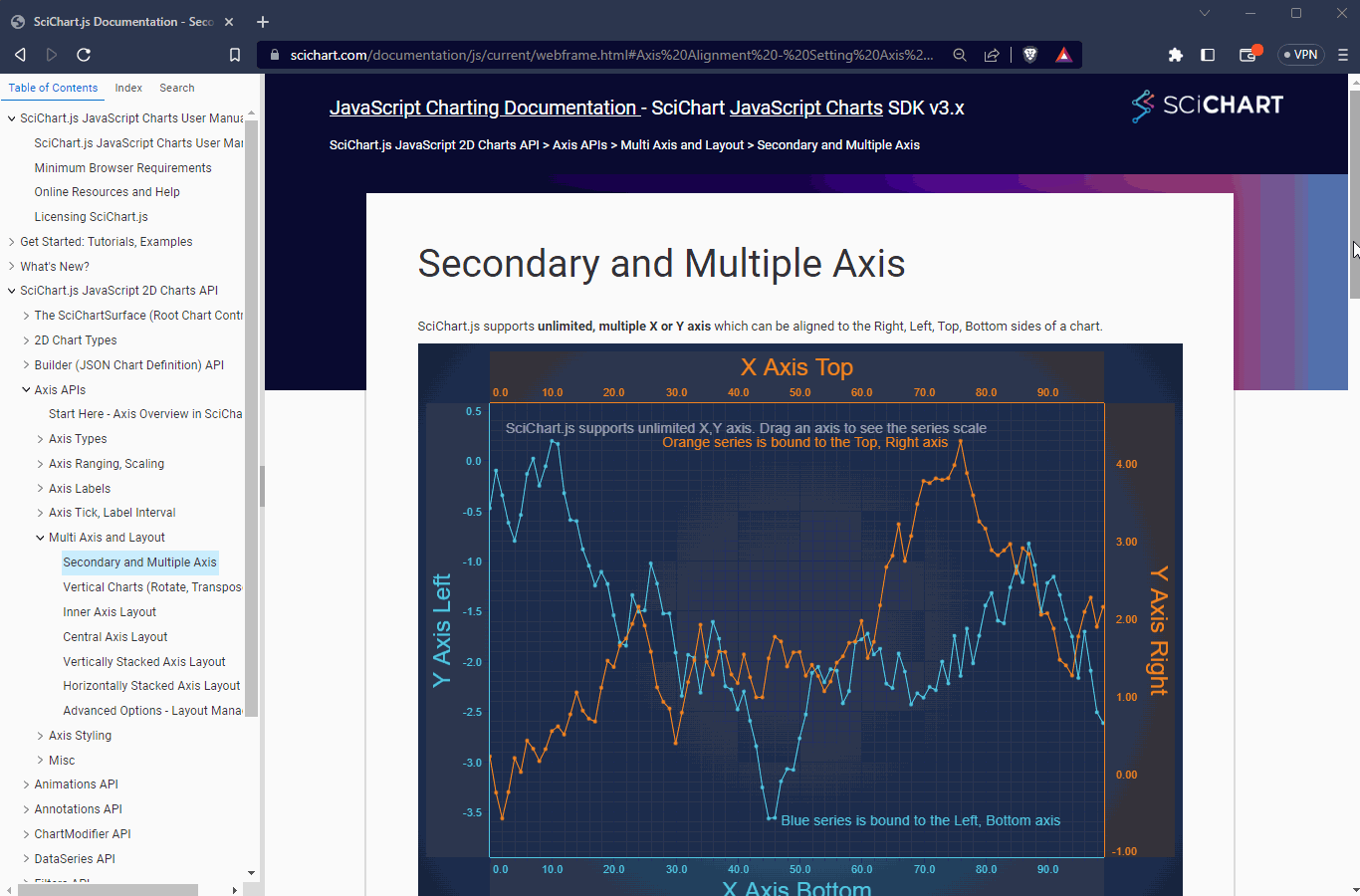
Other JavaScript chart libraries let you have a single or dual X and Y axis. Some JS charts limit the axis types to category only, meaning x-value spacing is ignored.
With SciChart we take axis types, axis customisation and layout to a whole new level. Here are some things you can do with SciChart that set it apart from other chart libraries:
All of this while maintaining extremely high performance which we mentioned above.
Above: SciChart.js Axis Configuration demos. Many configurations of Axis Layout are possible with SciChart.
What if you had a scenario where you need three or four chart panes in a dashboard, stacked one on top of another, but zooming, panning and mouse-over tooltips must be linked together?
With SciChart.js you can do this. This allows you create custom layouts like our financial chart demo here. Zooming or panning on one chart, zooms and pans them all.
One of SciChart’s APIs allows you to link together the mouse interactions of multiple charts, synchronise zooming, tooltips and chart sizes so you can create stacked layouts. Imagine a timeline view of several charts linked together. This flexibility allows you to create novel applications and ways to visualise data.
Above: Multi-pane stock chart demo. Links multiple charts and synchronises cursors, zooming.
Other Chart libraries won’t let you overlay thousands of text labels, markers and annotations on the chart, but with SciChart you can using our rich WebGL DataLabels API and Annotations API.
This means that for complex scientific or engineering applications were your customers need to tag data sources or samples with input values onto the chart surface they can, delivering the product your end users need and setting your application above competitors ensuring success.
Above: Annotations demo. Add text labels, boxes, lines, custom shapes to chart with data or viewport positioning.
Annotations can be clicked, selected, resized and dragged. They allow you to areas of interest in the background or interacting with thresholds, selection boxes and more. Data-Labels may be placed on data-points to display the value or custom text. SciChart’s WebGL drawing means you can place thousands of labels, markers or areas of interest without slowdown.
While most JavaScript chart libraries focus on just 2D visualisations, SciChart.js features 3D Scientific chart types such as 3D Bubble, 3D Point Cloud, 3D Point-line and 3D Surface Mesh.
All can be updated dynamically with big-data, with the performance & reliability that you’d come to expect from SciChart.
Above: Create 3D Charts with SciChart.js for scientific applications.
Most JavaScript charts allow zooming into the data, but what if you wanted to build specific zooming and panning interactions to match your requirements?
With SciChart we have a number of zoom, pan behaviours out of the box, and you can create your own. You can combine them together to create an experience like a rich trading application – completely custom with panning on the axis, mousewheel on the chart, drag-selection or drag to pan. Plus, touch is supported out of the box.
Above: Multiple zoom, pan operations combined onto a single chart.
Sometimes people ask us how to enable zooming only when CTRL is clicked, or how to mouse-wheel the axis rather than drag to zoom. There is no limit to how you can confirm the zoom and pan operations in SciChart, and this sets it apart from the competition.
Using SciChart’s APIs you can create behaviours to modify curves on point & click. For example in a scientific application where you have to click & drag a curve to change the input somewhere else in your application like in this interactions demo.
Maybe your application needs a level of interaction which is difficult to achieve elsewhere?
Above: Heatmap Interactions Demo. Point and click/drag the bottom left chart to update data. Drag lines or boxes in the top chart to update simulation inputs.
Try the above JavaScript Heatmap demo, try clicking and dragging on the bottom left chart. Also, the annotations (boxes, lines) are editable and change the inputs into the double-slit wave simulation.
From the background, to axis areas, labels, have image or transparent backgrounds and custom themes, SciChart can be styled to match your application easily. We provide themes out of the box and you can create your own with our simple API.
Above: One of many styling and theming examples showing how you can customise SciChart.js.
Everything can be styled in SciChart, as well as anything can be animated. From dataset animations to style animations to custom animations.
Open source and free chart libraries are very popular, but one of the benefits of choosing a commercial library like SciChart is it has hundreds of pages of hand-written documentation covering every feature. You won’t have figure it out from the JSDocs and there are samples for everything.
Another of the benefits of using SciChart.js is that we’re always working on improving our documentation, demos and code samples, and recently added embedded codepen samples into the documentation itself. If there’s a feature or idea you want to understand further, just click the ‘Edit in Codepen’ button and modify to your heart’s content.
What’s more, our commercial licenses come with Enterprise Tech Support that consistently receives 5-star reviews. Outsource your Charting & Data-Visualization to us and let us handle the stress of customising complex charts in your app.
SciChart is performant & reliable enough to be used by NASA, it has legendary technical support and is backed by a team of experts. Enterprise Tech Support is the #1 reason you should consider a commercial chart library over open source. Plus, our team is always innovating and making the library faster, leaner and more feature rich and stable.
We’re creating a library that will make you (the developer) look good when you include your charts in your app and will delight your users. With you feedback and your custom we can make it even better!
Start using SciChart.js Today
SciChart.js is now available with a FREE community edition (no trial, sign-up or credit card required) where you can try out the library commercially or use it in a non-commercial application.
If you have a question, or would like to give feedback, contact us.
Recent Blogs
![]()
Queens Award for Innovation
Proud winners of the Queens Award for Innovation, 2019. Awarded on account of our innovative graphics engine which underpins the SciChart library and enables our world-beating charting performance
![]()
National Business Awards
Highly Commended for Lloyds National Business Awards, 2019. Awarded on account of our innovative graphics engine and impressive customer base

Reviews
SciChart has received hundreds of verified, 3rd party reviews