
SciChart.js v2.x is a huge upgrade from version 1.x. Our team has worked very hard to bring you lots of features that you requested, and improve the overall quality, reliability and performance of our WebAssembly / WebGL powered JavaScript Charts.
Find out what's new in this major release below:
Style and Data Animations
As well as startup animations that sweep or fade a series when the chart is first shown, SciChart.js now features style and data animations.
This let's you animate style properties on series (stroke, strokethickness, fill) as well as entire datasets.
Builder API
A brand new API in SciChart.js - the Builder API - allows you to construct SciChartSurfaces with a JSON or Javascript object definition.
For example this:
Results in this:
JSON Serialization / Deserialization
The Builder API also allows JSON Serialization / Deserialization. It is now possible to construct chart definitions including data server-side, and reconstruct the SciChart.js chart client side.
Point Metadata
SciChart.js v2.x now features a PointMetadata API, comparable to our iOS Android and Windows charts. This API allows you to tag some or all x,y datapoints with a custom object, which can then be routed through to Tooltips, Hit-Test or PaletteProvider for dynamic colouring of chart segments.
For example this:
Results in this:
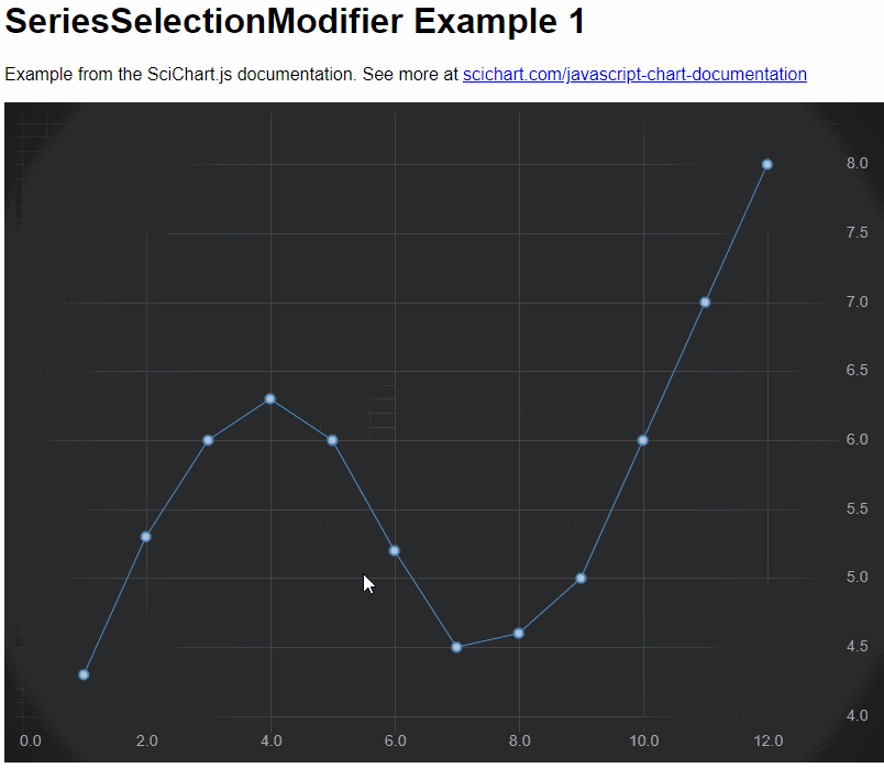
Series Selection
We've added Series Selection on click, and Hover events to SciChart.js v2.x. With the new SeriesSelectionModifier, you can get notified if a user clicked or hovered a series, and make some visual changes such as changing or animating series style.
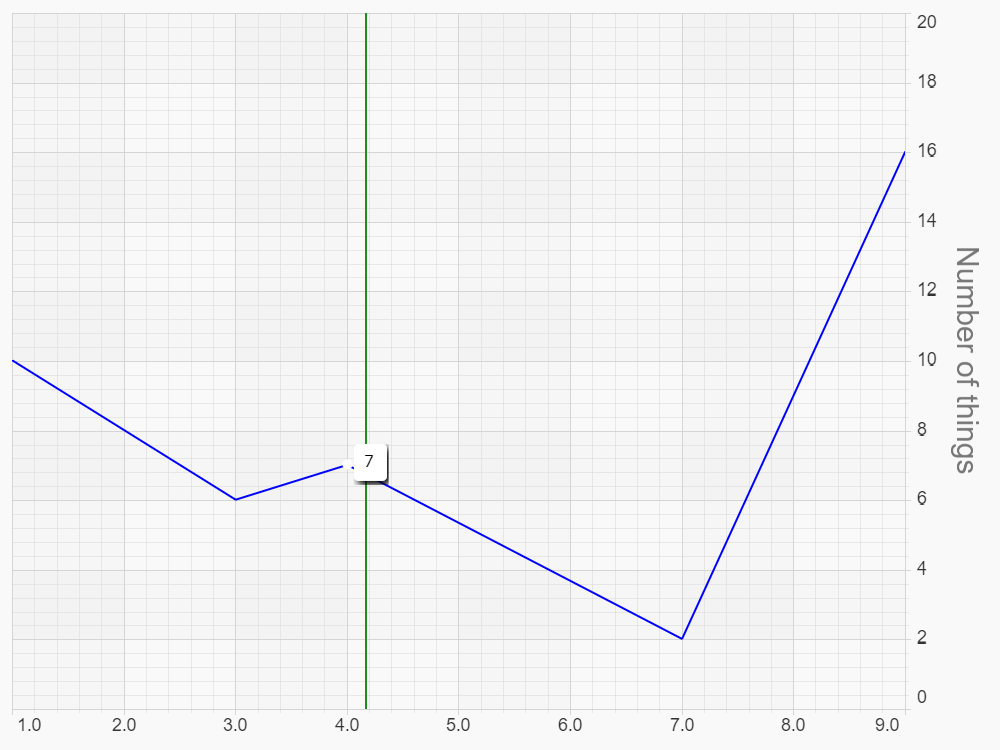
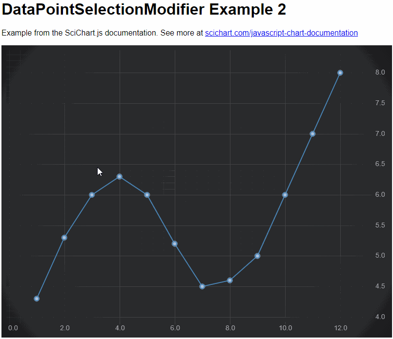
Datapoint Selection
We've also added Datapoint Selection into SciChart.js v2.x. You can now click select individual datapoints, drag to select multiple datapoints, get notified on click and display visual feedback. To use this feature, add a DataPointSelectionModifier to your chart.
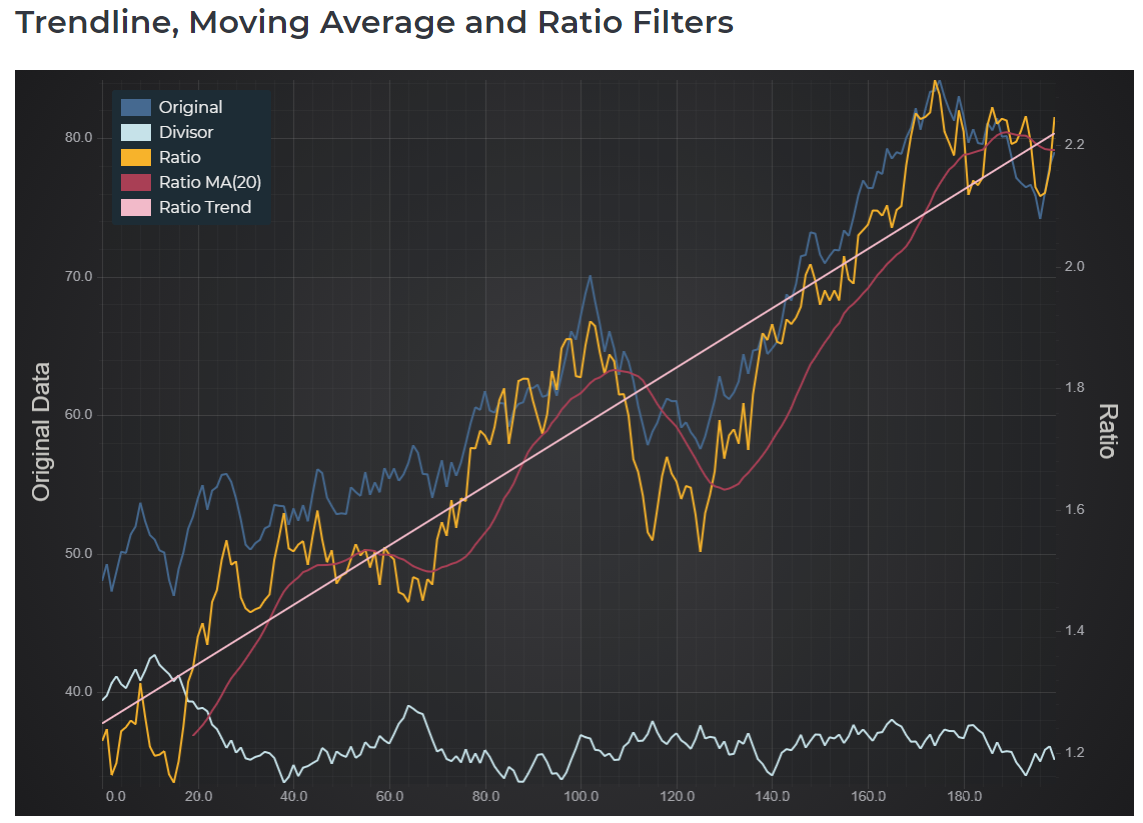
Filters (Data Transforms) API
SciChart.js now features a Filters or Data Transforms API. This allows you to add data transforms such as Linear Trendlines, Moving Averages, Scale/Offset, or Ratio of two DataSeries to your chart. Filters automatically update when the underlying data changes, making it easy to apply transforms to your data.
What's more, you can create custom filters easily if you wanted to add any other kind of behaviour.
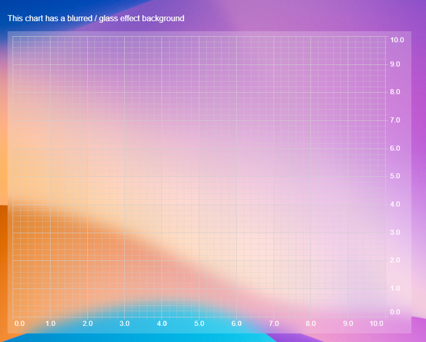
Transparent, Image or Blurred Backgrounds
In SciChart.js v2.x, we've completely re-written the way we composite WebGL powered JavaScript Charts onto the HTML page, allowing you to now create charts with transparent backgrounds, image backgrounds or even blurred/glass effect backgrounds.
Create stunning JavaScript charts with SciChart's flexible styling & theming API!
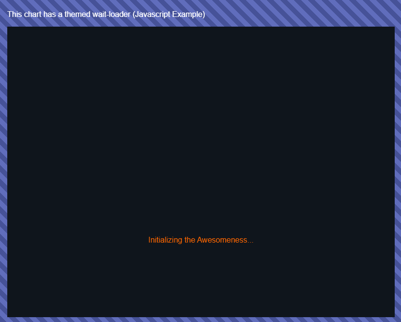
Loader Customisation
More styling & Theming changes in SciChart.js v2.x, you can now style the wait-loader, displayed when the chart initially starts up.
Styling options include simple changing of foreground & background colours, right through to customizing the DOM which is displayed as the chart loads for the first time.
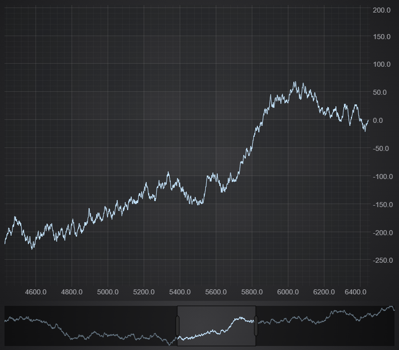
SciChartOverview control
After requests from our userbase, we've added the SciChartOverview control to SciChart.js v2.x. This is a Scrollbar control which lets you see an overview of your dataset, and scroll left/right at the touch of a button.
It works on vertical or horizontal charts, you can customize what series get displayed behind the overview, and customize the look & feel of the scroll grips and selection rectangle too.
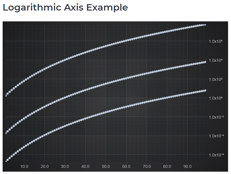
Logarithmic Axis
Another hotly requested feature, we've added a Logarithmic Axis to SciChart.js v2! Display charts with a logarithmic scale, on either X or Y axis, with a user-defined base. For example Log(10) charts, Log(e) for scientific applications or Log(2) for finance & trading.
You can specify the label format to display scientific notation with superscript, engineering notation or N-significant figures. Major and minor ticks can be displayed in linear or logarithmic scale.
Central / Inner Axis
We've added further customisations to the axis in SciChart.js v2. You can now place an X,Y axis in the center of the chart to create oscilloscope like graphs, or inside the chart as opposed to fixed on the outside of the chart area. Placement of the axis is fully customisable.
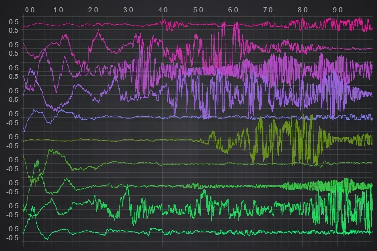
Vertically Stacked Axis
There's another axis customisation which we've added! Vertically Stacked Axis allows you to change the layout of axis panels.
Instead of left to right for Y-Axis, you can now layout several axis top to bottom. This gives you layout options like this. Perfect for EEG / ECG like charts where you want to display several overlapping traces on a single SciChartSurface.
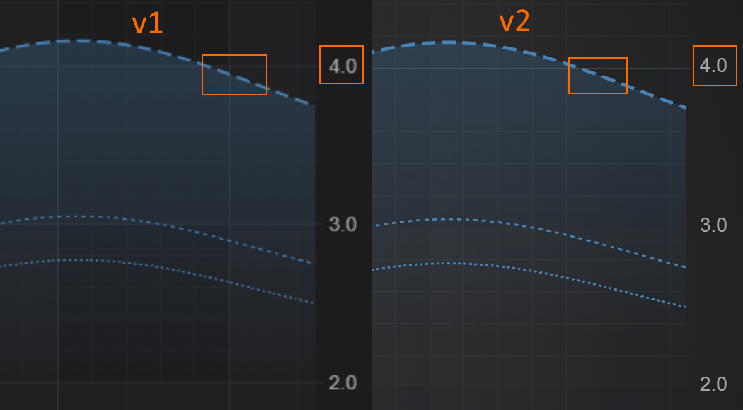
Retina and DPI Awareness / Browser Zoom
SciChart.js v2.x now supports sharp graphics on high resolution Retina displays, as well as Browser Zoom functionality.
Previously in SciChart.js, retina displays would look low quality, and when the browser is zoomed the image that SciChart renders to would simply be scaled. In SciChart.js v2, every element is now rendered at the native resolution and scaled down for display. This results in the following benefits:
- Lines, strokes, shapes now look sharper and clearer on higher DPI displays or when browser is zoomed
- Text is rendered at a higher resolution. Text scales with browser zoom (good for Accessibility)
- Stroke thickness (line pen) increases with Browser Zoom
Take a look below to see some comparison images side by side of SciChart.js v1 vs. v2 at 200% Browser zoom in Chrome.
Axis Label Customization
There are now several ways to customise axis labels in SciChart.js v2. SciChart now supports rotated axis labels, multi-line axis labels and even image labels. All this and more is possible via our Custom LabelProviders API.

Text Label Provider
Guess what, we've also added a way to natively put text labels onto an axis. The TextLabelProvider provides text labels rather than numeric. Specify text labels as an array with a mapping and our library displays them on the axis. This also features a rudimentary word wrapping algorithm for long labels.

Hit-Test Improvements
We've made multiple improvements to the Hit-Test API, allowing for greater control over what a hit (click) means on the chart.
You can now listen to mouse events and clicks on the chart and determine if the user:
- Clicked on a series segment (e.g. column body, candle body, line series segment)
- Clicked on an X-Y data-point
- Finding the nearest point using X-first (for timeseries) or X-Y distance (for scatter series)
The Hit-Test API returns an object which describes which points or series were under or nearest the mouse, and may be used for getting click notifications on chart series, implementing drill-downs, custom interactions or behaviours and more.
Miscellaneous Improvements
We've made lots of improvements into SciChart.js, including improving overall reliability, helpful error messages in the JavaScript console, improvements to the usability of APIs, improvements to documentation and examples plus much more.
If you're an existing user of SciChart.js or you've tried it out in the past, download SciChart.js v2 now and try it out! We would love to hear your feedback!