Building a Smith Chart in JavaScript: Inside the Rendering Pipeline
See how SciChart.js was extended to build a fully interactive Smith chart using standard APIs. This article highlights the flexibility of custom rendering and advanced interactions.
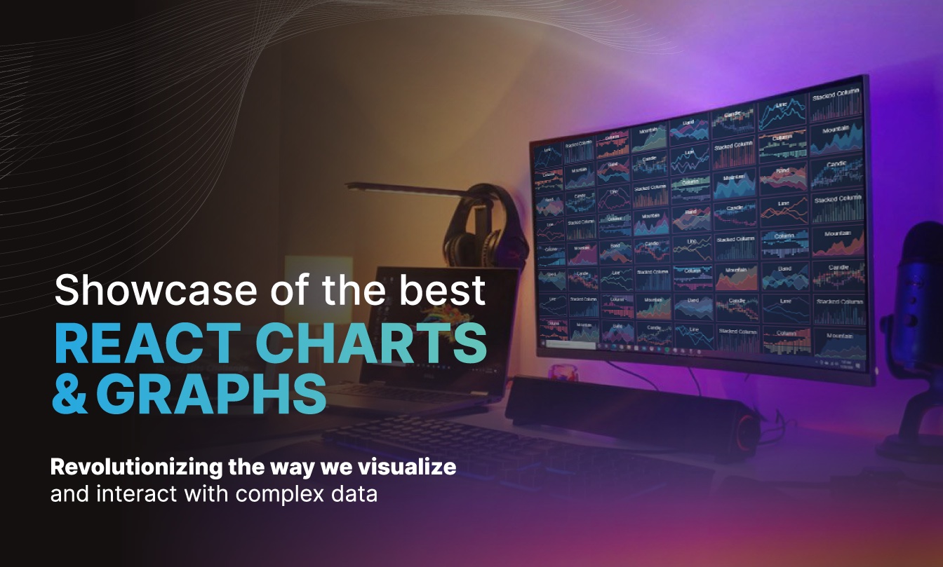
React Charts are revolutionizing the way we visualize and interact with complex data. These charts are not just tools for displaying information; they are gateways to deeper insights and analytics. React’s robust framework, combined with advanced charting libraries, empowers developers to build intuitive and responsive dashboards that can handle the complexities of real-time analytics & data visualization.
Whether you’re monitoring financial markets, analyzing health data, or tracking sports statistics, React Charts bring data to life. Their versatility and performance cater to a broad spectrum of industries, enabling users to dissect and comprehend intricate datasets with ease. In this guide, we explore the best React Charts and Graphs that stand out in the realm of web development, demonstrating how they can transform dense data into captivating and informative visual narratives.
Join us as we explore the realm of React Charts. Here, every graph and chart is more than just a visual representation; it’s an essential tool for insightful data analysis, unlocking the full potential of your datasets in clear and compelling ways.
React Charts can be used to display data in dashboards, analytics applications and more. However some applications require real-time updates and high performance to ensure data which is dynamically changing can be visualized fast.
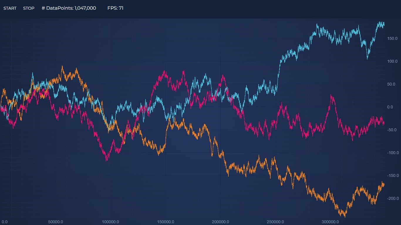
Demonstrates appending millions of points to a react line chart. Dynamic data updates previously have been a performance problem in React applications but with this demo 300k points per second are added to the chart. Millions of datapoints can be rendered in React Charts with scichart.js without performance problems!
Dashboards with tens, hundreds of charts and millions of datapoints were previously impossible in React. In this performance demo we show how you can have 64-charts all updating at once, with millions of points streaming dynamically in real-time.
Financial charts in react could include stock charts, price charts, trading charts with technical indicators. Charts for React Trading applications need to be highly interactive, show cursors, legends and tooltips, allow zooming and panning, as well as updating data in real-time.
Some examples are included below.
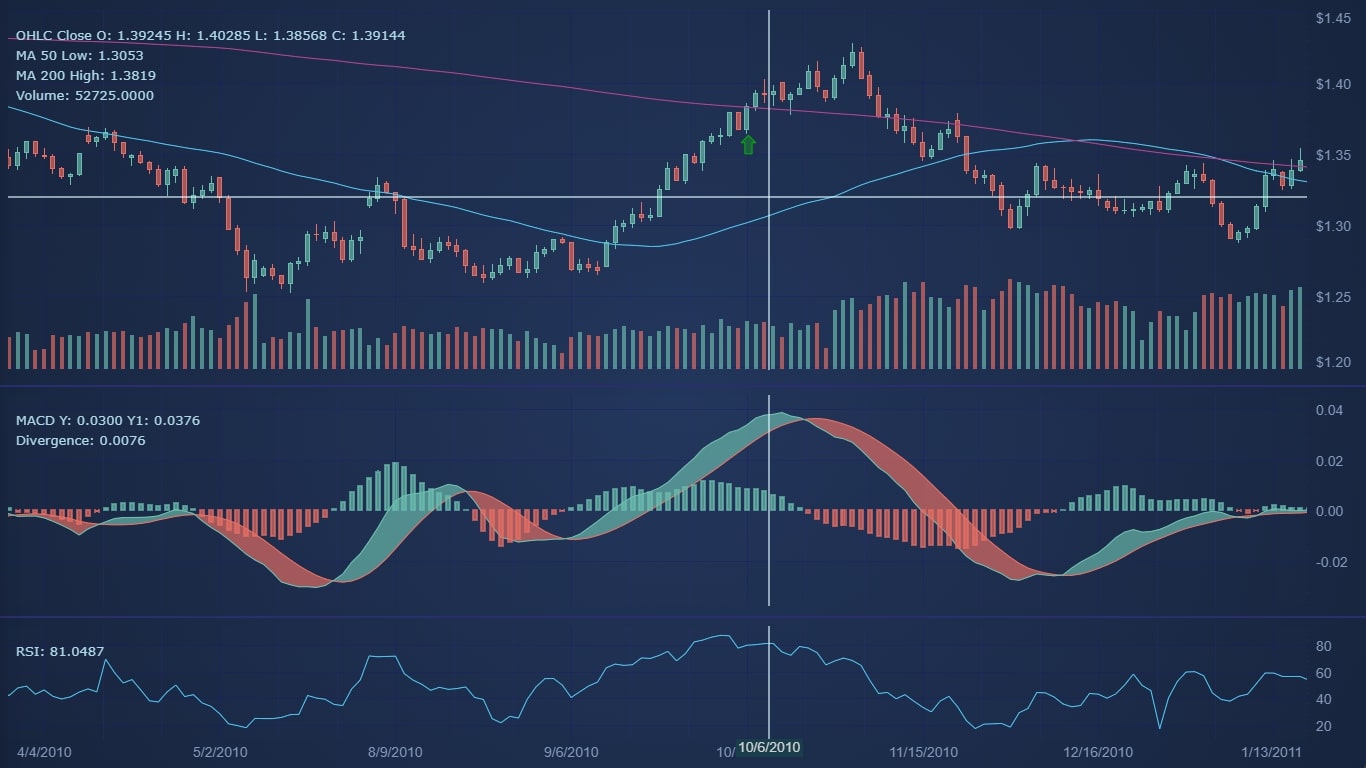
In this demo we show how to create a React Stock Chart with technical indicators. MACD and RSI indicator are added onto separate chart panes. Moving averages are added onto the main pane. There is an active legend and crosshair which tracks the mouse. The entire example can be zoomed or panned via touch or mouse interactions.
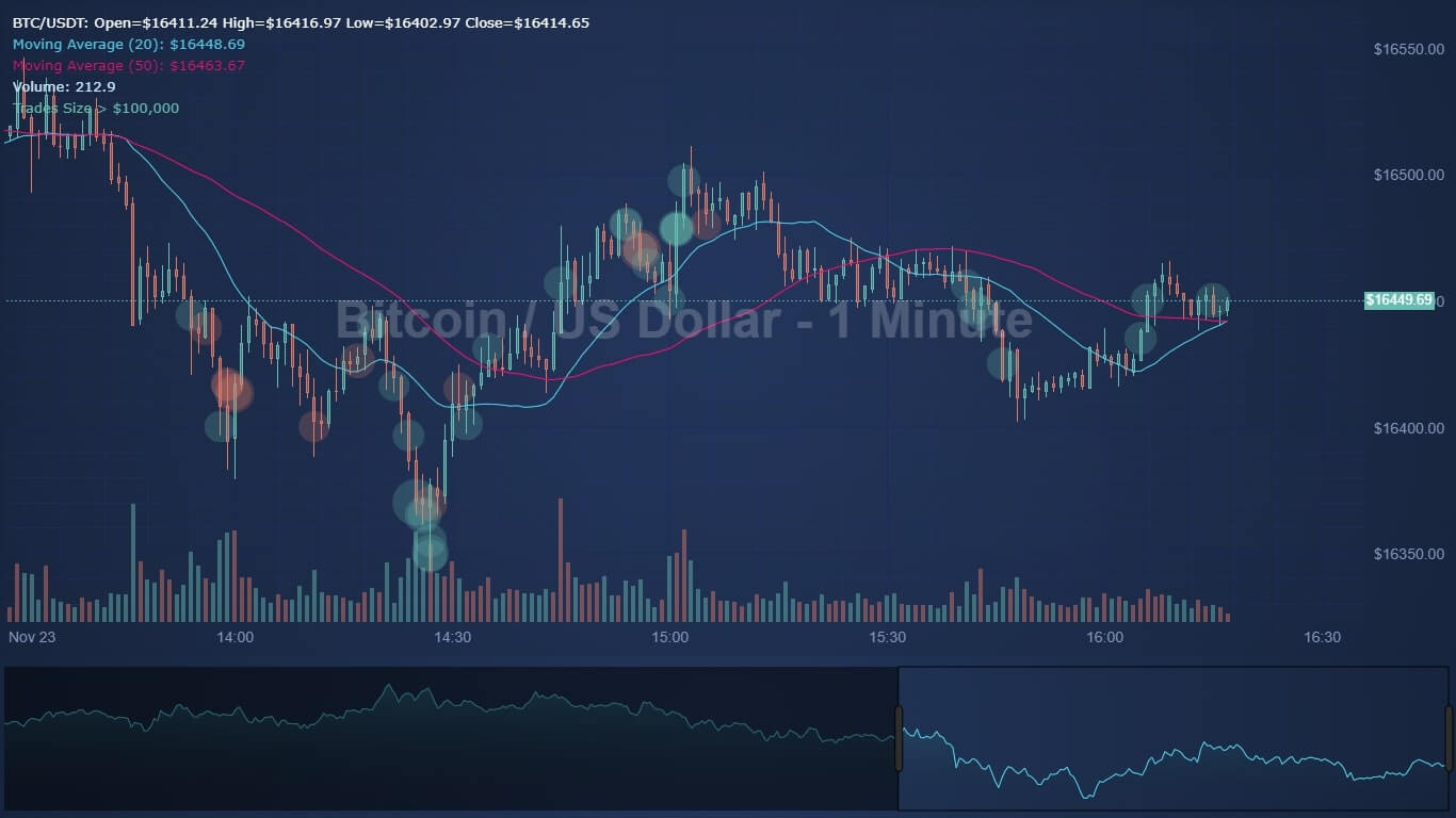
Connecting a React Candlestick Chart to financial data in an exchange is easy. In this example, price data is fetched from an exchange via REST API, then dynamically updated using a WebSocket. Candlestick charts are updated on price tick. Technical indicators (moving average) are calculated, and the chart allows zooming, panning to view older data.
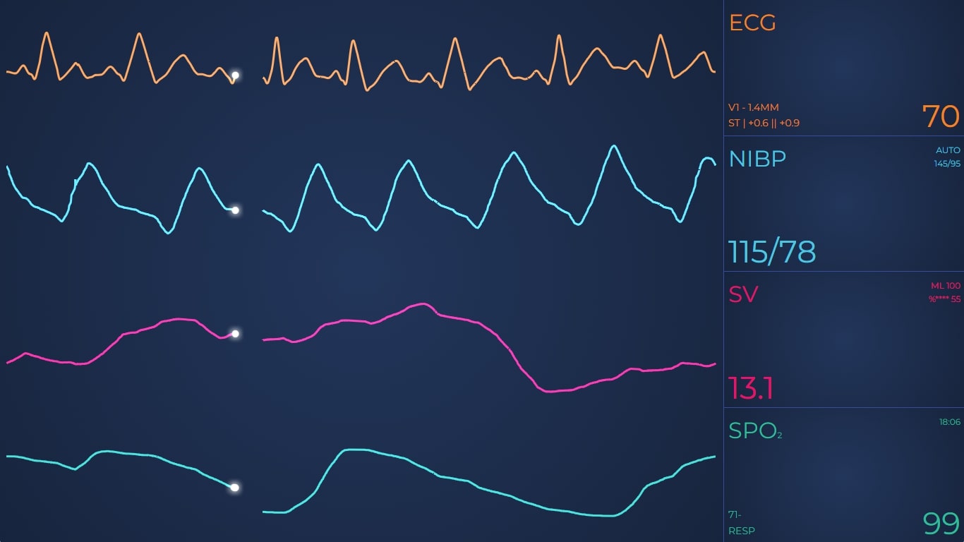
Medical applications are more and more being ported to React. Before, they were often C++ or C# applications. Medical device & medical software manufacturers expect high performance, reliability and low memory usage in charts & graphs. A showcase of examples can be found below.
Plotting a sweeping medical ECG is easy in React with this software. Cardiac telemetry often needs to be visualised on medical devices or patient monitoring systems. Data traces can be cardiac telemetry, heart rate, blood oxygen, SPO2, blood pressure are plotted to the right of the graph, then wrap around to the beginning. This is possible with SciChart.js’ Fifo Sweeping Mode.
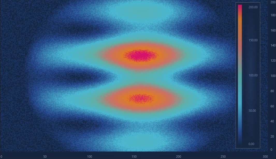
Echocardiograms, Ultrasound, Sonar, Thermal imaging and more can be created in React. Using a dynamic heatmap chart type
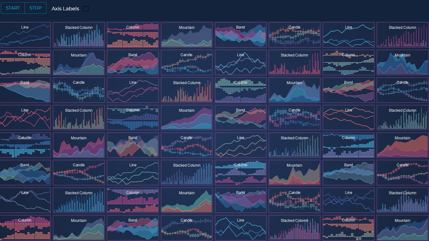
It’s not just complex financial & medical charts that can bring a new lease of life to your data visualizations. Variations in React Line Chart include a wide range of different line styles, such as simple lines, digital lines, tooltips, dashes, gaps, labels, hovering lines and more.
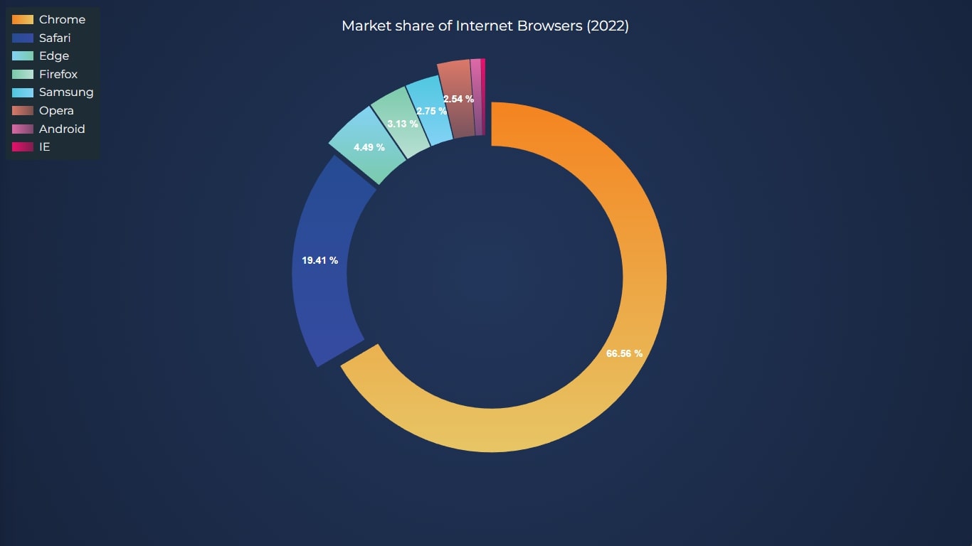 React Donut Chart
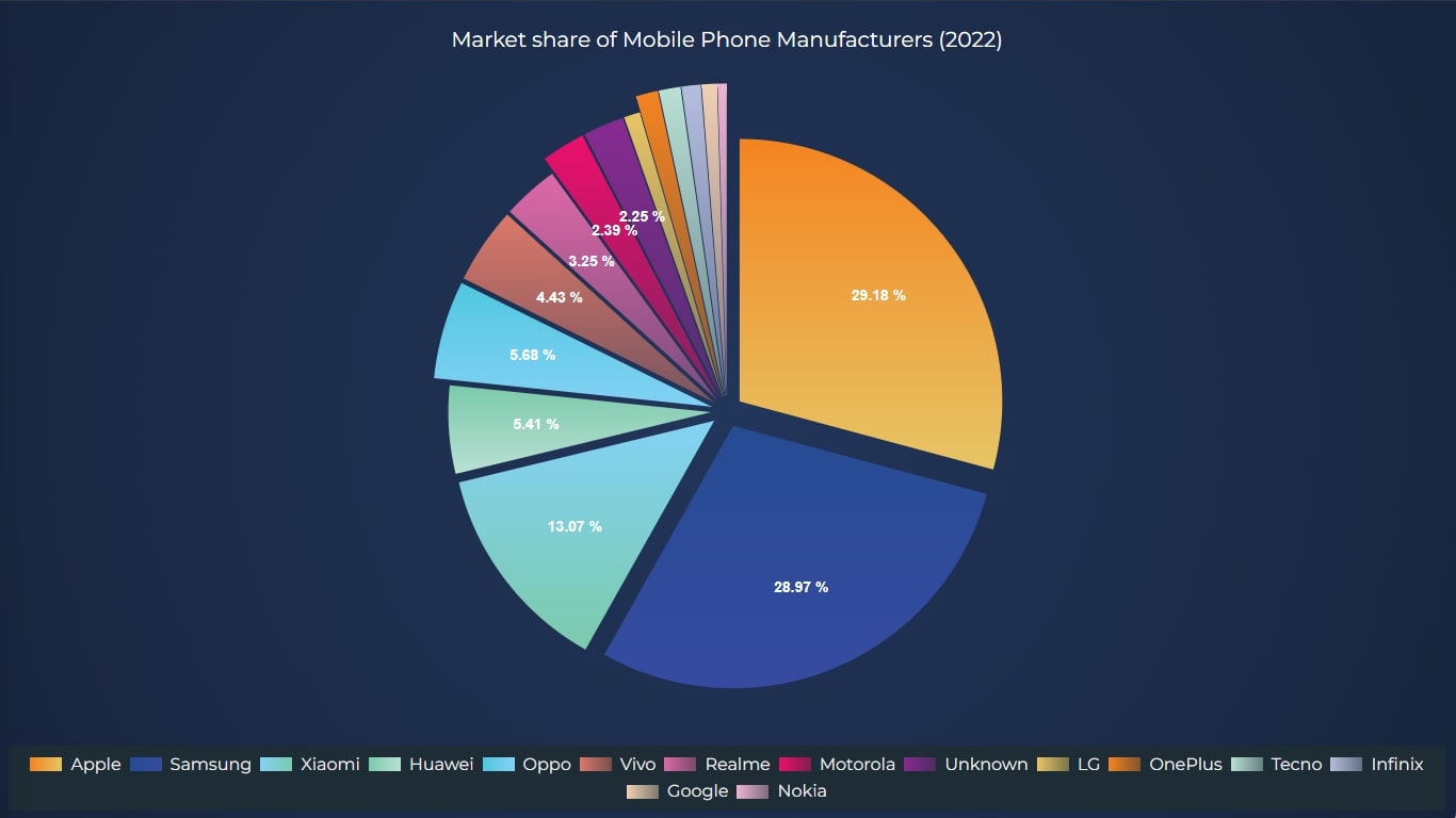 React Pie Chart
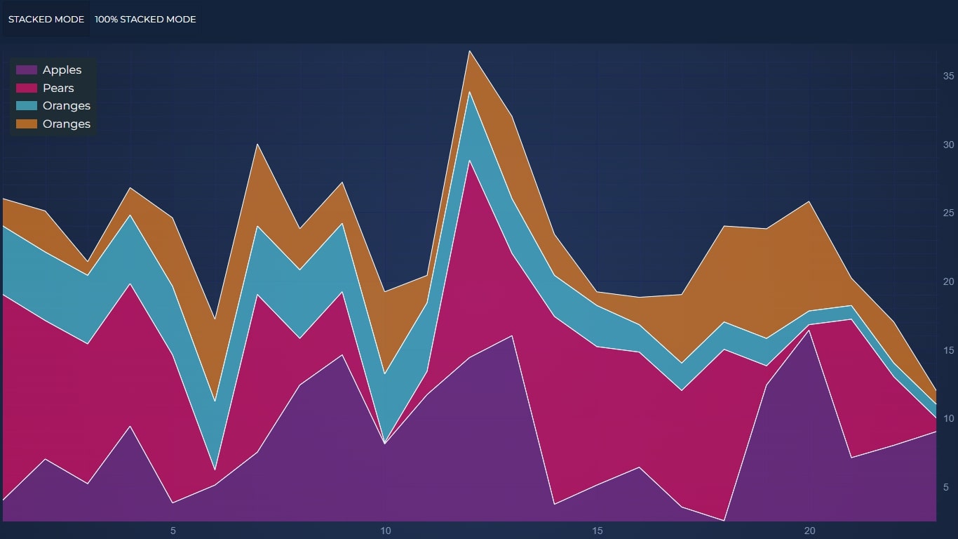 React Stacked Area or Stacked Mountain Chart
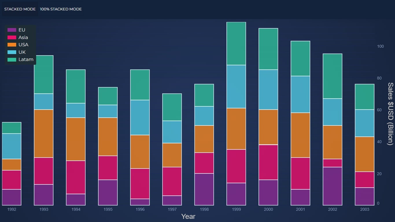 React Stacked Bar or Stacked Column Chart
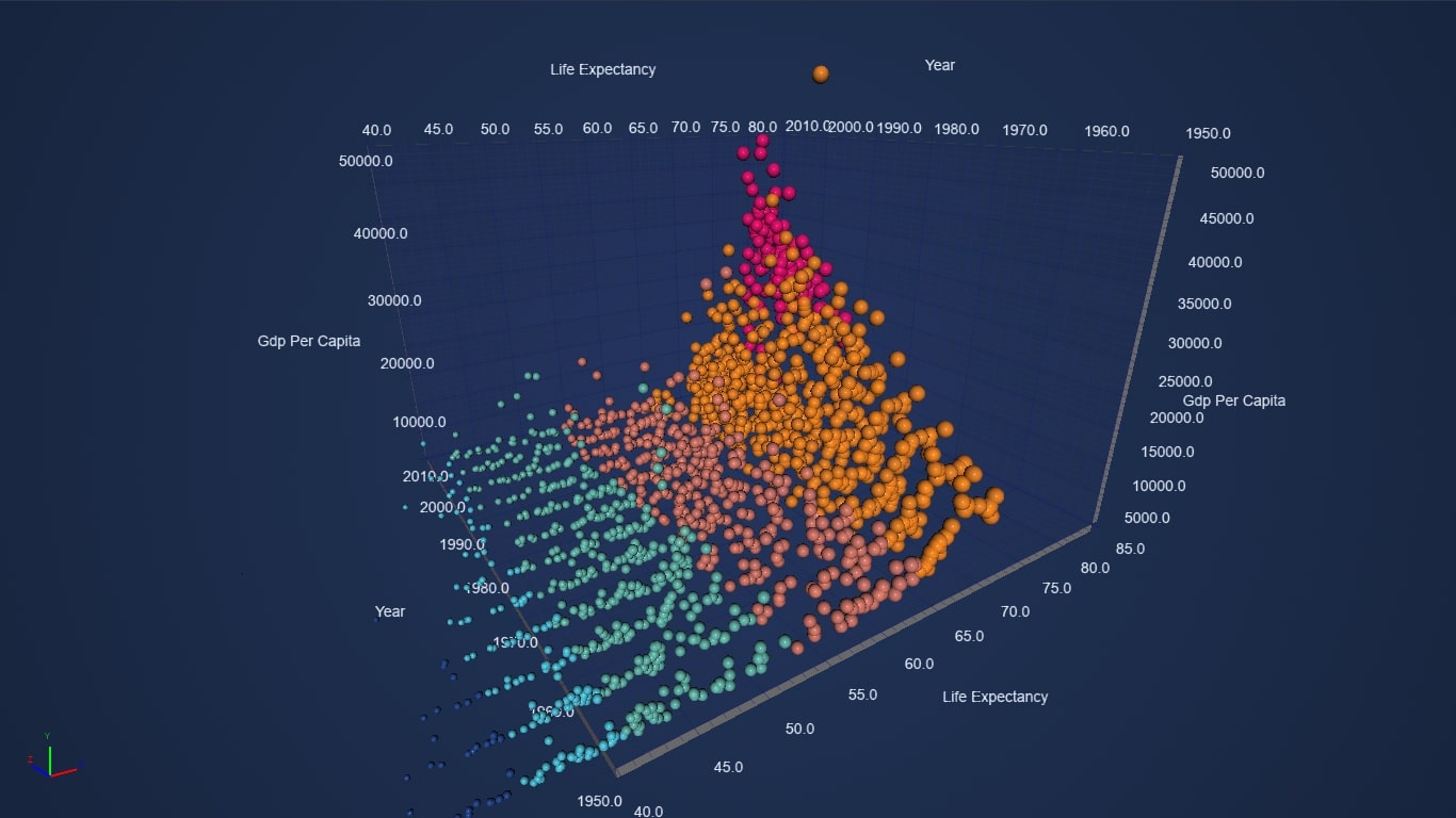 React 3D Bubble Chart
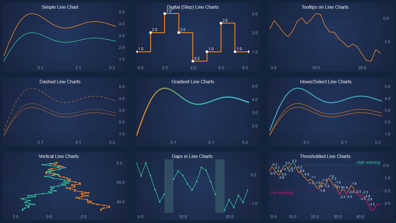 React Line Charts
Who Uses SciChart?
SciChart’s fully customizable React Charts are used by investment banks, NASA, top Formula 1 teams and companies in the tech, medical, engineering, electrical, and oil and gas domains. As you can see from the showcase above, we support a diverse range of customized features to help your users get the most out of their data.
Start using SciChart.js and SciChart-React Today
SciChart-React is a free open-source library to allow you to use SciChart.js in React applications. Available on Npm and Github:
npm install scichart-react.SciChart.js is a JavaScript Chart Library now available with a FREE community edition (no trial, sign-up or credit card required) where you can try out the library commercially or use it in a non-commercial application.
If you have a question, or would like to give feedback, contact us.
CONTACT USGET SCICHART.JS FREE
Recent Blogs
![]()
Queens Award for Innovation
Proud winners of the Queens Award for Innovation, 2019. Awarded on account of our innovative graphics engine which underpins the SciChart library and enables our world-beating charting performance
![]()
National Business Awards
Highly Commended for Lloyds National Business Awards, 2019. Awarded on account of our innovative graphics engine and impressive customer base
![]()
National Technology Awards
Awarded “Healthcare Tech of the Year” at the 2025 National Technology Awards – a top UK recognition for breakthrough innovation in technology.

Reviews
SciChart has received hundreds of verified, 3rd party reviews