Building a Smith Chart in JavaScript: Inside the Rendering Pipeline
See how SciChart.js was extended to build a fully interactive Smith chart using standard APIs. This article highlights the flexibility of custom rendering and advanced interactions.

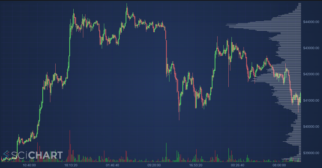
In this blog post, we’re going to answer a frequently asked question of How to create a volume profile chart in JavaScript. This is a financial chart which visualises the volume traded at specific prices as a histogram on the right hand-side of the chart. Sometimes a Volume Profile is also called a Market Footprint. This is also visualised as a mountain (area) series, or histogram next to individual candles, or at several points along a financial chart.
In financial stock charts, a candlestick chart is used to visualise open, high, low, close prices of an asset over a specific timeframe. The volume (amount traded) in each specific candle is significant for traders. Sometimes areas of high or low volume can act as support/resistance (difficult areas for the price to pass). Visualising the price levels associated with high volume can be done with a Volume Profile chart.
The output should look something like this:
In SciChart’s JavaScript Chart Library this can be achieved by creating a chart with an X,Y axis, but then adding a second X,Y axis with xAxis.axisAlignment = EAxisAlignment.Left and yAxis.axisAlignment=EAxisAlignment.Top respectively. An axis then may be hidden by setting axis.isVisible = false.
When the alignments of axis are switched in SciChart you create a Vertical Chart in JavaScript, and it’s possible to have two sets of axis on the same chart which are transposed.
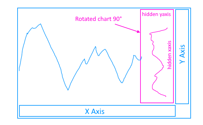
Here’s how to setup a transposed axis on the same chart as a normal X,Y axis in JavaScript using SciChart.js. This technique allows you to rotate a specific series on the chart.
const {
  SciChartSurface,
  NumericAxis,
  SciChartJSLightTheme,
  EAxisAlignment,
  Thickness,
  FastLineRenderableSeries,
  XyDataSeries,
  NumberRange,
  ZoomPanModifier,
  MouseWheelZoomModifier,
  ZoomExtentsModifier
} = SciChart;

async function initSciChart(divElementId) {
  const { sciChartSurface, wasmContext } = await SciChartSurface.create(divElementId, {
    title: "Custom layout JS Chart with Transposed Axis",
    titleStyle: { fontSize: 28, fontWeight: "bold" },
    theme: new SciChartJSLightTheme()
  });

  // Add the primary x,y axis
  sciChartSurface.xAxes.add(new NumericAxis(wasmContext, {
    axisTitle: "X Axis",
    backgroundColor: "#0066ff33"
  }));
  sciChartSurface.yAxes.add(new NumericAxis(wasmContext, {
    axisTitle: "Y Axis",
    backgroundColor: "#0066ff33"
  }));

  // Add the secondary y,x axis transposed
  sciChartSurface.xAxes.add(new NumericAxis(wasmContext, {
    id: "SecondaryXAxis",
    axisAlignment: EAxisAlignment.Right,
    axisTitle: "X Axis Transposed",
    backgroundColor: "#ff660033"
  }));
  sciChartSurface.yAxes.add(new NumericAxis(wasmContext, {
    id: "SecondaryYAxis",
    axisAlignment: EAxisAlignment.Bottom,
    axisTitle: "Y Axis Transposed",
    backgroundColor: "#ff660033",
    // growBy sets padding and yMax at 66% (2:1 ratio)
    growBy: new NumberRange(0, 2)
  }));

  // Add some series to make it clear which axis is which
  const xValues = Array.from(Array(100).keys());
  const yValues = xValues.map(x => Math.sin(x*0.3) * (150-x));

  // Blue series on primary X,Y axis
  sciChartSurface.renderableSeries.add(new FastLineRenderableSeries(wasmContext, {
    dataSeries: new XyDataSeries(wasmContext, { xValues, yValues }),
    stroke: "0066ff77",
    strokeThickness: 5
  }));

  // Orange series on secondary, transposed, X,Y axis
  sciChartSurface.renderableSeries.add(new FastLineRenderableSeries(wasmContext, {
    yAxisId: "SecondaryYAxis",
    xAxisId: "SecondaryXAxis",
    dataSeries: new XyDataSeries(wasmContext, { xValues, yValues }),
    stroke: "ff660099",
    strokeThickness: 5
  }));

  // Add panning, zooming interaction
  sciChartSurface.chartModifiers.add(
    new ZoomPanModifier(),
    new MouseWheelZoomModifier(),
    new ZoomExtentsModifier()
  );
}

initSciChart("scichart-root");
See the Pen
Layout Transposed Axis – JavaScript Charts with SciChart.js by SciChart.js Official (@scichart)
on CodePen.
A second option unique to SciChart.js is the SubCharts API. This allows you to group one or more charts together with different properties. This API is in it’s infancy and needs to be improved, but essentially it lets you place one or more charts on the same canvas at specific positioning, at datavalue, pixel or relative coordinates.
To add a SubChart to a SciChartSurface, then dock it to the right 33% of the main chart, use this API:
  // Create the parent chart
  const { sciChartSurface, wasmContext } = await SciChartSurface.create("scichart-root", {
    title: "New Chart",
    titleStyle: { fontSize: 28, fontWeight: "bold" },
    theme: new SciChartJSLightTheme(),
  });

  // Add the primary x,y axis
  sciChartSurface.xAxes.add(new NumericAxis(wasmContext, {
    axisTitle: "X Axis",
    backgroundColor: "#0066ff33"
  }));
  sciChartSurface.yAxes.add(new NumericAxis(wasmContext, {
    axisTitle: "Y Axis",
    backgroundColor: "#0066ff33"
  }));

  // Create a subchart
  const sciChart1 = sciChartSurface.addSubChart({
    theme: new SciChartJSLightTheme(),
    // position: x, y, width, height in data-values
    coordinateMode: ECoordinateMode.DataValue,
    position: new Rect(0, 0, 1, 1),
  });

  // Add the secondary y,x axis transposed to the subchart
  sciChart1.xAxes.add(new NumericAxis(wasmContext, {
    axisAlignment: EAxisAlignment.Right,
    axisTitle: "X Axis Transposed",
    backgroundColor: "#ff660033",
    drawMajorGridLines: false,
    drawMinorGridLines: false,
    drawMajorBands: false
  }));
  sciChart1.yAxes.add(new NumericAxis(wasmContext, {
    axisAlignment: EAxisAlignment.Bottom,
    axisTitle: "Y Axis Transposed",
    backgroundColor: "#ff660033",
    flippedCoordinates: true,
    drawMajorGridLines: false,
    drawMinorGridLines: false,
    drawMajorBands: false
  }));

  // Dynamically dock the subchart inside the main chart on the right 20%
  sciChartSurface.rendered.subscribe(() => {
    const parentXRange = sciChartSurface.xAxes.get(0).visibleRange;
    const parentYRange = sciChartSurface.yAxes.get(0).visibleRange;
    sciChart1.subPosition = new Rect(
      parentXRange.max - parentXRange.diff * 0.2,
      parentYRange.max,
      parentXRange.diff * 0.2,
      parentYRange.diff);
  });
This results in the following output:
See the Pen
Layout Transposed SubCharts – JavaScript Charts with SciChart.js by SciChart.js Official (@scichart)
on CodePen.
Now that we’ve covered the basics of how to achieve the layout of a docked, rotated JavaScript chart inside the main chart in SciChart.js, we can proceed to build a volume profile.
Using Option #1, setup the chart with a transposed X,Y axis.
You can fake a decent set of normally distributed data using random numbers with some code like this:
  const volWidth = 10;
  const numbars = Math.round(priceYAxis.visibleRange.diff / volWidth);
  const xVolValues = makeIncArray(numbars, volWidth, n => n + priceYAxis.visibleRange.min);
  const yVolValues = makeIncArray(
      numbars,
      1,
      v => Math.exp(-Math.pow(v - numbars / 2, 2) / 20) + Math.random() * 0.5
  );
Then place this on the chart with a transposed axis like this:
  const volumeProfileSeries = new FastColumnRenderableSeries(wasmContext, {
      dataSeries: new XyDataSeries(wasmContext, { xValues: xVolValues, yValues: yVolValues }),
      dataPointWidth: 0.5,
      opacity: 0.33,
      fill: "White",
      strokeThickness: 0,
      xAxisId: "VolX", // Assumes axis exists as a transposed Y,X hidden axis
      yAxisId: "VolY"
  });
  sciChartSurface.renderableSeries.add(volumeProfileSeries);
However what if you wanted to do this with real market data & calculate the volume distribution?
First you’re going to need some market data. For this blog I’ve taken the code from binanceRestClient.ts which is found in our JavaScript Candlestick Chart Example. The source code for binanceRestClient can be found here.
This fetches price data from the free Binance API for a symbol such as BTC/USDT and timeframe such as 1hr. To fetch candle data call this code:
// Data format is { dateValues[], openValues[], highValues[], lowValues[], closeValues[] }
const { dateValues, openValues, highValues, lowValues, closeValues, volumeValues }
     = await getCandles("BTCUSDT", "1h", 100);
This can now be piped into a FastCandlestickRenderableSeries using SciChart’s API:
// Create a OhlcDataSeries with open, high, low, close values
const candleDataSeries = new OhlcDataSeries(wasmContext, {
	xValues: dateValues,
	openValues,
	highValues,
	lowValues,
	closeValues,
});

// Create and add the Candlestick series
const candlestickSeries = new FastCandlestickRenderableSeries(wasmContext, {
	strokeThickness: 1,
	dataSeries: candleDataSeries,
	dataPointWidth: 0.7,
	brushUp: "#33ff3377",
	brushDown: "#ff333377",
	strokeUp: "#77ff77",
	strokeDown: "#ff7777",
});
sciChartSurface.renderableSeries.add(candlestickSeries);Volume bars can also be placed at the bottom of the chart and coloured with up/down buy or sell colours using SciChart’s PaletteProvider API. Here’s an example how to do this below, it also uses a hidden axis with growBy padding to achieve it’s docked bottom effect.
// Helper class to colour column series according to price up or down
class VolumePaletteProvider extends DefaultPaletteProvider {

    constructor(masterData, upColor, downColor) {
        super();
        this.upColorArgb = parseColorToUIntArgb(upColor);
        this.downColorArgb = parseColorToUIntArgb(downColor);
        this.ohlcDataSeries = masterData;
    }

    // Return up or down color for the volume bars depending on Ohlc data
    overrideFillArgb(xValue, yValue, index, opacity, metadata) {
        const isUpCandle =
            this.ohlcDataSeries.getNativeOpenValues().get(index) >=
            this.ohlcDataSeries.getNativeCloseValues().get(index);
        return isUpCandle ? this.upColorArgb : this.downColorArgb;
    }
}

// Ensure the main chart has a hidden yAxis for volume bars
const volumeYAxis = new NumericAxis(wasmContext, {
	id: "volumeAxisId",
	isVisible: false,
	growBy: new NumberRange(0, 4)
});
sciChartSurface.yAxes.add(volumeYAxis);

// Add a volume series docked to bottom of the chart
const volumeSeries = new FastColumnRenderableSeries(wasmContext, {
	dataPointWidth: 0.7,
	strokeThickness: 0,
	dataSeries: new XyDataSeries(wasmContext, { xValues: dateValues, yValues: volumeValues }),
	yAxisId: "volumeAxisId",
	paletteProvider: new VolumePaletteProvider(
	  candleDataSeries,
	  "#33ff3377",
	  "#ff333377"
	),
});
sciChartSurface.renderableSeries.add(volumeSeries);For this bit I used GPT-4 to save myself some time doing maths. Here’s my prompt:
Prompt: I’d like to calculate an approximation of a volume profile from candlestick data in JavaScript Given arrays of data in JavaScript containing open, high, low, close, volume data respectively.
const dateValues = []; const openValues = []; const highValues = []; const lowValues = []; const closeValues = []; const volumeValues = [];
The answer it provided was relatively decent, with a code sample on how to compute a volume distribution given arrays of Open, High, Low, Close and Volume values. Here’s the code to calculate the volume distribution based on all candle data. Adjusting this and recalculating for a specific range of candle data should be quite easy:
const binSize = 25.0; // Define your bin size

// Function to calculate the bin for a given price
function getBin(price, binSize) {
	return Math.floor(price / binSize) * binSize;
}

// Initialize volume profile
const volumeProfile = {};

// Function to distribute volume across bins
function distributeVolume(high, low, volume, binSize) {
	const startBin = getBin(low, binSize);
	const endBin = getBin(high, binSize);

	let totalBins = (endBin - startBin) / binSize + 1;
	const volumePerBin = volume / totalBins;

	for (let bin = startBin; bin <= endBin; bin += binSize) {
		if (volumeProfile[bin]) {
			volumeProfile[bin] += volumePerBin;
		} else {
			volumeProfile[bin] = volumePerBin;
		}
	}
}

// Process each candlestick
for (let i = 0; i < highValues.length; i++) {
	distributeVolume(highValues[i], lowValues[i], volumeValues[i], binSize);
}

const xVolValues = [];
const yVolValues = [];

// Extract bins (prices) and corresponding volumes from volumeProfile
for (const [price, volume] of Object.entries(volumeProfile)) {
  xVolValues.push(parseFloat(price)); // Convert string key back to number
  yVolValues.push(volume);
}
The computed Volume Profile data can be plotted in SciChart on a transposed X,Y axis docked to the right of the chart as follows:
// Create the transposed volume X-axis
const volXAxis = new NumericAxis(wasmContext, {
	id: "VolX",
	axisAlignment: EAxisAlignment.Right,
	flippedCoordinates: true,
	isVisible: false,
});
sciChartSurface.xAxes.add(volXAxis);

// Create the transposed volume Y-axis
sciChartSurface.yAxes.add(new NumericAxis(wasmContext, {
	id: "VolY",
	axisAlignment: EAxisAlignment.Bottom,
	isVisible: false,
	growBy: new NumberRange(0, 3)
}));

// When the main chart price yaxis changes, we want to update the range of the volume xAxis
priceYAxis.visibleRangeChanged.subscribe(args => {
	volXAxis.visibleRange = new NumberRange(args.visibleRange.min, args.visibleRange.max)
});

// ...

// Render the volume profile series on transposed Y, X axis. This could also be a
// mountain series, stacked mountain series, and adding Point of Control (POC) is possible
// via Line Annotations
const volumeProfileSeries = new FastColumnRenderableSeries(wasmContext, {
  dataSeries: new XyDataSeries(wasmContext, { xValues: xVolValues, yValues: yVolValues }),
  dataPointWidth: 0.5,
  opacity: 0.33,
  fill: "White",
  strokeThickness: 0,
  xAxisId: "VolX",
  yAxisId: "VolY"
});
sciChartSurface.renderableSeries.add(volumeProfileSeries);Here’s the final result, also with all the code present: the fetching of candlestick data from Binance US, plotting a JavaScript Candlestick chart, plotting coloured volume bars docked to the bottom of the chart, plotting a Volume Profile docked to the right of the chart, with computed volume distribution from live market data, and with zooming, panning and mousewheel zoom behaviour.
Enjoy!
See the Pen
SciChart.js Single Volume Profile in JavaScript by SciChart.js Official (@scichart)
on CodePen.
This sample could be expanded a lot further for use in real JS financial & trading applications.
HorizontalLineAnnotation at the price of maximum volumeRecent Blogs
![]()
Queens Award for Innovation
Proud winners of the Queens Award for Innovation, 2019. Awarded on account of our innovative graphics engine which underpins the SciChart library and enables our world-beating charting performance
![]()
National Business Awards
Highly Commended for Lloyds National Business Awards, 2019. Awarded on account of our innovative graphics engine and impressive customer base
![]()
National Technology Awards
Awarded “Healthcare Tech of the Year” at the 2025 National Technology Awards – a top UK recognition for breakthrough innovation in technology.

Reviews
SciChart has received hundreds of verified, 3rd party reviews