When your whole business is data visualisation, you visualise data.
SciChart specialises in high performance data visualisation, but powerful software can be used for the high performance market, for optimising business processes, on low spec hardware and for standard applications due to it’s flexibility and ease of customisation, built in chart types, API’s & optimisations.
Across my professional career I’ve been an advocate of clear and concise data visualisation at a glance and at SciChart this is something that both our team and products are excellent at.

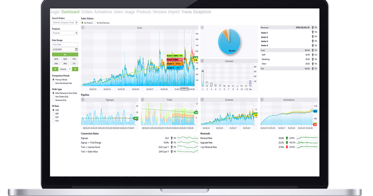
When reviewing our 2019 strategy we realised we needed to know more about our companies performance moving forward. For us, this was conversion rates, sales, pipelines, quotes, orders & renewals amongst other factors. We already collect this info as I’m sure you do, but being able to look at this data and see trends, notice growth or slowdown at a glance allows us to remain dynamic and pivot to our business need.
Our team is now building the application you can see above and we’re already seeing the trends we hoped we would.
In your own business would you like to know two or three months ahead of any suspected slow down or growth?
Us too.
By leveraging our existing data feeds we now track our pipeline giving us a 3 month notice period of slowdown or growth in one singular view based on signups, conversions, web traffic and other metrics. The same could be true on a range of applications from the race track through to the factory or crop field. With SciChart this can be tuned to your business or projects requirements and branded how you see fit.
How are we doing this?
Using SciChart, but more precisely we’re building this platform using data feeds from our accounting platform Xero, our In-House Customer Relationship Management System and our marketing platform Active Campaign alongside other data sources. We’re enriching this data and performing some custom calculations to get the info we need such as period-on-period analysis and using SciChart’s multiple axis chart type to combine data fields.
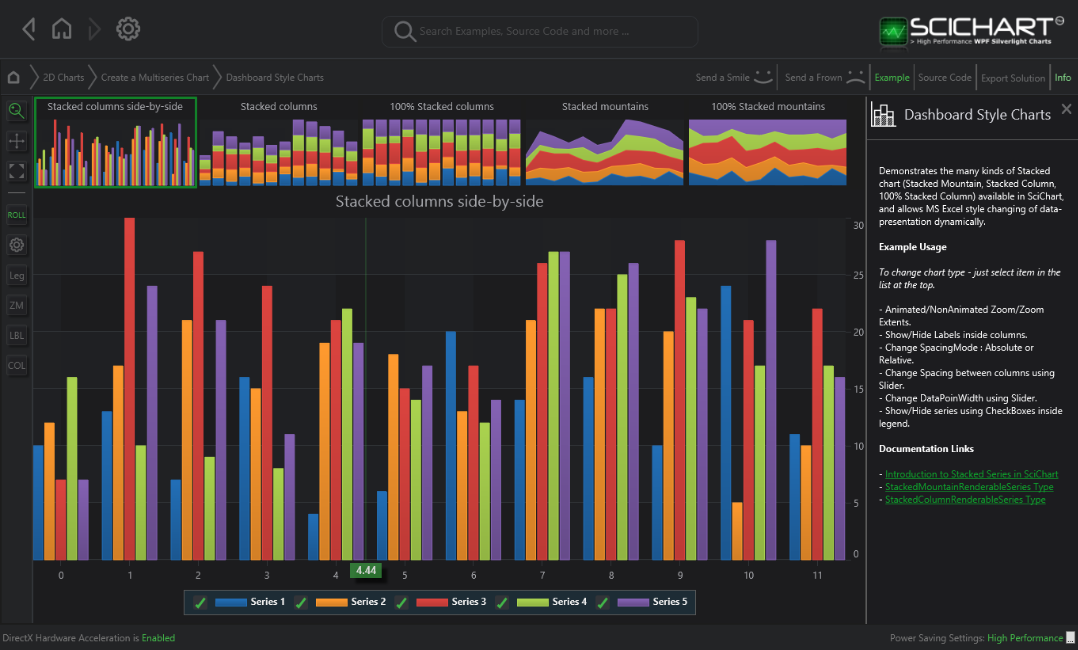
We’re also implementing a feature where a spark-line is converted into a full sized chart for simple analysis adding a low weight angle to the product and using Stacked Mountain charts to overlay information where needed.
All this will be done in SciChart WPF calling Azure Functions.
You’ll notice that we’re displaying multi chart views that are independently inspectable and receiving variant data as well as overlaying colour schemes, tooltips and annotations to really get into the data at a glance and make it as user friendly as possible.

How else can this be used?
If I said everywhere would you believe me?
Truth be told, that’s the case. A lot of my current customers in Automation roll out similar applications to the above dashboard for machinery, robotics and silo management. Embedded software is key across sectors and quick, functional, effective data visualisation makes more possible in less time. If you’re working on something that you think we can help with, feel free to get in touch and I’d be happy to make some recommendations.
Would you like us to do this for you?
I wouldn’t work in sales if I didn’t at least try this angle! SciChart sells our award winning SDK but we also carry out consultancy projects. These range from the large 6 figure + contracts all the way down to small projects in the single digit thousand range with a great deal of stuff in between. Where do we perform best? Everywhere SciChart does, we’ve previously handled extensive projects in Banking and Finance, F1 and MedTech to name a few as well as handling custom system creation and integration. We’re experts across a wide range of programming languages and as you’d expect, we can’t be beaten on our knowledge of SciChart.
Recent Blogs

