SciChart.js v5.2 and Financial Drawing Tools Released!
Continuing our rapid release cadence of new features every ~8 weeks, today we have an announcement to make. SciChart.js v5.2 […]
It’s been almost three years since we released SciChart iOS: Realtime Charts for the iOS Platform. Right from the start, our goal has been to create the worlds fastest iOS Charts, but also produce visually appealing, productive, easy to use and flexible / powerful iOS charting controls, capable of being used in demanding business apps.
Our first version of SciChart iOS beat the speed records of any previous known iOS Chart control and we have only worked to improve our chart performance since then. We realise though, that speed isn’t everything, and also have been focussing on flexibility so that we can provide a compelling offering vs. open source iOS Chart components.
However, if it’s iOS Chart Performance you are looking for, then you have come to the right place! With the recent release of SciChart iOS v2.5 with metal support, we have taken the opportunity to update present new performance results of our iOS Chart control: SciChart iOS, vs. a number of competing open source iOS charts and commercial charts, as well as demonstrate the performance differences in our iOS Charts between Metal & OpenGL rendering on a variety of devices.
In this article we compare the performance of the following chart controls:
A number of tests are carried out to really stress the chart controls, these are:
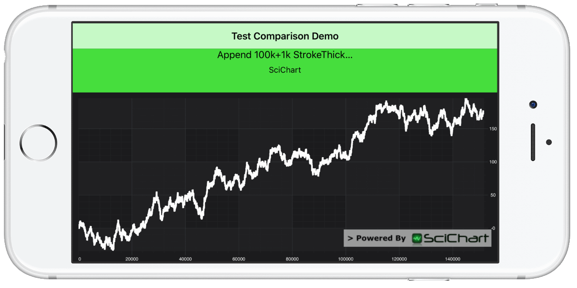
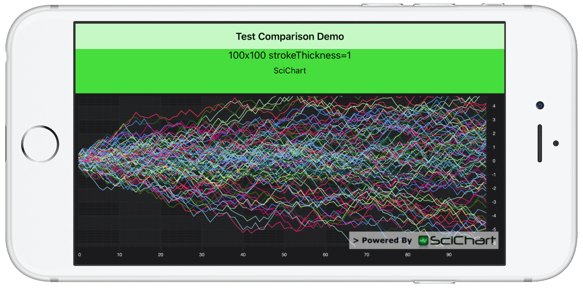 In this test, tens or hundreds of series, with tens or hundreds of points are added to the chart, then the chart redraws (the same data) as fast as possible by just resizing the Y-Axis for 10 seconds per test.
Performance is measured as FPS (Frames per second) using the CADisplayLink , which fires once after each drawing pass completes.
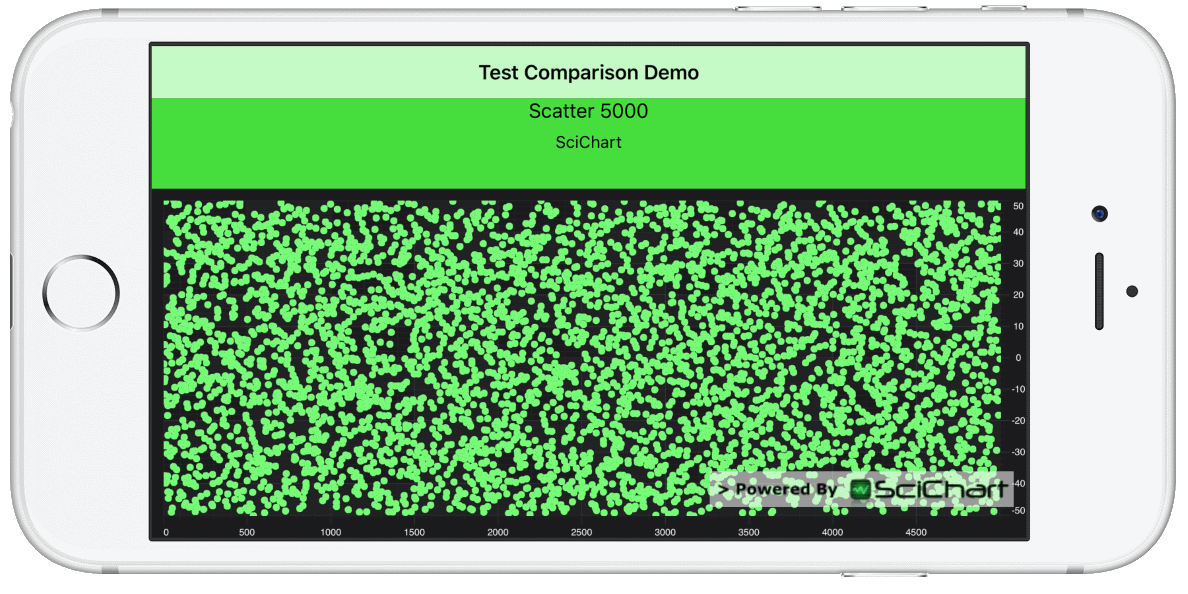 In this test, thousands or hundreds of thousands of Scatter points (ellipses) are appended to a series, then the chart redraws. Immediately after, the point positions are updated in a Brownian motion fashion and the chart is drawn again.
Performance is measured as FPS (Frames per second) and recorded.
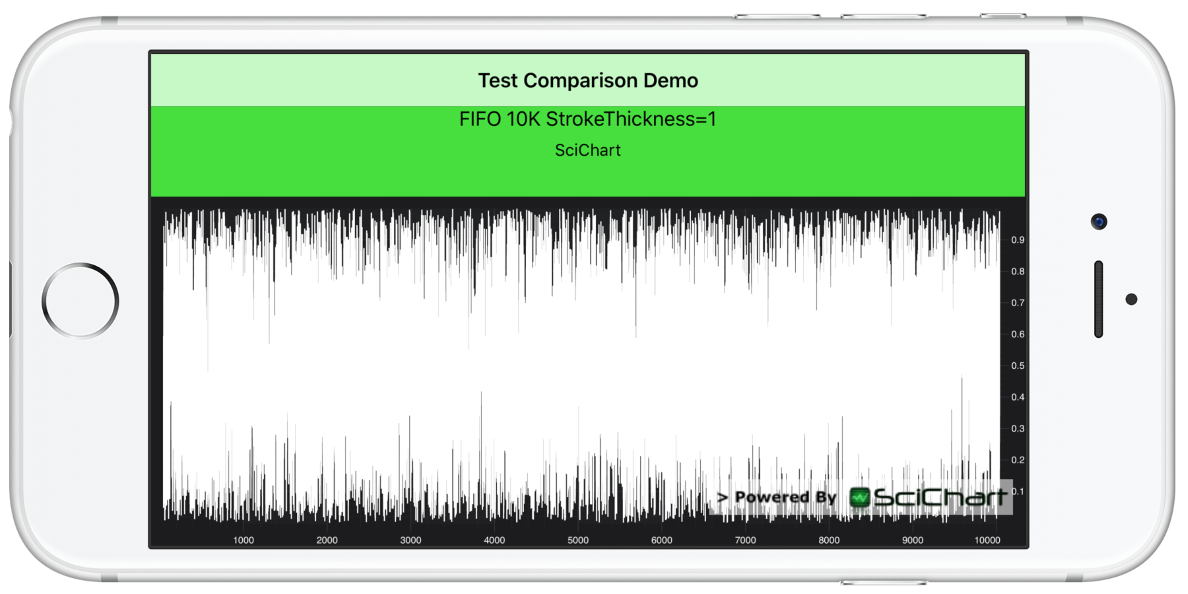 In this test, hundreds of thousands or even up to one million points are appended to a line chart, but scrolled from right to left (as new points arrive, old are discarded). SciChart for iOS & Android has a built-in mode to handle this called Fifo data series which use a circular buffer. Other chart components you can simply remove a point for each point added.
 Performance is measured as FPS (Frames per second) and recorded. In this test we start off with a line chart with thousands or even tens of thousands of points. We then add hundreds or thousands of points per second to the chart, so that the series gets bigger very fast. The data is random-walk and the chart automatically zooms to fit when data is updated. This gives the appearance of a live streaming realtime chart.
Performance is measured as FPS (Frames per second) and recorded.
For the Test Hardware, we’ve used three phones: an iPhone 5s, iPhone X, and iPhone XR. The results are interesting as they show the strengths and weaknesses of each phone when drawing realtime iOS Charts using both Metal and OpenGL.
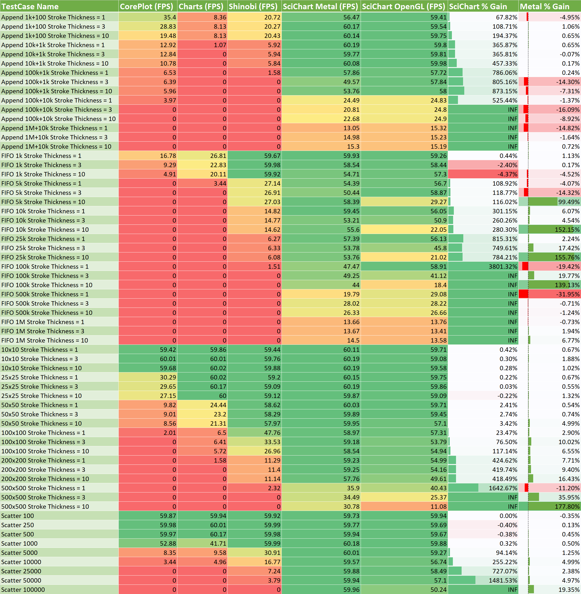
Below: All test result numbers are in FPS (Frames per second – Higher is Better), meaning, the average number of redraws per second during the test, as measured by CADisplayLink.
The Test Case Name column is understood as follows:
The Results Columns (Core Plot, Charts, Shinobi, SciChart Metal, SciChart OpenGL) are understood as follows:
Because many of the open source iOS charts we tested became unstable as dataset size increased, we skip running further tests once a chart has dropped below 5FPS. So a zero in a column means that test was skipped (the iOS Chart control was unable to render that data size).
Note that in the case where SciChart was able to run a test but other iOS Charts could not, the percentage gain was marked as INF (infinite).
The % Gain Columns are understood as follows:
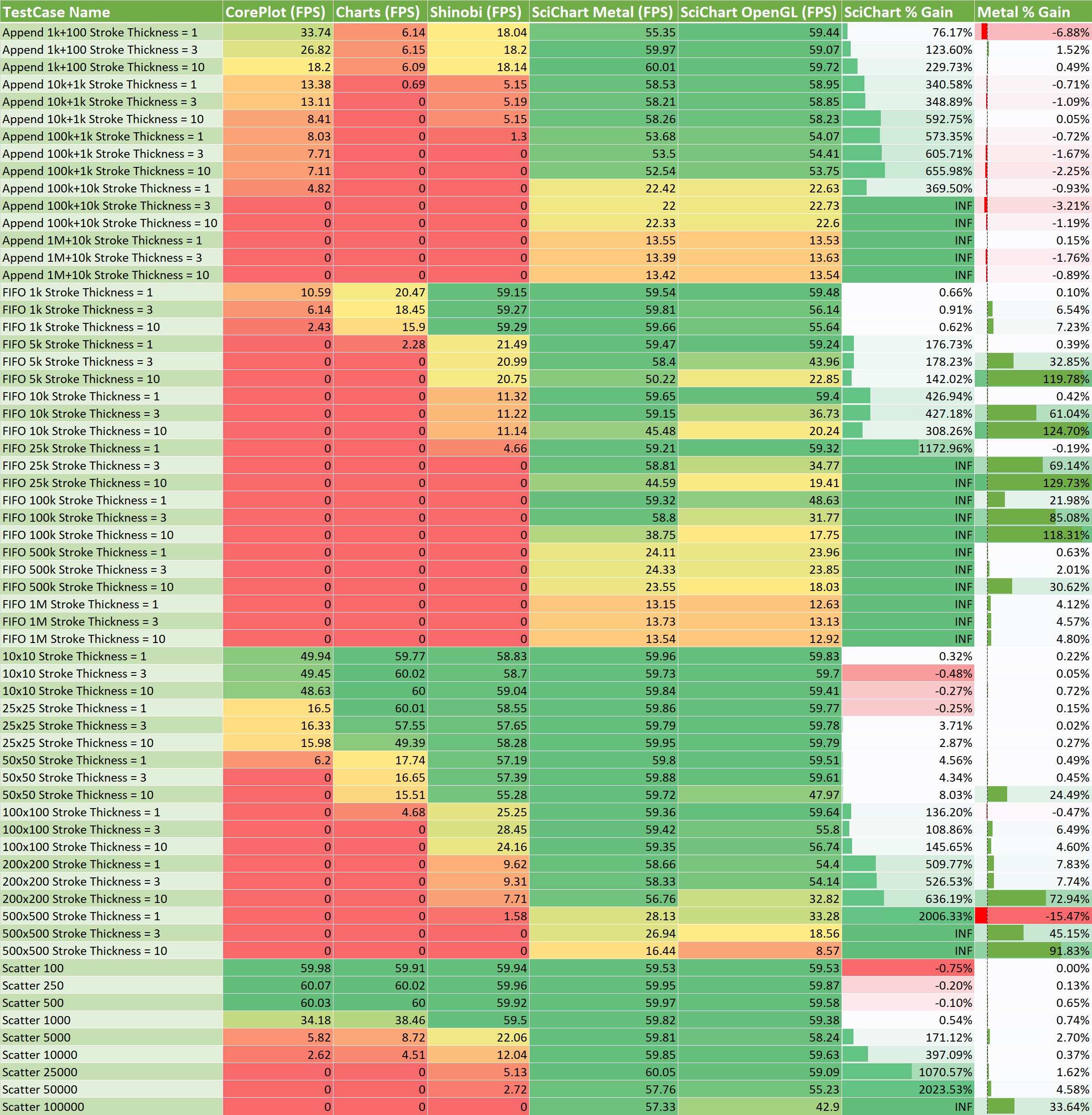 SciChart iOS Performance Comparison vs. Open Source Charts with Metal/OpenGL on iPhoneX.
The iPhoneX shows strong performance results for SciChart, where our Metal rendering plugin is able to draw big data and real-time updates at smooth frame rates.
On an iPhone X, SciChart’s iOS Chart can draw:
 SciChart iOS Chart Performance is 60FPS for 100k points, 200 series or 100,000 scatter points in real time on iPhone X
On an iPhone X, SciChart is considerably faster than competitors, with test cases up reporting up to 2,000% faster than the nearest competing iOS Chart component.
 SciChart iOS Chart Performance gain is up to 2000% faster than competitors on an iPhone X
Finally, SciChart’s Metal renderer plugin shows strong performance, with most cases comparable to SciChart’s OpenGL plugin. Some cases, a performance boost of over 100% is realised just by using the Metal renderer.
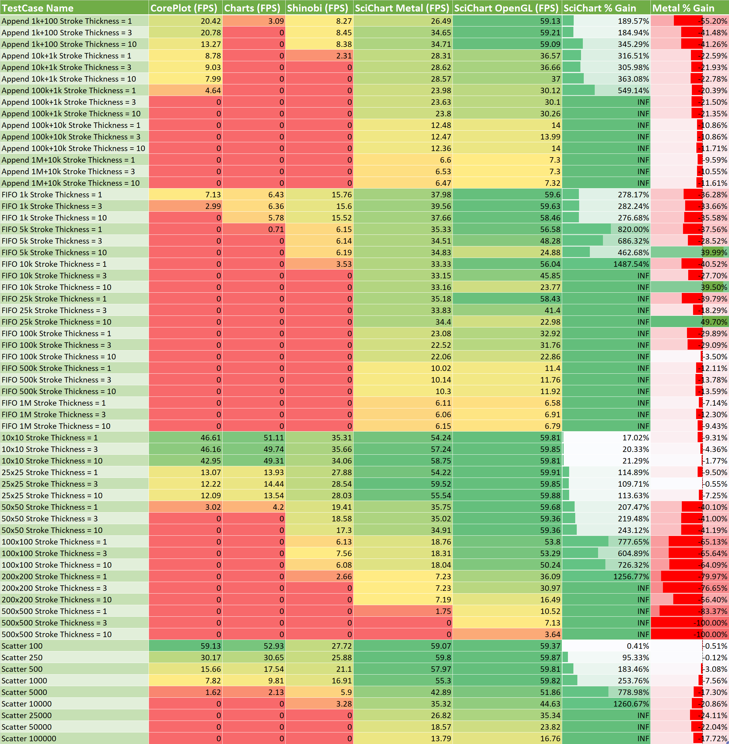
SciChart iOS Performance Comparison vs. Open Source Charts with Metal/OpenGL on iPhoneXS.
On the iPhone XS we have even stronger performance results. The iPhone XS is a really powerful device with a 6-core A12 Processor, vs a 6-Core A11 in the iPhone X. The iPhone XS also has a 4-core GPU vs. a 3-Core GPU in the iPhone X, and provides up to 50% faster graphics performance (source: Forbes – iPhone XS vs. iPhone X, What’s the Difference?).
This is reflected in the performance results. While some of the cases are comparable to the iPhone X, some are up to twice as fast. SciChart iOS is still able to draw hundreds of thousands of scatter points at 60 FPS, and now 500 series at 30 FPS, or a half a million points in a realtime scrolling chart at just under 30 FPS. Truly a big-data iOS Chart control. For the fastest test case SciChart iOS performs 3,800% faster than the nearest competitor.
 SciChart iOS Performance Comparison vs. Open Source Charts with Metal/OpenGL on iPhone5S.
We’ve included the iPhone 5s as a testing device in our set of tests as well. The iPhone 5s is the oldest iOS Device which supports iOS 12 and Apple’s Metal graphics API. Because the processor is older and graphics processor less powerful, it isn’t as fast as the newer devices.
You can see a table of the Apple processor benchmarks over at browser.geekbench.com/ios-benchmarks.
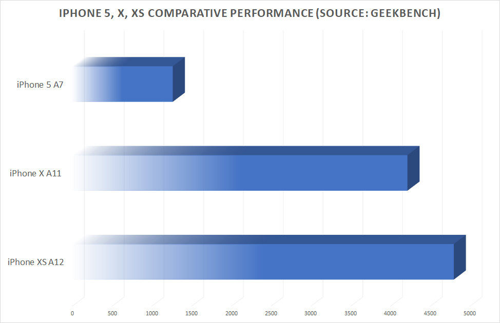
The iPhone 5s has a processing power approximately 1/4 of the iPhone X and XS, so it is not a surprise that SciChart iOS is performing slower on these devices. However, it is still outperforming competing iOS Charts by a long way.
You will also note that Metal performance on the iPhone 5s is slower than OpenGL, in some cases up significantly slower. This is because the A7 processor in the iPhone 5s has less powerful GPU features than newer devices. It is therefore advisable to detect operating system and device before applying the Metal rendering plugin in SciChart iOS. You can find out how in our iOS Chart Documentation.
It’s hard to draw much conclusion from these test results other than SciChart’s iOS Chart Control is really, really fast!.
> SciChart iOS: Up to 3,800% faster than competing iOS Charts, able to draw millions of points in realtime
These kind of performance results may seem over the top however consider that mobile computing is really starting to grow as a platform not just to surf the web and use simple apps, but actually create real big-data utility applications for scientists, engineers, medical professionals and businessmen.
Datasets are only getting larger, and the performance demands of applications are growing. With SciChart’s iOS Charts you can add visually appealing, animated line, column, scatter, bubble charts to your iOS application, or, create new kinds of apps that enable you to visualise massive amounts of data. Never before has this second case been possible for developers of iOS Applications.
If you wish to verify the performance test results, we are happy to share a copy of our iOS Chart Performance Comparison app on request.
SciChart provides powerful, flexible, high-performance realtime iOS Charts, Android Charts and WPF Chart controls to thousands of users in 80 countries. Our customers have use SciChart to create completely novel iOS apps such as capturing and displaying large volumes of heart-rate data during physical training sessions, for realtime visualisation of cardiovascular data for medical diagnostics, visualising telemetry and more. Without SciChart’s High Performance iOS & Android charts, these kind of apps would simply not be possible.
Far from just a fast 2D line or scatter chart, our iOS, Android & Windows (WPF) Charts are powerful, flexible, fully-featured chart controls and provide a compelling alternative to open source and commercial chart libraries. You can find out more about SciChart in the articles Comparison of SciChart vs. Open Source Chart Controls, and Why SciChart, the Best WPF Charts.
For more information about how some of our customers have used SciChart iOS, please see our case studies. We have included some below, and the full set is available at online. If you have any questions, or wish to get in touch to discuss what SciChart can do for you, then please contact us.

Avicena is a medical device company focused on providing critical information to patients and physicians through their mobile app. Bespoke proprietary sensors stream cardiovascular data directly to a mobile device via Bluetooth to aid in diagnosis. Avicena chose SciChart as a reliable iOS charting solution to display Realtime, High-Bandwidth Cardiovascular data in up to 90 series streamed from sensors whilst maintaining a smooth UI and allowing for bespoke customizations and annotations.

Ihealth needed to display 70,000 points of Realtime Cardiac data for their revolutionary health and fitness app.
Custom iOS Charts were integrated alongside their existing styling adding great features and maintaining a smooth UI.
Keen to know more? Click below and find out what SciChart did to get this project off the ground!

IMT AG’s custom hardware project, the Citrex H5 had a range of hardware and cost requirements. SciChart was able to work with these and get IMT’s Android powered Gas Flow Analyzer off the ground with custom features and a slick high-performance interface despite the limitations of low-cost embedded hardware.
Read on to learn more and have a look through our full case study.
Related Posts
![]()
Queens Award for Innovation
Proud winners of the Queens Award for Innovation, 2019. Awarded on account of our innovative graphics engine which underpins the SciChart library and enables our world-beating charting performance
![]()
National Business Awards
Highly Commended for Lloyds National Business Awards, 2019. Awarded on account of our innovative graphics engine and impressive customer base
![]()
National Technology Awards
Awarded “Healthcare Tech of the Year” at the 2025 National Technology Awards – a top UK recognition for breakthrough innovation in technology.

Reviews
SciChart has received hundreds of verified, 3rd party reviews