SciChart.js v5.2 and Financial Drawing Tools Released!
Continuing our rapid release cadence of new features every ~8 weeks, today we have an announcement to make. SciChart.js v5.2 […]
Updated results for our iOS Chart Performance Comparison can be seen at the page iOS Chart Performance: Metal vs. OpenGL.
In this post, we compare the performance of iOS Charting Libraries including open source iOS chart libraries as well as paid charts. Our goal is to demonstrate the performance comparison between well known iOS Chart libraries, and if you are looking for a feature comparison vs. open source charts, then please look no further than this article.
In this article we compare the performance and big data capabilities of four of the main iOS Chart libraries. These are:
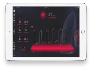
Big-Data means tens of thousands to millions of points in a chart or graph. People are starting to create quite innovative apps which read data from heart-rate sensors, or plot signals from many sensors or bluetooth devices simultaneously, or even just plot lots of recordings from GPS data (running, cycling apps). As they push the envelope of what the iPhone / iPad devices can do, charts or graphs fast become a bottleneck.
Real-Time iOS charts are charts which are dynamically updating. Another term for this is ‘Streaming iOS charts’.
Realtime iOS Charts are required when data is being downloaded continuously from the web, or continuously pushed from bluetooth or wire-connected sensors.
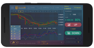
In modern iOS apps it is becoming increasingly common to see realtime charts, apps such as heart rate monitors, health & fitness apps, trading apps and server or process monitoring apps. We compare the realtime performance of several iOS Chart libraries to show you which perform the best with streaming updates.
To carry out performance tests we’ve built a iOS Chart comparison application in Objective-C. This application performs a number of identical tests on the four chart providers: Core Plot, iOS Charts, Shinobi and SciChart and outputs the results to a CSV file.
Results include refresh rate (FPS – Frames per Second) as well as CPU Usage and Startup Time for each iOS Chart test case. The tests are designed to really stress the chart control and find it’s limits.
There are four different test cases run in our iOS Charts Performance Comparison app, under different conditions. They are designed to really really stress the chart, by having huge numbers of series, or points, or many updates per second, with varying thickness of pens / number of pixels filled.
A certain test is run, and FPS, or refresh rate, is measured via the CADisplayLink, which fires once after each drawing pass completes.
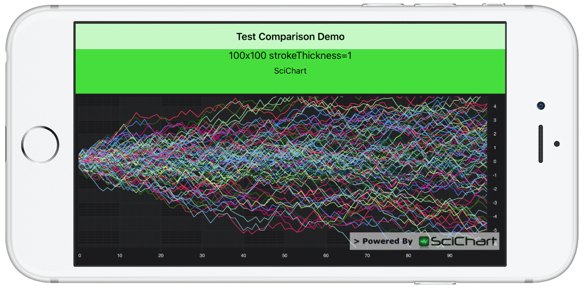 In this test, N series of M points are appended to series, then the chart redraws (the same data) as fast as possible by just resizing the Y-Axis for 10 seconds per test.
FPS is measured using the CADisplayLink , which fires once after each drawing pass completes.
Areas Stressed: Big-Data, many (hundreds of) series, many points per series.
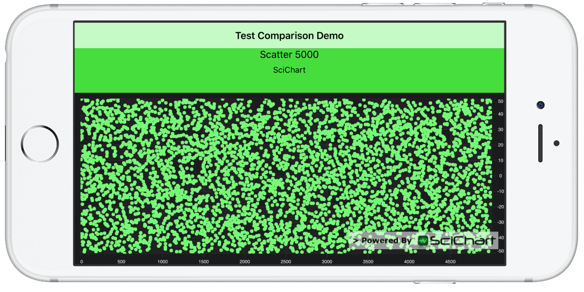 In this test, N Scatter points (ellipses) are appended to a series, then the chart redraws. Immediately after, the points are updated in a Brownian motion fashion and the chart is drawn again.
FPS is measured using the CADisplayLink , which fires once after each drawing pass completes.
Areas Stressed: Big-Data, updating scatter charts
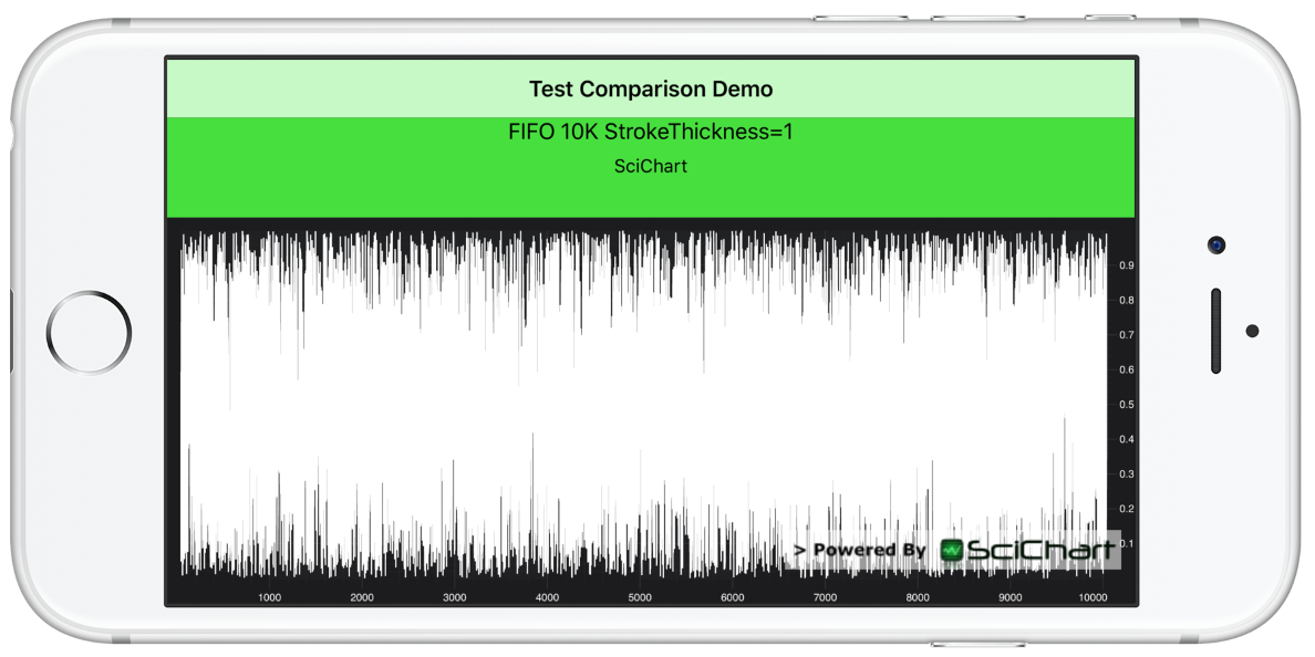 In this test N points are appended to a series, but scrolled from right to left (as new points arrive, old are discarded). SciChart for iOS & Android has a built-in mode to handle this called Fifo data series which is implemented as a circular buffer. Other chart components you simply remove a point for each point added.
FPS is measured using the CADisplayLink , which fires once after each drawing pass completes.
Areas Stressed: Streaming, scrolling charts. Big-data.
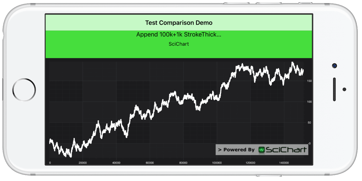 In this test N points are appended to a series, then M points are appended between each draw of the chart. The data is random-walk and the chart automatically zooms to fit when data is updated. This gives the appearance of a live streaming realtime chart.
FPS is measured using the CADisplayLink , which fires once after each drawing pass completes.
Areas stressed: Streaming, Realtime Charts. Big-Data.
We’ve used SciChart iOS v2.0 for this purpose and compared it with the latest version of other iOS Charts on a number of devices. Test results are presented with the iPad 2017 (A9 processor, iOS 10).
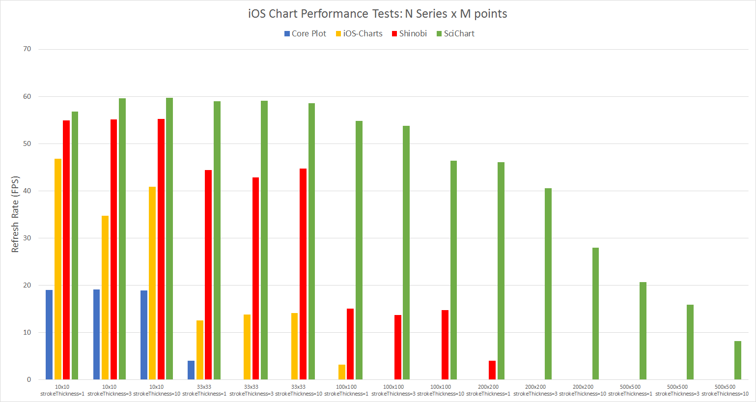
You can find the test results of our iOS Chart Performance Comparison below. All test result numbers are in FPS (Frames per second – Higher is Better), meaning, the average number of redraws per second during the test, as measured by CADisplayLink.
Because many of the charts we tested became unstable as dataset size increased, we skip running further tests once a chart has dropped below 5FPS. That’s why you see lots of zeros below. It means that this test has been skipped to avoid crashing or failing to run.
The final column (SciChart Speedup) is the speed increase of SciChart iOS vs. the other iOS Charting Packages, e.g. 11.52 means SciChart was 11.52x faster than the closest competitor for this test run.
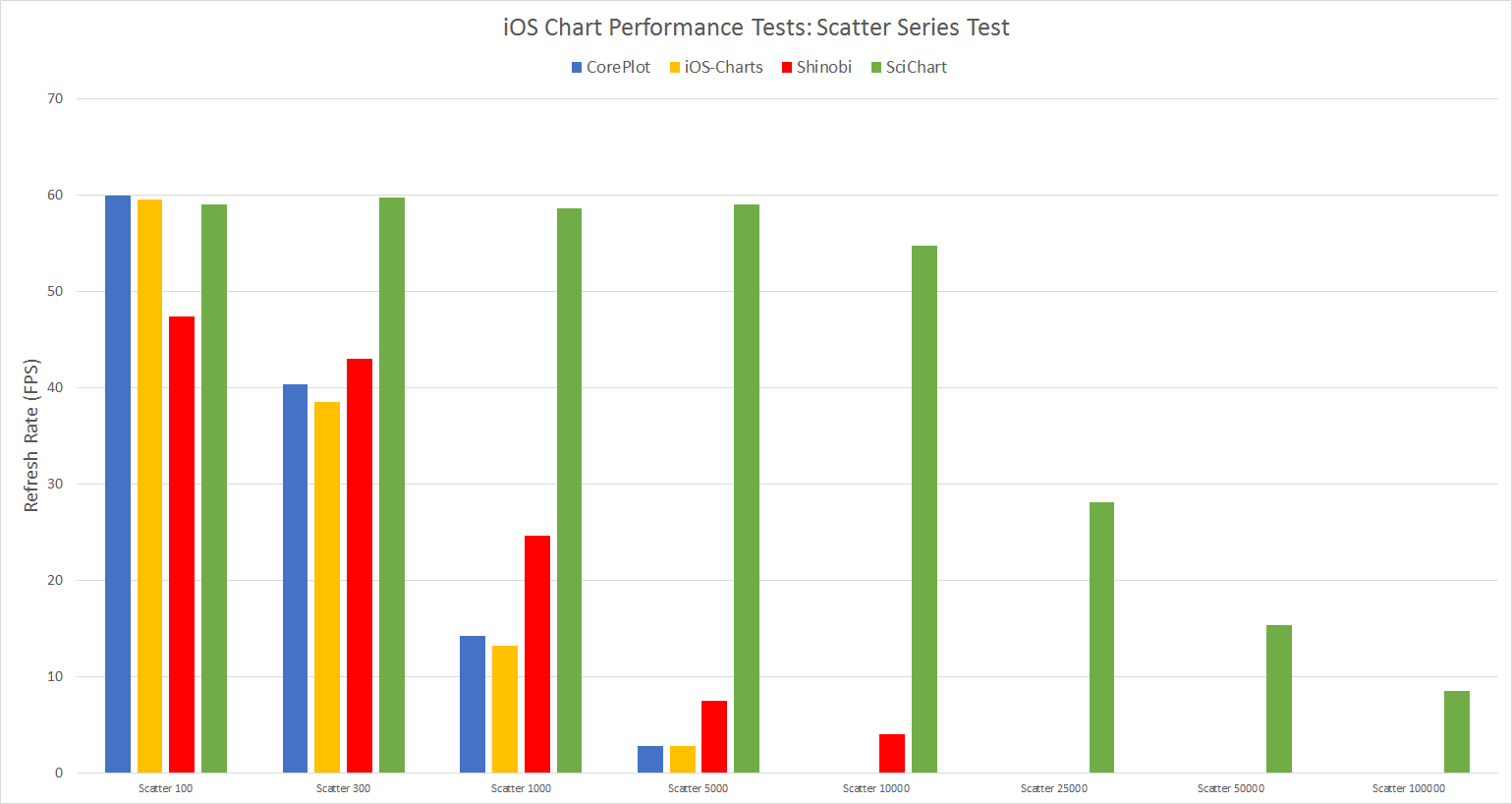
") iOS Chart Performance Test Results (FPS, Higher is Better). In these tests SciChart is put head to head vs. CorePlot, iOS-Charts and Shinobi. In all tests, SciChart outperformed all competitors. In one test, SciChart was able to perform up to 18.54x faster than the closest competitor.
iOS Chart Performance Test Results (FPS, Higher is Better). In these tests SciChart is put head to head vs. CorePlot, iOS-Charts and Shinobi. In all tests, SciChart outperformed all competitors. In one test, SciChart was able to perform up to 18.54x faster than the closest competitor.
What iOS charting performance comparison would be complete without the results in chart form?
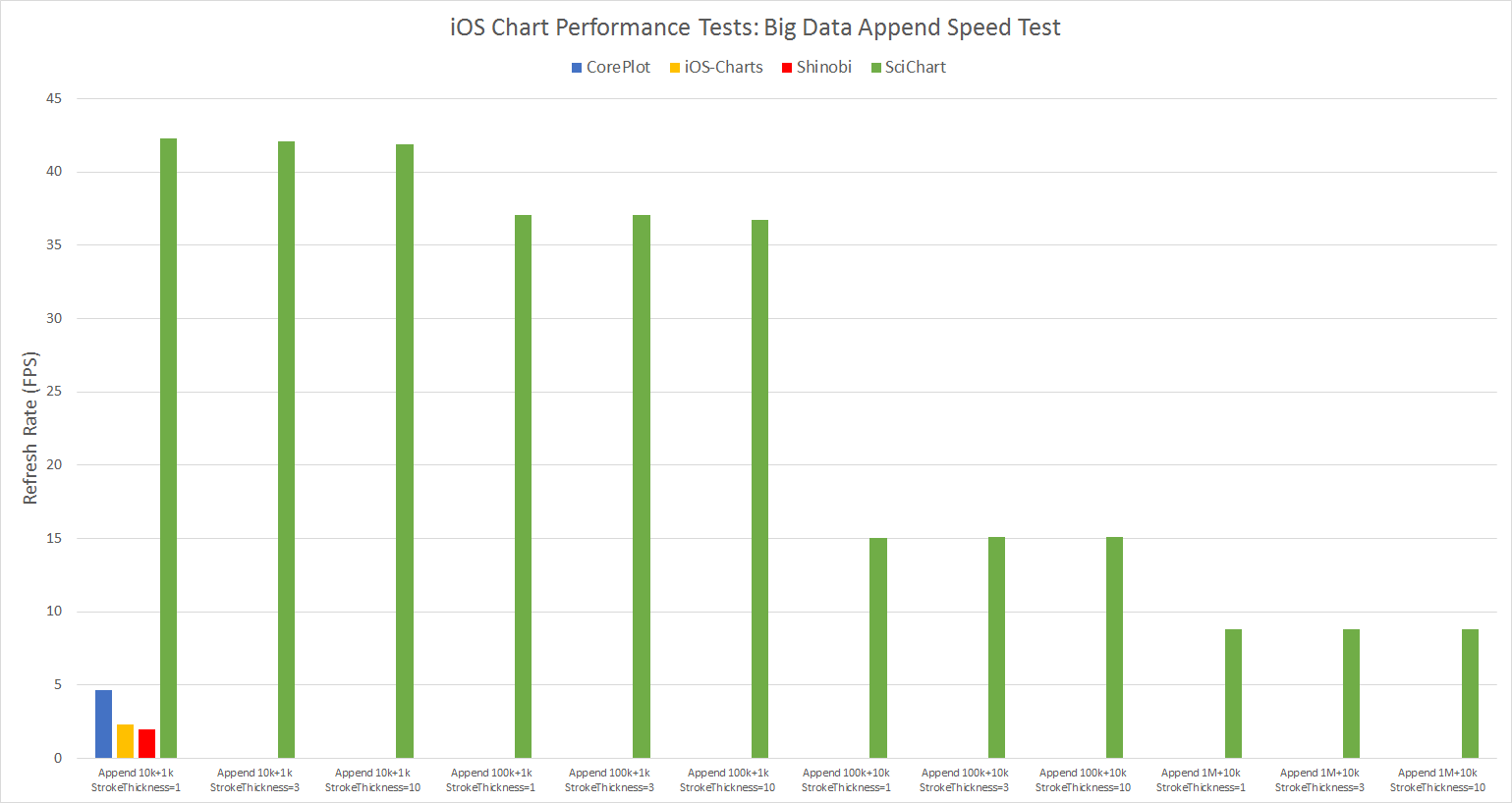
You can find the test results plotted below:
In this test SciChart is green and the results are FPS (Higher is better).
SciChart iOS is Green, results are FPS (Refresh rate) so higher is better.
SciChart iOS is Green, results are FPS (Refresh rate) so higher is better.
SciChart iOS is green, results are FPS (Refresh rate) so higher is better.

SciChart suffers a bit with wider strokes. We noticed that from 1 stroke thickness to 10 stroke thickness there’s an approximate 50% performance drop. It’s still capable of drawing huge datasets though in excess of other charts.
According to the Performance Comparison Results, Most iOS Chart libraries are unsuitable for real-time updates on the chart. Most perform poorly once the amount of data reaches a few thousand points.
4th: Core plot performance
Core plot was unable to compete most performance tests. For the line series tests, only showing 10 series with 10 points per series caused Core-plot to stutter, averaging under 20 FPS. For the scatter chart tests Core plot will display a few hundred data-points comfortably but not more. Core plot was not able to handle 1,000 data-points streaming without significant slowdown.
3rd: iOS Charts Performance
Charts came third in our tests, performing well for streaming (scrolling) 1,000 points on a line chart, but poorly in almost every other test. We observed that Charts would display a few thousand points in a static chart but as soon as you change the axis range, zoom or update data, it would stall and did not perform well. In some cases the chart would flicker or go completely blank while updating.
2nd: Shinobi Charts
Shinobi iOS Charts performed better in performance tests, however still struggled under the following conditions:
1st: SciChart iOS Charts
SciChart is the clear winner in the performance tests. Test results showed SciChart outperforming competitors with refresh rates up to 10-20x faster(1), and able to show up to 200x more data(2).
Conclusion: SciChart is the Fastest chart available for iOS Apps which require big-data, or streaming, realtime updates.
A version of the test-application is available on request, if you would like to contact us. If you are one of the authors of chart components mentioned in this article and wish to verify the results or submit a modification to optimize your code, please feel free. We would also welcome submissions from other chart vendors and authors.
Finally let us know what you think in the comments! If there’s anything else you want us to test, please ask!
Best regards,
Yaroslav,
SciChart Team
Related Posts
![]()
Queens Award for Innovation
Proud winners of the Queens Award for Innovation, 2019. Awarded on account of our innovative graphics engine which underpins the SciChart library and enables our world-beating charting performance
![]()
National Business Awards
Highly Commended for Lloyds National Business Awards, 2019. Awarded on account of our innovative graphics engine and impressive customer base
![]()
National Technology Awards
Awarded “Healthcare Tech of the Year” at the 2025 National Technology Awards – a top UK recognition for breakthrough innovation in technology.

Reviews
SciChart has received hundreds of verified, 3rd party reviews