SciChart vs Plotly: Which Software Is Right for You?
Did you know that SciChart offers a powerful, high-performance charting solution with far more features and flexibility than other libraries, such as Plotly?
How Does SciChart Differ to Plotly?
Book a free, no obligation software demo today or start a free trial and discover how SciChart can transform your projects!
Book a SciChart Demo Get Started for Free
![]()
Trusted By Global Brands


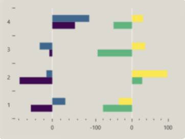
Real-Time Chart Speed

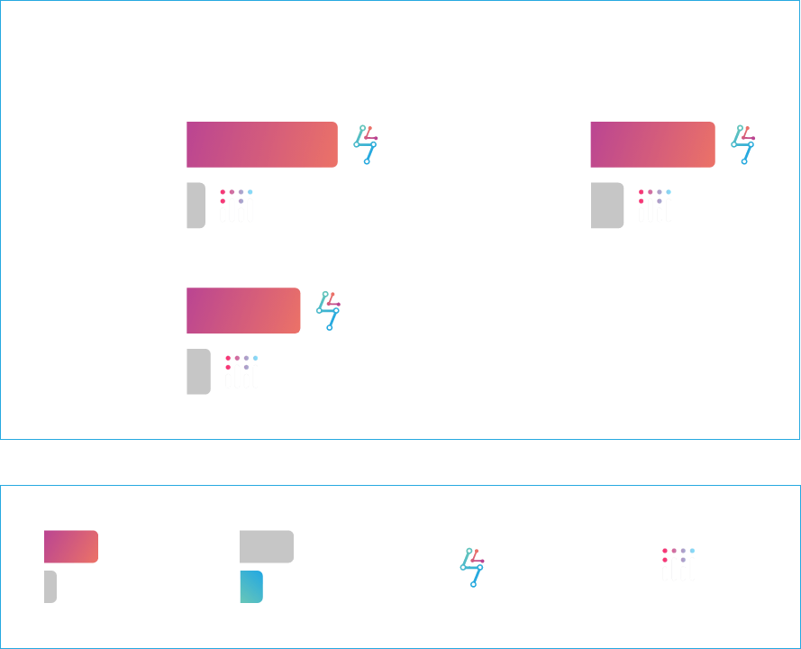
Up to 100x Faster Chart Rendering Than Plotly
Carrying out performance comparison tests using the WebGL accelerated plugins for Plotly.js, we found that SciChart excelled on real-time chart rendering, time and again:
- 100x faster for scrolling in real-time.
- 23x faster at appending and autofitting data.
- 30x faster for randomised, unsorted data.
Plotly also starts to slow down after 10k points when adding overlays, tooltips and annotations – meanwhile, SciChart powers through.
For big-data workloads where performance defines success, there’s simply no alternative
SciChart vs Plolty Chart Speed Stats
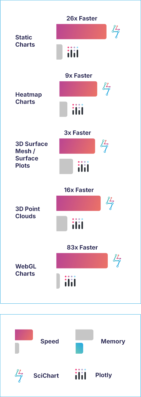

Faster Rendering for Mission-Critical & Big-Data Charts
SciChart doesn’t just render fast at real-time, it keeps on performing at reliable speeds under load.
- 26x faster rendering of datasets on large static charts.
- 9x faster at rendering 1000×1000 heatmaps.
- 16x faster at rendering 3D point clouds.
- 3x faster at rendering 3D surface mesh plots.
- 83x faster 100+ WebGL Charts.
For multi-charts, SciChart can handle over 100 WebGL charts in the same page. Meanwhile, Plotly.js is limited to 8 before WebGL context is lost.
SciChart vs Plolty Memory Use Stats
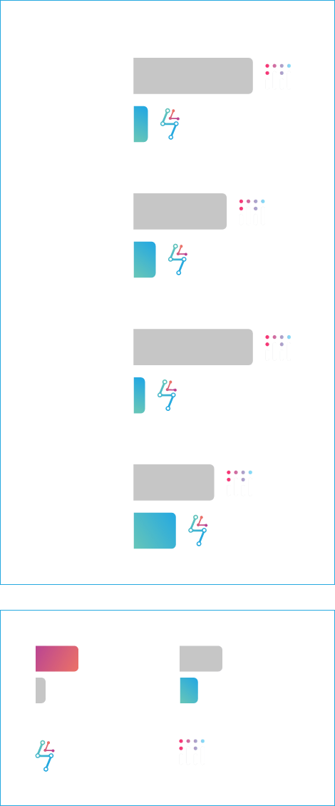

Up to 80% Less Memory Use Than Plotly
SciChart provides up to 80% less memory use than Plotly thanks to our memory-efficiency data structure, including the Float64 array and FIFO mode.
See how much memory you could save compared to using Plotly:
- 79% less memory for static charts.
- Up to 40% less memory for heatmaps.
- 80% less memory for 3D point clouds.
- 35% less memory for 3D surface mesh/ surface plots.
Less memory for big data visualizations means better performance, greater stability and more room for scalability
Real-Time Chart Memory Use


Give Your Real-Time Charts a Boost With Less Memory
To give your real-time charts the best chance of performing under stress, we give developers the tools they need to reduce the memory load.
This means you can confidently achieve up to:
- 70% less memory for scrolling real-time charts.
- 35% less memory for randomised, unsorted data.
It’s also worth comparing the bundle sizes. SciChart’s bundle size is around half the size of Plotly’s – 2.3MB and 4.7MB respectively. That goes hand in hand with improving your dashboard performance and load speed.
How Does SciChart Differ to Plotly?
When choosing a charting library for .NET applications, developers often face a decision between simplicity and performance. Plotly and SciChart are two popular options, each catering to different needs.
![]()
What Does SciChart Have to Offer?
With over 70 2D and 3D chart types, SciChart lets is built for ambitious data-visualization projects that require huge real-time data sets at scale with consistent performance. SciChart is a commercial product with enterprise-level support, which is crucial for companies that need guaranteed performance, maintenance, and long-term reliability.
- High-performance 2D & 3D charting.
- Deep zoom and pan capabilities.
- Hardware-accelerated graphics (GPU support).
- Rich interactivity (tooltips, annotations, zooming, etc.).
- Supports multiple platforms, including WPF, IOS, Android, macOS, and JavaScript.
- Built for scale with the ability to run dashboards with hundreds of live-updating charts and components.
- 64-bit precision for reliable scientific-level plotting and numeric stability.
- Optimized for real-time, high-frequency, and large-volume data visualization—something Plotly can struggle with.
- Built for sectors that demand advanced visuals (e.g., ECG waveforms and trading charts).
- Hundreds of documentation, demos and examples, all backed up with 5-star human technical support and instant AI assistance.
Plotly
What Does Plotly Have to Offer?
Plotly.js is a free, open-source JavaScript library for interactive charts, built on D3.js and stack.gl. It offers a wide range of chart types, simplifies complex data visualizations, and integrates with statistical software, making it suitable for data science.
- Supports many 2D and 3D chart types (line, scatter, bar, heatmap, contour, etc.).
- Built-in interactivity such as zooming and panning.
- Permissive MIT License 3D chart support.
- WebGL support for a maximum of 8 charts per webpage – performance problems occur with big datasets.
- Subplots support or plots within plots.
- Suitable for data-science, with Python, Matlab, Julia and R modules built on top of plotly.js.
- Open-source MIT-licensed project maintained by an active community.
See the Differences Between the Features & Visualizations with Side-By-Side Comparisons
Which Charting Software Option Should You Choose?
If you’re building a high-performance, data-intensive, or commercial-grade app, SciChart is the easy winner with the range of features, visualization options and data-handling it offers.
Plotly’s open-source libraries may work for simple, budget-conscious projects, but they fall short when it comes to the scale and reliability demanded in commercial, high-performance visualization.
How do the features of SciChart and Plotly compare?
The following table provides a detailed comparison of the key features of Plotly and SciChart to help you better understand the strengths and differences between the two libraries.
| Plotly | |
|---|---|---|
Product Features | What does SciChart Offer? | What does Plotly Offer? |
Licensing & Support | ||
Licence Type | Paid, commercial license. Free trial available. | Open-source (free) |
Performance | High-performance | Limited performance – becomes unresponsive with heavy loads |
Integrations | .NET, iOS, Android, JavaScript, third-party libraries. | JS, Python, R, Julia |
Real-time Data Support and Live Updates | Supports hundreds of real-time chart dashboards at 60 FPS | Limited – can struggle for real-time, high-frequency updates at scale |
Technical Support | 5-star-rated technical support alongside instant AI assistance | Technical support available |
Documentation & Community | Professional support, AI assistant, extensive documentation and examples. | Limited documentation support, including GitHub and forums. |
Dataset Size | Up to 10-100 million datapoints | Up to 10k datapoints (struggles with performance after 10k) |
FPS Achieved | Up to 60 FPS at scale | Renders at 35 FPS for 100 series with 100 points, but struggles at 500 series |
Dynamic LOD | | |
Charting Features | ||
2D & 3D Plots | 70 chart types | 40 chart types |
Active Forum Updates & Commits | Updates forum questions and issues daily | Updates forum questions and issues less often |
Animation of Data | Advanced animations | Basic animations |
Annotations on Chart | Advanced annotation options with no slow down on performance | Limited annotation options for high-performance big-data sets |
Custom Series | Full extensibility | Limited custom series |
Custom Zoom or Pan Behaviors | Deep control on zoom/pan | Basic zoom/pan – May hit limitations if you need extreme zoom interactions |
Export / Print | | |
Fully Documented | | Limited |
Hardware Acceleration (GPU) | WebGL acceleration with unlimited scope | WebGL acceleration with limitations of 8 charts per page |
Link Multiple Charts | Supporting multiple chart syncing natively | Can achieve multiple chart syncing with workarounds |
Legend Customization | Deep legend styling | Basic legend styling |
Logarithmic Axis | Supports high-precision axes | May hit limitations with finely controlled numerical axes |
Multiple X-Axis & Y-Axis | Multiple X and Y axes can be aligned to the top, bottom, left, or right | Limited |
Per-Point Coloring | | |
Programmatically Change Viewport | | |
Theme or Template Customization | Advanced customization options that lets you configure anything | Customization is comparatively limited |
Tooltips | Unparalleled customization options for tooltips | Limitations on tooltips customizations |
Touch Interaction | Supports touch interactions out of the box | Does not have full native support for touch interactions |
Click the button below to view the remaining 23 rows or swipe left and right to see more information
View full tableBook a free, no obligation software demo or start a free trial today and discover how SciChart can transform your projects.
How Does the Data Visualization of SciChart and Plotly Compare?
Below is a visual comparison of various chart types created with SciChart and Plotly, highlighting the differences in rendering quality, performance and feature depth.
![]()
SciChart offers engaging, high performance data visualization for professional, mission-critical data projects and its high level of customization offers the flexibility to cover a wider range of applications to suit all industries.
SciChart ships with over 70 chart types including fully WebGL accelerated 3D charts, 2D cartesian charts, 2D polar charts, Radial Gauges and WebGL accelerated GeoJSON maps. WebGL context limits are bypassed by intelligent canvas sharing, allowing over 100 WebGL accelerated charts on the same page, allowing for large, performant dashboards.
Since each chart type is fully optimised in Scichart.js, you can be assured that for complex dashboards you will get the best possible performance, allowing your data visualisation application to run smoothly and fast, leaving more CPU resources available for the rest of the app.


Plotly
Plotly for Python is a free and open-source charting library. The library ships with 40 chart types including 3D Charts, statistical graphs and SVG maps. You can create charts Python, R, Julia, JavaScript, ggplot2, F#, MATLAB®, and Dash. While it’s a good charting platform, there are limitations when it comes to performance and customizations.
Some charts are WebGL accelerated while others use slower SVG rendering as a fallback.
When WebGL rendering is enabled, you are limited to 8 charts on a screen (Google Chrome WebGL context limit) and must include more modules, resulting in a larger bundle size (up to 4.7MB).


Fuel Your Charts With the Fastest Rendering Speed on the Market
SciChart is renowned for providing the fastest chart rendering speed in the world, making it a standout choice for applications requiring high-performance visualizations.
The library leverages advanced optimization techniques, including hardware acceleration (GPU), to render large datasets and complex charts with exceptional speed and smoothness.
This allows SciChart to handle real-time data streaming, deep zooming, and highly interactive charts without sacrificing performance, even with millions (or even billions) of data points.
Whether used for financial applications, scientific visualizations, or engineering analysis, SciChart ensures that users experience a responsive charting experience, even under the most demanding conditions.
“We wrestled with a free alternatives for several weeks; but after trying SciChart, we realized that we’d ultimately save money and ship our software faster.”Watson
Build the Most Complex Charts With Ease
High-level tech support (that contributes to a boost in productivity) includes SciChart-GPT, thousands of documentation, clean code samples, tutorials and a 5-star customer support desk for developers.
SciChart has 15 developers supporting it full time – ensuring the chart library is up to date, bugs are fixed and that new features are shipped quickly.
You won’t need to save much time for the license to pay for itself. If an API or library is easy to use and offers perfect code samples from the offset, it can lead to bigger cost savings. You can build your first chart in as little as two minutes, and feel confident that no matter how demanding your data visualization requirements, your chart library can handle the pressure!
Unlike Plotly, you really can build anything with SciChart thanks to the level of flexibility we offer.
Book a free, no obligation software demo or start a free trial today and discover how SciChart can transform your projects.
Don't Just Take our Word for It
With a rating of 4.8 SciChart has the highest rated chart libraries in the world*,
used by over 10,000 expert developers worldwide.
