Transform Big Data Analytics in Semiconductor Manufacturing
Trusted by leading semiconductor manufacturers, test platform providers and equipment suppliers, SciChart’s semiconductor big data visualizations deliver yield insights in real time.
With SciChart’s high-performance chart library, you can maintain continuous monitoring and decision-making visibility without interruption.
- SciChart delivers deterministic rendering, 24/7 operational stability, and proven performance on multi-million-die datasets.
- Wafer maps, SPC dashboards, and defect clustering at fab scale – interactive, precise, and real time.
- Compatible with JavaScript, WPF/.NET, and native environments, enabling seamless deployment within fab or test workflows.
- Deploy the same Visual Xccelerator Engine across browser, desktop, and mobile with cross-platform integration.
Trusted By Industry Leaders

Big Data Analytics in Semiconductor Manufacturing Starts with SciChart
For enterprise teams, SciChart ensures continuous KPI visibility and stable decision data across fabs. The result? This helps you maintain production continuity and compliance with yield management standards.

Built for Fab-Scale Performance
Do your charts stall when visualizing more than 100K points or 30–60 SPC tiles? It’s not uncommon for developers to encounter browser or DOM crashes when correlating wafer, metrology, and test data.
Losing visibility into defect-density trends, CPK statistics, and excursion patterns, impacts yield KPIs and fab decision-making.
With SciChart, you can achieve real-time rendering for fab-scale visualization, ensuring accessible yield and defect insights without latency or instability.

Where SciChart Powers Semiconductor Data Analysis
SciChart is the chart library of choice for semiconductor big data visualization and analysis for the following applications:
Inline Process Control: Real-time SPC streaming for wafer, etch, and deposition stages. Supports rule-based violation detection and trend visualization.
Defect Analytics: Visualize defect clustering, reticle pattern overlays, and density distribution across wafers or lots.
Test Data Correlation: Correlate wafer, metrology, and ATE test data for inline and final test analysis.
Yield Dashboards: Combine SPC and yield KPIs in multi-chart dashboards for engineers and managers.
Design and Emulation Test Suites: Used in advanced SoC and FPGA test platforms for real-time performance visualization and debug during device validation and system testing.
Semiconductor Big Data Case Studies
Proven in fabs, ATE portals, aerospace telemetry, and industrial systems, where reliability, determinism, and real-time performance are critical.
“SciChart eliminated dashboard stalls and gave our engineers real-time yield visibility we never thought possible.”
Ready to Level-Up Your Semiconductor Data Analysis?
Explore how SciChart improves yield visibility and reduces downtime in fab and test workflows by booking a consultation or getting a free trial.
Semiconductor Big Data Visualization Examples
Visualize multi-million point-die datasets, apply SPC rules, overlay metrology and defect data, and create hierarchical dashboards linking wafer to test to metrology – all made possible with SciChart’s easy-access examples and source code.
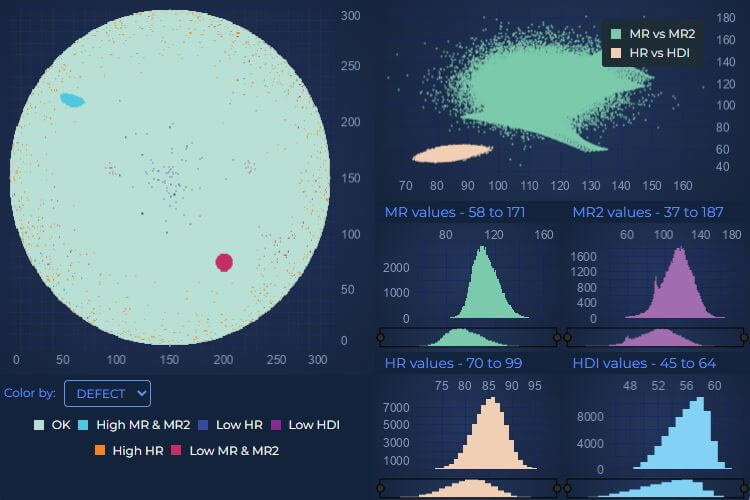
Wafer Analysis Example
Do your Wafer dashboards become unstable, with overlays, bin filtering and reticle zones? Do they collapse under data load?
With SciChart’s Wafer Map Explorer with SPC Grid, you can:
- Visualize 50 K+ dies per wafer
- Apply instant bin filtering
- Navigate from die-level to SPC time-series data
- View linked Paretos
- Zoom, pan, and filter in real time with no lag (even across 10 M+ die lots)
- Refresh 100+ SPC charts in under one second
View the demo to render millions of wafer data points directly in your browser and experience deterministic real-time performance.
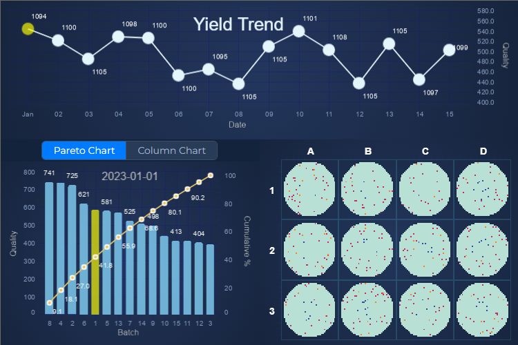
Semiconductor Big Data Dashboard Example
The semiconductor big data dashboard example includes the following chart types:
- Yield Trend Chart (Line Chart): Shows overall quality trends over time, identifying yield drops or anomalies.
- Batch Analysis (Pareto / Column Chart): Highlights which batches contribute most to defects.
- Wafer Maps (Grid of Sub-Charts): Circular maps show the spatial distribution of defects on each wafer.
This data combined helps engineers optimize production quality and reduce manufacturing defects.
What Features to Expect With SciChart?
With SciChart, you get unrivalled performance and extensive customizable charting features to push the boundaries of your semiconductor big data visualizations.

Chart Performance
- Visualize 100 M+ points per dataset
- Sustain 200 K points per second
- Refresh 64+ SPC charts in under one second
- Embeddable within MES, YMS, and ATE systems
- Available across JavaScript, WPF/.NET, and iOS/Android
- Direct integration into React, Angular, and Vue
- Continuous streaming
- Deterministic rendering
- Zero memory growth
- Continuous 24/7 operation
- GPU-accelerated
- WebAssembly-powered architecture
- Sub-second rendering and stability for long-duration fab operations
Extensive Charting Features
- Wafer maps
- Reticle overlays
- Inline SPC rule checks
- Defect clustering
- Recipe-step annotations
- 2D & 3D plotting
- Animation of data
- Annotations on chart
- Zoom & pan
- Link multiple charts
- Legend customization
- Logarithmic axis
- Multiple X & Y-Axis
- Per-point coloring
- Programmatically change viewport
- Theme or template customization
- Tooltips
- Touch interaction
5-Star Support for Developers
When you push the boundaries of charting you may need access to additional resources to help you to cross that boundary. That’s why we ensure you can always access the information and support you need – when you need it. If you are working in mission-critical environments where time is critical we can also talk to you about building a Developer Support package based around what you and your organization needs.
 Responsive 5-Star Technical Support
With our 5-star technical support subscription, we aim to answer all support tickets within one business day* and often even faster.
 Get Answers Fast with our AI Assistant
Ask our AI Assistant anything about SciChart and it will answer your questions fast!
 Knowlegable Support Forums
With nearly 4000 answered support requests on our public support forum, you’ll never be left without an answer.
 Extensive Documentation
1000s of pages of support documentation across all platforms for expert guidance on getting the most from SciChart.
 Tutorials & Videos
Our regularly updated YouTube channel will help you understand what’s possible and answers the most commonly asked questions.
 Hundreds of Example Charts
Over 350 chart examples will get you what you need to get out of the blocks more quickly.
Testimonials & Reviews
Award Winning Software – Continually Rated Best with Hundreds of 5-Star Reviews
With a rating of 4.8, SciChart is one of the highest rated chart libraries in the world*, used by over 10,000 expert developers worldwide.
Read All Reviews