SciChart.js v5.2 and Financial Drawing Tools Released!
Continuing our rapid release cadence of new features every ~8 weeks, today we have an announcement to make. SciChart.js v5.2 […]
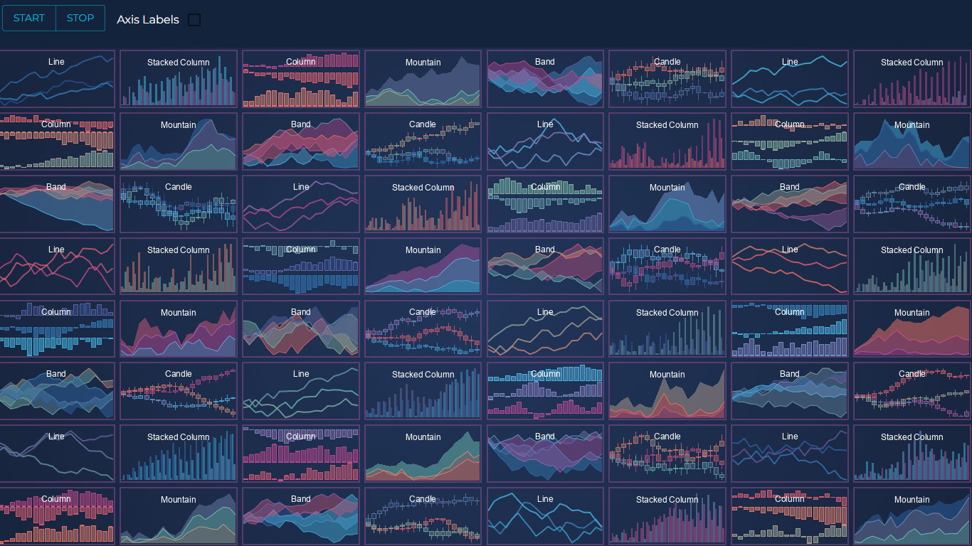
JavaScript charts enable digital application owners to tell stories with data.
Humans engage with and interpret visual information much more easily than written content. Spreadsheets and data reports aren’t always the most effective way to get your story across. If you want to get to the heart of a set of data, it’s important not to bore your audience with too much information and small print. JavaScript Charts and Graphs powered by SciChart.js can transform the way you present and engage with data.
You can make complex information more accessible and digestible. It works for a wide range of industry sectors, including health, finance, sport and more. In this guide, we’re looking at some of the best examples of JavaScript charts to help you visualise the possibilities.
With SciChart.js, the world’s fastest JavaScript chart library, you can create exceptional graphs with little effort. Customisable options ensure you can stay on brand and deliver a unique content experience that gives you the edge over the competition.
It’s just one of the many ways you can make your website more appealing for potential customers or clients. Showcase statistics and data in a professional way.
Real-time data is ideal for financial, stock and trading charts as well as medical and scientific applications. It’s an effective way to demonstrate your expertise and that you’re an authority on your subject.
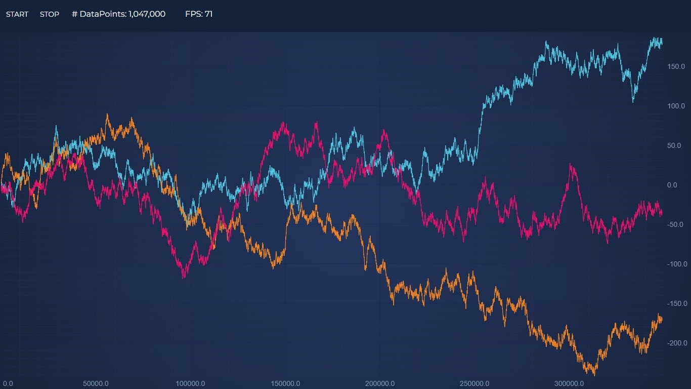
Discover the speed and power of SciChart.js in a real-time example. The Real-time JavaScript Chart Performance Demo creates a timer and pushes 300,000 points per second!
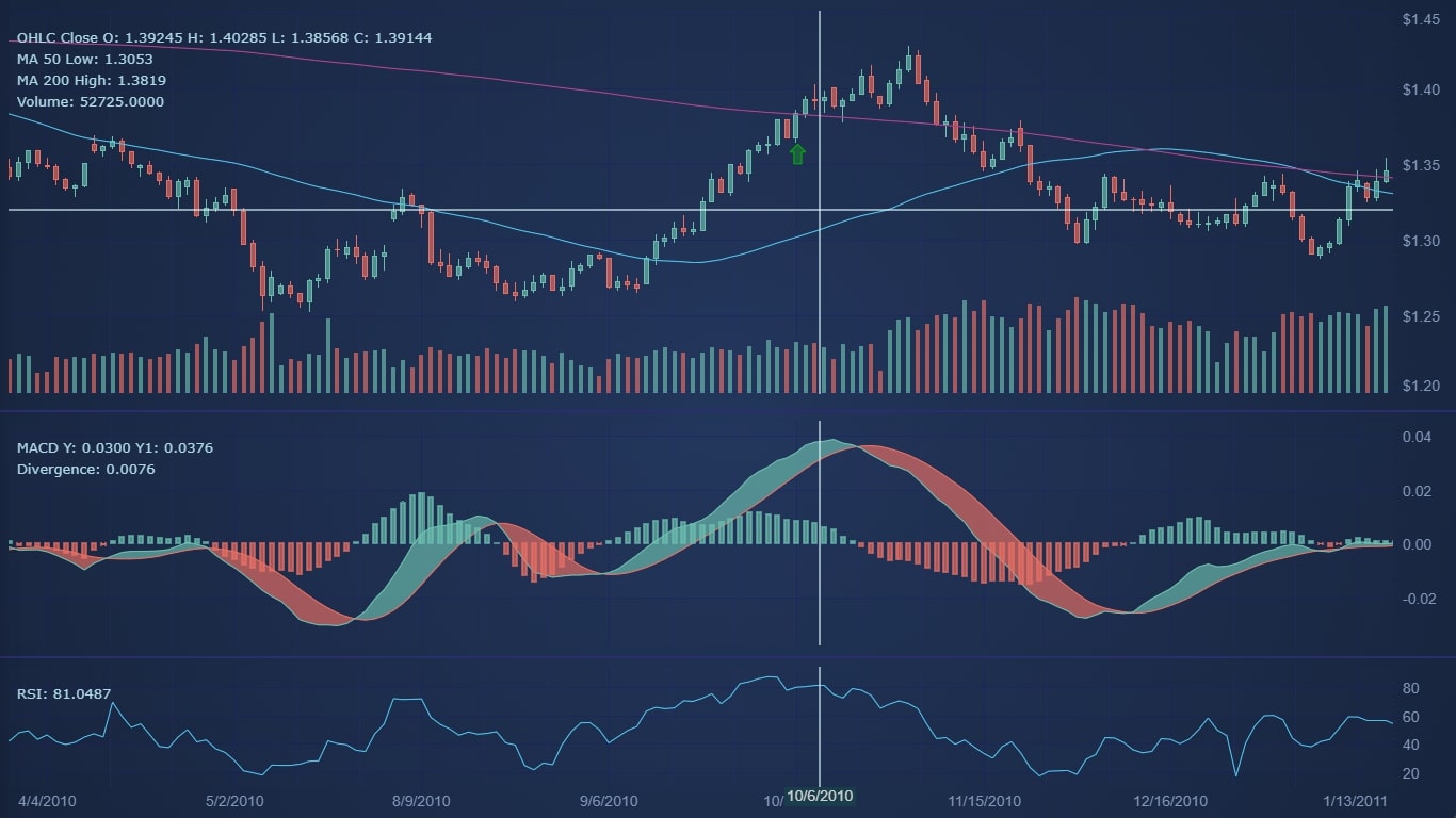
Create static multi-pane stock charts in JavaScript with price data as Candlesticks, Volume bars behind the chart and moving averages, plus link several charts together to draw Macd and RSI indicators. All charts can be synchronised together. We recommend using TA-Lib to add more complex indicators to SciChart.js.
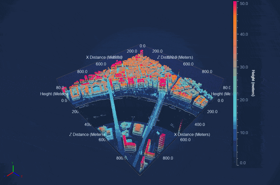
3D Point Cloud presents data points in a 3D space and is collected through sensors such as lidar. The sensors emit light and calculate the time it takes to be reflected back into the sensor to create each dot. They can be used to display geospatial data.
The example below demonstrates the capability of SciChart.js to create JavaScript 3D Point Cloud charts and visualize Lidar data from the UK Defra Survey.
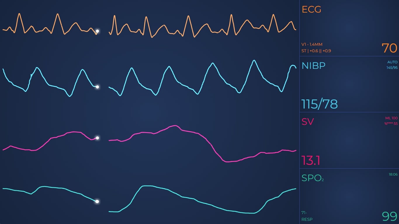
SciChart.js can help you short-cut your development by providing rich, real-time high performance and reliable charts for JavaScript medical and healthcare applications. Monitor heart rate, body temperature, blood pressure, pulse rate, SPO2 blood oxygen, volumetric flow and more with the Vital Signs JavaScript ECG/EKG chart.
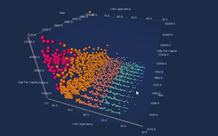
This 3D Bubble Chart supports up to a million points, enabling the visualisation of large statistical datasets. Bubbles can also be colored individually and tagged. Interactive elements enable users to zoom and tilt the graph.
The demo pcitured above plots Gapminder.org JSON data in three dimensions, comparing GDP per capita of countries vs. Life expectancy vs. Year. The size of the bubble and the colour are determined by the life-expectancy, showing how you can plot four or even five dimensions on a single chart by using X, Y, Z, Scale, Colour.
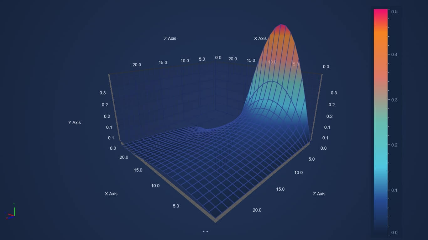
The Surface Mesh chart can be used to represent 2D data in a 3D map. It looks like a topographical map where values in a 2D array are drawn as heights and mapped to a color. The Surface Mesh 3D chart type in SciChart.js is highly dynamic and allows for large volumes of data to be plotted.
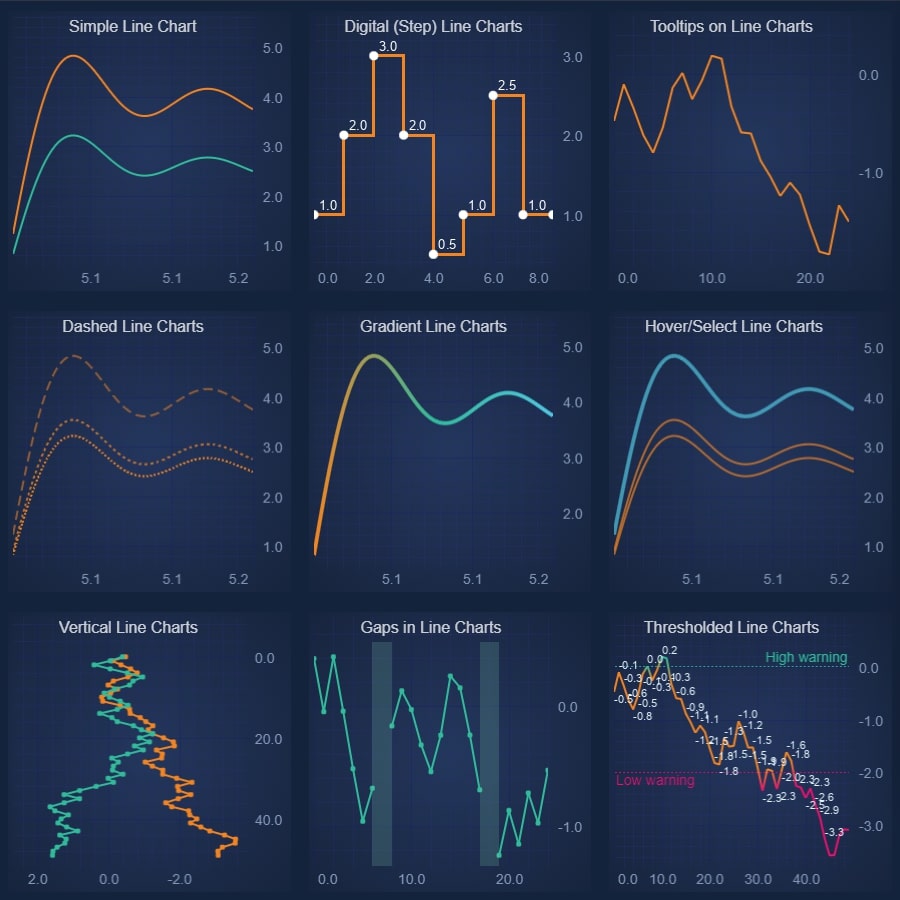
It’s not just complex 3D charts that can bring a new lease of life to your data visualizations. Variations in JavaScript Line Chart include a wide range of different line styles, such as simple lines, digital lines, tooltips, dashes, gaps, labels, hovering lines and more.
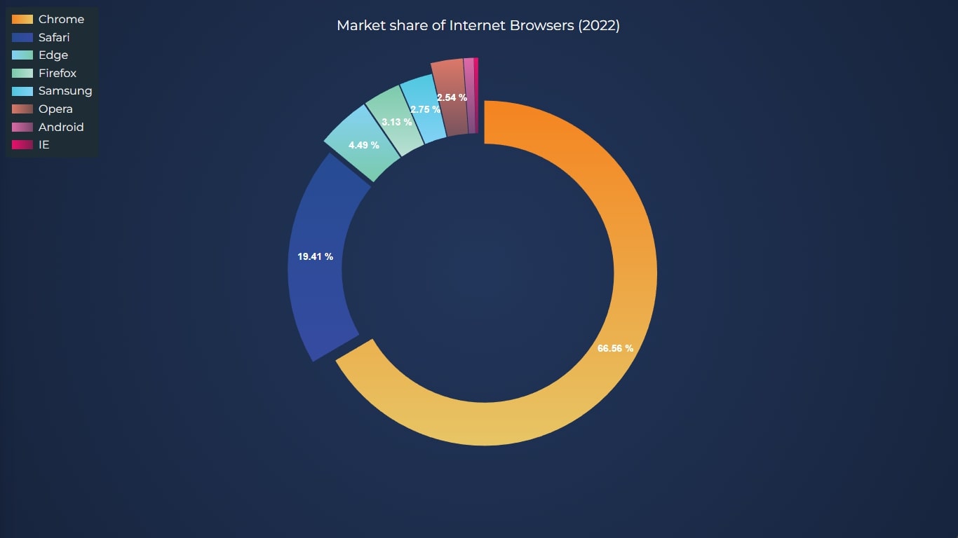
SciChart can help you make the Pie and Donut Chart a bit more exciting to look at. The visualization example above displays the market share of internet browsers in 2022.
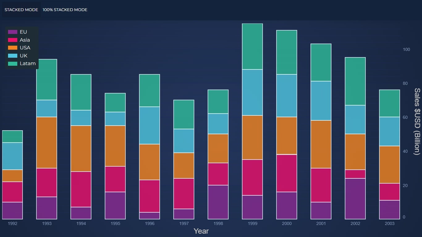
With SciChart, you can even make beautiful Column Charts. With just a click, you can switch between stacked column and 100% stacked.
SciChart.js is an award-winning graphics engine that enables you to plot millions of data-points in real time. It’s designed for innovative data presentation for updating financial, medical, scientific and big-data business applications. See our demos now.
Start using SciChart.js Today
SciChart.js is now available with a FREE community edition (no trial, sign-up or credit card required) where you can try out the library commercially or use it in a non-commercial application. If you have a question, or would like to give feedback, contact us.
Related Posts
![]()
Queens Award for Innovation
Proud winners of the Queens Award for Innovation, 2019. Awarded on account of our innovative graphics engine which underpins the SciChart library and enables our world-beating charting performance
![]()
National Business Awards
Highly Commended for Lloyds National Business Awards, 2019. Awarded on account of our innovative graphics engine and impressive customer base
![]()
National Technology Awards
Awarded “Healthcare Tech of the Year” at the 2025 National Technology Awards – a top UK recognition for breakthrough innovation in technology.

Reviews
SciChart has received hundreds of verified, 3rd party reviews