Hi,
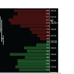
I am trying to build a chart with two series in it. One is an OHLC chart with the time on the X axis and price on the Y Axis. The other is an Bar chart with the price as the X Axis and an integer scale for the YAxis. The bar chart will need be have horizontal columns though which will need to align with the prices on the OHLC series. I have attached an image here with what the chart should look like, is there a way to achieve this ?
- deepakb1 asked 10 years ago
- You must login to post comments
Hi Deepak, Andrew
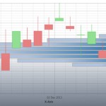
There is also another way of achieving this. SciChart allows you to build “mixed charts”, where you have two X axis with different orientation. I compiled a small sample for you, maybe you will find it a bit easier to implement. Please, find the code and screenshot attached.
Also, you can find the example of a histogram implementation in this post.
Hope this helps!
Best regards,
Yuriy
- Yuriy Zadereckiy answered 10 years ago
 Yuriy, Thanks for your example, I was able to get it to work. I do have one issue, I'm trying to get the XAxis of the histogram aligned with the YAxis of the candlestick, this is so that the user can relate the histogram to the corresponding point in the candlestick. Is there any way to achieve this. I have attached a screenshot of the chart. I have made the x-axis of the histogram visible. You will see that the YAxis of the candlestick and the x-axis of the histogram are out of sync. I guess what I'm asking is there a way for the YAxis of the candlestick to share an axis with the XAxis of the histogram. Thanks, Deepak
 Hi Deepak, Try binding both of them to some shared VisibleRange, or XAxis.VisibleRange to YAxis.VisibleRange. This technique is used in most of our MVVM examples, e.g. the Sync Multi Chart Mouse example. Please, let us know if you get it working. Best regards, Yuriy
 Andrew and Yuriy, that worked. Your help is much appreciated.
- You must login to post comments
Please login first to submit.


