How to Detect & Manage React Memory Leaks With Ease
Stop performance lag with our expert guide on React memory leak detection for high-performance React chart applications.

Donut charts are a well-known, accessible and visually appealing way to visualize data insights. They may be considered a more basic chart, but they can fuel top-level business and marketing decisions, making them an integral feature for data dashboards.
If you want to know how to create a donut chart in React that’s suitable for high-level decision-makers, we’ll show you how to do exactly that using SciChart.js. We’ll also be focusing on how to customize and add interactive elements to engage your end users and tailor the design to your branding.
Some prefer the donut chart over the pie chart thanks to its more minimal, less crowded data visualization. You also have the option to overlay one chart on top of the other for the ultimate space-saving solution on your data dashboard.
With a responsive React chart library, the data will automatically update the React donut chart whenever new information is received. That means your dashboard will always be up-to-date and won’t need to be manually tweaked every time the numbers change!
React donut charts are more appropriate for small data sets. They are ideal for comparing between two and six categories to prevent overloading the display. With the right chart library, you can tap into the true power of a React donut chart, with minimal development time required.
The high-level data insights you can acquire with minimal effort goes a long way—we’re sharing a sample of business use cases to help visualize the possibilities.
Customer Demographics: By visualizing the numbers of customers per country, businesses can better understand where their main customer base is and where to target their marketing efforts.
Customer Segmentation: By separating customers based on whether they are new or returning, your marketing team can be informed on how best to split their marketing budget.
Sales Distribution: A go-to chart for business and marketing reports, it’s a quick way to convey to directors and stakeholders in a board meeting which product categories are scooping all the sales and which ones are comparatively lagging behind.
Budget Allocation Overview: Aside from marketing, the donut chart can also show how a department or company allocates its budget (e.g., marketing, R&D, operations). The value this can provide is to facilitate budget reviews and informed reallocation discussions.
Using our open-source library called scichart-react, we make it easy to create donut charts (and a plethora of other charts) in React. We have a step-by-step walkthrough for your developers, making it super easy to set up for their first React project.
To create a Donut Chart, create PieSegment instances and add them to the SciChartPieSurface.pieSegments collection.
Set the property sciChartPieSurface.pieType = EPieType.Donut to enable a donut chart. Then the property sciChartPieSurface.holeRadius is obeyed to create the donut.
Each PieSegment has properties for value, text and color, or colorLinearGradient if you wish to specify a gradient fill. The property isSelected denotes whether the PieSegment is in the selected state or not.
const sciChartPieSurface = await SciChartPieSurface.create(divElementId);
const theme = { ...new SciChartJSLightTheme() };
theme.sciChartBackground = "Transparent";
sciChartPieSurface.applyTheme(theme);
sciChartPieSurface.pieType = EPieType.Donut;
sciChartPieSurface.holeRadius = 0.6;
sciChartPieSurface.legend.showLegend = true;
sciChartPieSurface.animationFrames = 60;
sciChartPieSurface.labelStyle = { fontSize: 14, color: EColor.White };
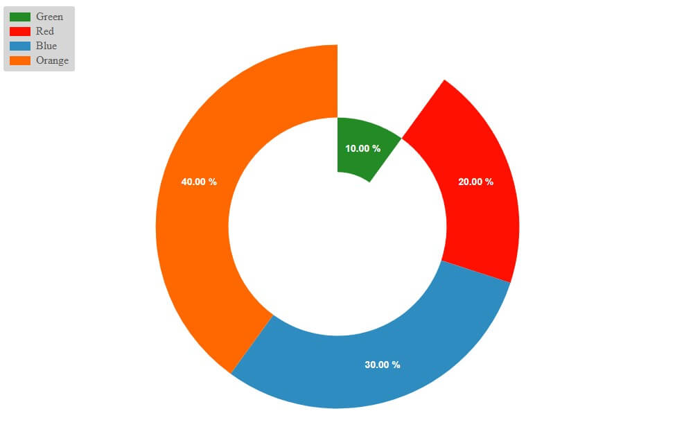
const pieSegment1 = new PieSegment({
color: EColor.Green,
value: 10,
text: "Green",
delta: 10
});
const pieSegment2 = new PieSegment({
color: EColor.Red,
value: 20,
text: "Red",
delta: 20
});
const pieSegment3 = new PieSegment({
color: EColor.Blue,
value: 30,
text: "Blue",
delta: 30
});
const pieSegment4 = new PieSegment({
color: EColor.Orange,
value: 40,
text: "Orange",
delta: 40
});
sciChartPieSurface.pieSegments.add(pieSegment1, pieSegment2, pieSegment3, pieSegment4);

Helpful Links:
🔗Set Up with React
🔗React Donut Chart Demo
🔗 GitHub Donut Chart
With SciChart, you can tailor the design of the segments to suit your needs. This includes support for dynamic theming, to create custom, on-brand experiences and dark mode for accessibility to ensure the data is accessible for more users.
Detailed documentation on how to style donut chart segments and format labels can be found on the Pie Chart Documentation page.
To add gradient
const pieSegment1 = new PieSegment({
        color: EColor.Green,
        value: 10,
        text: "Green",
        delta: 10,
        colorLinearGradient: new GradientParams(new Point(0, 0), new Point(0, 1), [
            { color: "#1D976C", offset: 0 },
            { color: "#93F9B9", offset: 1 }
        ])
    });


    const pieSegment2 = new PieSegment({
        color: EColor.Red,
        value: 20,
        text: "Red",
        delta: 20,
        colorLinearGradient: new GradientParams(new Point(0, 0), new Point(0, 1), [
            { color: "#DD5E89", offset: 0 },
            { color: "#F7BB97", offset: 1 }
        ])
    });


    const pieSegment3 = new PieSegment({
        color: EColor.Blue,
        value: 30,
        text: "Blue",
        delta: 30,
        colorLinearGradient: new GradientParams(new Point(0, 0), new Point(0, 1), [
            { color: "#2b2828", offset: 0 },
            { color: "#656565", offset: 1 }
        ])
    });


    const pieSegment4 = new PieSegment({
        color: EColor.Yellow,
        value: 40,
        text: "Yellow",
        delta: 40,
        colorLinearGradient: new GradientParams(new Point(0, 0), new Point(0, 1), [
            { color: "#F09819", offset: 0 },
            { color: "#EDDE5D", offset: 1 }
        ])
    });

To add padding in between pie segments: Set SciChartPieSurface.seriesSpacing
sciChartPieSurface.seriesSpacing = 10;

To create a global label font size, color and family: Set SciChartPieSurface.labelStyle
sciChartPieSurface.labelStyle = { fontFamily: "Arial", fontSize: 20, color: EColor.White };

To set a general label text override: Use SciChartPieSurface.labelProvider.getSegmentText
const labelProvider = new PieLabelProvider();
labelProvider.getSegmentText = (segment: IPieSegment, total) =>
`<span>${segment.text}<span><br/><span>${segment.value.toFixed(1)} (${((100 * segment.value) / total).toFixed(
1
)}%)</span>`;
sciChartPieSurface.labelProvider = labelProvider;

To move labels further away from the pie segment: Set PieSegment.labelOffset
pieSegment1.labelOffset = new Point(10, 10);To set individual pie segment font and color: Set PieSegment.labelStyle
pieSegment1.labelStyle = { fontFamily: "Arial", fontSize: 20, color: EColor.White };To make the pie segment larger or smaller: Set PieSegment.radiusAdjustment
pieSegment1.radiusAdjustment = 0.3;
LabelProviders are also available on individual PieSegment.labelProvider property
pieSegment1.labelProvider.formatLabel = (value: number) =>
`<span style="color: purple; font-family: Arial, sans-serif;font-size: 2em;">${value.toFixed(
3
)}</span><span style="font-size: 2em;">$</span>`;Working with SciChart puts you in the driving seat when building your chart. You have the basic elements and then you can level them up and customize to suit the exact design requirements you need. This includes the size of the donut hole and the segments.
If you want to add more dynamic elements, you can add tooltips and customizable labels. The beauty of tooltips is that you can add more information without cluttering the display. That way, users can engage with the data that matters to them. You could for instance, add exact percentages and amounts or more context behind the data for each segment, which would only display if a user hovered or clicked on that specific segment.
Donut charts can be dynamically updated by setting the PieSegment.value property. When SciChartPieSurface.animate is true, updates to the pie chart will be animated.
SciChart’s exceptional customization abilities and easy-to-use interface are two reasons why it’s the library of choice for developers. We offer hundreds of documentation and a 64-bit library that can handle millions of data points in real-time. With cross-platform performance, it’s also super easy to make your data visualizations compatible across various systems and hardware devices.
Our flexible chart library ensures you can tailor the designs to suit the exact finish you’re hoping to present for your end users—this gives you more control than basic out-of-the-box designs that most open-source chart libraries typically restrict you to.
We’re known for our high-performance charting software that renders huge volumes of data in real-time—think millions of data points! However, that’s not all we’re known for. When it comes to developer support, we offer exemplary customer service and advice. From huge volumes of documentation, examples and demos to responsive community forums and support from our development team, using SciChart is designed to be as intuitive and user-friendly as possible while blowing the competition out the water when it comes to customizations on the design front.
Discover SciChart React Chart Library
Recent Blogs
![]()
Queens Award for Innovation
Proud winners of the Queens Award for Innovation, 2019. Awarded on account of our innovative graphics engine which underpins the SciChart library and enables our world-beating charting performance
![]()
National Business Awards
Highly Commended for Lloyds National Business Awards, 2019. Awarded on account of our innovative graphics engine and impressive customer base
![]()
National Technology Awards
Awarded “Healthcare Tech of the Year” at the 2025 National Technology Awards – a top UK recognition for breakthrough innovation in technology.

Reviews
SciChart has received hundreds of verified, 3rd party reviews