Data Visualization in the Oil & Gas Industry Using SciChart
Discover the chart types and features that help producers of oil and gas visualize complex and big data with ease.

Oil rigs collect enormous amounts of data to support profitable decision-making across operations—often exceeding 10 TB of data per day per well.
However, even if you know what real-time data to collect, there could be challenges in ensuring the accuracy and reliability of this data. For instance, how can you be confident your sensors are providing the right information and updating in real-time? How can you be sure there is no lag in data on the visualizations?
In this guide, we’re exploring the complex challenges of ensuring accurate, real-time data visualizations for wellsites. We understand that for many developers working with complex scientific data, the chart solutions from some available tools have their limitations and setbacks.
What you really want to know is not just how to safeguard your data, ensuring accuracy, but also how to improve the data quality and ensure stakeholders can see the bigger picture.
Handling data in real-time poses its own challenges, but we’ll talk through these and provide solutions and insights to help you feel more confident in your approach to processing large datasets.
From latency to missing data sets, these are the common challenges of handling complex scientific data for wellsites. We’re sure you’ll resonate with multiple of these, if not most, and we follow-up with the insights you need to get your data back on track. You always want to provide the most accurate, up-to-date insights possible, and that’s what we’re here to help with.
You’ve put all the processes and sensors in place to collect the data, but sometimes it fails you! Whether your data is missing intervals or corrupt, gaps in data are frustrating to handle. Fortunately, there are ways data scientists can piece together the missing jigsaw pieces, which we discuss later in this article. There are ways to get back on track and inform decision-makers of data that still works towards your goals, even when the data glitches strike!
To ensure real-time accuracy, latency between data input and visualization must be kept to a minimum. But what can you do to achieve this? This often requires parallel processing between the Central Processing Unit (CPU), memory, and Graphics Processing Units (GPU). By lining up the data processing in the most efficient way, you can reduce lag.
Inaccurate data or invalid data sensor calibration also creates issues for data analysts and decision-makers. A common challenge is ensuring noise doesn’t disrupt the frequency readings of your distributed acoustic sensing data. Luckily, there are ways to distinguish between noise and quality data, so you can easily sift out the data you don’t want! We explore how to achieve this below.
Just using standard tools will make you the same as all the other oil and gas companies and leave your profit potential in a stagnant position. Instead, you want to leverage new metrics and overlays. This is how you unlock new insights or enhance the data interpretation experience for the end user. However, to do that, you need the customisation levels that a big data software provider such as SciChart has to offer.
Want to prevent unnecessary delays and inspire confidence across your teams? With the right insights and data rendering platform, you can take steps to mitigate and remedy the current data challenges. Below, we’re outlining solutions to the common complex data handling challenges listed above, including how to deal with missing data or identify if noise is disrupting the accuracy of your distributed acoustic sensing.
Inferior charting solutions, such as open-source platforms, struggle with the niche data requirements of scientific applications. Examples include picometers and nanometers which get slightly more complicated to deal with. Something as basic as handling integers is crucial for ensuring accurate data insights. It’s worth using a high-performance 64-bit library as a 32-bit library would lack the precision you require.
Another example is the Bézier curve. Often used in scientific data interpretation, how you interpret and draw the curves really plays into the quality of insights gathered. Even if you input the right data, the risk of an incorrect curve—which can often happen without the right charting software solution—is that you could churn out inaccurate data visuals.
In short, using an inferior chart solution could degrade what you’re doing. That’s why it’s worth investing in a charting solution that’s powerful enough to support the complex demands of scientific data.
Often, the quality of your data comes down to the sensors and your data collection mechanisms. Monitor the efficacy of your sensors with design and test software. Could this be running in dashboards to assess the competency of the sensors?
Are frequencies interfering? One channel you could explore is deep diving into your distributed acoustic sensing, as background noise could be introduced into that. Common sources of noise include vibration impacts from engines and equipment relating to the drilling. Noise testing devices can be put in place to measure and discount interfering frequencies from your data.
This will help to get your data back on track.
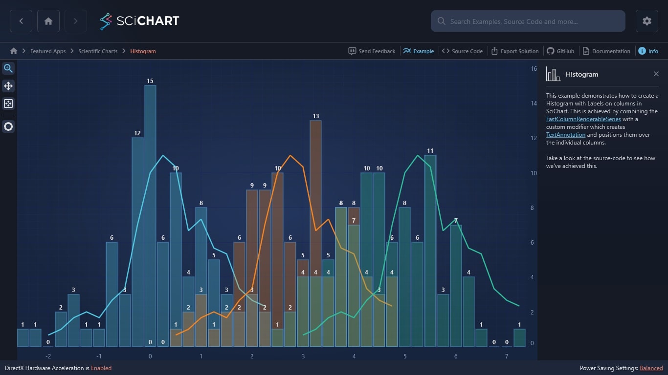
Correlation techniques, such as crossplots or histograms, can help you estimate missing or incomplete values based on the available values of different log measurements and the relationship between them. Although correlation techniques are widely considered, this strategy is not suitable for all wellsites as it relies on the subsurface layers being consistent.
If correlation values aren’t suitable, you could fall back on core data about the properties of your rock and fluid, inputting that data into missed intervals. You could also look at your seismic data, but log data is often more accurate.
To ensure data quality problems are identified, you can set up annotations, markers, trend lines and alerts to trigger whenever a data anomaly is detected. It can also be worth setting up data quality algorithms—perhaps even leveraging machine learning. This helps remove the manual guesswork from identifying common data quality challenges to get to the core of the data challenges much more quickly.
Handling large datasets consumes significant memory, and operations like zooming and panning require fast access to this data.
With that being said, you might think you need hardware that supports high memory. But that’s not necessarily the case. A more effective solution is to have a rendering engine that is optimized for both low-memory and high-memory hardware.
Another way a big-data rendering system can support your performance is by instilling Level-of-Detail (LOD) techniques, which show less detail at larger zoom levels.
Learn why SciChart is the fastest precision charting solution on the market and what that means when undertaking CPU/GPU or memory intensive task. … Continue reading Powered by our proprietary rendering engine Visual Xcellerator, SciChart is optimised for efficiency and low memory usage
Review how your data is sent to the charting software and establish the best possible way to achieve this. This could involve some trial and error, but ensuring a seamless transfer and communication of data between systems will help support quality, accurate real-time data.
Concurrency of data processing tasks can reduce the latency of your data. However, with this method of data collection, a continuous stream of work from the CPU is required without delays or stalls in the pipeline.
You could also use ahead-of-time (AOT) compilation. In environments like C++ or Swift, code is compiled before execution. The result? This enhances optimization for performance-sensitive applications.
Get started with preserving the integrity and quality of your real-time data with SciChart. SciChart provides superfast, high-performing, customizable charts for WPF, JavaScript, iOS and Android.
Recent Blogs
![]()
Queens Award for Innovation
Proud winners of the Queens Award for Innovation, 2019. Awarded on account of our innovative graphics engine which underpins the SciChart library and enables our world-beating charting performance
![]()
National Business Awards
Highly Commended for Lloyds National Business Awards, 2019. Awarded on account of our innovative graphics engine and impressive customer base
![]()
National Technology Awards
Awarded “Healthcare Tech of the Year” at the 2025 National Technology Awards – a top UK recognition for breakthrough innovation in technology.

Reviews
SciChart has received hundreds of verified, 3rd party reviews