
Building a Smith Chart in JavaScript: Inside the Rendering Pipeline
See how SciChart.js was extended to build a fully interactive Smith chart using standard APIs. This article highlights the flexibility of custom rendering and advanced interactions.
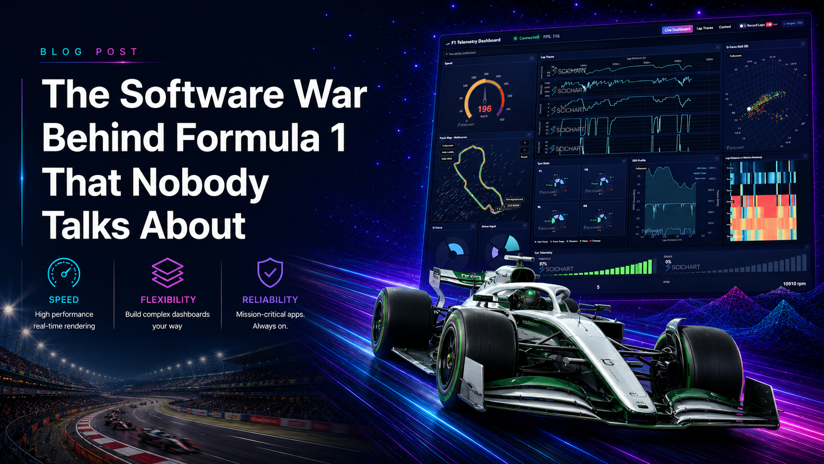
When people think about what wins a Formula 1 championship, they think about aerodynamics. Engine power. Tyre strategy. The driver.
They rarely think about the engineer staring at a screen in the pit wall, watching hundreds of data channels update in real time, trying to catch a 40-millisecond anomaly in the power unit before it becomes a DNF.
But increasingly, that’s where races are won and lost.
F1 has quietly become one of the most data-intensive engineering environments on the planet. And the software that sits between raw sensor data and human decisions is under enormous pressure – pressure that most general-purpose tools simply weren’t built to handle.
The scale of the data problem
A modern F1 car runs somewhere north of 300 IoT telemetry sensors. Wheel speeds, brake temperatures, tyre pressures, fuel flow, throttle position, DRS actuation, suspension travel, GPS position, g-forces across three axes – all streaming simultaneously, many at several hundred Hz.
On a race weekend, a single car generates hundreds of gigabytes of data. The engineers watching it in real time can’t wait for post-processing. A tyre that’s about to blister, a power unit running hot, an undercut window opening up – these are decisions made in seconds, based on live data.
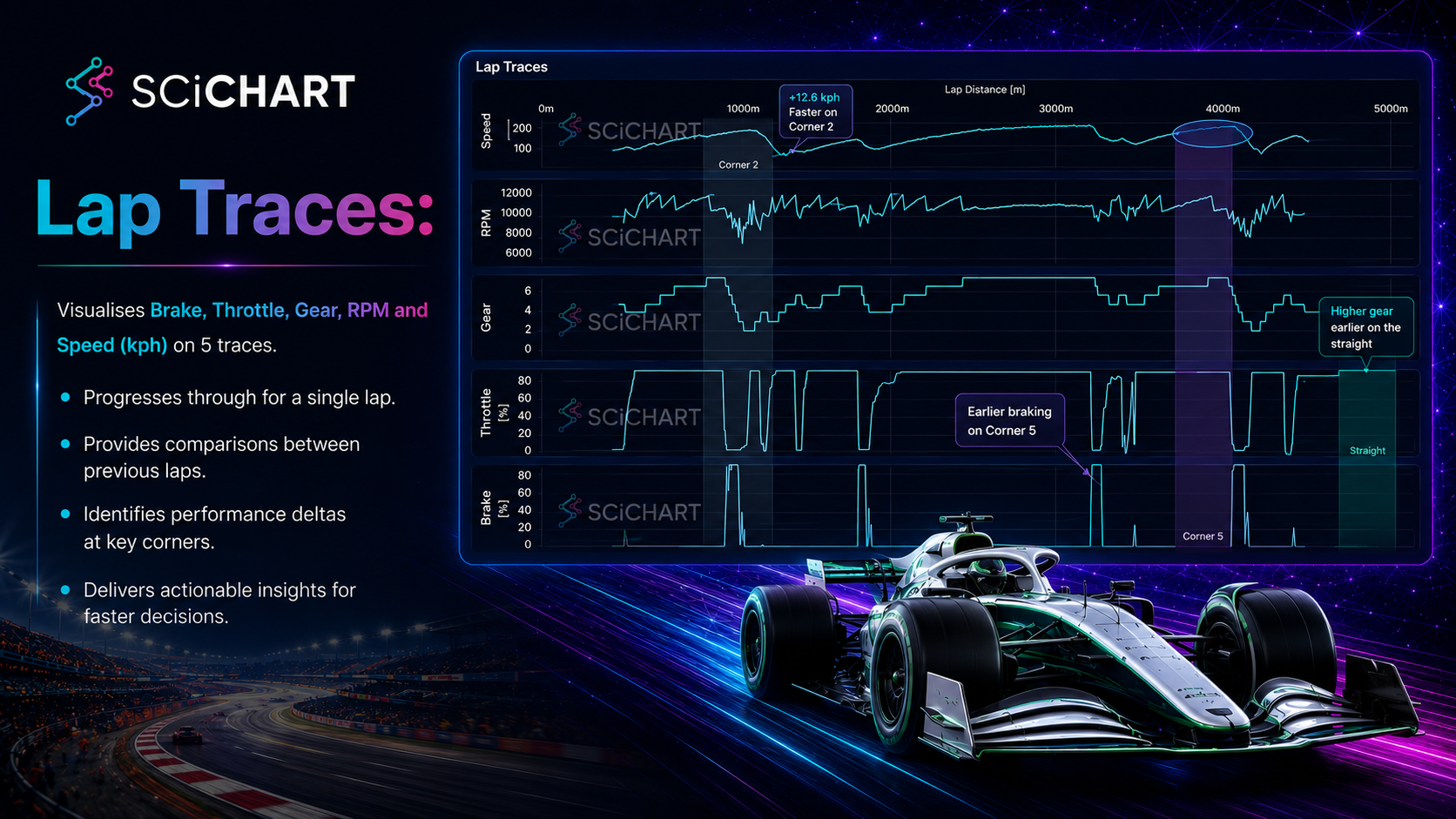
The challenge isn’t just storing or transmitting the data. It’s also displaying it. Fast enough, accurately enough, across enough channels at once, that a human engineer can actually make sense of it.
Why this is harder than it sounds
Plotting a handful of sensor channels on a chart isn’t hard. Plotting hundreds of channels, updating multiple times per second, across split screens in a pit wall environment, while an engineer is actively zooming in on a specific corner of a specific lap from three laps ago – that’s a different problem entirely.
The transients that matter in F1 often last milliseconds. A spike in brake temperature. A momentary loss of downforce through a corner. If your visualization is downsampling the data to keep up with rendering, those events disappear. You’re looking at a smoothed version of reality, and the thing you needed to catch isn’t there anymore.
This is where most off-the-shelf charting libraries fall over. They were designed for slower, simpler data. They handle downsampling gracefully because for most use cases, downsampling is fine. In F1 it isn’t.
What we do about it
We’ve been embedded in F1 for years now, and at this point we’re used by 9 out of 10 teams on the grid. Our GPU-accelerated rendering engine underpins telemetry systems, pit wall dashboards, simulation correlation tools, power unit development workflows, tyre performance modelling, wind tunnel data interpretation, and ECU analysis across the paddock.
The reason teams use us comes down to one thing: we don’t drop data.
Because we render directly on the GPU rather than on the CPU through Canvas or SVG, the rendering cost doesn’t scale with the volume of data the way it does with conventional libraries. A single visualization in a production F1 environment might be pulling tens of millions of data points. It still needs to feel instant. With GPU rendering, it does.
That means engineers are always looking at the full signal. Not a summary of it. Not an approximation. The actual data, at full resolution, rendered fast enough to interact with in real time.
The cost cap changed everything
Something shifted in F1 a few years ago with the introduction of the budget cap. Before the cap, teams with the biggest budgets could throw hardware and headcount at every problem. Now everyone is working within the same financial ceiling.
That’s pushed teams toward a software-first engineering philosophy. If you can’t outspend your rivals on wind tunnel time or manufacturing, you’d better be getting more insight out of the data you already have. Simulation, correlation, sensor fusion – these workflows have become genuinely competitive differentiators.
And all of them depend on data visualization. Data you can’t see clearly is data you can’t act on.
New teams coming into F1 are building their software infrastructure before they’ve built the car. That tells you something about where the sport’s priorities have shifted.
F1 as a proving ground
One of the things we’ve noticed over the years is that F1 acts as a kind of stress test for data telemetry, storage and visualization technology. The requirements – high frequency, low latency, full signal fidelity, real-time interaction – are extreme. Solutions that work in F1 tend to work everywhere else too.
The same rendering engine we use in pit wall telemetry also powers real-time patient monitoring in ICUs, live institutional or high-frequency trading dashboards handling thousands to millions of ticks per second, and aerospace simulation. The domains are completely different but the underlying data problem is the same: too much signal, moving too fast, where missing something has real consequences.
F1 just happens to be the environment where those requirements are most visible – and most unforgiving.
What this looks like as a developer
If you’re building anything in this space – motorsport engineering tools, high frequency data dashboards, anything where signal integrity matters at scale – the questions worth asking are:
What happens to my chart at a million data points? Does it downsample, or does it render everything? What’s the frame rate when 50 channels are updating simultaneously? Can an engineer view the dashboard, zoom, pan, or annotate without the UI blocking?
If the answers involve workarounds, you’ve found your ceiling. The rendering architecture is the constraint, and it’s worth treating it as a first-class engineering decision rather than something you pick a library for and move on.
We’ve been lucky to work with teams where these decisions genuinely matter – where the software on the pit wall is part of what gets a car across the finish line first. That’s a standard that keeps us honest.
Andrew Burnett-Thompson is CEO and Founder of SciChart. He started the company out of personal necessity, writing the first version during his commute into London. SciChart now powers data visualization across Formula 1, healthcare, finance, and aerospace. He holds a doctorate in electrical engineering and is a top-2% contributor on Stack Overflow.
Disclaimer: Images generated by AI.
Recent Blogs

Queens Award for Innovation
Proud winners of the Queens Award for Innovation, 2019. Awarded on account of our innovative graphics engine which underpins the SciChart library and enables our world-beating charting performance

National Business Awards
Highly Commended for Lloyds National Business Awards, 2019. Awarded on account of our innovative graphics engine and impressive customer base

National Technology Awards
Awarded “Healthcare Tech of the Year” at the 2025 National Technology Awards – a top UK recognition for breakthrough innovation in technology.

Reviews
SciChart has received hundreds of verified, 3rd party reviews