I have a huge dataset to display in graphical form starting from the daily data for 30 days and then to each minute when zoom in, what is the best way to plot this data using zoom in functionality
- Umer Nawaz asked 1 year ago
- last edited 1 year ago
 Hi Umer, as it happens we’re preparing a demo of how to load data from the server on zoom, pan. This will be uploaded to our demo site shortly. Will notify you
 Awesome, thank you so much
- You must login to post comments
Hi Umer
Thank you for your question about SciChart. We’ve created an example showing how to virutalize data (dynamically load data on zoom) using SciChart.js here:
JavaScript Chart Demo: Virtualized Data 10 Million Points on server
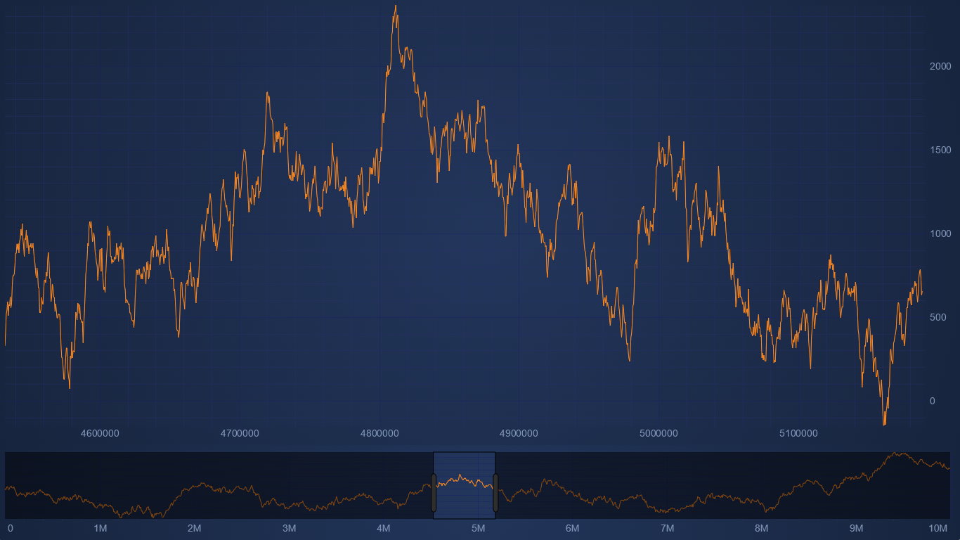
There is a detailed description of how the example works plus links to the source code in the demo page here.
The main idea is to subscribe to xAxis.visibleRangeChanged and do the data load there. In the example we use a bit of rx to debounce those range changes so you don’t get lots of unnecessary loads while zooming. We also show how to set up an overview for this scenario which has its own dataSeries, rather than sharing the data with the main chart which the standard overview does.
The server side of this has 10 million points and uses a very basic “return every nth” algorithm to summarise the data.
For more details read the demo description.
Thanks for your request!
Best regards,
David
- David Burleigh answered 1 year ago
- last edited 1 year ago
- You must login to post comments
Please login first to submit.
