Hi, I want to create info boxes between xAxis and chart, info box will contain text, but the width/position of the box will be base on the xAxis and should sync with the chart (zoom etc). For example, if xAxis is from 1-100, and the first info box start from 1 to 10, then the width/position of the box should cover from 1-10, and if I zoom between 1-10, then info box should also sync and expand.
So far, I have created it using horizontal stacked xAxes and custom axis layout strategy provided by you. But the issue is that the stacked xAxes are not sync with the chart, for now, to make it seem sync, I am recalculating stacked axis length when zoom. But the issue comes when there should be gap between the info boxes, for example, if xAxis is 1-100 and the first box is 1-10 and the second box is 20-40, then there is a gap of 10 between the first and second. Right now, those gap are filled using empty xAxes, but they are not correct. When there is gap, the position of the boxes are wrong.
- First image is my current implementation of it using custom axis layout and stacked xAxes.
- Second image is how it look when zoomed
- Third image is the gap issue with the current implementation
- Fourth image is how the correct implementation should look like.
Codesanbox example:
https://codesandbox.io/s/scichart-stacked-xaxis-stacked-length-issue-3knt23?file=/src/App.tsx


- Nung Khual asked 10 months ago
- last edited 10 months ago
 Now that I can see your requirement, and why you wanted mixed horizontal/normal stacked axis, I can probably think of a better way to do this using the Annotations API. Allow me to have some time to talk to the team and come back with a solution.
 Awesome, thank you and will be looking forward to your solution.
- You must login to post comments
Hi Nung,
So in the previous question you asked us Is it possible to create two xAxis, where one is normal and the other one is Horizontally Stacked Axis Layout, you asked how you can have mixed vertical & horizontally stacked axis. We provided a solution with a custom layout manager showing how to do this.
However, with this new information it’s now much more clear what you want to do. You want to have annotations or info boxes above the XAxis which scroll and zoom as you update the chart.
So the solution you’ve attempted is to create a layout like this:
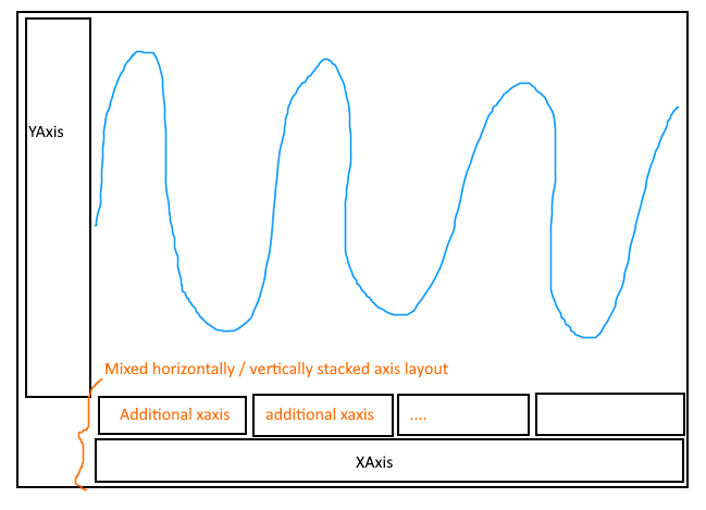
This would result in you creating 1 axis for each info box (which could be 100s or even thousands) and then assuming they’ll scale, zoom and pan correctly. It’s a complex solution and probably not the right way to approach this problem.
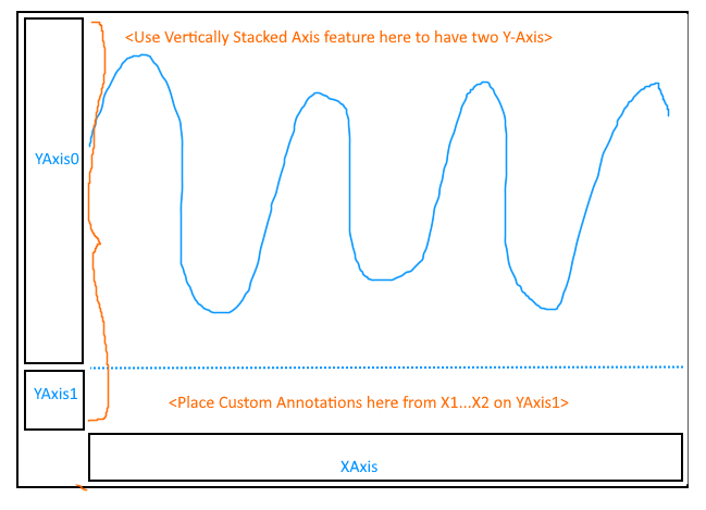
Here’s another idea. If you use SciChart’s Vertical Stacked Axis feature you can simply have 2 Y-Axis, one for the main chart, and another for the info box row directly above the XAxis.
Next, using the Annotations feature, you can place BoxAnnotation, or CustomAnnotations (custom SVG + Text) directly onto that axis.
The final layout will be like this:
Here’s a code sample:
const drawExample = async () => {
const { sciChartSurface, wasmContext } = await SciChartSurface.create(
divElementId,
{
theme: appTheme.SciChartJsTheme
}
);
// Left Axis panel is stacked axis alignment
sciChartSurface.layoutManager.leftOuterAxesLayoutStrategy = new LeftAlignedOuterVerticallyStackedAxisLayoutStrategy();
// Shared common XAxis
sciChartSurface.xAxes.add(
new NumericAxis(wasmContext, {
axisTitle: "X Axis",
axisBorder: { borderTop: 1, color: "SteelBlue" }
})
);
// Two Y-Axis stacked
sciChartSurface.yAxes.add(
new NumericAxis(wasmContext, {
id: "YAxis0",
axisAlignment: EAxisAlignment.Left,
axisTitle: "Y Axis",
axisBorder: { borderRight: 1, color: "SteelBlue" }
})
);
// Second Y-Axis for info boxes
const dummyYAxis = new NumericAxis(wasmContext, {
id: "YAxis1",
visibleRange: new NumberRange(0, 1),
axisAlignment: EAxisAlignment.Left,
drawMajorGridLines: false,
drawMinorGridLines: false,
drawLabels: false,
drawMajorTickLines: false,
drawMinorTickLines: false,
axisBorder: { borderRight: 1, color: "SteelBlue" },
stackedAxisLength: 30 // 30 pixels. "10%" is also valid
});
// Always force range to 0..1
dummyYAxis.visibleRangeChanged.subscribe(
(_) => (dummyYAxis.visibleRange = new NumberRange(0, 1))
);
sciChartSurface.yAxes.add(dummyYAxis);
// Add a series
const lineSeries = new FastLineRenderableSeries(wasmContext, {
yAxisId: "YAxis0",
stroke: "auto",
strokeThickness: 2
});
lineSeries.dataSeries = getRandomSinewave(
wasmContext,
0,
Math.random() * 3,
Math.random() * 50,
10000,
10
);
sciChartSurface.renderableSeries.add(lineSeries);
const addInfoBox = (
x1: number,
x2: number,
stroke: string,
fill: string,
text: string
) => {
sciChartSurface.annotations.add(
new BoxAnnotation({
// Position in X with slight adjustment to prevent overlap
x1: x1 + 0.02,
x2: x2 - 0.02,
// Positioned between top, bottom of the dummy axis
y1: 0,
y2: 1,
// Placed on dummy yaxis
yAxisId: "YAxis1",
// Additional style properties
stroke,
fill,
strokeThickness: 1
})
);
sciChartSurface.annotations.add(
new TextAnnotation({
x1,
y1: 0.5,
verticalAnchorPoint: EVerticalAnchorPoint.Center,
horizontalAnchorPoint: EHorizontalAnchorPoint.Left,
xCoordShift: 5,
text,
yAxisId: "YAxis1"
})
);
};
// Add the info box annotations
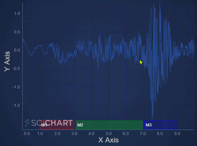
addInfoBox(1, 3, "Red", "#FF000033", "M1");
addInfoBox(3.1, 7, "Green", "#00FF0033", "M2");
addInfoBox(7.1, 9, "Blue", "#0000FF33", "M3");
// Optional: Add some interactivity modifiers to enable zooming and panning
sciChartSurface.chartModifiers.add(
new ZoomPanModifier(),
new MouseWheelZoomModifier({ xyDirection: EXyDirection.XDirection }),
new ZoomExtentsModifier(),
new XAxisDragModifier()
);
return { sciChartSurface, wasmContext };
};
Try this CodeSandbox and drag to pan the chart. How does that behave compared to your expectations?
Best regards
Andrew
- Andrew Burnett-Thompson answered 10 months ago
- last edited 10 months ago
- You must login to post comments
Please login first to submit.
