Trying to make a spectrum analyzer with a column chart instead of a line chart. Is there a way to animate the column so that the column automatically starts a slow fall back to zero after appended to?
This link has a you tube video that shows the effect that we are looking for in the upper left hand corner
This link shows a hardware version but it is the same effect that we are looking for.
Thanks
- Shawn asked 9 years ago
- You must login to post comments
Hi Shawn,
> Is there a way to animate the column so that the column automatically starts a slow fall back to zero after appended to
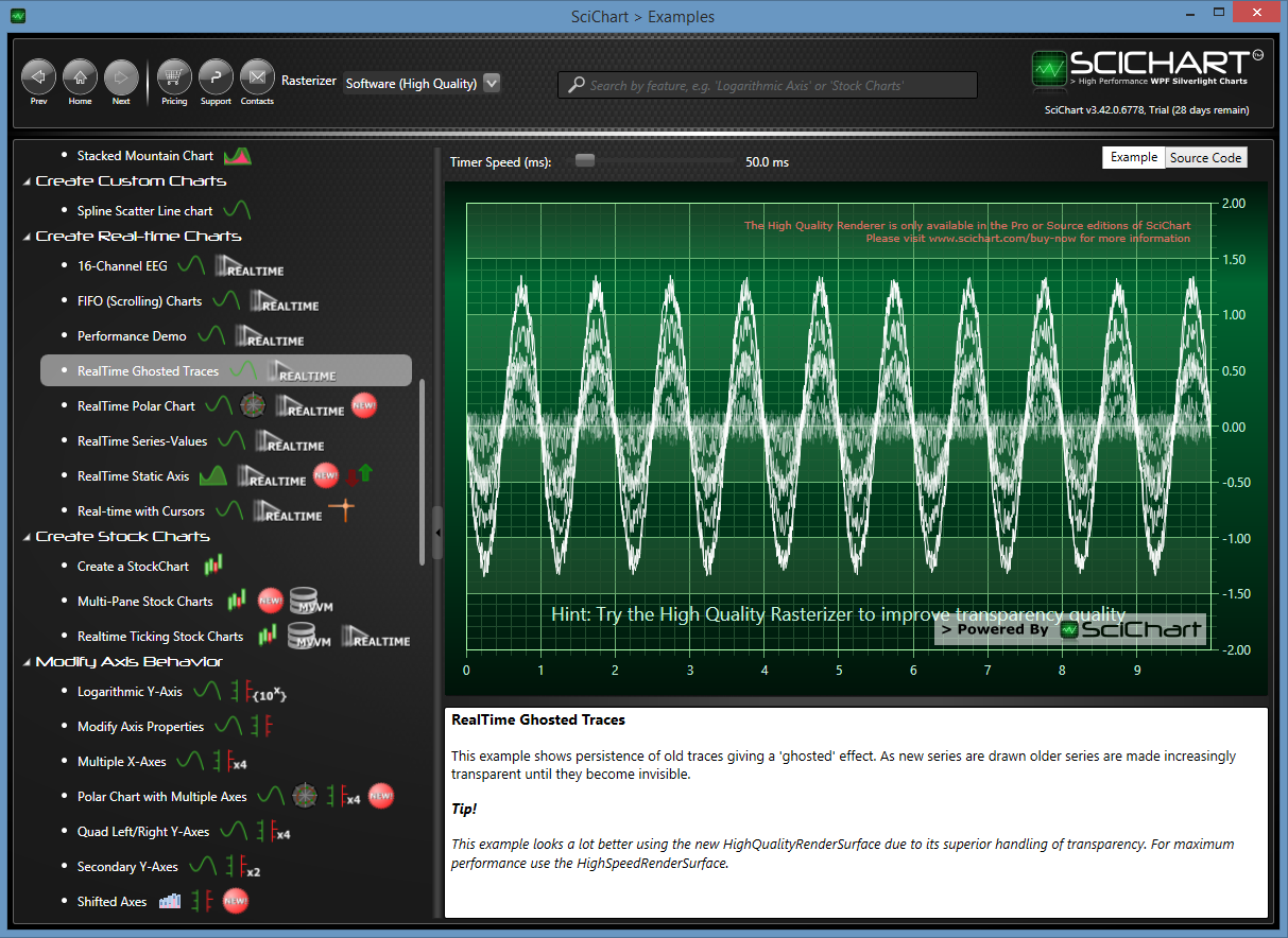
The short answer is, no, however, we do have something similar in the example Realtime Ghosted Traces in the SciChart Examples suite.
This example actually does a slight trick where it has 10x DataSeries/RenderableSeries pairs and it updates a new series and then changes the opacity of the old series. The effect is each series shows momentarily then fades out, rather like a Digital Phosphor on an oscilloscope.
You could do something similar to this. Imagine you have a column series with 10 horizontal ‘bins’. As data comes in, you update The Y-values of each bin only if the new value is greater than the existing, otherwise, you attenuate (reduce by 10%) the value in that bin.
Does that make sense? Basically what I’m saying is, by combination of using multiple series, using opacity and using the ability to update data-series you should be able to achieve the effect you want.
Let me know what you come up with, would be interested to see it!
Best regards,
Andrew
- Andrew Burnett-Thompson answered 9 years ago
- You must login to post comments
Please login first to submit.
