iOS & Android v4.7 Has Launched: Everything You Need to Know
iOS and Android v4.7 is here! Take a look at what’s new, including the latest features, bug fixes and examples.

In mobile apps, navigating large datasets can be a challenge. Users often get lost when zooming or panning through extensive stock data, ECG waveforms, or scientific time-series charts. Small-screen real estate makes it tough to maintain context, which can lead to a frustrating experience for users.
That’s where Overview Chart comes in. New in version 4.6.1, this iOS chart library and Android chart library feature acts like a mini-map for your chart—helping users stay oriented and move smoothly through massive data ranges upwards of 100,000 data points. It’s also a lightweight, interactive control that offers a zoomed-out preview of your main chart.
Think of it as a navigator panel that mirrors the full data range of your Android and iOS chart, giving users better context and control over what they’re viewing. It’s fast, lightweight, customizable, and ideal for applications in finance, healthcare, engineering, and more.
In this guide, we’re showcasing the customizations and benefits that this feature has to offer, along with the code samples you need to get started quickly.
To get started using this feature, refer to the links below.
 Overview Chart
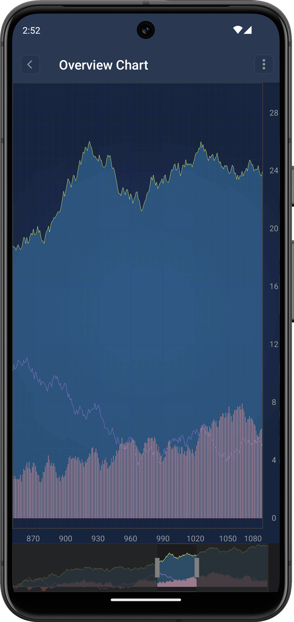 Overview Chart on a Mobile Screen.
From adding interactive elements for users to offering full chart visibility, the benefits of Overview Chart focus primarily on elevating the user experience, ensuring that your data is interacted with in a meaningful way.
`SCIChartOverview` integrates with your existing `SCIChartSurface` (main chart) either via storyboard or programmatically. It syncs in real-time with the main chart’s data and modifiers, ensuring a consistent user experience.
import SciChart

override func viewDidLoad() {
    super.viewDidLoad()

    let overviewChart = SCIChartOverview()
    overviewChart.translatesAutoresizingMaskIntoConstraints = false
    self.view.addSubview(overviewChart)

    // Pin below the main chart
    overviewChart.topAnchor.constraint(equalTo: self.surface.bottomAnchor).isActive = true
    overviewChart.heightAnchor.constraint(equalToConstant: 100).isActive = true
    overviewChart.leftAnchor.constraint(equalTo: self.view.leftAnchor).isActive = true
    overviewChart.rightAnchor.constraint(equalTo: self.view.rightAnchor).isActive = true

    // Link the overview with your main chart
    overviewChart.createOverviewChart(forParentSurface: self.surface)
}
Note: Please refer to the `SCIChartOverview` document for implementation in detail. Users can view the complete dataset at a glance, no matter how much zooming or panning they’ve done on the main chart.
A draggable and resizable selection box lets users define the visible data range. They can easily scroll by dragging the box or zoom into specific areas by resizing it.
Tapping or dragging in the overview immediately updates the main chart’s focus, enabling fluid and responsive data exploration.
By combining `SCIChartOverview` with zoom and pan gestures, users get a dynamic, interactive way to engage with complex data. Scrolling or zooming on the main chart updates the overview, and vice versa—providing a two-way, intuitive interaction loop.
self.surface.chartModifiers.add(items: SCIZoomPanModifier(), SCIPinchZoomModifier(), SCIZoomExtentsModifier())
Realtime Ticking Stock Chart Demo
From adding custom views to changing colors on selected data ranges, `SCIChartOverview`is highly customizable:
You can provide a custom view to style the selection box.
let customView = UIView()
customView.backgroundColor = .systemBlue.withAlphaComponent(0.2)

let options = SCIOverviewOptions()
options.xAxisId = "axis"
options.yAxisId = "axis"

overviewChart.createOverviewChart(forParentSurface: self.surface, grip: customView, options: options)
overviewChart.fillBrush = SCISolidBrushStyle(color: 0x33A4EBC6)
Easily change the color of the selected range to match your app’s design. Grip helpers appear when the left and right handles in the range selection view are positioned very close and may be difficult to interact with precisely. Toggle visibility using the shouldShowGripHelper property (default is true):
self.overviewChart.fillBrush = SCISolidBrushStyle(color: 0x33A4EBC6)Grip helpers appear when the left and right handles in the range selection view are positioned very close and may be difficult to interact with precisely. Toggle visibility using the shouldShowGripHelper property (default is true):
self.overviewChart.shouldShowGripHelper = false
   let options = SCIOverviewOptions()

   var filteredSeries: [ISCIRenderableSeries]
   filteredSeries = self.surface.renderableSeries.toArray().filter({ series in
       if series.isKind(of: SCIFastCandlestickRenderableSeries.self) {
           return true
       }
           return false
   }).map { series in
       if series.isKind(of: SCIFastCandlestickRenderableSeries.self) {
           let rSeries = SCIFastMountainRenderableSeries()
           rSeries.dataSeries = series.dataSeries
           rSeries.xAxisId = "axis"
           rSeries.yAxisId = "axis"
           return rSeries
       }
           return series
   }

   options.renderableSeries = NSMutableArray(array: filteredSeries)
   options.xAxisId = "axis"
   options.yAxisId = "axis"
   self.overviewChart.createOverviewChart(forParentSurface: self.surface, grip: customView, options: options)
`SCIChartOverview` isn’t limited to horizontal layouts. You can also implement it for vertical charts by adjusting the axis alignment and layout—perfect for advanced iOS data visualizations like volume histograms or vertically oriented time-series charts.
Add both `SciChartSurface` and `SciChartOverview` to your layout:
```xml
<LinearLayout xmlns:android="https://schemas.android.com/apk/res/android"
    android:layout_width="match_parent"
    android:layout_height="match_parent"
    android:orientation="vertical">

    <com.scichart.charting.visuals.SciChartSurface
        android:id="@+id/surface"
        android:layout_width="match_parent"
        android:layout_height="0dp"
        android:layout_weight="1" />

    <com.scichart.charting.visuals.overview.SciChartOverview
        android:id="@+id/overview"
        android:layout_width="match_parent"
        android:layout_height="75dp" />
</LinearLayout>
```
In your `Activity` or `Fragment`, bind the overview chart to your main chart surface:
```kotlin
binding.overview.parentSurface = binding.surface
```You can customize the draggable grip handles using `VerticalLineAnnotation`:
```kotlin
binding.overview.setGrips(generateGrip(), generateGrip())
// Here’s how you can create a grip annotation:
private fun generateGrip(): VerticalLineAnnotation {
val annotation = VerticalLineAnnotation(getContext())
annotation.coordinateMode = AnnotationCoordinateMode.RelativeY
annotation.verticalGravity = Gravity.CENTER_VERTICAL
annotation.stroke = SolidPenStyle(ColorUtil.Grey, true, 7f, null)
return annotation
}
```
You can use `setOverviewTransformation` to modify the series displayed in the overview. This allows you to use a different series type, reduce resolution, or filter noise for better performance.
Example: Replace Candlestick with Line Series
```kotlin
binding.overview.setOverviewTransformation(object : ISciChartOverviewTransformation {
            override fun transformRenderableSeries(renderableSeries: IRenderableSeries?): IRenderableSeries? {
                if (renderableSeries is FastCandlestickRenderableSeries) {
                    val candleSeries = renderableSeries

                    val originalData =
                        candleSeries.getDataSeries() as IOhlcDataSeries<Date?, Double?>

                    val lineDataSeries =
                        XyDataSeries<Date, Double>(Date::class.javaObjectType, Double::class.javaObjectType)

                    val count = originalData.getCount()
                    for (i in 0..<count) {
                        val x = originalData.getXValues().get(i)
                        val high = (originalData.getHighValues().get(i) as Number).toDouble()
                        val low = (originalData.getLowValues().get(i) as Number).toDouble()
                        val average = (high + low) / 2.0
                        lineDataSeries.append(x, average)
                    }

                    val lineSeries = FastLineRenderableSeries()
                    lineSeries.dataSeries = lineDataSeries

                    return lineSeries
                } else {
                    return renderableSeries
                }
            }
        })

```
This transformation replaces a heavy candlestick chart with a lightweight average line in the overview.
`getxAxis()`
Retrieve the X-axis used in the overview chart. You can use this to synchronize properties like visible range, label formatting, or styles.
```kotlin
val overviewAxis = binding.overview.getxAxis()
```
`setGripThreshold(threshold: Double)`
This sets the pixel threshold that determines when grip dragging should activate. Useful when you have multiple touchable elements and want to avoid accidental grip movement.
```kotlin
binding.overview.setGripThreshold(20.0)
```
`setOverviewTransformation(transformation: ISciChartOverviewTransformation)`
This lets you dynamically transform the series rendered inside the overview chart.
Whether you’re building financial dashboards, scientific analysis tools, or custom data viewers, `SCIChartOverview` adds a layer of usability that turns good charts into great ones. It helps users stay oriented, navigate complex data effortlessly, and focus on the data insights that matter most.
Related Posts
![]()
Queens Award for Innovation
Proud winners of the Queens Award for Innovation, 2019. Awarded on account of our innovative graphics engine which underpins the SciChart library and enables our world-beating charting performance
![]()
National Business Awards
Highly Commended for Lloyds National Business Awards, 2019. Awarded on account of our innovative graphics engine and impressive customer base
![]()
National Technology Awards
Awarded “Healthcare Tech of the Year” at the 2025 National Technology Awards – a top UK recognition for breakthrough innovation in technology.

Reviews
SciChart has received hundreds of verified, 3rd party reviews