Building a Smith Chart in JavaScript: Inside the Rendering Pipeline
See how SciChart.js was extended to build a fully interactive Smith chart using standard APIs. This article highlights the flexibility of custom rendering and advanced interactions.

If you’re processing GeoJSON and rendering triangle meshes in the browser, you’ve likely hit the ceiling with SVG or Canvas. SciChart.js v4 breaks through that bottleneck — and unlocks a new layer of performance for teams building data-intensive visualizations.
At launch, the first examples we’ve implemented are all variations of choropleth maps — where geographic regions are shaded or colored based on a data value, such as population density, signal strength, or sensor readings. Choropleth maps are ideal for spatial dashboards, and with SciChart’s WebGL-based rendering, you get a fluid, high-performance experience even with complex geometries or large datasets.
With SciChart.js v4, there are plenty of new features we’re excited to share with our community of developers that enable you to break through the SVG bottleneck. From a new TriangleRenderableSeries to smarter render batching for redrawing, explore the latest updates that SciChart has to offer, and how they can help you build complex GeoJSON maps faster and better.
Our GPU-accelerated TriangleRenderableSeries lets you render arbitrary triangle meshes (e.g. triangulated GeoJSON) via WebGL, with support for:
We’re not accelerating the parsing or triangulation. We’re accelerating the rendering of arbitrary triangles.
Using the RectangleRenderableSeries, you can render layout-driven visuals like treemaps, allocations, spatial grids — all GPU-accelerated and interactive.
With SciChart.js v4, you’ll benefit from smarter render batching for redraw-intensive scenes, dynamic z-ordering for layered charting and full control over colors, vertex transforms, and coordinate space.
With advanced dashboards, you can effortlessly create treemaps, data tiling layouts, and spatial relationship charts. Developers can also merge geometric and business data into highly customized, renderable layers.
The examples below, including a triangulated USA map, showcase choropleth-style visualizations rendered via SciChart’s GPU engine. While they resemble traditional maps, each is built on WebGL with real-time rendering performance and deep extensibility — ideal for interactive dashboards, spatial analytics, and high-volume geospatial data.
 World Map
 Albers USA Projection
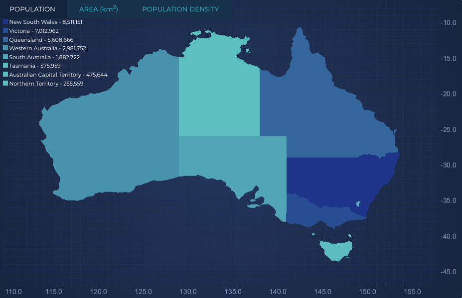 Australia Data
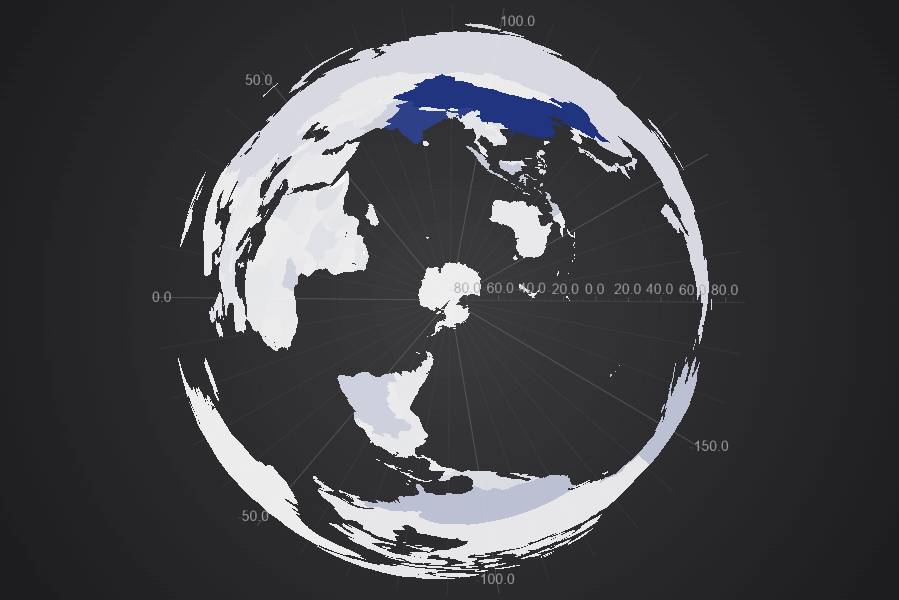 Polar South
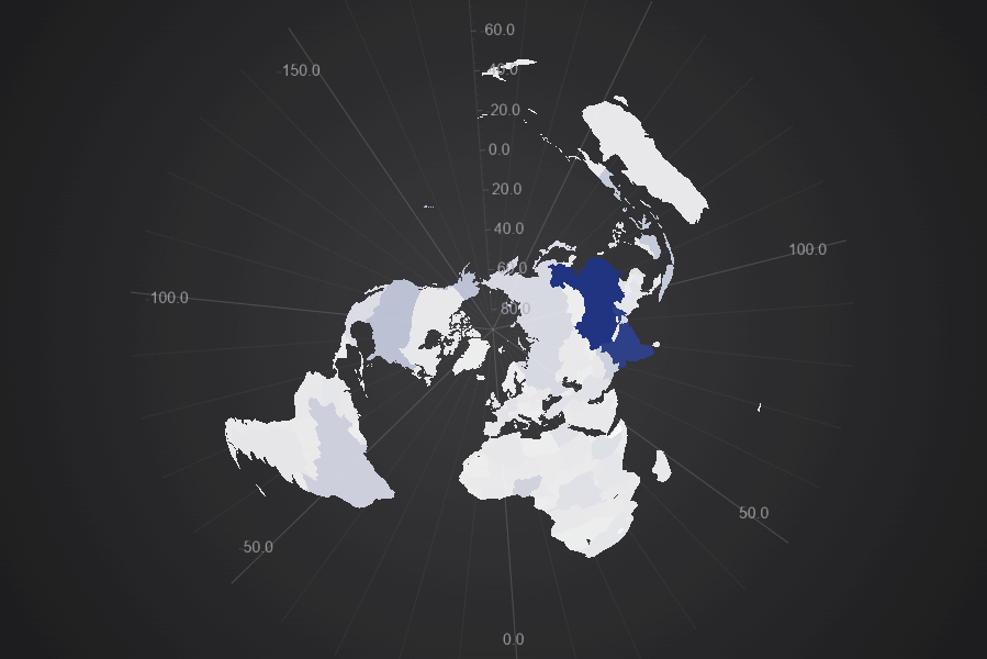 Polar North
Now that you know what is being added to our repertoire of expansive, customizable and high-performance features, it’s worth showcasing where these new features were designed to shine. While this is not an exhaustive list of examples, it encompasses some of the core sectors that can leverage and benefit from these new features and upgrades.


Imagine a fleet management system where the exact location of vehicles needs to be displayed instantaneously on a map. As each vehicle transmits its updated coordinates, the GeoJSON data changes, and the map must reflect these changes in real-time, providing an accurate and up-to-the-minute overview of the entire fleet’s movements.
Beyond simple points, real-time rendering also facilitates the visualization of complex terrain overlays. This could involve displaying dynamic weather patterns, updating in real-time to show precipitation, wind speeds, or temperature changes. The ability to overlay this constantly changing data onto a base map provides critical insights and situational awareness.
Another significant area is mission planning visuals. In defense, logistics, or even drone operations, real-time map updates are essential for dynamic mission planning. This could involve visualizing changing no-fly zones, updating routes based on new intelligence, or displaying the live progress of ground troops or airborne assets. The instantaneous feedback on the map allows for rapid adjustments and optimized decision-making during critical operations.
The technology enables the display of vector-based operational maps that update in real-time. Unlike static raster images, vector maps are composed of geometric primitives like points, lines, and polygons, which allows for crisp rendering at any zoom level and easier manipulation of individual features. In operational contexts, this means that boundaries, infrastructure, or strategic points can be added, modified, or removed from the map instantly as circumstances change. The real-time, vector-based nature ensures that users always have the most accurate and actionable visual representation of their operational environment.
Delving into real-time GeoJSON map rendering, we unlock the potential to visualize intricate datasets for climate and remote sensing with unprecedented clarity and responsiveness. Imagine the ability to instantaneously display dynamic phenomena, such as:
The power of real-time GeoJSON rendering extends to manipulating and displaying highly complex datasets. By combining the precision of GeoJSON with advanced rendering techniques, we empower users to explore and analyze complex geospatial information dynamically, facilitating deeper understanding and more informed decision-making across diverse fields, from scientific research and environmental monitoring to logistics and urban planning. Capabilities we’re unlocking for developers include:
Display Infrastructure Coverage, Signal Strength, or Failure Overlays by Geographic Zones
For telecommunications companies, utilities, and emergency services, understanding the real-time status of their infrastructure is crucial. Imagine visualizing cellular signal strength across different neighborhoods, pinpointing areas with weak coverage. Or, for a power grid operator, instantly identifying geographic zones affected by outages, allowing for rapid response and resource allocation. Similarly, civil engineering firms can overlay data on structural integrity or environmental impact across specific building zones. This capability enables proactive maintenance, efficient resource deployment, and improved public safety by providing an immediate, visual understanding of operational status within defined geographic boundaries.
The Internet of Things (IoT) has led to an explosion of sensor data, much of which has a geographic component. Integrating this data with GeoJSON maps allows for powerful spatial analysis and real-time monitoring.
For instance:
This integration moves beyond static maps, transforming them into dynamic dashboards that reflect the pulsating rhythm of real-world phenomena, providing actionable insights for decision-makers across a multitude of sectors.
Real-time visibility of dynamic fleet locations, comprehensive congestion heatmaps, and precise route planning overlays can be achieved by leveraging GeoJSON charts with SciChart.js v4. This allows for optimized logistics operations, improved delivery times, and proactive responses to unforeseen delays.
Using GeoJSON maps with SciChart.js v4, you can combine static base layers with real-time, triangle-driven data overlays to visualize complex transport and logistics data, such as vehicle movements, supply chain routes, and delivery statuses.
Using Scichart’s JavaScript chart library means you can stop pushing SVG to its limits!
Traditional rendering techniques can struggle with performance, leading to lag. Therefore, innovative approaches are required to ensure that these rich, geographically-aware visualizations are not only accurate but also responsive and readily accessible for critical operational and analytical tasks.
SciChart.js v4 isn’t just faster — it’s built for the next generation of data-driven apps.
Building on this, SciChart React Chart Library bring the same next-generation performance to modern web apps. With seamless React integration, they make it easy to create fast, interactive, and visually rich charts that enhance any data-driven experience.
Recent Blogs
![]()
Queens Award for Innovation
Proud winners of the Queens Award for Innovation, 2019. Awarded on account of our innovative graphics engine which underpins the SciChart library and enables our world-beating charting performance
![]()
National Business Awards
Highly Commended for Lloyds National Business Awards, 2019. Awarded on account of our innovative graphics engine and impressive customer base
![]()
National Technology Awards
Awarded “Healthcare Tech of the Year” at the 2025 National Technology Awards – a top UK recognition for breakthrough innovation in technology.

Reviews
SciChart has received hundreds of verified, 3rd party reviews