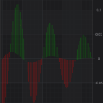
Hi, I want to draw a chart like the attached image.
This is a chart with XyDataSeries, it show as vertical line at each data point and verticle line is a dotted line in order to separated from other series.
Since the OHLC chart will have the open, close on the data point and an impulse chart is forced to draw from an axis, is there any better way that can achieve a series like this? Thank you!
- may lym asked 5 years ago
- You must login to post comments
Hi May Lym,
Unfortunately we don’t support such series types. In this case you will need to use XyyDataSeries which contains both lines. This is required to determine which color to use for drawing of each line + to correctly implement hit test and some other APIs required by chart.
The closest thing to this type of chart is FastBandRenderableSeries, but it fills the area instead of drawing it with lines. You can try to pick up a fill texture for both FillBrush and FillY1Brush which contains desired output ( create a bitmap which contains those vertical lines and use it as fill for FastBandRenderableSeries).
Also you can try to create a custom renderable series – in your case you’ll need to extend XyyRenderableSeriesBase and draw it on your own using RenderContext API
Hope this will help you!
Best regards,
Yura
- Yura Khariton answered 5 years ago
 Thank you, Yura! I will try out the custom renderable series.
- You must login to post comments
Please login first to submit.

