I am trying to use SciChart library for my project and find out whether it satisfy all requirements.
I am currently trying to display the ECG signal. Therefore the data is coming in realtime.
I have the following configuration
 final NumericAxis xAxis = mSciChartBuilder
                .newNumericAxis()
                .withAxisTitle("Time (seconds)")
                .withDrawLabels(false)
                .withDrawMajorTicks(false)
                .withDrawMinorTicks(false)
                .withDrawMajorBands(false)
                .withDrawMajorGridLines(false)
                .withDrawMinorGridLines(false)
               // .withVisibleRange(0, 2040)
                .withAutoRangeMode(AutoRange.Always)
                //.withAutoRangeMode(AutoRange.Never)
                .build();
        final NumericAxis yAxis = mSciChartBuilder
                .newNumericAxis()
                .withAxisTitle("Voltage (mV)")
                //    .withGrowBy(0.1d, 0.1d)
                .withDrawLabels(false)
                .withDrawMajorTicks(false)
                .withDrawMinorTicks(false)
                .withDrawMajorBands(false)
                .withDrawMajorGridLines(false)
                .withDrawMinorGridLines(false)
                .withVisibleRange(Short.MIN_VALUE, Short.MAX_VALUE)
                .build();
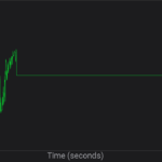
It works but the X axis a little bit scaled/compress.
Here is the result
enter image description here
I need to make it a bit wider.
How can I do this ?
I have tried to set range manually like that
.withVisibleRange(0, 2040)
However in this case it doesn’t show anything.
I would be grateful for any help.
UPDATE
https://drive.google.com/file/d/17p1E-Z_YxiVh_JtwEvlM1PaTVyJ7eyz7/view
- Durian Odour asked 7 years ago
- last edited 7 years ago
- You must login to post comments
Hi Durian,
You set for xAxis has AutoRange.Always which will override any changes to VisibleRange and scale axis to data extents. As I see from your screenshot line series is drawn horizontally to the right side of the screen so probably there is some data point at the end of the line and that’s why AutoRange.Always provide such result.
If you want to set VisibleRange manually then you should use AutoRange.Never or AutoRange.Once and provide desired VisibleRange:
final NumericAxis xAxis = mSciChartBuilder
            .newNumericAxis()
            .withAutoRangeMode(AutoRange.Never)
            .withVisibleRange(0, 2040)
            .build();
Hope this will help you!
Best regards,
Yura
- Yura Khariton answered 7 years ago
 Here is the video link https://drive.google.com/file/d/17p1E-Z_YxiVh_JtwEvlM1PaTVyJ7eyz7/view
 Basically I need to display the Audio input stream scaled (wider than it is really) in time, I have tried just to increase the delta value used for incrementing time, however it doesn’t help
 Did you have a chance to take a look on our Showcase application which has an Audio Analyzer example (https://github.com/ABTSoftware/SciChart.Android.Examples/blob/master/v2.x/Showcase/app/src/main/kotlin/com/scichart/scishowcase/views/AudioAnalyzerFragment.kt). In this example we also record audio input with 44,1k sampling rate and we get 2048 samples per second. If this doesn’t help then maybe you should decrease amount of points which are displayed on screen or choose another VisibleRange value so you’ll have less data per pixel and as result chart should look less compressed in X direction.
 Thank you for the reply, yes I have already tried every single examples provided. Ideally it should be like Ecg in the showcase project. However I have also tried to use realtime chart, it shows the signal however it is narrower that should be, is it possible to make it wider using Autorange ?
 By default using AutoRange.Always sets VisibleRange to the data extents so your entire data set could be drawn on screen. So to make chart’s output wider and increase spacing between data points you need to decrease amount of points in data series and as result decrease amount of data points per pixel. Another possible solution is to provide more smooth data set with less amount of noise.
- 3 more comments
- You must login to post comments
Please login first to submit.

