SciChart.js v6 in Alpha – WebGPU, Incredible Performance Gains and more
Our team has been working hard on continued R&D with SciChart.js – High Performance JavaScript Charts – and today we’d […]
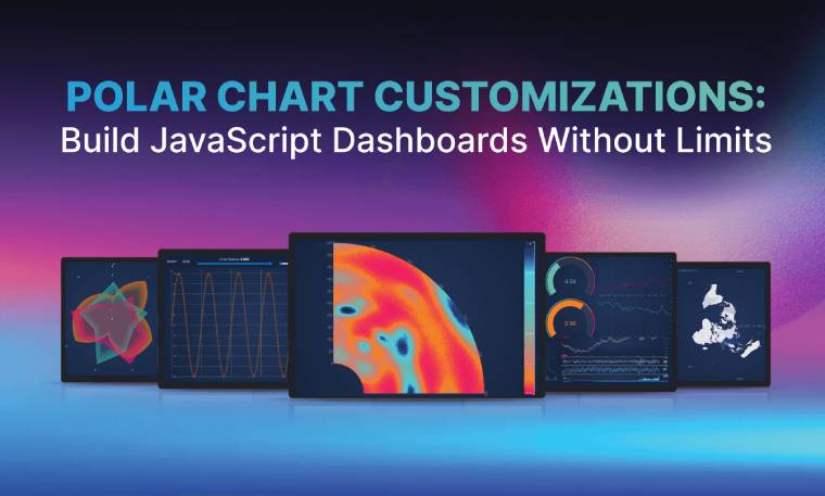
Have you ever hit the wall with your charting library?
Maybe you tried to add Polar Chart customizations, only to find you’re stuck with one fixed circle.
Maybe you needed Radial Gauges, branded dashboards, or interactive overlays – and discovered your library only lets you tweak colors and labels.
If you’ve ever asked yourself:
…then you already know the frustration of tools that promise flexibility but stop at cosmetic tweaks.
That’s where SciChart’s JavaScript Chart Library v4 comes in. It’s a charting engine designed for deep customization: flexible Polar Charts, powerful gauges, reusable dashboards – all without giving up performance.
In this deep dive, you’ll find out how to eliminate the common “not supported” roadblocks encountered with other charting libraries to create exactly what you envision, without limits.
When you’re building JavaScript Polar Charts, you need more than “nice visuals.” You need charts that:
Most libraries stop at surface-level Polar Chart customizations – colors, fonts, and themes. The moment you need a chart type that isn’t prebuilt, or behavior outside the defaults, you hit a wall.
That’s why SciChart JS v4 focuses on structural Polar Chart customizations. It gives you primitives, APIs, and rendering control so you can build the chart you actually need – not just the chart the library designer thought of.
With SciChart JS v4, you’re not stuck with templates. SciChart gives you a toolbox of Polar Chart customizations to build exactly what you need:
This breadth of control means you can say yes to niche requirements and still deliver dashboards that perform. Instead of “skinning” charts, you can redefine them from the ground up.
At SciChart, we offer several resources for developers to support the customization of data point and axis labels. We recommend exploring our Polar Axis Labels Documentation, Polar Data Point Labels Documentation and JavaScript Polar Label Modes Demo.
Finally break out of the fixed circle Polar Chart design with flexible shape options. You can create quarter arcs, half-circles, or offset centres with totalAngle and startAngle and axis alignment properties. For example, you can set totalAngle to π/2 for a quarter arc or π for a half-circle.
You can control where the Polar Chart starts. For instance, it could start at the left, 12 o’clock, 3 o’clock or 6 o’clock – wherever you want your audience to focus their attention. You can also set the chart to clockwise and anti-clockwise with the ability to flip coordinates. With render order control, you decide what sits above or below in layered data to improve the clarity of your visualization. This is great for collaboration or overlaying multiple datasets cleanly. Interpolation modes also let you choose how data points connect, with straight lines, splines, or polar curves.
Custom shapes enable you to use rectangles, triangles, and polygons to build complex polar charts, such as histograms, treemaps, maps, event markers or vector fields. You can also easily switch between circular or polygonal (radar/spider style) grids with the gridlineMode property – ideal for styling Spider Radar Charts, Radial Gauges, and Windroses.
Pointers and gauges let you configure sizes, angles, arrowheads, and thresholds without manual SVG coding. This makes radial gauges easy to build and style.
SciChart supports HTML/CSS/React annotations inside charts, making it easy to create responsive interactive tooltips, forms, or layouts that work well on mobile dashboards.
You want to build sophisticated, branded, and high-performance data visualizations. The unparalleled Polar Chart customization flexibility offered by SciChart JS is critical for achieving this. From the polar heatmap to gauge charts, explore our favorite Polar Chart examples below, with code samples for you to give a go.
Visualize intensity and density with color gradients using the Polar Heatmap.
View Polar Heatmap DemoView Polar Heatmap Documentation
const {
    PolarMouseWheelZoomModifier,
    SciChartJsNavyTheme,
    PolarZoomExtentsModifier,
    PolarPanModifier,
    EAxisAlignment,
    PolarNumericAxis,
    EPolarLabelMode,
    SciChartPolarSurface,
    EPolarAxisMode,
    NumberRange,
    HeatmapColorMap,
    UniformHeatmapDataSeries,
    PolarUniformHeatmapRenderableSeries,
} = SciChart;
// or, for npm, import { SciChartSurface, ... } from "scichart"

const { sciChartSurface, wasmContext } = await SciChartPolarSurface.create(divElementId, {
    theme: new SciChartJsNavyTheme(),
});

const HEATMAP_WIDTH = 48;
const HEATMAP_HEIGHT = 10;

const angularXAxis = new PolarNumericAxis(wasmContext, {
    polarAxisMode: EPolarAxisMode.Angular,
    axisAlignment: EAxisAlignment.Left,
    visibleRange: new NumberRange(0, HEATMAP_WIDTH),

    autoTicks: false,
    majorDelta: 1,

    polarLabelMode: EPolarLabelMode.Perpendicular,
    flippedCoordinates: true, // go clockwise
    totalAngle: Math.PI * 2,
});
sciChartSurface.xAxes.add(angularXAxis);

const radialYAxis = new PolarNumericAxis(wasmContext, {
    polarAxisMode: EPolarAxisMode.Radial,
    axisAlignment: EAxisAlignment.Bottom,
    visibleRange: new NumberRange(0, HEATMAP_HEIGHT),

    drawLabels: false, // hide radial labels
    innerRadius: 0.1,
});
sciChartSurface.yAxes.add(radialYAxis);

// Add a heatmap series to the chart
const heatmapSeries = new PolarUniformHeatmapRenderableSeries(wasmContext, {
    dataSeries: new UniformHeatmapDataSeries(wasmContext, {
        zValues: Array.from({ length: HEATMAP_HEIGHT }, () => {
            return Array.from({ length: HEATMAP_WIDTH }, () => {
                return Math.random() * 100;
            });
        }),
        xStart: 0,
        yStart: 0,
        xStep: 1,
        yStep: 1,
    }),
    colorMap: new HeatmapColorMap({
        minimum: 0,
        maximum: 100,
        gradientStops: [
            { offset: 0, color: "lightblue" },
            { offset: 1, color: "indigo" },
        ]
    }),
});
sciChartSurface.renderableSeries.add(heatmapSeries);
Build polar maps with astounding levels of detail using the Triangle Series Type. To create a more basic triangle chart to see how our Triangle Series works, use the documentation linked below.
View Polar Map ExampleView Triangle Series Documentation
Display progress indicators and performance metrics with the Polar Gauge FIFO Dashboard. This Polar Chart dashboard example uses the powerful SubCharts API functionality to combine Polar and Cartesian charts on one SciChart surface.
View Polar Gauge Dashboard DemoView Polar Gauge Chart Documentation
// Demonstrates how to create a gauge chart using ArcAnnotation & PolarPointerAnnotation using SciChart.js
const {
    SciChartPolarSurface,
    SciChartJsNavyTheme,
    NumberRange,
    PolarArcAnnotation,
    PolarNumericAxis,
    EPolarAxisMode,
} = SciChart;
// or, for npm, import { SciChartSurface, ... } from "scichart"

const { wasmContext, sciChartSurface } = await SciChartPolarSurface.create(divElementId, {
    theme: new SciChartJsNavyTheme(),
});

// The gauge angle
const gaugeTotalAngle = Math.PI * 1.2;
const gaugeRange = new NumberRange(0, 100); // the range of the gauge

// Add the axes
const angularXAxis = new PolarNumericAxis(wasmContext, {
    polarAxisMode: EPolarAxisMode.Angular,
    visibleRange: gaugeRange, // 0 - 100
    flippedCoordinates: true, // go clockwise
    totalAngle: gaugeTotalAngle,
    startAngle: (Math.PI - gaugeTotalAngle) / 2, // to center the bottom gap
    isVisible: false,
});
sciChartSurface.xAxes.add(angularXAxis);

const radialYAxis = new PolarNumericAxis(wasmContext, {
    polarAxisMode: EPolarAxisMode.Radial,
    visibleRange: new NumberRange(0, 10), // 0 - 10
    isVisible: false,
});
sciChartSurface.yAxes.add(radialYAxis);

// (optional) add a gray background Arc
const backgroundArc = new PolarArcAnnotation({
    y1: 10, // outer radius of the arc relative to the center of the gauge
    y2: 8, // inner radius of the arc

    x1: gaugeRange.min, // start angle -> 0
    x2: gaugeRange.max, // end angle -> 100

    fill: "#88888822",
    strokeThickness: 0
});

// The Value Arc
const valueArc = new PolarArcAnnotation({
    y1: 10, // outer radius
    y2: 8, // inner radius

    x1: gaugeRange.min, // start angle -> 0
    x2: 50 + Math.random() * 30, // current value (end of arc)

    fill: "#3388FF",
    stroke: "#FFFFFF",
    strokeThickness: 3
});

sciChartSurface.annotations.add(backgroundArc, valueArc);
View JavaScript Polar Chart Examples
How Does SciChart’s Polar Chart Customizations Stack Up Against Other Libraries
SciChart JS v4 isn’t just another chart library. It’s a charting engine you can bend to your use case.
Coupled with predictable APIs for easier debugging, reusable configurations for faster deployment of dashboards, and real-time performance at scale, SciChart JS’s Polar Chart customizations offer a significant advantage for building truly bespoke and efficient charting solutions.
How do our Polar Chart customizations compare to the competition?
- Polished defaults but limited polar/gauge flexibility.
- Big template sets, but stuck if you go outside them.
- GPU fast, but narrower customization APIs.
- Suite-wide styling, but charting remains cosmetic.
- Simple/cheap, not built for advanced workloads.
Only SciChart delivers structural Polar Chart customizations, including coordinate systems, primitives, hybrid surfaces, HTML overlays, render control. These can be applied at scale, for scientific, engineering, and high-performance apps.
If you’re frustrated at having to choose between performance and design, SciChart offers some of the best JavaScript Polar Charts with no compromises – you get the deep flexibility you’re looking for as well as high performance.
By configuring instead of hacking, you can ship your Polar Chart data visualization projects faster and fulfil the most niche or complex of charts.
You’ll also get peace of mind that your chosen library is future-proof, with regular updates and responsive design.
Recent Blogs
![]()
Queens Award for Innovation
Proud winners of the Queens Award for Innovation, 2019. Awarded on account of our innovative graphics engine which underpins the SciChart library and enables our world-beating charting performance
![]()
National Business Awards
Highly Commended for Lloyds National Business Awards, 2019. Awarded on account of our innovative graphics engine and impressive customer base
![]()
National Technology Awards
Awarded “Healthcare Tech of the Year” at the 2025 National Technology Awards – a top UK recognition for breakthrough innovation in technology.

Reviews
SciChart has received hundreds of verified, 3rd party reviews