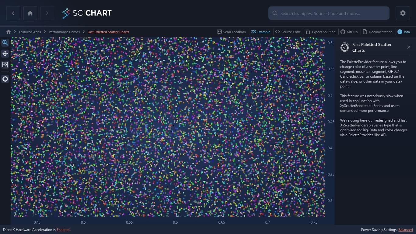
I want to create a chart like the attached image file.
I want to mark points with different colors depending on the number of data corresponding to the x and y axes.
As a result of searching, there is a HeatmapColorPalette. Is it good to use this?
If there is a more suitable chart, please introduce it.
thank you
Version
6.2.1.13304
Images

- Seung Woo Jin asked 1 year ago
- You must login to post comments
Hi Seung Woo Jin,
Thanks for your question.
Yes, you can use our PaletteProvider API to achieve coloring of scatter series points.
Here you can find the corresponding documentation: The PaletteProvider API
Also, our “Using PaletteProvider” examples can be useful. Here are the links:
With best regards,
Lex
SciChart Technical Support Engineer
- Lex answered 1 year ago
- last edited 1 year ago
- You must login to post comments
Your Answer
Please login first to submit.
