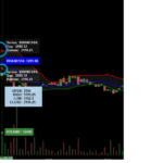
Hello,
Is it possible to display distinct labels for Y, and Y1 on BandRenderableSeriesViewModel using RollerOverModifier?
I have tried using following code snippet for RolloverModifier.TooltipTemplate, additionally tried using TooltipContainerStyle with a custom template. With these, same tooltip appears on both the lines. Is it possible to
1- Either display tooltip on only one line (e.g. on the red line), and point markers on both lines.
2- Or display a single label with current point markers’s value on each line i.e. Y on Red, and Y1 on green?
3- Set point marker colors to same as line’s as circled on the screenshot?
<DataTemplate x:Key="BandTooltipTemplate" DataType="s:XyySeriesInfo">
    <StackPanel Orientation="Vertical">
        <TextBlock Foreground="White">
            <Run Text="Series: "/>
            <Run Text="{Binding SeriesName, StringFormat='{}{0}:', Mode=OneWay}"/>
        </TextBlock>
        <TextBlock Foreground="White">
            <Run Text="Top: "/>
            <Run Text="{Binding FormattedYValue, Mode=OneWay}"/>
        </TextBlock>
        <TextBlock Foreground="White">
            <Run Text="Bottom: "/>
            <Run Text="{Binding FormattedY1Value, Mode=OneWay}"/>
        </TextBlock>
    </StackPanel>
</DataTemplate>
Existing result screenshot attached.
Thanks, Roger.
- Roger Thomas asked 3 years ago
- last edited 3 years ago
- You must login to post comments
Hi Roger,
Are you asking how to combine the two Band Series tooltips into one? I don’t believe that is possible out of the box, but we do have some novel solutions for displaying legends in financial applications.
For example this one:
This is described over at blog.scichart.com/algorithmic-trading-with-scichart.
What we do is use the RolloverModifier as a datasource and create a custom ItemsControl to display the info:
<!-- Note, datatemplates have been omitted for brevity -->
<!-- but notice you can bind to RolloverModifier.SeriesData.SeriesInfo -->
<!-- to create custom legends -->
<ItemsControl Grid.Row="0"
              MinHeight="24"
              Margin="20"
              IsHitTestVisible="False"
              Background="#33333333"
              DataContext="{Binding Source={x:Reference Name=PriceChart}, Path=ChartModifier}"
              ItemTemplateSelector="{StaticResource ChartDataTemplateSelector}"
              ItemsSource="{Binding Path=[RolloverModifier].SeriesData.SeriesInfo}"
              Visibility="{Binding Path=[RolloverModifier].IsEnabled,
                                       Converter={StaticResource BooleanToVisibilityConverter}}">
    <ItemsControl.ItemsPanel>
        <ItemsPanelTemplate>
            <StackPanel Orientation="Horizontal" />
        </ItemsPanelTemplate>
    </ItemsControl.ItemsPanel>
</ItemsControl>
Is something like this what you want?
Best regards,
Andrew
- Andrew Burnett-Thompson answered 3 years ago
- You must login to post comments
Please login first to submit.

