SciChart.js v5.1.0 Released!
Just six weeks after the release of SciChart.js v5.0, we have another minor update for you: SciChart.js v5.1.0. In this […]

Happy birthday SciChart! Just under a year ago, the first production version of our High Performance WPF Chart went live. This was a really simplistic version which included only Line, Candlestick, Mountain and Column Charts, few interactivity modifiers, and used only a category axis for X-data. Since then we’ve come a long way!
We want to thank all our customers who have supported us in year one. We aim to repay you by continuing to develop our High Performance WPF & Silverlight Chart component and by delivering the outstanding service & support that you’ve come to expect.
Here are the major milestones we’ve covered in just one year.
Feb 2012, SciChart v1.1: Interactivity Modifiers
In February 2012 we launched SciChart v1.1 after a 2-month public beta. This version featured high performance rendering (100k points) of Candlestick, Mountain, Column and Line Charts and had a Rubber Band zoom, Rollover Modifier, Cursor modifiers and basic hit-testing of series.
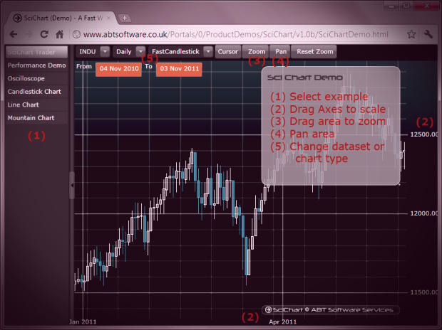
April 2012 SciChart v1.2 Examples Suite
In April 2012 we launched SciChart v1.2 which included the examples suite, Point-Markers, ScatterSeries, RolloverMarkers, Zoom-Pan and MouseWheelModifiers and improved Xaml styling of the chart. We also improved performance (1M points), rendering quality and fixed a handful of bugs reported by users.
June 2012 SciChart v1.3,Value and Category Axes, Themes
In this release we made major steps forward in separating out our axis / coordinate calculation to allow Category and Value X-Axis types.
We added themes and made massive performance improvements to rendering for large datasets (now up to 10 Million points and counting)
We added vertical chart synchronization for mouse, the ThemeManager and fixed a handful of bugs reported by users.
This release also included Legends, Series-Selection, Overview control and had many improvements to the DataSeries API (Append, Update, Insert, Remove).
Sept 2012 SciChart v1.3.5
Between June and September 2012 we made no less than 7 hotfix releases, slowly narrowing down and improving the functionality to get to v1.3.5 – a very stable and fast release of SciChart!
Nov 2012 – Jan 2013 SciChart v1.5
The next big features to be included in SciChart were real-time stock charts support, rich UIElement annotations support, Band-Series and many improvements to CategoryDateTimeAxis to improve scrolling and panning in a real-time financial chart.
Between November 2012 and January 2013 there were three further minor updates perfecting this behaviour in response to user’s requests.
So what’s next? Never to rest on our laurels we are busy planning the features & functionality to include in SciChart 2.x, the first minor version of which is scheduled to arrive in the next couple of months. We have had a lot of feedback from customers, prospective users alike and come up with a feature-set which best fits the most requested items.
SciChart v2.x features are being prioritized and we are aiming to include the following:
Each of the following series types have been requested more than once, so we are going to work hard to deliver as many as possible of the following:
We’ve been saying this for a while now, but it hasn’t been the right time yet. SciChart is currently priced extremely competitively in the high-performance WPF Chart niche and we are hoping to make some changes to the price structure, as well as introduce new editions / versions.
We welcome your comments below – are there any features you particularly want to see in vNext of SciChart? Is there anything in the above plan that looks great? Let us know!
Related Posts
![]()
Queens Award for Innovation
Proud winners of the Queens Award for Innovation, 2019. Awarded on account of our innovative graphics engine which underpins the SciChart library and enables our world-beating charting performance
![]()
National Business Awards
Highly Commended for Lloyds National Business Awards, 2019. Awarded on account of our innovative graphics engine and impressive customer base
![]()
National Technology Awards
Awarded “Healthcare Tech of the Year” at the 2025 National Technology Awards – a top UK recognition for breakthrough innovation in technology.

Reviews
SciChart has received hundreds of verified, 3rd party reviews