DirectX Compatibility in WPF Charts with SciChart
SciChart now features an optional DirectX10 based renderer. This is currently included as an add-on to the SciChart High Performance […]
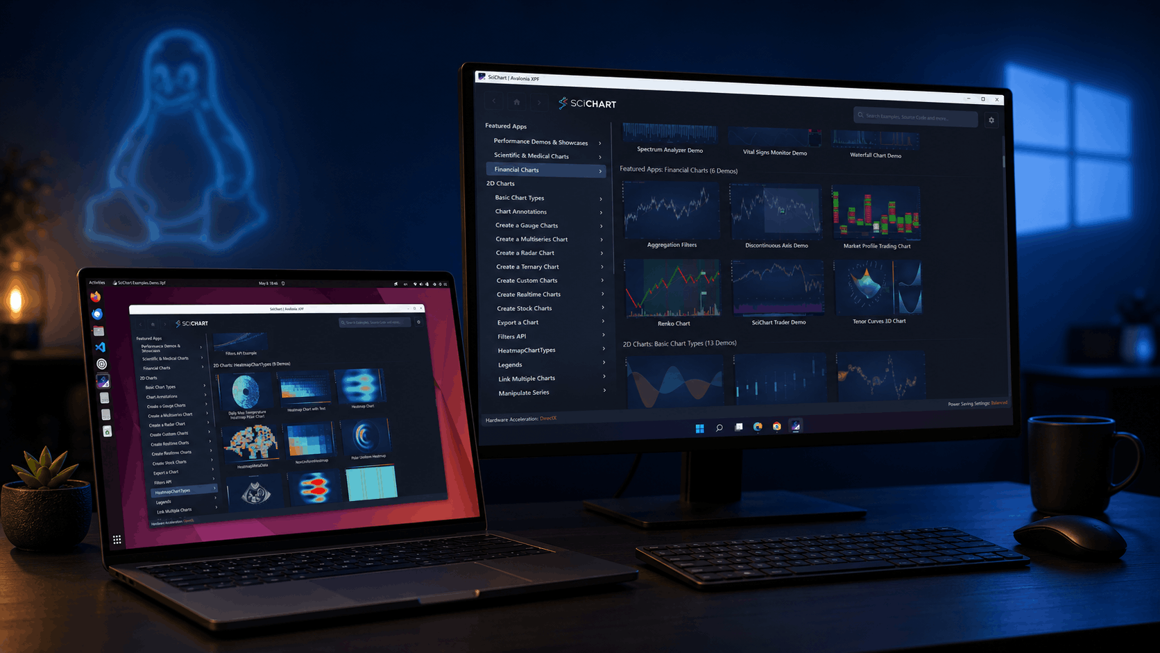
SciChart is thrilled to announce the release of SciChart for Avalonia XPF 2.0 – a major update that brings all features and improvements from SciChart WPF v8.6 through v8.11.1 to the cross-platform Avalonia XPF ecosystem. Whether you’re targeting Windows, Linux, or preparing for macOS, this release ensures your charting applications have access to the same powerful capabilities that SciChart WPF developers have relied on – without any rewrites or compromises.
This release includes new chart types, new financial and scientific examples, expanded ChartModifier APIs, 3D chart enhancements, MVVM improvements, and hundreds of refinements ported from the SciChart WPF v8.6 – v8.11.1 release cycle. You can find all related SciChart WPF releases in the News section of our website. Let’s walk through the highlights.
We’ve moved over to a new format for communicating our releases and updates, by publishing a rolling changelog of every fix or enhancement in SciChart. You can find the changelogs in the top menu at Developers -> Changelogs -> SciChart XPF ChangeLog
Below is a summary of the main features and changes in this release (v2.0.0 build 28304):
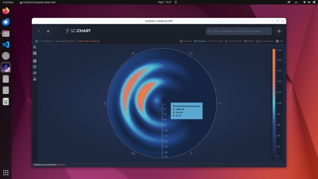
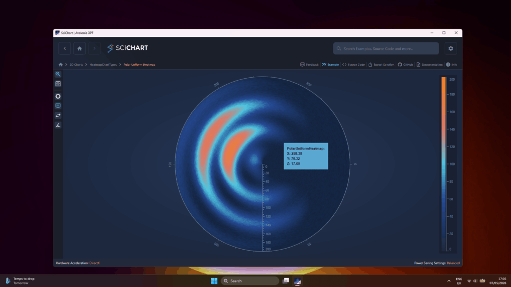
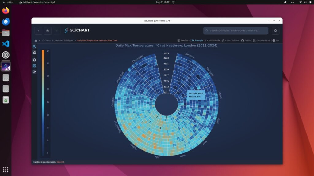
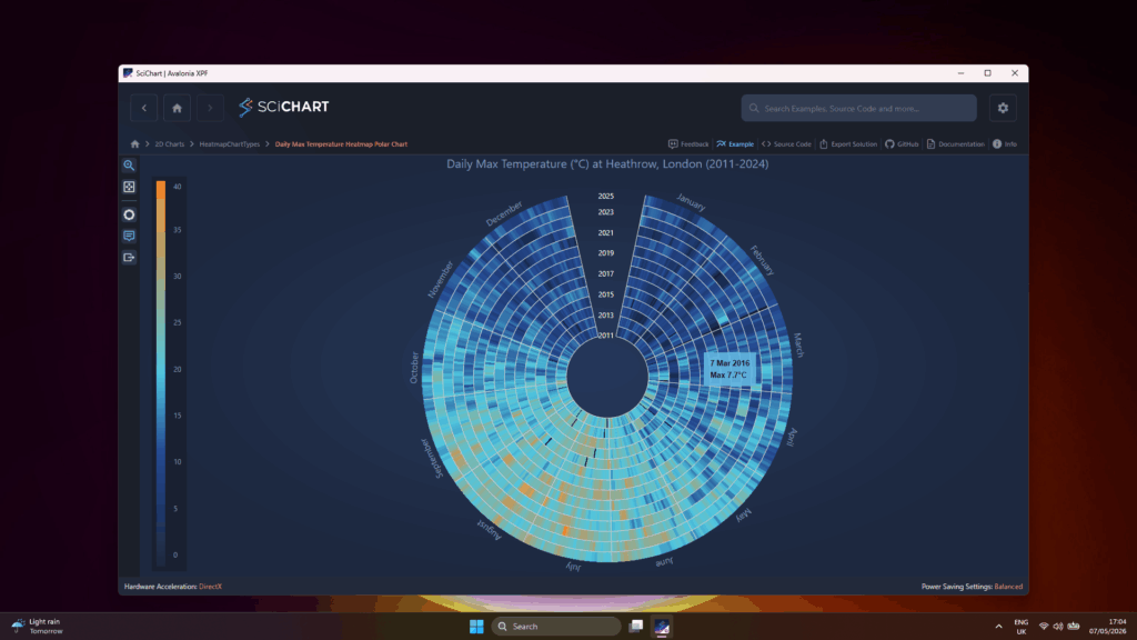
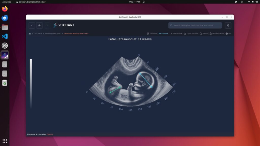
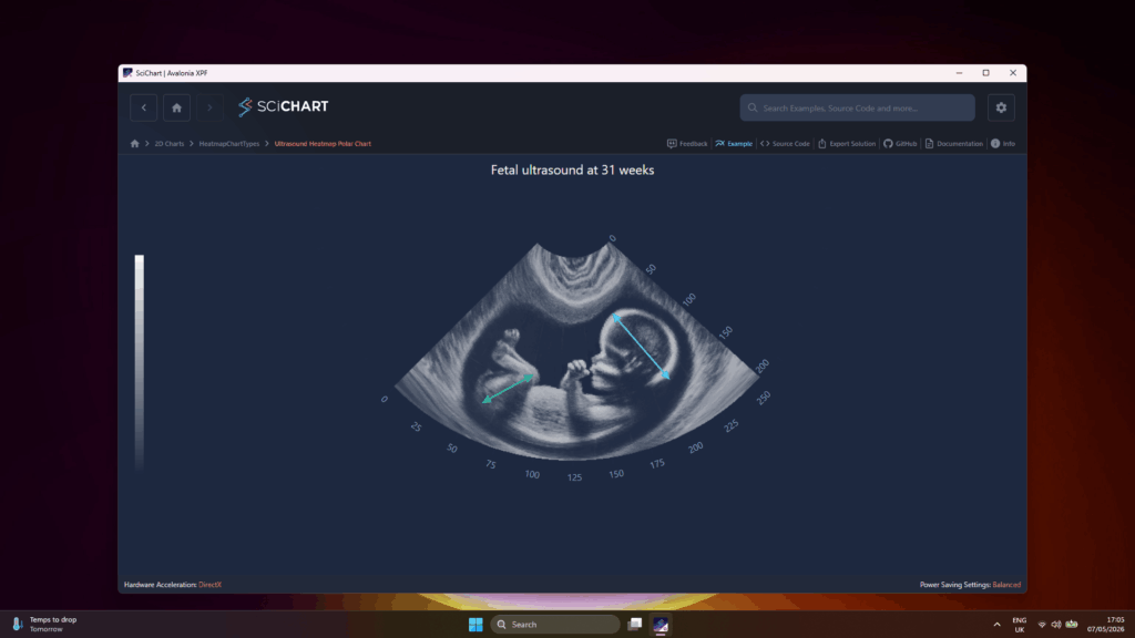
SciChart XPF 2.0 introduces the PolarUniformHeatmapRenderableSeries — a new chart type for visualizing scalar data distributed across polar coordinates. Polar heatmaps are ideal for directional data analysis, antenna radiation patterns, circular heat distribution, and any domain where data naturally maps to angular and radial dimensions.
Three new examples showcase the capabilities of this chart type:
The foundational polar heatmap example. Accepts a 2D array of data with a user-defined color map, rendered in polar coordinates with full support for interactive zooming, panning, and tooltips.
Visualizes maximum daily temperature data over multiple years. The angular axis represents days of the year with month boundary labels, while the radial axis represents individual years. Demonstrates real-world data handling including NaN values rendered as transparent cells.
A sector-shaped polar heatmap for visualizing ultrasound diagnostic data. Uses a large VisibleRange to compress the heatmap into a sector shape with configurable rotation, along with custom WPF behaviors for automatic scaling and repositioning on resize.
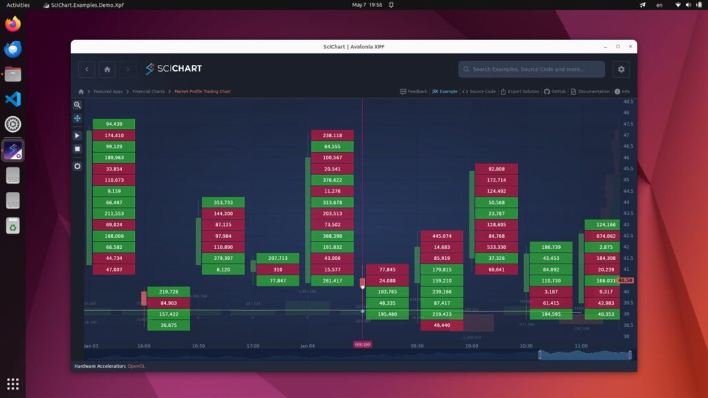
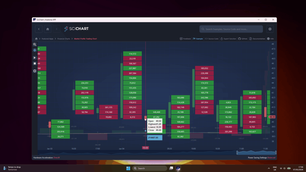
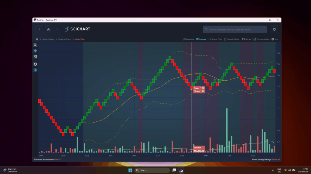
SciChart XPF 2.0 introduces two new category axis types — IndexDateTimeAxis and IndexNumericAxis. These axes treat each data point as equidistant regardless of its actual value, automatically collapsing gaps such as overnight periods and weekends in financial data. The result is cleaner, more readable financial charts with smooth scrolling and interpolated positioning between category bases.
Both new axis types are showcased in the financial examples below.
A comprehensive financial charting example demonstrating Market and Volume Profile series types. Features FastHistoBarRenderableSeries with three visualization modes (Volume Ladder, Cumulative Volume, Volume Profile), FastVolumeCandlestickRenderableSeries for cumulative volume per candlestick, an SMA-20 overlay, and FastMarketProfileRenderableSeries for volume distribution across the full data range. Uses the new IndexDateTimeAxis to automatically collapse non-trading periods.
Demonstrates a Renko chart with Bollinger Bands, SMA-20, and aggregated volume, based on EUR/USD daily data. Renko bricks are rendered via FastCandlestickRenderableSeries using the AggregateByRenko filter. Includes custom Bollinger Bands calculation, two-color background bands using the Axis Bands API, and IndexDateTimeAxis for automatic gap collapsing.

New configuration properties, AutoSimplify, SimplifyOpenThresholdPx and SimplifyCloseThresholdPx, on OHLC series provide fine-grained control over tick visibility at different zoom levels, allowing charts to remain clear and readable as users zoom in and out of financial data.
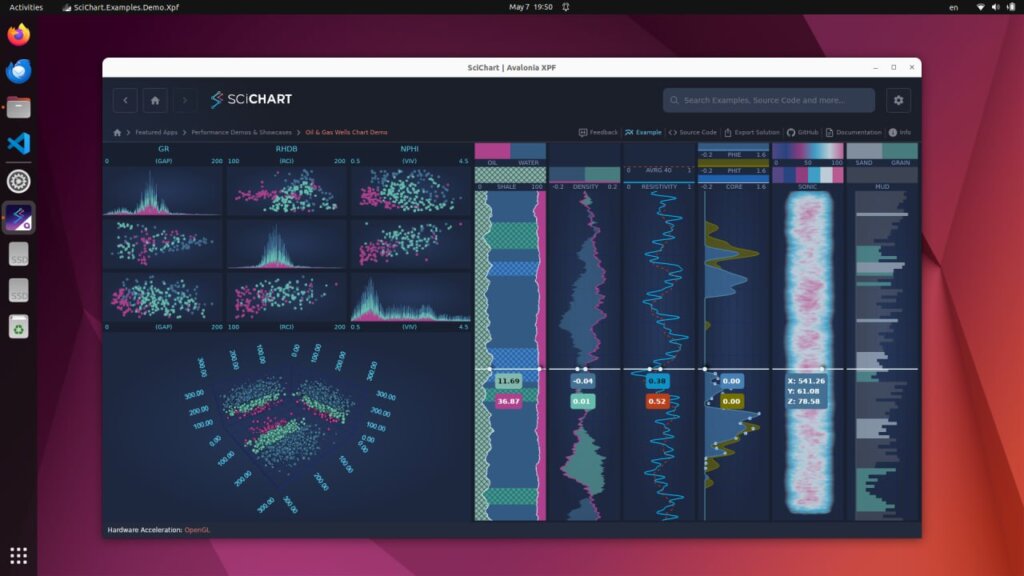
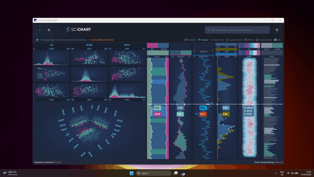
A new showcase example demonstrating a common use case in oil and gas exploration: a vertically arranged dashboard of charts visualizing well parameters such as drill speed, rock type and hardness, temperature, and pressure with increasing depth. The dashboard combines grid charts, 3D scatter/point cloud visualizations, and specialized vertical chart panels with custom series factories for density, porosity, resistivity, shale content, sonic velocity, and rock texture.
Axes now support MajorTickLineStyle and MinorTickLineStyle dependency properties, enabling dynamic styling of tick marks with full data binding support. This allows applications to change tick appearance at runtime through styles and bindings, rather than requiring static configuration.
A new ZoomExtentsRange property on Axis allows specifying a desired VisibleRange that is applied during ZoomExtents and AutoRange operations. This gives developers precise control over the range the chart returns to when the user double-clicks or triggers a zoom-to-fit action.
The SciChartScrollBar has been updated so that scrolling while zoomed no longer changes the VisibleRange span. Previously, dragging the scrollbar thumb while zoomed in could inadvertently alter the zoom level. The new behavior preserves the current zoom span and only translates the visible window.
Under the hood, SciChart XPF 2.0 includes 100+ ported improvements and fixes from the SciChart WPF v8.6-v8.11.1 release cycle. These cover better memory management, improved hit-testing accuracy, eliminated memory leaks, resolved crashes, and numerous rendering refinements across 2D, 3D, and polar chart types.
The SciChart XPF roadmap continues with exciting developments ahead:
and other exciting things we can’t wait to share!
Ready to try SciChart for Avalonia XPF 2.0? Get started today:
We’d love to hear your feedback! Reach out to us with questions, feature requests, or to share what you’re building with SciChart XPF.
Related Posts
![]()
Queens Award for Innovation
Proud winners of the Queens Award for Innovation, 2019. Awarded on account of our innovative graphics engine which underpins the SciChart library and enables our world-beating charting performance
![]()
National Business Awards
Highly Commended for Lloyds National Business Awards, 2019. Awarded on account of our innovative graphics engine and impressive customer base
![]()
National Technology Awards
Awarded “Healthcare Tech of the Year” at the 2025 National Technology Awards – a top UK recognition for breakthrough innovation in technology.

Reviews
SciChart has received hundreds of verified, 3rd party reviews