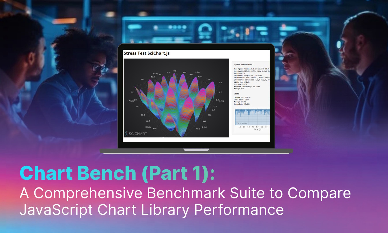
Building a Smith Chart in JavaScript: Inside the Rendering Pipeline
See how SciChart.js was extended to build a fully interactive Smith chart using standard APIs. This article highlights the flexibility of custom rendering and advanced interactions.
When doing a performance comparison of JavaScript Chart Libraries, we are often asked “which is the fastest JavaScript chart?“. Users coming to SciChart for the first time often spend time setting up a complex benchmark comparison app to see if SciChart can meet their needs. This is a time consuming process, and each benchmark will be different, so, we’ve taken the time to do this for you!
We want to demonstrate to you that we care about performance, and that SciChart.js has all the performance you need, even for the most demanding apps. We’ve built a benchmark application for comparing the rendering performance of multiple popular JavaScript Chart Libraries under extreme workloads. This includes the evaluation of a wide range of metrics, including FPS (Frames per second), time to first render (initialization time), memory usage, data ingestion rate (data-points per second) across a wide range of 2D and 3D chart series and features.
Using our benchmark application, you can quickly evaluate the performance of SciChart.js vs. open source and commercial alternatives under very demanding conditions. The outcome is that you can make an informed choice when evaluating a chart library for your big-data, real-time data visualization projects.
Here’s what we will discuss and present below:
In later blog posts in the series, we will also present test results on many hardware configurations from high-end workstations to low-powered or integrated graphics hardware. This will help you to make an informed choice on whether SciChart’s JavaScript Charts has the performance you need for demanding and complex applications.
We’ve published an open-source JavaScript Chart Performance Test Suite at github.com/abtsoftware/javascript-chart-performance-test-suite.
This benchmark runs a number of tests on a variety of chart libraries and measures FPS, Time to first render (startup latency), Memory usage, Frame count, data ingestion rate (data-points per second) and monitors error conditions such as Hanging (timeouts or freezes), Exceptions, Low FPS warnings.
The benchmark test suite can be run simply via npm start and manually driven. Alternatively, you can bulk run the tests using PlayWright npx playwright install, npm install, npm run test:headed, which stores the data as JSON, which can later be imported into the dashboard.
Here’s a quick walkthrough:
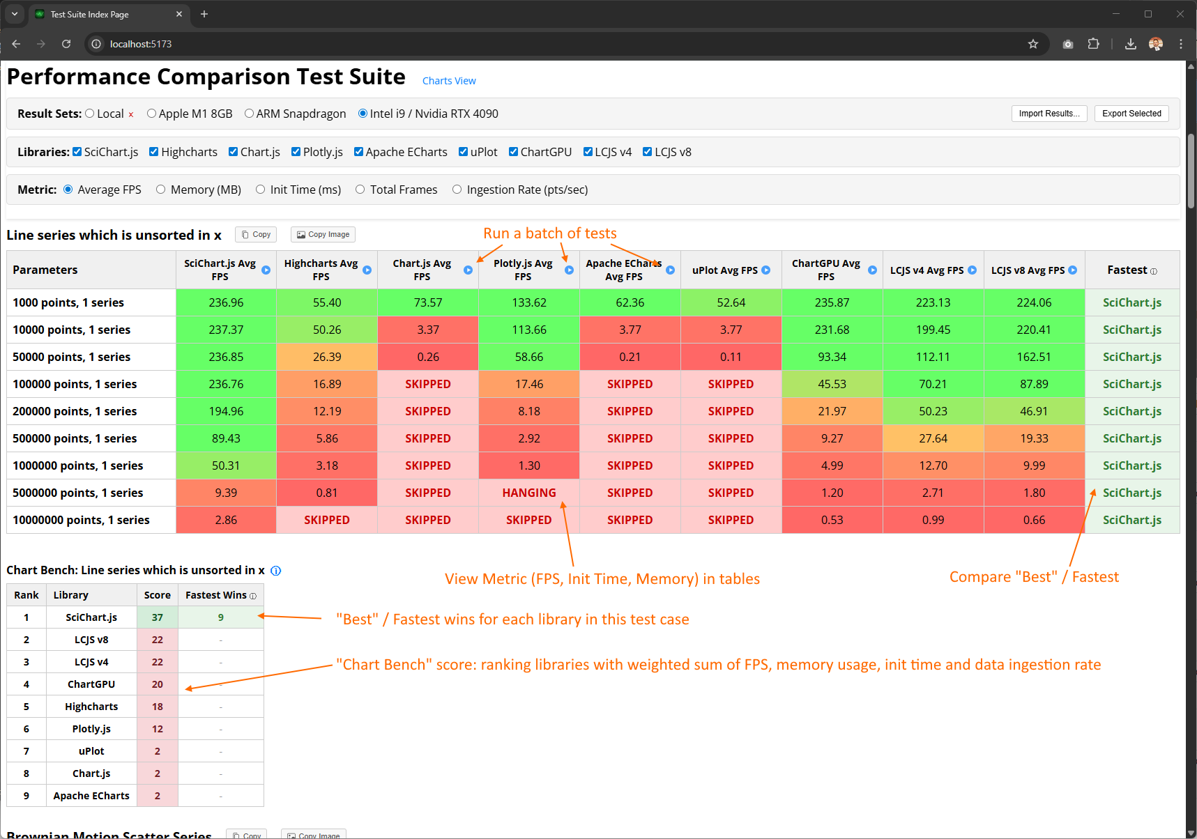
When the chart benchmark starts up, you’ll be presented with a number of tables for each test case and blanks. Click ‘Run’ on any chart library / test case combo to run that test. This will open in a new tab, once it’s complete, close the tab and run the next test. At the time of writing, you’ll have to refresh the homepage to update the table.
Note: Instructions how to bulk-run the tests using PlayWright can be found on GitHub.
Once you’ve populated some test case data, your home screen should look like this:
Some notes here:
For each test case:
FPS only tells part of the story. For an overall holistic view of JavaScript Chart performance we’ve included logging of not only frames per second, but also memory usage, initialization time (time to first render), total frames rendered, and ingestion rate (datapoints per second).
On the homepage, you can switch between metrics to view how each chart library performed as follows:
When you start the application, your Local result set scores tables will be empty. You’ll need to click ‘Run’ on any of the chart library / test combinations to open a test page. After that has run, close the tab and refresh the homepage.
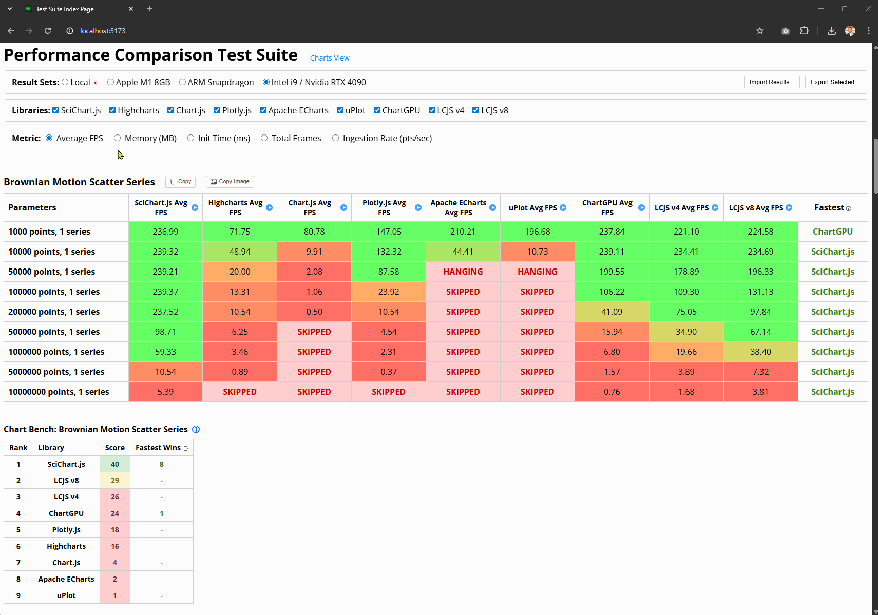
Clicking ‘Run’ on any specific test will bring up the test page which looks like this:
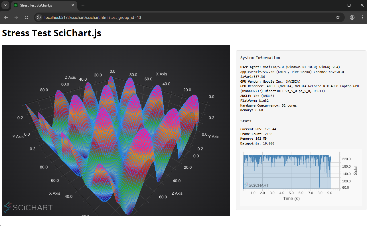
The test page runs for several seconds, with logarithmically increasing difficulty (more data points, more series, more charts). At the end of the test, the chart library is deleted (if supported) and memory is freed.
On the right we have some system information, immediate stats and an FPS counter where you can see frame drops. On this machine I have a UHD monitor with 240 FPS, so you can see this 3D chart test running almost clamped at 240 FPS throughout!
Note: After each test run, close the chart test page before running another test. The homepage will automatically update. Repeat with as many tests as you wish to populate the Local Result set table with data.
The benchmark test suite also includes a Charts View. Click the Charts View button at the top of the page to switch to this:
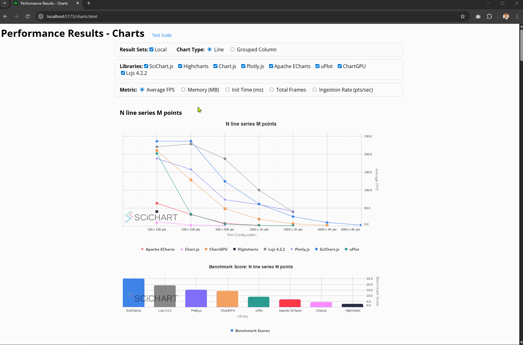
Here you will see FPS Scores and Chart Bench scores plotted for each individual test-case, with results ranked by the highest benchmark number.
Switching between the metrics will help explain the Chart Bench score. For example, a library that performs with high FPS may have high initialization time, or higher memory, or lower data ingestion rate. The benchmark score takes into account all this to provide an overall score (more on this below).
At the time of writing, we’ve included the following chart libraries in the test suite.
We put them head to head in a demanding performance test that stress your CPU and GPU to the max to find out the limits of these libraries. You’ll see how well they perform and their respective stats (FPS, memory usage, initialization time, data ingestion rate) on a variety of hardware.
* LightningChart.js (LCJS) v4.2.2 was included, as well as LightningChart v8.2.0, as v4.x is the latest version which has a community license and does not require a downloadable trial key. The latest version (v8) requires a license key to run the tests.
At the time of writing, the JavaScript Chart Performance Test Suite carries out 13 tests across each of the JavaScript Chart Libraries, each with several sub test-cases. The benchmark aims to test a variety of operations including line charts, scatter charts, column or bar charts, candlestick charts, multi-chart cases, 2D heatmaps as well as 3D charts (surface mesh/plot, 3D point cloud).
Below you will find a list and brief description of the test cases carried out:
3D Surface Mesh Test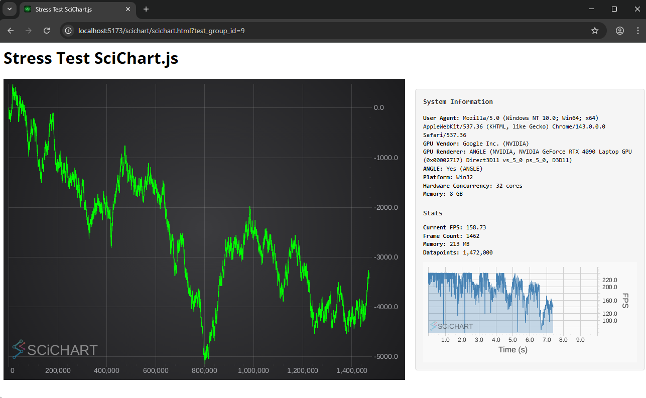 Big Data Line Series Test
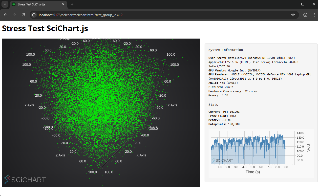 3D Point Cloud Test
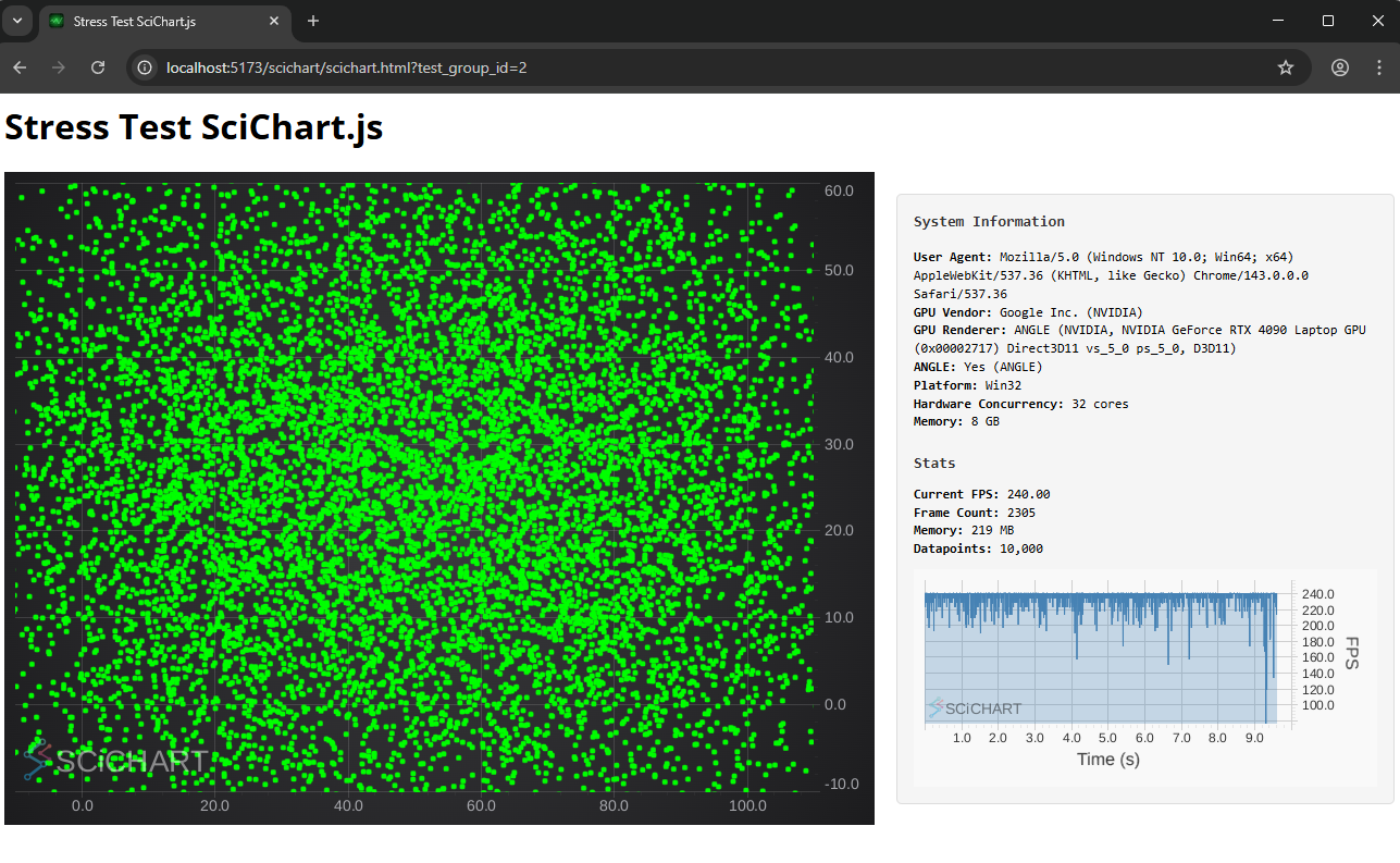 Xy Scatter Test
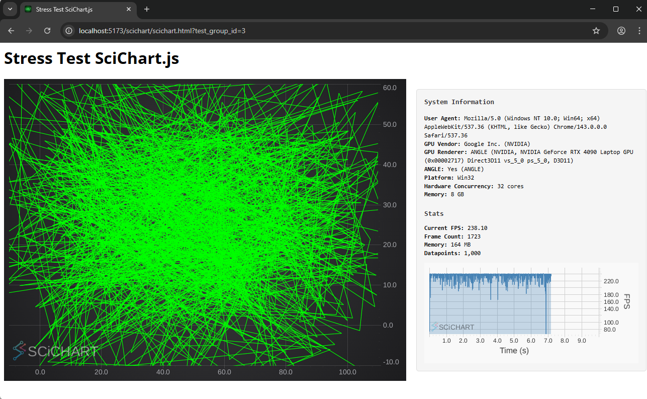 Xy Line Test
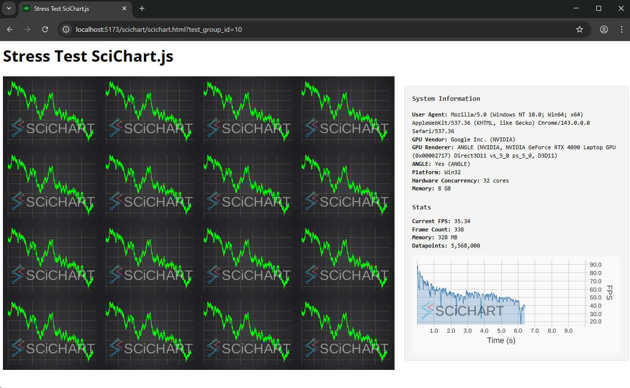 Multi Chart Test
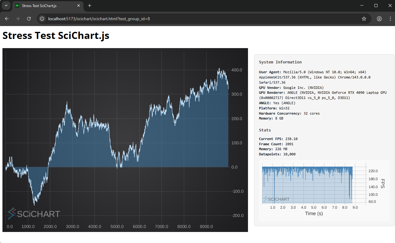 Mountain Series Test
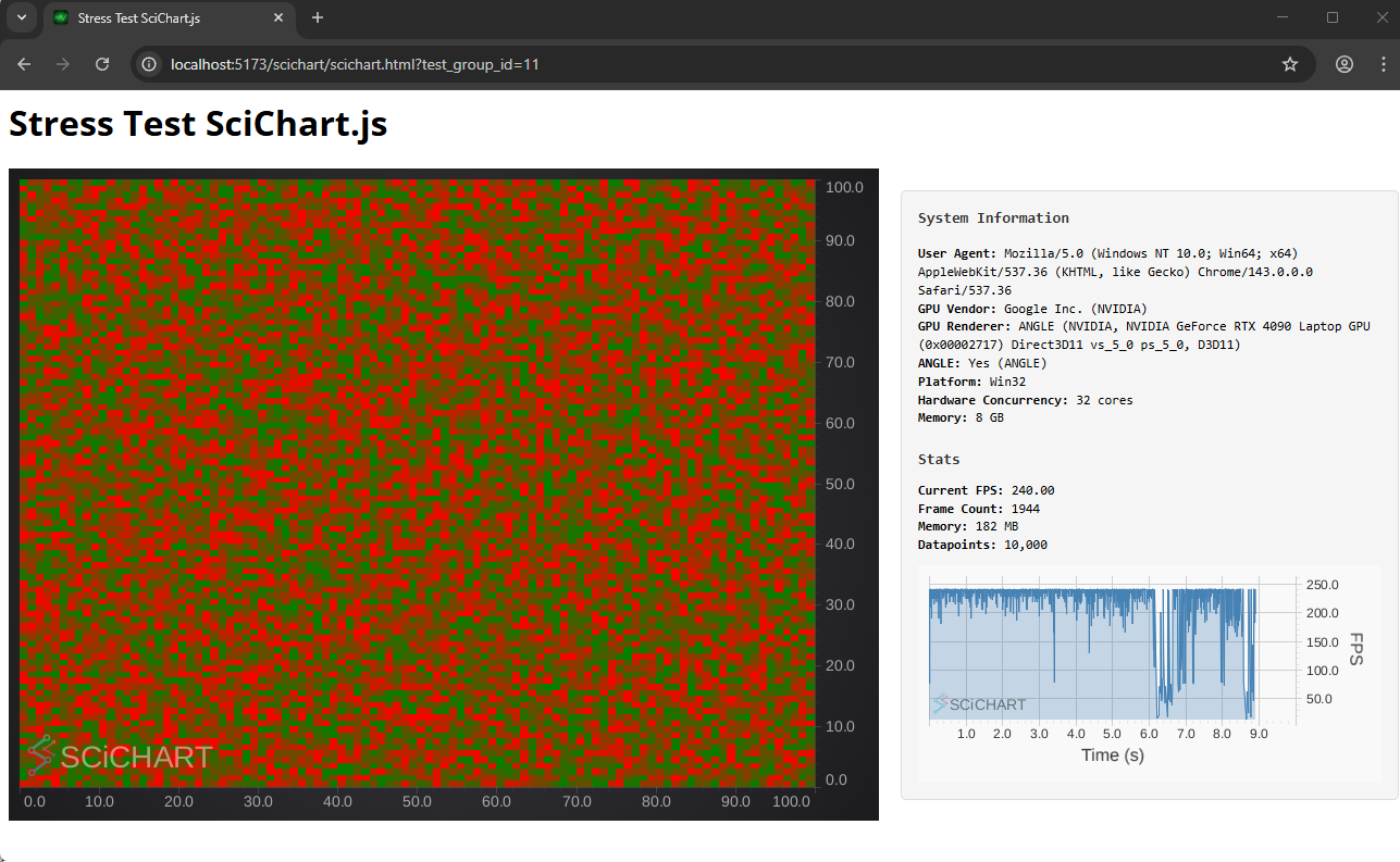 Heatmap 2D Test
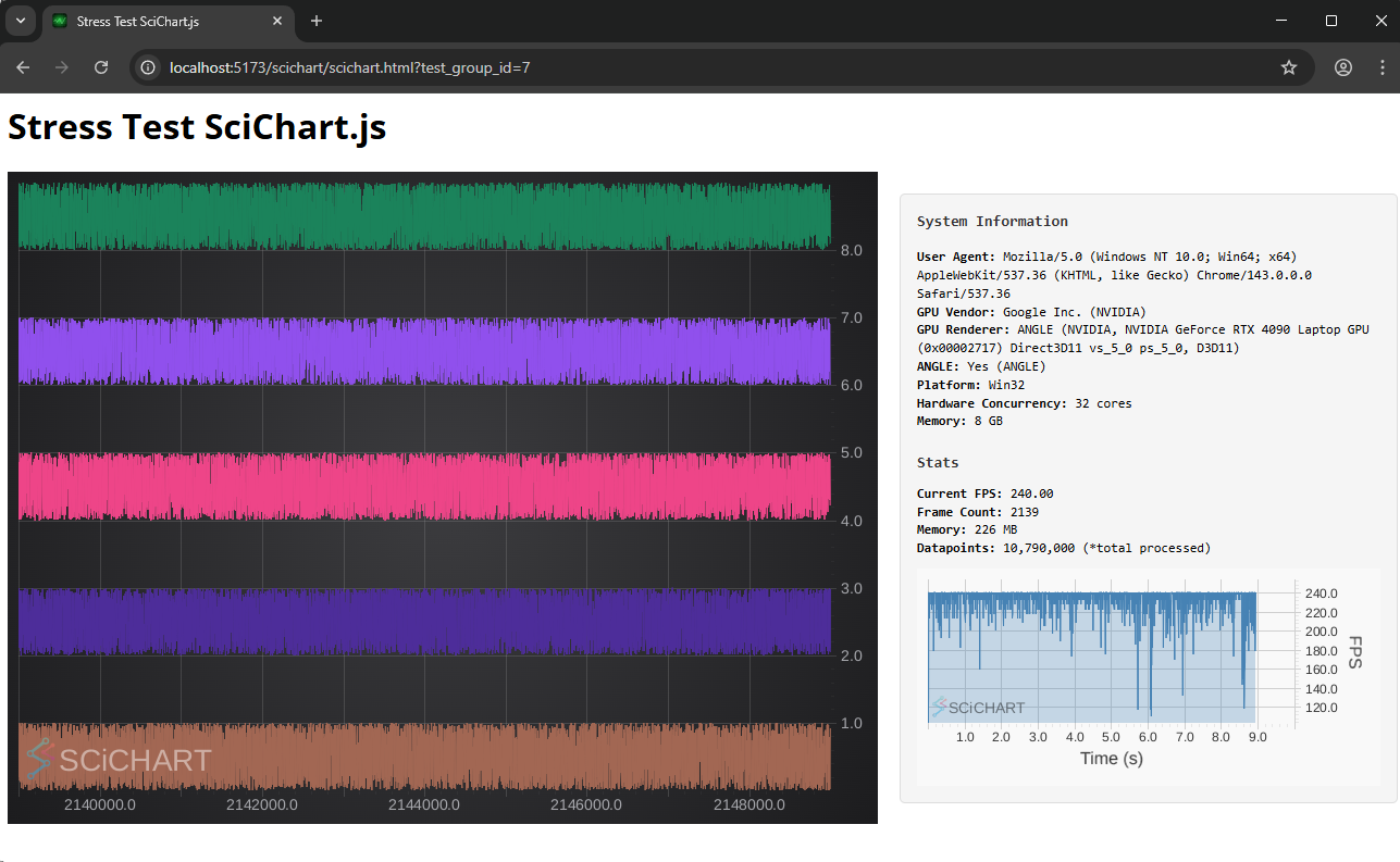 ECG/FIFO Lines Test
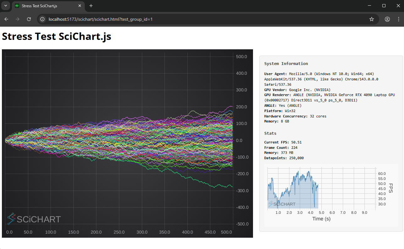 Many Series Tests
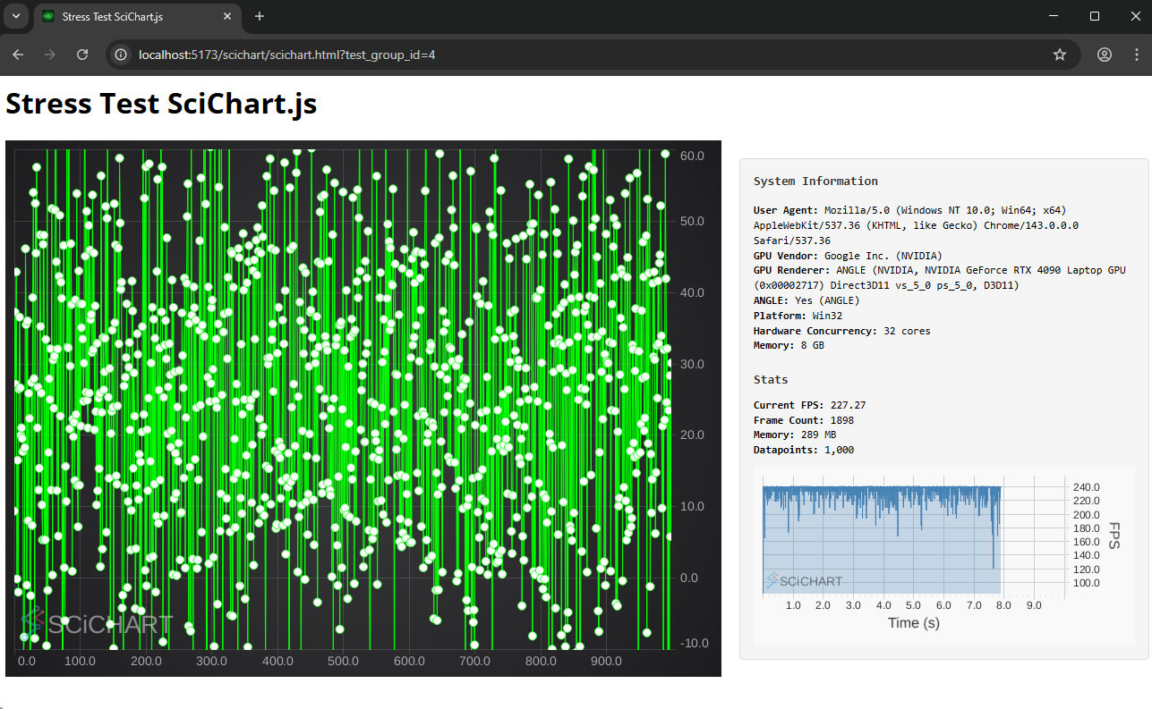 Point-Line Test
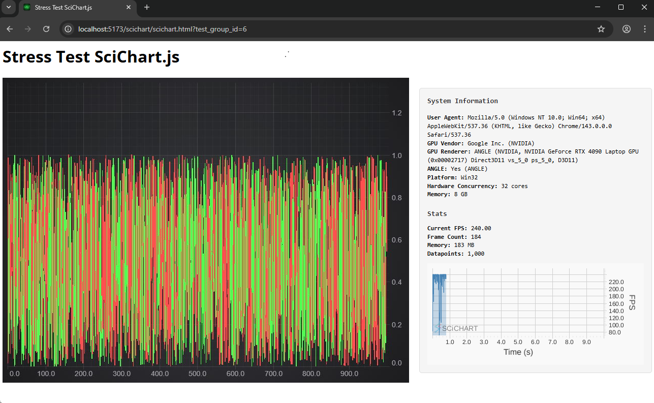 Candlestick Test
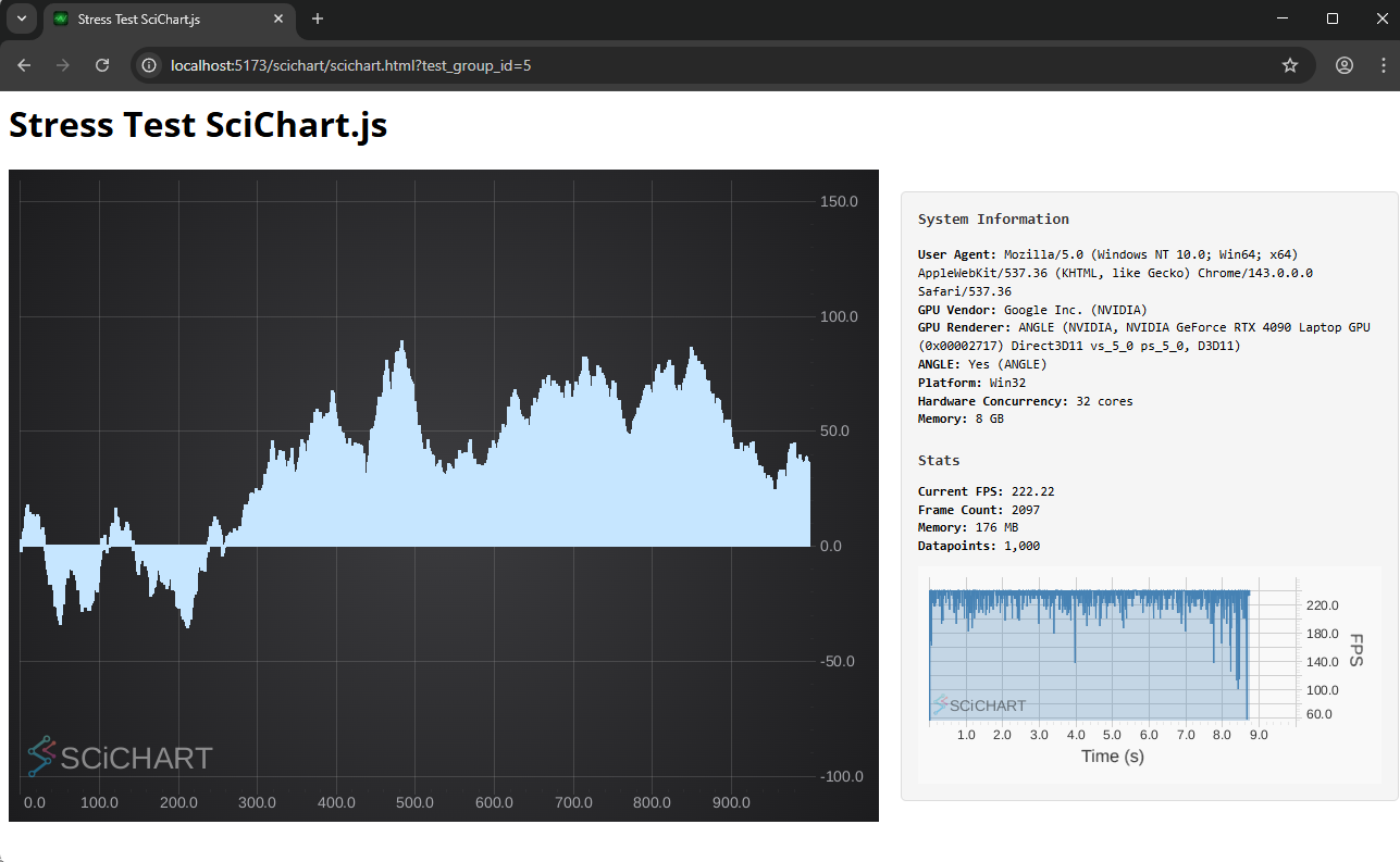 Column Series Test
In our benchmark test suite, we test each chart library and compare the output. Each individual test case reports:
performance.memory.usedJSHeapSize at the end of the test. This is only available in Chrome) – lower is betterAll of this data is logged to IndexedDB locally and displays on the homepage of the benchmark app.
Individual test cases report more data such as system information, CPU/GPU stats, immediate FPS, frame count, library initialization time, time to first render, memory consumption and chart data-points. Aggregated results just report the average FPS.
FPS doesn’t tell the whole story. What if your chart library renders at 60 FPS but takes 10 seconds to initialize? Or, what if two chart libraries both render at the same speed, but one uses more memory than the other? How does the data ingestion rate play into the overall performance of the chart library?
To compute an overall score, or Chart Bench, we do the following composite calculation:
Chart Bench Benchmark Score Calculation:
Score = Σ(composite × weight) / Σ(weight)
Composite = (FPS×65% + InitTime×20% + Frames×10% + Memory×5%) × 100
Metrics use power transformation to amplify performance differences:
- FPS^1.5: Exponentially rewards higher FPS (42 vs 4.77 FPS → 272 vs 10.4 = 26x scoring difference)
- Frames^1.5: Higher frame counts exponentially better
- Init Time: Linear scale (lower is better)
- Memory: Linear scale (lower is better)
- Weight = [log₁₀(points × series × charts)]^3.5
Aggressive polynomial weighting ensures complex tests contribute exponentially more (16M points >> 1K points).
Failed/skipped tests receive 0 score but full weight penalty.
We then report both FPS numbers and Chart Bench results in the test-suite.
In the next series of blogs which we will be publishing soon, we’ll present results of SciChart.js vs. a variety of competitors on multiple different hardware setups.
We’ve carried out the tests internally on different hardware, in order to show the effect of different CPU/GPU setups, and conclude that SciChart.js has all the performance you need for demanding scientific, medical, IoT, industrial or telemetry apps, regardless of your target hardware.
Here’s a quick rundown of the test setup and hardware:
Some libraries perform all their calculations on the CPU, while others use the GPU or other techniques. SciChart, for instance, uses a load-balanced approach to CPU/GPU scheduling.
Which is the fastest when there is a low-powered hardware, single-board computer or integrated graphics? What are the limits of performance of JavaScript Charts on integrated graphics?
Not all workstations or IoT / embedded or medical devices have access to the fastest possible GPU, so in these test cases, we validate performance on the following machines:
| PC Name | CPU | GPU | RAM / VRAM | Browser | Operating System |
|---|---|---|---|---|---|
| MSI Raider Gaming Laptop | Intel i9-14900HX / 24 cores | nVidia 4090 RTX (Mobile) | 192GB RAM / 16GB VRAM | Chrome | Windows 11 |
| Lenovo ARM Mini PC | Snapdragon X126100 / 8 cores | Qualcomm Adreno X1-45 | 32 GB RAM / 128MB VRAM | Chrome | Windows 11 ARM |
| Apple Mac M1 Mini | Apple Silicon M1 / 8 cores | 8-core M1 GPU | 8GB (integrated memory) | Safari | OSX Tahoe 26.2 |
| Raspberri Pi 5 | ARM Coretex-A76 CPU / 4 cores | Videocore VII | 8GB / (shared memory) | Chromium | Raspberri Pi OS (Debian Linux) |
Watch this space for the test results. Until then, you can download Chart Bench from GitHub and try running some JavaScript Chart Performance tests!
We’ll be publishing full test results soon for a variety of hardware test setups, but for now, here are some key takeaways:
Which chart library you should choose depends on your specific platform needs, workloads and developer workflow preferences. This blog post and associated Git repo is designed to be informative, to help the evaluation process should you be deciding on a chart library to use.
Every project has different performance requirements, datasets and development constraints. If evaluating SciChart or comparing against open source or commercial competitors, and if performance is a requirement, we encourage you to clone the repo and try out the tests. Any question, comments or feedback, do get in touch with tech support and we’ll be glad to help!
Clone Chart Bench now on GitHub: github.com/abtsoftware/javascript-chart-performance-test-suite
JavaScript Charts by SciChart are extremely fast and allow high performance data visualization across a number of chart types and scenarios. Learn more about the features and view a demo today by clicking the button below:
Recent Blogs
![]()
Queens Award for Innovation
Proud winners of the Queens Award for Innovation, 2019. Awarded on account of our innovative graphics engine which underpins the SciChart library and enables our world-beating charting performance
![]()
National Business Awards
Highly Commended for Lloyds National Business Awards, 2019. Awarded on account of our innovative graphics engine and impressive customer base
![]()
National Technology Awards
Awarded “Healthcare Tech of the Year” at the 2025 National Technology Awards – a top UK recognition for breakthrough innovation in technology.

Reviews
SciChart has received hundreds of verified, 3rd party reviews