Hi, I would like to make styling on the candlestick stroke of each tick by different situation, like if open > close show red stroke and on reverse in blue color stoke.
I have extended the PaletteProviderBase and implemented the IStrokePaletteProvider and IFillPaletteProvider interface, it seems that it always render the black stroke, but the filled color was correct as expected. Is there any way to custom the stroke color by case? Thanks!
I use the same approach as this suggested (candlestick-chart-coloring) , it seems in 2.0.0 cannot style the stroke as this way.
- may lym asked 7 years ago
- last active 7 years ago
Hello!
I want the chart to scroll from right to left and stop at left side. Don’t automatically scale, don’t move right.
I have a modifier:
ZoomPanModifier zoomModifier = new ZoomPanModifier() { ... };
zoomModifier.setReceiveHandledEvents(true);
zoomModifier.setXyDirection(XyDirection.XDirection);
zoomModifier.setClipModeX(ClipMode.ClipAtExtents);
// zoomModifier.setClipModeX(ClipMode.ClipAtMin);
When I scroll a chart left to the beginning, it scales the chart to one screen. So, all points are visible, proportions are broken.
When I replace “ClipMode.ClipAtExtents” to “ClipMode.ClipAtMin”, it sometimes stops at left side (as desired), but if I swipe too fast, it shows a right part of the chart and continues to scroll left.
Currently a first version of the SciChart library is installed.
As written in https://www.scichart.com/documentation/android/v1.x/SciChart.Charting~com.scichart.charting.ClipMode.html both “ClipAtExtents” and “ClipAtMin” have another behaviour.
My question is similar to https://www.scichart.com/questions/question/disable-scaling-on-zoompanmodifier, but for Android.
Answer, please, is it a bug? Has it been already fixed or expected to be fixed?
- Alex N asked 7 years ago
- last active 7 years ago
I am trying to integrate custom symbols from AnnotationsAreEasyFragment to MultiPaneStockChartsFragment but the symbols are not visible on price chart of MultiPane… can anyone please help me out with how to give X and Y axis in multipane price chart
- Ghousia Begum asked 7 years ago
- last active 6 years ago
Hello.
I have found out that calling suspendUpdate() and resumeUpdate() on a SciChartSurface object allocates memory that is never released. The allocations get bigger with more data in the chart.
I have created an empty Android project. I have added a SciChartSurface and a Button. Pressing the button suspends and resumes updates. You can then see in the Android Monitor that after each press of the button the memory consumption of the app increases. Since the chart is empty the allocations are very small but still noticeable. I have attached the zip of the example project.
Kotlin code of the Activity in the project:
class MainActivity : AppCompatActivity()
{
    override fun onCreate(savedInstanceState: Bundle?)
    {
        super.onCreate(savedInstanceState)
        setContentView(R.layout.activity_main)

        val layout = findViewById(R.id.layout) as ConstraintLayout

        val chartSurface = SciChartSurface(this)
        layout.addView(chartSurface)

        val button = findViewById(R.id.button) as Button
        button.setOnClickListener {
            val suspender = chartSurface.suspendUpdates()
            chartSurface.resumeUpdates(suspender)
        }
    }
}
I
P.S.:
I have tried to open a priority ticket, but I got the following error:
We encountered a problem (cross-site request forgery detected); please try again
Sorry, we encountered a problem (invalid department). Please start over.
- MIha Rozina asked 7 years ago
- last active 7 years ago
Hello,
I am trying to pass multiple custom symbols both (up and down arrows) on multipane stock chart in such a manner that green symbols should be below OHLC candle and red symbols above OHLC candles but I cannot place it in proper manner
Can anyone please help me out with how to give positioning on X axis as it is an year scale?
- Ghousia Begum asked 7 years ago
- last active 7 years ago
Hello,
Please verify my code and help me out where I am going wrong to display multiple symbols on a price chart of multipane stock charts…
The symbols are not getting displayed
private class PricePaneModel extends BasePaneModel {

    public PricePaneModel(SciChartBuilder builder, PriceSeries prices) {
        super(builder, PRICES, "$0.0000", true);

        // Add the main OHLC chart
        final OhlcDataSeries<Date, Double> stockPrices = builder.newOhlcDataSeries(Date.class, Double.class).withSeriesName("EUR/USD").build();
        stockPrices.append(prices.getDateData(), prices.getOpenData(), prices.getHighData(), prices.getLowData(), prices.getCloseData());
        addRenderableSeries(builder.newCandlestickSeries().withDataSeries(stockPrices).withYAxisId(PRICES).build());

        List<Double> maLowPoints = MovingAverage.movingAverage(prices.getCloseData(), 50);
        List<Double> maHighPoints = MovingAverage.movingAverage(prices.getCloseData(), 200);

        final XyDataSeries<Date, Double> maLow = builder.newXyDataSeries(Date.class, Double.class).withSeriesName("Low Line").build();
        maLow.append(prices.getDateData(), maLowPoints);
        addRenderableSeries(builder.newLineSeries().withDataSeries(maLow).withStrokeStyle(0xFFFF3333, 1f).withYAxisId(PRICES).build());

        final XyDataSeries<Date, Double> maHigh = builder.newXyDataSeries(Date.class, Double.class).withSeriesName("High Line").build();
        maHigh.append(prices.getDateData(), maHighPoints);
        addRenderableSeries(builder.newLineSeries().withDataSeries(maHigh).withStrokeStyle(0xFF33DD33, 1f).withYAxisId(PRICES).build());

        AnnotationCollection annotations = priceChart.getAnnotations();
        for (int i = 0; i < prices.size(); i++) {
            if(maLowPoints.get(i) > maHighPoints.get(i) && maLowPoints.get(i-1) < maHighPoints.get(i-1)) {
                IAnnotation annotation = builder.newCustomAnnotation().withPosition(i, prices.getHighData().get(i)).withVerticalAnchorPoint(VerticalAnchorPoint.Bottom).build();
                annotations.add(annotation);
            }
            else if(maLowPoints.get(i) < maHighPoints.get(i) && maLowPoints.get(i-1) > maHighPoints.get(i-1))
            {
                IAnnotation annotation = builder.newCustomAnnotation().withPosition(i, prices.getHighData().get(i)).withVerticalAnchorPoint(VerticalAnchorPoint.Bottom).build();
                annotations.add(annotation);
            }
        }

        Collections.addAll(annotations,
                builder.newAxisMarkerAnnotation().withY1(stockPrices.getYValues().get(stockPrices.getCount() - 1)).withBackgroundColor(0xFFFF3333).withYAxisId(PRICES).build(),
                builder.newAxisMarkerAnnotation().withY1(maLow.getYValues().get(maLow.getCount() - 1)).withBackgroundColor(0xFFFF3333).withYAxisId(PRICES).build(),
                builder.newAxisMarkerAnnotation().withY1(maHigh.getYValues().get(maHigh.getCount() - 1)).withBackgroundColor(0xFF33DD33).withYAxisId(PRICES).build());
    }
}
- Ghousia Begum asked 7 years ago
- last active 7 years ago
Hi Yura,
Thank you for the answer here
I already did tried that way before also but was unable to display the custom annotations, even though I give the YAxisId the symbols are not visible on the chart…
I would be really grateful if you could help me out with this please
- Ghousia Begum asked 7 years ago
- last active 7 years ago
Hi SciChart Team,
Thank you all for your help and support.
I finally got the multiple symbols on the stock chart with reference to this and with this clear explanation
IAnnotation annotation = builder.newCustomAnnotation().withContent(R.layout.example_custom_annotation_view).withYAxisId(PRICES).withPosition(i, prices.getHighData().get(i)).withVerticalAnchorPoint(VerticalAnchorPoint.Bottom).build();

this.annotations.add(annotation);
The above code worked for me and hope it helps to others too who all are trying this.
Thanks,
Ghousia
- Ghousia Begum asked 7 years ago
- last active 7 years ago
I am using SCICHART in my project on Xamarin.Android, but the default them show some themes but I would like to change the background grid color of the reports. Please any can help me ?.
- JORGE CASTILLO asked 7 years ago
- last active 6 years ago
Hello,
is it possible to modify the corner radius of tooltips in SciChart Android?
- Anna Lazar asked 7 years ago
- last active 2 years ago
Hi, from the attached screenshot, we can see that the axis marker is somehow overlapped the chart content. I would like to ask how to resize the annotation so that we can fix this issue? thanks.
- Ray Hung asked 7 years ago
- last active 6 years ago
Very simply, I am attempting to get the Examples to compile and upload to my Android phone. The first download had the examples, but not including Showcases. That version I successfully compiled and ran on an Android phone. Very happy with the professional look and feel.
Since then, I re-downloaded the examples including Showcase and gone through so many upgrades of Android Studio and Gradle and various supporting libraries (as prompted) I’ve lost track.
However, now I cannot compile. Please tell me what dependency is broken of config needs to be changed. Someone else must have been through this.
Thank you for your help.
Ed
Error message:
Gradle sync failed: Could not find core.aar (com.scichart.library:core:2.0.1.1962).
Searched in the following locations:
https://www.myget.org/F/abtsoftware/maven/com/scichart/library/core/2.0.1.1962/core-2.0.1.1962.aar
Consult IDE log for more details (Help | Show Log) (9s 483ms)
I’ve also gone through and set Compile SDK Version to API 25, build tools version to 27. Then I get an error
Gradle sync failed: Could not find method android() for arguments [build_dpm8geo0q8d311u3f6njnup18$_run_closure10@1d7e526a] on root project ‘Examples’ of type org.gradle.api.Project.
Configuration:
MacOS 10.12.6, Android Studio 3.0 (updated from 2.3.x), JDK 1.8
- Ed Chambers asked 7 years ago
- last active 6 years ago
I set the theme is: SciChart_Bright_Spark, but in Android 4.4 mobile phone, chart often display the grid interval display black box, how to solve?
- Huang haiyan asked 6 years ago
- last active 6 years ago
The online Quick Start Guide includes the code :
PenStyle penStyle = new PenStyle(ColorUtil.Green, true, 2f);
This needs to be updated as PenStyle is now abstract.
Presumably it should now be:
PenStyle penStyle = new SolidPenStyle(ColorUtil.Green, true, 2f, null);
or similar.
- Grant Davidson asked 6 years ago
- last active 6 years ago
I crashed when I was quick to show and hide the content of the chart。
The source code is similar to the following:
public void show(){
if(!surface.getRenderableSeries().contains(lineUpSeries)) {
Collections.addAll(surface.getRenderableSeries(), lineUpSeries);
Collections.addAll(surface.getRenderableSeries(), lineDownSeries);
Collections.addAll(surface.getRenderableSeries(), line20Series);
Collections.addAll(surface.getAnnotations(), upTextMarker);
Collections.addAll(surface.getAnnotations(), downTextMarker);
Collections.addAll(surface.getAnnotations(), ma20TextMarker);
Collections.addAll(surface.getAnnotations(), upAxisMarker);
Collections.addAll(surface.getAnnotations(), downAxisMarker);
Collections.addAll(surface.getAnnotations(), ma20AxisMarker);
}
}
public void hide(){
if(surface.getRenderableSeries().contains(lineUpSeries)) {
surface.getRenderableSeries().remove(lineUpSeries);
surface.getRenderableSeries().remove(lineDownSeries);
surface.getRenderableSeries().remove(line20Series);
surface.getAnnotations().remove(upTextMarker);
surface.getAnnotations().remove(downTextMarker);
surface.getAnnotations().remove(ma20TextMarker);
surface.getAnnotations().remove(upAxisMarker);
surface.getAnnotations().remove(downAxisMarker);
surface.getAnnotations().remove(ma20AxisMarker);
}
}
error log:
java.lang.NullPointerException: Attempt to invoke interface method ‘boolean com.scichart.charting.visuals.annotations.IAnnotationPlacementStrategy.isInBounds(com.scichart.charting.visuals.annotations.AnnotationCoordinates, com.scichart.charting.visuals.annotations.IAnnotationSurface)’ on a null object reference
at com.scichart.charting.visuals.annotations.AnnotationBase.a(SourceFile:1207)
at com.scichart.charting.visuals.annotations.AnnotationBase.update(SourceFile:1105)
at com.scichart.charting.visuals.annotations.AxisMarkerAnnotation.update(SourceFile:246)
at com.scichart.charting.visuals.annotations.AnnotationBase.update(SourceFile:1083)
at com.scichart.charting.visuals.rendering.RenderSurfaceRenderer.a(SourceFile:327)
at com.scichart.charting.visuals.rendering.RenderSurfaceRenderer.a(SourceFile:218)
at com.scichart.charting.visuals.rendering.RenderSurfaceRenderer.a(SourceFile:132)
at com.scichart.charting.visuals.rendering.RenderSurfaceRenderer.onDraw(SourceFile:123)
at com.scichart.drawing.opengl.RenderSurfaceGL$a.onDraw(SourceFile:228)
at com.scichart.drawing.opengl.MyGLRenderer.b(SourceFile:293)
at com.scichart.drawing.opengl.MyGLRenderer.onDrawFrame(SourceFile:277)
at android.opengl.GLSurfaceView$GLThread.guardedRun(GLSurfaceView.java:1548)
at android.opengl.GLSurfaceView$GLThread.run(GLSurfaceView.java:1259)
- Huang haiyan asked 6 years ago
- last active 6 years ago
Hello,
I want to display a chart using a DateAxis as X-Axis. The data set contains values for each basic unit of chosen time base, e.g. for a time base of one month, I get 31 data points, with one value assigned for each day. I want the chart to display a label for each value assigned, but using automatic settings I get the following output:

I wanted to manipulate the ticks by setting the MajorDelta and MinorDelta properties, but it expects a value of type Date, and I’m not sure which value I should provide to get a timespan of 1 day, 1 hour etc.
I set EnableLabelCulling to false, but somehow it doesn’t seem to take any effect.
- Anna Lazar asked 6 years ago
- last active 6 years ago
When setting yAxis to have auto range enabled or when manually calling chartSurface.zoomExtents() after adding new data to chart, the top point are cropped (not shown in the chart). I have attached an image that shows this phenomenon (note: bottom part of the chart is cropped out of the image).
Below is full code of an Activity that reproduces the problem. I also updated the attached image that shows the result of the following code. As you can see both red points with y value of 1.1f are cropped out of the chart.
class MainActivity : AppCompatActivity()
{
    private val chartBuilder by lazy { SciChartBuilder.instance() }
    private val chartSurface by lazy { createChartSurface() }

    override fun onCreate(savedInstanceState: Bundle?)
    {
        super.onCreate(savedInstanceState)

        SciChartBuilder.init(this)
        setContentView(R.layout.activity_main)

        val background = findViewById<ViewGroup>(R.id.background)
        background.addView(chartSurface)

        addPoints()
    }

    private fun createChartSurface(): SciChartSurface
    {
        val surface = SciChartSurface(this)

        val xAxis = chartBuilder.newNumericAxis()
            .withAxisTitle("X Axis title")
            .withVisibleRange(0.0, 1.0)
            .withAutoRangeMode(AutoRange.Always)
            .build()

        val yAxis = chartBuilder.newNumericAxis()
            .withAxisTitle("Y Axis title")
            .withVisibleRange(0.0, 1.0)
            .withAutoRangeMode(AutoRange.Always)
            .build()

        Collections.addAll(surface.xAxes, xAxis)
        Collections.addAll(surface.yAxes, yAxis)

        surface.renderableSeries.add(createSeries(Color.RED))
        surface.renderableSeries.add(createSeries(Color.BLUE))

        return surface
    }

    private fun createSeries(color: Int): FastLineRenderableSeries
    {
        val lineData = chartBuilder.newXyDataSeries(Long::class.javaObjectType, Float::class.javaObjectType)
            .withSeriesName("series")
            .build()

        return chartBuilder.newLineSeries()
            .withDataSeries(lineData)
            .withIsVisible(true)
            .withStrokeStyle(color, 2f, true)
            .build()
    }

    private fun addPoints()
    {
        val xValues = LongValues(longArrayOf(0, 1, 2, 3, 4, 5))

        @Suppress("UNCHECKED_CAST")
        var lineData = chartSurface.renderableSeries[0].dataSeries as XyDataSeries<Long, Float>
        lineData.append(xValues, FloatValues(floatArrayOf(0.9f, 1f, 1.1f, 0.9f, 1.1f, 1f)))

        @Suppress("UNCHECKED_CAST")
        lineData = chartSurface.renderableSeries[1].dataSeries as XyDataSeries<Long, Float>
        lineData.append(xValues, FloatValues(floatArrayOf(0f, 0f, 0f, 0f, 0f, 0f)))
    }
}
- MIha Rozina asked 6 years ago
- last active 6 years ago
How to position the legend in the botton of chart and make 2 column foreach tag?
- Benigno Ranilla asked 6 years ago
- last active 6 years ago
When I insert a series of data (more than 100 data)into the graph, the application crashes
Source code is as follows
    ma5Series.insertRange(0,date,ma5Y);
    ma10Series.insertRange(0,date,ma10Y);
    ma20Series.insertRange(0,date,ma20Y);
    macdSlowSeries.insertRange(0,date,macdFast,macdSlow);
    macdSignalSeries.insertRange(0,date,macdSignal);
The error is as follows
java.lang.UnsupportedOperationException: Data has been changed to a DataSeries which is unsorted in the X-Direction. Unsorted data can have severe performance implications in SciChart.
For maximum performance, please double-check that you are only inserting sorted data to SciChart. Alternatively, to disable this warning and allow unsorted data, please call dataSeries.setAcceptsUnsortedData(true).
I set up “dataSeries.setAcceptsUnsortedData (true)”, but still reported wrong.
how to solve it?
- Huang haiyan asked 6 years ago
- last active 6 years ago
When I insert a series of data, the hollow K diagram shows the error, and a line is displayed in the middle
ohlcSeries.insertRange(0,date,open,high,low,close);
My Settings are as follows:
candlestickSeries = sciChartBuilder.newCandlestickSeries()
            .withStrokeUp(UP_COLOR)
            .withStrokeDown(DOWN_COLOR)
            .withDataSeries(ohlcSeries)
            .withFillDownColor(0xFFFFFFFF)
            .withFillUpColor(UP_COLOR)
            .build();
How can I solve this problem?Please see the attachment for details。
- Huang haiyan asked 6 years ago
- last active 6 years ago
I want to use code to intercept a picture, but find that the image is empty
    surface.buildDrawingCache();
    Bitmap src = surface.getDrawingCache();//save screenshot
    ((ImageView)findViewById(R.id.iv)).setImageBitmap(src);
how can I get the image of suface。
- Huang haiyan asked 6 years ago
- last active 6 years ago
I want to draw one of the first picture, but FastLineRenderableSeriesBuilder found no fill color Settings, do you have other solution?
- Huang haiyan asked 6 years ago
- last active 6 years ago
I use the surface.exportToBitmap () to get the picture, but the AxisMarker doesn’t match the actual display, and there’s no sharp arrow. How to solve?
- Huang haiyan asked 6 years ago
- last active 6 years ago
I am using StackedColumnRenderableSeries and I have a problem when a data is displayed as it shows the incomplete graph as the second attached image.
Thank you
var xAxis = new DateAxis(this)
{
GrowBy = new DoubleRange(0.1, 0.1),
AxisTitle = “”,
AutoRange = AutoRange.Always,
TextFormatting = “MMM yyyy”,
DrawMajorGridLines = false,
DrawMinorGridLines = false,
AxisBandsStyle = new SolidBrushStyle(0xfff9f9f9),
};
- Benigno Ranilla asked 6 years ago
- last active 6 years ago
I am trying to use SciChart library for my project and find out whether it satisfy all requirements.
I am currently trying to display the ECG signal. Therefore the data is coming in realtime.
I have the following configuration
 final NumericAxis xAxis = mSciChartBuilder
                .newNumericAxis()
                .withAxisTitle("Time (seconds)")
                .withDrawLabels(false)
                .withDrawMajorTicks(false)
                .withDrawMinorTicks(false)
                .withDrawMajorBands(false)
                .withDrawMajorGridLines(false)
                .withDrawMinorGridLines(false)
               // .withVisibleRange(0, 2040)
                .withAutoRangeMode(AutoRange.Always)
                //.withAutoRangeMode(AutoRange.Never)
                .build();
        final NumericAxis yAxis = mSciChartBuilder
                .newNumericAxis()
                .withAxisTitle("Voltage (mV)")
                //    .withGrowBy(0.1d, 0.1d)
                .withDrawLabels(false)
                .withDrawMajorTicks(false)
                .withDrawMinorTicks(false)
                .withDrawMajorBands(false)
                .withDrawMajorGridLines(false)
                .withDrawMinorGridLines(false)
                .withVisibleRange(Short.MIN_VALUE, Short.MAX_VALUE)
                .build();
It works but the X axis a little bit scaled/compress.
Here is the result
enter image description here
I need to make it a bit wider.
How can I do this ?
I have tried to set range manually like that
.withVisibleRange(0, 2040)
However in this case it doesn’t show anything.
I would be grateful for any help.
UPDATE
https://drive.google.com/file/d/17p1E-Z_YxiVh_JtwEvlM1PaTVyJ7eyz7/view
- Durian Odour asked 6 years ago
- last active 6 years ago
Hello,
I am currently evaluating SciChart Android and have some questions:
1)
I am using fragments and when I load the fragment with the chart or replace the chart with another fragment, the view flashes black for a moment. This effect is considerable noticeable because I am using a white background for the chart.
VIDEO EXAMPLE
2)
My application domain is like kind of a stock chart. The Y-Values are Doubles while the X-Values are timestamps.
There are small gaps in the data so the distance from each point to the next one is not always the same.
The example dataset consists of 152 datapoints, starts at November 18, 17:00 and end at November 25, 16:00 with distances which are either 1 hour or 2 hours apart.
When zooming and dragging the graph, some labels for the date seem to appear and disappear at random which is really distracting.
VIDEO EXAMPLE
3)
When the user keeps zooming in, the labels should get more detailed.
It is kinda pointless when all the labels are showing the same day. How can I set it, that when the first visible point and the last visible point are only 2 days apart, that the format on the label is HH:MM and not the day and month?
Also, how can I set the maximum zoom? I got it working with the CategoryDateAxis but with the DateAxis it is different and I don’t know how to use the visibibleRangeLimit as the documentation for timeseries charts is rather lacking in this regard.
Our company is considering buying the chart for Android & iOS but those first two problems are king of a deal breaker for us.
Thank you.
My simple style code:
    <style name="CustomSciChart" parent="SciChart_BaseStyle">
    <item name="sciChartBackground">@android:color/white</item>
    <item name="majorGridLinesColor">@color/midLightGray</item>
    <item name="minorGridLinesColor">@color/midLightGray</item>
My chart code:
    final SciChartBuilder sciChartBuilder = SciChartBuilder.instance();
    surface.setTheme(R.style.CustomSciChart);
    XyDataSeries<Date, Double> lineData = sciChartBuilder.newXyDataSeries(Date.class, Double.class).build();
    final DateAxis xAxis = sciChartBuilder.newDateAxis()
            .withDrawMinorGridLines(false)
            .withDrawMinorTicks(false)
            .withAutoRangeMode(AutoRange.Once)
            .build();

    final IAxis yAxis = sciChartBuilder.newNumericAxis()
            .withAxisAlignment(AxisAlignment.Left)
            .withDrawMinorGridLines(false)
            .withDrawMinorTicks(false)
            .withGrowBy(0.2d, 0.2d)
            .build();

    final IRenderableSeries lineSeries = sciChartBuilder.newLineSeries()
            .withDataSeries(lineData)
            .withStrokeStyle(ContextCompat.getColor(getActivity(), R.color.colorPrimary), 2f, true)
            .build();


    PinchZoomModifier pinchZoomModifier = new PinchZoomModifier();
    pinchZoomModifier.setScaleFactor(1.5f);
    pinchZoomModifier.setDirection(Direction2D.XDirection);
    surface.getChartModifiers().add(pinchZoomModifier);

    ZoomPanModifier zoomPanModifier = new ZoomPanModifier();
    zoomPanModifier.setClipModeX(ClipMode.ClipAtExtents);
    zoomPanModifier.setDirection(Direction2D.XDirection);
    zoomPanModifier.setZoomExtentsY(false);
    surface.getChartModifiers().add(zoomPanModifier);


    surface.getRenderableSeries().add(lineSeries);
    Collections.addAll(surface.getYAxes(), yAxis);
    Collections.addAll(surface.getXAxes(), xAxis);
Fragment replacement:
         FragmentTransaction fragmentTransaction = getSupportFragmentManager().beginTransaction();
        fragmentTransaction.replace(R.id.content, fragment, tag);
        fragmentTransaction.commit();
- Patrick Venturini asked 6 years ago
- last active 6 years ago
When setting yAxis to have auto range enabled or when manually calling chartSurface.zoomExtents() after adding new data to chart, the top point are cropped (not shown in the chart). I have attached an image that shows this phenomenon (note: bottom part of the chart is cropped out of the image).
Below is full code of an Activity that reproduces the problem. I also updated the attached image that shows the result of the following code. As you can see both red points with y value of 1.1f are cropped out of the chart.
class MainActivity : AppCompatActivity()
{
    private val chartBuilder by lazy { SciChartBuilder.instance() }
    private val chartSurface by lazy { createChartSurface() }

    override fun onCreate(savedInstanceState: Bundle?)
    {
        super.onCreate(savedInstanceState)

        SciChartBuilder.init(this)
        setContentView(R.layout.activity_main)

        val background = findViewById<ViewGroup>(R.id.background)
        background.addView(chartSurface)

        addPoints()
    }

    private fun createChartSurface(): SciChartSurface
    {
        val surface = SciChartSurface(this)

        val xAxis = chartBuilder.newNumericAxis()
            .withAxisTitle("X Axis title")
            .withVisibleRange(0.0, 1.0)
            .withAutoRangeMode(AutoRange.Always)
            .build()

        val yAxis = chartBuilder.newNumericAxis()
            .withAxisTitle("Y Axis title")
            .withVisibleRange(0.0, 1.0)
            .withAutoRangeMode(AutoRange.Always)
            .build()

        Collections.addAll(surface.xAxes, xAxis)
        Collections.addAll(surface.yAxes, yAxis)

        surface.renderableSeries.add(createSeries(Color.RED))
        surface.renderableSeries.add(createSeries(Color.BLUE))

        return surface
    }

    private fun createSeries(color: Int): FastLineRenderableSeries
    {
        val lineData = chartBuilder.newXyDataSeries(Long::class.javaObjectType, Float::class.javaObjectType)
            .withSeriesName("series")
            .build()

        return chartBuilder.newLineSeries()
            .withDataSeries(lineData)
            .withIsVisible(true)
            .withStrokeStyle(color, 2f, true)
            .build()
    }

    private fun addPoints()
    {
        val xValues = LongValues(longArrayOf(0, 1, 2, 3, 4, 5))

        @Suppress("UNCHECKED_CAST")
        var lineData = chartSurface.renderableSeries[0].dataSeries as XyDataSeries<Long, Float>
        lineData.append(xValues, FloatValues(floatArrayOf(0.9f, 1f, 1.1f, 0.9f, 1.1f, 1f)))

        @Suppress("UNCHECKED_CAST")
        lineData = chartSurface.renderableSeries[1].dataSeries as XyDataSeries<Long, Float>
        lineData.append(xValues, FloatValues(floatArrayOf(0f, 0f, 0f, 0f, 0f, 0f)))
    }
}
- MIha Rozina asked 6 years ago
- last active 6 years ago
I want to monitor the event that the chart stops sliding, what’s the way
- Huang haiyan asked 6 years ago
- last active 6 years ago
1,Is the grid line too dense, can it be reduced?
2,Can the grid lines marked by red frames be hidden?
- Huang haiyan asked 6 years ago
- last active 6 years ago
I’m pretty sure the modifier ZoomExtents fits the entire graph to the screen. But a lot of my interesting data happens right at the far right edge of my graph. So I want to add a buffer.
I’d like to zoom to XMin – XMax0.05 and XMax +XMax0.05.
I do this when loading my graph, and I’d like the double tap of my graph to also zoom to that range.
Any ideas?
- Nicholas Provost asked 6 years ago
- last active 6 years ago
On Xamarin iOS there is a property SciChartSurface.ChartTitle.
Is there an equivalent on Xamarin Android?
- Nicholas Provost asked 6 years ago
- last active 6 years ago
Hello,
How would one implement X- or Y-Value animations for a simple line chart?
I don’t need real time value animations like in the demo but I have all the data at once and want to animate the X-values when drawing the chart. In MPAndroidChart this is done with a single line specifying the duration and the interpolator:
mChart.animateY(3000, Easing.EasingOption.EaseOutBack);
So long!
- Patrick Venturini asked 6 years ago
- last active 6 years ago
Hi, I want to color the axis label by its value,
eg. value< 0 -> show with red color
value = 0 -> show grey color
value > 0 -> show green color
similar to this question, but in android platform, it seems the LabelProvider has function related to the value(string) formatting only. Is there any ways to styling the label? Thanks!
- may lym asked 6 years ago
- last active 6 years ago
Hi, I am trying to a similar result as provided in the Showcase project (ECG Screen).
However I have been struggling for more than two days with the problem of backline. It draws a line back to start.
Here are some screenshots.
How can I get read of back line.
Thanks
- Ibragim Aemena asked 6 years ago
- last active 6 years ago
Hello,
I would like to replace the standard “X” tooltip marker with a custom drawable. This article suggests that it is possible to customize the marker, but I wasn’t able to find any examples how to do it. Could you help me with that?
Regards,
Anna
- Anna Lazar asked 6 years ago
- last active 6 years ago
How to limit the multiplier of enlargement and reduction when enlarging and reducing
- Huang haiyan asked 6 years ago
- last active 6 years ago
Please help me on this, as I want to draw/combine multiple charts on a single surface and I am getting Json values from Api & also attaching the Graph look which I want.
Help me how I can achieve this.
Thanks in advance.
- Wa MobileApps asked 6 years ago
- last active 6 years ago
How to achieve per-point shapes? I need to have, say, triangle, ellipse, and square shapes on a single line series. It’s pretty straightforward for iOS by overriding the StyleForPoint() method and providing shapes and colors. However, I had hard times figuring it out for Android (Xamarin). I found how to change colors of markers but not shapes. Could anyone help me with this, please?
- rubs00 asked 6 years ago
- last active 6 years ago
There’s a build error when implementing IPointMarkerPaletteProvider, IFillPaletteProvider, or IStrokePaletteProvider.
MainActivity_P.java:50: error: isAttached() in MainActivity_P cannot override isAttached() in PaletteProviderBase
    public boolean isAttached ()
                   ^
    overridden method is final


 MainActivity_P.java:58: error: attachTo(IServiceContainer) in MainActivity_P cannot override attachTo(IServiceContainer) in       PaletteProviderBase
    public void attachTo (com.scichart.core.IServiceContainer p0)
                ^
    overridden method is final


MainActivity_P.java:66: error: detach() in MainActivity_P cannot override detach() in PaletteProviderBase
    public void detach ()
                ^
    overridden method is fina
What’s wrong with it? See the attached project to reproduce the issue.
- rubs00 asked 6 years ago
- last active 6 years ago
Sometimes the X axis does not display the coordinOne of the pictures in the appendix is normal and one shows incorrect.ates when the chart is moved.
How to solve?
- Huang haiyan asked 6 years ago
- last active 6 years ago
hi, I wanted to display the cursor information (x, y value)on the text annotation like the following. I can only find the example of displaying as tooltip, but is it possible to show with the text annotation? Thank you!
- may lym asked 6 years ago
- last active 6 years ago
I am developing android app where i received data from pressure sensor(attached to arduino) and want to show it in scichart heatmap. i created succesfully scichart heatmap with IPaletteProvider. Now i want to update the heatmap with pressure sensor but currently i am unable to update my heatmap. Here is my Whole(PressureActivity code)code.
if (intent.getAction().equals(Constants.DATA)) {
String data = intent.getStringExtra(“DATA”);
if (data.contains(“ccccc”)) {
int index = data.indexOf(‘/’);
int indexx = data.indexOf(‘#’);
String d = data.substring((index + 1), indexx);
DoubleValues doubleValues=new DoubleValues(1);
doubleValues.add(Double.parseDouble(d));
dataSeries.updateZValues(doubleValues);
}
}
The above code is piece of android code where i actually received data from arduino and want to show it in heatmap so i update my dataSeries value. In my case
i use UniformHeatmapDataSeries<Integer, Integer, Double> dataSeries
But it did not work and shows only a rectangal of blue color and not updating with coming data.
Any one have any idea how to fix it.Thanks in advance.
- mtg khan asked 6 years ago
- last active 6 years ago
I have issue with legend on high resolutions screens. Checkboxes and text is very small and hard to read. I couldn’t find any solution to change text size or provide my own template with text size for legend in Android SciChart.
I want to change legend text size depends on screen like it is in Android by declaring size in dimens.xml.
I do that for Axis labels but I don’t know how do the same for text in legend.
Does anyone know how to achieve this?
- Marcin K asked 6 years ago
- last active 6 years ago
Hi,
I have issue with export SciChart to Bitamp. I have to generate pdf report from data. Report contains two charts.
It is possible to render chart in memory and export to bitmap? I know it is possible in WPF but I couldn’t achive this in Android.
Now my solution is that I render this charts on fragments and wait 1s on each to render and then save chart. But this solution is not good. For slower devices chart is not exported correctly.
For example on one device have strange grid (only exported bitmap, fragment with this chart looks good):

- Marcin K asked 6 years ago
- last active 6 years ago
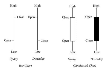
Now I using different library for displaing candles.
And have two different styles of candles.
An author of library that I using strongly recomended this one library.
And I try to port my app to SciChart.
How can I change CandlestickSeries to displayed as a Bar Chart
- Evgeny Khramov asked 6 years ago
- last active 6 years ago
I see MountainSeries has property “IsDigitalLine”
But how can I configure MountainSeries with rounded corners like in a picture below
- Evgeny Khramov asked 6 years ago
- last active 6 years ago
Hi,
I’m trying to wrap the Scichart surface in XF. I’ve used native views as recommended in documentation and there is no problem when the SciChartSurface is the only element in a ContentPage, but when the surface is placed inside a layout or merged with any other element, then is not rendering.
Do you know why is this happening and how can I merge XF controls and SciChartSurface(s) in a ContentPage or any Layout?
1: This is rendering without problem
    <ContentPage xmlns="http://xamarin.com/schemas/2014/forms"
             xmlns:x="http://schemas.microsoft.com/winfx/2009/xaml"
             xmlns:local="clr-namespace:SciChartForms"
             xmlns:localAndroid="clr-namespace:SciChartForms.Droid"
             x:Class="SciChartForms.MainPage">
    <localAndroid:Stripchart />
</ContentPage>
2: This is not rendering:
<ContentPage xmlns="http://xamarin.com/schemas/2014/forms"
             xmlns:x="http://schemas.microsoft.com/winfx/2009/xaml"
             xmlns:local="clr-namespace:SciChartForms"
             xmlns:localAndroid="clr-namespace:SciChartForms.Droid"
             x:Class="SciChartForms.MainPage">
    <StackLayout Margin="20">
        <Button Text="adafsd"/>
        <localAndroid:Stripchart/>
    </StackLayout>
</ContentPage>
Thanks in advance!
PS: I’ve also tried with custom renderer obtaining the same result.
- S C asked 6 years ago
- last active 6 years ago
Hello everyone,
I am the beginner of SciChart, now I able to create a candlestick chart with a HorizontalLineAnnotation but it doesn’t display well.
I have checked-out this tutorial
https://www.scichart.com/documentation/v5.x/webframe.html#The%20HorizontalLineAnnotation%20Type.html
I tried to convert the C# code and XML document to Kotlin but it seems there are no class AnnotationLabel found from the library.
Bellow is my screenshot

You can see the issue is the HorizontalLineAnnotation doesn’t contain the label (with value). What I need is it should have a label as bellow
Bellow is my implementation (in Kotlin)
val xAxis = sciChartBuilder.newCategoryDateAxis().build()
    val yAxis = sciChartBuilder
            .newNumericAxis()
            .build()
val currentAnnotation = sciChartBuilder
            .newHorizontalLineAnnotation()
            .withBackgroundColor(0xFFFCB51E.toInt())
            .withYValue(currentValue).build()

val rSeries = sciChartBuilder.newCandlestickSeries()
            .withStrokeUp(upColor)
            .withFillUpColor(upColor)
            .withStrokeDown(downColor)
            .withFillDownColor(downColor)
            .withDataSeries(dataSeries)
            .build()

    UpdateSuspender.using(surface) {
        Collections.addAll(surface.xAxes, xAxis)
        Collections.addAll(surface.yAxes, yAxis)
        Collections.addAll(surface.annotations, currentAnnotation)
        Collections.addAll(surface.renderableSeries, rSeries)
        Collections.addAll(surface.chartModifiers, sciChartBuilder.newModifierGroupWithDefaultModifiers().build())
    }
Can someone please help me on this?
- Vo Hoa asked 6 years ago
- last active 6 years ago
