Hi, I need some new type of annotation, for example, TriangleAnnotation or HexagonalAnnotation. I would rather derive the new type from AnnotationBase than from CustomAnnotation, because I need more control points than one. what shall I do?
- wang siyuan asked 9 years ago
- last active 9 years ago
I have a real time charting program that is getting data from accel sensors. When the sampling is complete, I allow them to add annotations to the graph. I also have the double-click ZoomExtentsModifier active, which normally works great. I added a text annotation but when I double-click it doesn’t include the text annotation in the extents and as a result the text is not showing on the screen. Is there something I am doing wrong? I don’t want the user to get confused when the text isn’t visible. I allow them to save and re-load so on the re-load the text doesn’t show unless the user zooms out.
- Richard Wood asked 6 years ago
- last active 6 years ago
When I have cursor tooltips enabled, showing the y-values, they display properly until the y-valuse for the 1st series is below the axis y-min. Below the tooltip y-values are showing correctly

If I move the mouse to the left, below 25 Hz, the tooltip disappears as below.
How can I correct this?

Thanks,
Robert
- Robert Zeff asked 9 years ago
- last active 9 years ago
Hi,
I’ve manually updated one of our apps from v3 to v4.0.6.8442 so I haven’t installed the update tool or anything into my 2013 environment. Initially the result was that the SciChart logo was still displayed no matter how it was run i.e. from debug in studio or directly from the release folder .exe.
I resolved this by replacing the license in App.Xaml.cs with a more up to date one as we’ve recently extended our licenses. Now I can run the exe’s directly (or from ctrl-F5) and there is no logo displayed as I’d expect – However, if I debug into the app using just F5 the logo is now displayed in the graph area.
Is there something the updater tool does to Studio that I’ve missed?
/Stuart
- Stuart McCullough asked 8 years ago
- last active 8 years ago
I am trying to create a custom CursorModifier Tooltip. It works in that it shows both of my lines on the screen and all the data associated with the lines. But what I would like to do is only report information about the first line, as the second line is only there for visual purposes as default. Here is a sample of my code.
<ItemsControl Margin="6" ItemsSource="{Binding SeriesData.SeriesInfo}">
 <ItemsControl.ItemTemplate>
  <DataTemplate>
    <StackPanel Orientation="Vertical">
     <StackPanel Orientation ="Horizontal">
      <TextBlock Style="{StaticResource HintDataItemsStyle}" Text="Available Imports:"></TextBlock>      <TextBlock Style="{StaticResource HintDataItemsStyle}" Text="{Binding Value, StringFormat=\{0:###\,##0\}}" />
       </StackPanel>
      </StackPanel>
     </DataTemplate>
    </ItemsControl.ItemTemplate>
   </ItemsControl>
What I’ve tried to do is change the ItemsSource to SeriesData.SeriesInfo[0] which seems to get only the line I want, but then the Value bindings below no longer work.
- Kohins asked 11 years ago
Hi,
A problem appears changing Axis Alignment if Annotations exists, look this simple example:
NumericAxis x, y;
    SciChartSurface c;
    public Sci()
    {
        InitializeComponent();

        c = new SciChartSurface();


        c.XAxes.Add(x = new NumericAxis() { Id = "x" });
        c.YAxes.Add(y = new NumericAxis() { Id = "y" });

        //some limits
        y.VisibleRange = new DoubleRange(-5, 5);
        y.VisibleRangeLimitMode = RangeClipMode.MinMax;

        //a series
        var s = new FastLineRenderableSeries() { XAxisId="x", YAxisId="y"};
        c.RenderableSeries.Add(s);

        //some datapoints
        var ds = new XyDataSeries<double>();
        ds.Append(1, 1);
        ds.Append(2, 2);
        ds.Append(3, 1);
        ds.Append(4, 2);
        s.DataSeries = ds;

        //Add an annotation
        var a = new HorizontalLineAnnotation() { Y1 = 1.5d, YAxisId = "y", Stroke = Brushes.Red, StrokeThickness = 1 };
        c.Annotations.Add(a);

        //appending the chart on a grid
        mG.Children.Add(c);


    }
If you run it all works good. Now, add a button that flip chart, with this code:
private void Button_Click(object sender, RoutedEventArgs e)
    {
        c.Annotations.Clear();

        if (x.AxisAlignment == AxisAlignment.Left)
        {
            x.AxisAlignment = AxisAlignment.Bottom;
            y.AxisAlignment = AxisAlignment.Left;

            var a = new HorizontalLineAnnotation() { Y1 = 1.5d, YAxisId = "y", Stroke = Brushes.Red, StrokeThickness = 1 };
            c.Annotations.Add(a);
        }
        else
        {
            x.AxisAlignment = AxisAlignment.Left;
            y.AxisAlignment = AxisAlignment.Bottom;


            var a = new VerticalLineAnnotation() { Y1 = 1.5d, YAxisId = "y", Stroke = Brushes.Red, StrokeThickness = 1 };
            c.Annotations.Add(a);
        }

    }
Now nothing works good…
Can you solve it?
Thanks.
marc.
- [email protected] asked 5 years ago
- last active 5 years ago
i want to make y axis big in range as you can see in screenshot . Yaxis is small in Height
want to make it full screen
- vinay khandelwal asked 9 years ago
- last active 9 years ago
I added LineAnnotation like attached picture.
I can grab the end of line and change length of line.
But I can’t grab the line itself, it means I can’t move the line.
What do you think the problem?
- Yutaka Dejima asked 5 years ago
- last active 5 years ago
I build a .net6.0 project, and add an scichart, when I set the min of visible range of Axis to a bit less than 0, for example -1, the first tick will be zero ,but will show as -0, which is very weird.
And the situation occurs on demo of Scichart, too.
- Hugo Chu asked 10 months ago
- last active 10 months ago
Hi,
I have 3 questions regarding the FastHeatMapRenderableSeries
First, I would like to ask whether it possible to use the transparent color FastHeatMapRenderableSeries, even when the map itseft is opaque (Opacity=1)? I tried to include the transparent color into the ColorMap gradient brush, but then the corresponding data values are shown in white.
Second, when the heatmap is scaled, the semi-transparent cell borders are visible on the heatmap. Can I get rid of them, for example, with the UseLayoutRounding or proper scaling?
Finally, if I continuously refresh the heatmap with incoming data, I see some rendering artifacts in some frames. The artifacts are usually black vertical stripes or, more rarely, rectangles. Can it be related to graphics hardware?
I made a screenshot demonstrating all 3 problems and attached it here.
Thank you very much in advance!
Ilia
- corvex asked 9 years ago
- last active 9 years ago
Hi
I want to set multi TextAnnotations on the top left of the chart surface like as bmp.
So I use the HorizontalAnchorPoint and VerticalAnchorPoint to set top left of the chart but how can I set these property in multi TextAnnotations?
This is my code:
            txtAnno1.Text = "Hellow World1!";
            txtAnno1.Foreground = new SolidColorBrush(Colors.Blue);
            txtAnno1.HorizontalAnchorPoint = HorizontalAnchorPoint.Left;
            txtAnno1.VerticalAnchorPoint = VerticalAnchorPoint.Top;
            Surface.Annotations.Add(txtAnno1);

            txtAnno2.Text = "Hellow World2!";
            txtAnno2.Foreground = new SolidColorBrush(Colors.Red);
            txtAnno2.HorizontalAnchorPoint = HorizontalAnchorPoint.Left;
            txtAnno2.VerticalAnchorPoint = VerticalAnchorPoint.Top;
            Surface.Annotations.Add(txtAnno2);
Please help me.
Thanks
- Bruce Juli asked 3 years ago
- last active 3 years ago
Default ChartTitle is Top of the ChartSurface.
But, I need ChartTitle in the ChartSurface… (Like LegendPlacement.Inside)
- yungy86 asked 8 years ago
- last active 8 years ago
Hi,
I would like to know if the SCICHART support the 3D polar plot, as shown below.
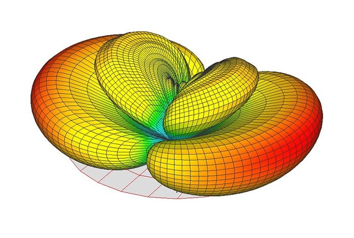
Many thanks
Dan
- Yinliang Diao asked 6 years ago
- last active 6 years ago
Someone recently asked the question on priority support tickets
Q: How do I have two YAxis on the left and right of the chart but with
the same VisibleRange?
e.g. how to mirror the YAxis on both sides of the chart
We are replicating the answer below for benefit of our userbase:
- Andrew Burnett-Thompson asked 9 years ago
- last active 5 years ago
I am considering applying server-side licensing for my javerScript application.
In the document below, there is a phrase “Our server-side licensing component is written in C++.”
(https://support.scichart.com/index.php?/Knowledgebase/Article/View/17256/42/)
However, there is only asp.net sample code on the provided github.
(https://github.com/ABTSoftware/SciChart.JS.Examples/tree/master/Sandbox/demo-dotnet-server-licensing)
I wonder if there is a sample code implemented in C++ for server-side licensing.
Can you provide c++ sample code?
Also, are there any examples to run on Ubuntu?
- John Flemmer asked 2 years ago
- last active 1 week ago
Hello,
I have the problem, that sometimes only one label is shown on the X-Axis even when there is space to show some more, than only one.
The property “IsLabelCullingEnabled” would show them all, but than it is ugly if there is not enough space.
So what can I do to have some more Labels shown?
In the Screenshots you can see that with only a few pixels more, more labels are shown, but the could have been also shown with less pixels (Especially Label “1” and “22” could have been shown).
- Nick Müller asked 5 years ago
- last active 5 years ago
Is there any way to have a FastLineRenderableSeries have more than one color?
I have several series sources with a minimum of eight series generate from them. Each source is unique (a file) and each signal (Displacement, Force, etc) is also unique.
To help the user identify which signal is which i’d like to apply something like the color coding used on the wire with a stripe when there are many conductors.
I’d like to use a drawing brush such as:
        <DrawingBrush x:Key="DrawingBrush" TileMode="Tile"
                      Viewport="0, 0, 16, 2" ViewportUnits="Absolute"
                      Viewbox="0, 0, 16, 2" ViewboxUnits="Absolute">
            <DrawingBrush.Drawing>
                <DrawingGroup>
                    <GeometryDrawing Brush="Red">
                        <GeometryDrawing.Geometry>
                            <LineGeometry StartPoint="0,0" EndPoint="7,0" />
                        </GeometryDrawing.Geometry>
                        <GeometryDrawing.Pen>
                            <Pen Brush="Red" Thickness="4" />
                        </GeometryDrawing.Pen>
                    </GeometryDrawing>
                    <GeometryDrawing Brush="Black">
                        <GeometryDrawing.Geometry>
                            <LineGeometry StartPoint="9,0" EndPoint="15,0" />
                        </GeometryDrawing.Geometry>
                        <GeometryDrawing.Pen>
                            <Pen Brush="Black" Thickness="4" />
                        </GeometryDrawing.Pen>
                    </GeometryDrawing>
                </DrawingGroup>
            </DrawingBrush.Drawing>
        </DrawingBrush>
But I bet that’s a performance hit and frowned on.
See attach bitmap for artists conception of potential appearance.
Any ideas hints or suggestions?
- Doug asked 3 years ago
- last active 3 years ago
CategorizedDateTimeAxis is not suitable for financial intraday charts of instruments with low liquidity and pre/afterhours charts. It discards time periods (minutes) with no trades, ‘compresses time’ and makes picture confusing. They don’t do it in good trading platforms.
DateTimeAxis would help here. But is there any hack to remove time periods when market closed, weekend, holidays?
If not please consider it as new feature request. It can be implemented as a collection of time periods to remove or show.
- RTrade A asked 10 years ago
- last active 4 years ago
Hello there,
I’m currently working for a customer that is interested in buying SciChart WPF.
But first we have a question regarding the real time charts. It’s not a question that I can state easily but I will give it a try.
So the question goes like this:
Is it possible to have a static curve onto the same chart where the real time data points will be plotted n real time?
For e.g. the customer wants to load a theoretical reference curve on the chart before feeding real time data on the chart so that a real time comparison can be done and based on this comparison some hardware tools that generate the real time data will be stopped or let continue depending on how big the divergence gets between that reference curve and what comes in real time from the hardware tools running in background.
Thanks!
- Ionut Holhos asked 5 years ago
- last active 5 years ago
I create a chart like the example Vertically Stacked Axes. I add many channel,the chart would draw outside the view. It can’t scroll down or up to see other channel.
I have use NumericAxis scrollbar,but it only XAxis can scroll. Is there any method to solve it?
- JiaRong Kang asked 8 years ago
- last active 8 years ago
Hello,
I’m currently rewriting a program in .net7 WPF using MVVM as much as possible.
In my MainViewModel:
I read data from a CSV file and transforming it into an ObservableCollection of LineRenderableSeriesViewModel (stored in the « RenderableSeriesViewModels » variable) . Additionally, the Y axes are transformed into ObservableCollection of IAxisViewModel (within the « Yaxes » variable).
Each series corresponds to a LineRenderableSeriesViewModel and each Y axis is represented as a NumericAxisViewModel. The X-axis is a DateTime common to all series and is declared only in XAML.
Within my view’s XAML:
I declare RenderableSeries=”{s:SeriesBinding RenderableSeriesViewModels}” and YAxes=”{s:AxesBinding YAxes}. I’ve defined a legend template to add several elements:
– DataContext=”{Binding RenderableSeries}”
– A checkbox to toggle serie visibility (IsVisible binding).
– A checkbox to toggle Y-axis visibility for the serie (YAxis.Visibility binding).
– A color picker to change the color of a serie, bound to “Stroke”, “YAxis.TickTextBrush”, and “YAxis.BorderBrush”
– A slider for adjusting serie thickness (StrokeThickness binding).
Results:
Each element acts on the graph as expected: RenderableSeries updates and the graph refreshes correctly.
In the MainViewModel, RenderableSeriesViewModels and YAxes are not updated for all elements:
– “IsVisible” and “StrokeThickness” for the concerned series are instantly modified in RenderableSeriesViewModels but “Stroke” is not.
– “YAxes” is not updated.
The code for the LegendTemplate and a screenshot of the resulting legend are in the attachements.
Could you please help me to understand what I do wrong?
- Nicolas MARTINEZ asked 6 months ago
- last active 5 months ago
Dear SciChart Team:
Undo and redo functions are incorrect in my application. It didn’t go back to the previous step. My original curve is shown in the attached figure in Figure 1, then I use zoom in to display part of the curve as shown in Figure 2. After that, use undo to return to the previous step from the partial curve(Figure 3). The final result is shown in Figure 4, which is obviously different from Figure 1.
I call “SciChartSurface.ZoomHistoryManager.Undo()” to achieve this function. After execution, the position of the angle of view and the scale of the canvas are not correct. How do I get back to the previous step correctly?
I have two other questions I would like to ask:
1. How do I get the current range of perspective(max/min of X axis and max/min of Y axis) after many drags and zooms?
2. How do I make the scale of the X axis equal to the scale of the Y axis and zoom in/out it at the same scale?
- Johnny Yeh asked 5 years ago
- last active 5 years ago
I want to implement something like, if a certain analysis value/custom logic is true for one of the values in the loop, –> set this bar color to ‘orange’ as an example, how can i do this?
   // Create a dataset of type x=DateTime, y=Double
  var dataSeries = new OhlcDataSeries<DateTime, double>();

   // Prices are in the format Time, Open, High, Low, Close (all IList)
  var prices = smallerList;

    // Append data to series. SciChart automatically redraws
    for (var i = 0; i < prices.Count(); i++)
   {

 // Convert TIME to a 4-digit string (e.g., 5 becomes "0005", 15 becomes "0015")
 string timeString = prices[i].Value.TIME.ToString("D4");

 // Parse the TIME field
 int hour = int.Parse(timeString.Substring(0, 2));
 int minute = int.Parse(timeString.Substring(2, 2));

 // Create the DateTime object
 DateTime dateTime = new DateTime(prices[i].Value.YEAR, prices[i].Value.MONTH, prices[i].Value.DAY,      hour, minute, 0);
 Dispatcher.Invoke(() =>
 {
     //here we append values in 'dataSeries', how do i do something like, 'bool condition =
// returnCustomLogic('dataValues') --> outputs true, if true --> set this bar color to orange

     // Update the UI element on the UI thread
     dataSeries.Append(
    dateTime,
    (double)prices[i].Value.OPEN,
    (double)prices[i].Value.HIGH,
    (double)prices[i].Value.LOW,
    (double)prices[i].Value.CLOSE);

   });


   }
     Dispatcher.Invoke(() =>
     {
 StockChart.RenderableSeries[0].DataSeries = dataSeries;

 // Zoom Extents - necessary as we have AutoRange=False
 StockChart.ZoomExtents();
   });
- Adan Ramirez asked 3 months ago
- last active 3 months ago
i am tried to use this code in window.cs file …it is not showing any output. kindly let me know the steps what i have to do for getting output
// Create the chart surface
var sciChartSurface = new SciChartSurface();

// Create the X and Y Axis
var xAxis = new NumericAxis() { AxisTitle = "Number of Samples (per series)"};
var yAxis = new NumericAxis() { AxisTitle = "Value"};

sciChartSurface.XAxis = xAxis;
sciChartSurface.YAxis = yAxis;

// Specify Interactivity Modifiers
sciChartSurface.ChartModifier = new ModifierGroup(new RubberBandXyZoomModifier(), new ZoomExtentsModifier());
// Add annotation hints to the user
var textAnnotation = new TextAnnotation()
{
   Text = "Hello World!",
   X1=5.0,
   Y1=5.0
};
sciChartSurface.Annotations.Add(textAnnotation);
- cse dbmt asked 4 years ago
- last active 4 years ago
My goal: Cumulate several values over a time span and show them as stacked bars, where the bars should be located exactly over the time span.
Current situation: Bars are always centered around the x value of the datapoint.
Question: How can bars be shifted to the left? In the attached picture the blue bars represent the current situation, the yellow bars are drawn by offseting the x values by -0.5s. The latter is what I wanted to achieve. Is there an easier approach I havn’t seen so far?
Thanks for your support!
- jengel asked 10 years ago
- last active 4 months ago
By default legends are displayed as follows:
checkbox, line, legend text
Is it possible to move the legend text to be next to the checkbox and have the line come after? The problem with the way it is is when the legend is on the bottom (for example), the text for one series legend is right next to the checkbox for the following series’ checkbox and it’s kind of visually deceiving and confusing.
- David Adams asked 9 years ago
- last active 9 years ago
I’m trying to create a custom overview control as shown in the example with the same name, but all I get is an empty black box. The main chart is working just fine and I have it bound (for now) to the same data series as the main chart. However the only way I can get it to show anything in the overview chart is to bind it’s x and y axes to the same as the main chart, which basically makes it a copy.
            <sc:SciChartSurface x:Name="OverviewSurface" Loaded="OnOverviewSurfaceLoaded" Grid.Row="1" Margin="10,0,0,0" RenderableSeries="{sc:SeriesBinding RenderableSeriesViewModels}" >

            <sc:SciChartSurface.XAxis>
                <sc:NumericAxis DrawMajorGridLines="False" DrawMinorGridLines="False" Visibility="Collapsed"/>
            </sc:SciChartSurface.XAxis>

            <sc:SciChartSurface.YAxis>
                <sc:NumericAxis DrawMajorGridLines="False" DrawMinorGridLines="False" Visibility="Collapsed"/>
            </sc:SciChartSurface.YAxis>
        </sc:SciChartSurface>
That code above just doesn’t work at all. The RenderableSeriesViewModels are the same as bound to the main chart which is working. I’ve tried variations, using AutoRange and and creating all new ViewModels just for the overview axes but the only way I can get it to show anything at all is to bind it to the main chart axis and then I can’t hide them without hiding them on the main chart.
- Kevin Seiden asked 6 years ago
- last active 6 years ago
Dear all,
Does anyone of you have a solution in order to avoid zooming out too much when using the mouse wheel button ?
What I means is that if you call the ZoomExtents the graph will zoom out to fit in chart viewport. By using the mouse wheel is there a way to stop zooming where we reach zoomextents range ?
regards
- sc sc asked 6 years ago
- last active 6 years ago
I made an example based on the “Vertically Stacked Axes” from SciChart Examples. The main difference is that I can add DataSeries / YAxes on the fly.
The problem is that when DrawMajorGridLines, DrawMinorGridLines are turned ON the are drawn only at the first trace.
- Jan Kaiser asked 9 years ago
- last active 9 years ago
Is it possible to draw RolloverMarker above RolloverModifier’s LineOverlay?
Picture below show how SchiChart is working now, and what I would like to see.

- szviktor asked 10 years ago
- last active 10 years ago
I am using SciChart v3.42.0.6778.
I’m having some trouble getting a static left and static right Y axis to have aligned grid lines and labels. I have a pan modifier for both axes. When the graph is initially drawn, the axes are aligned. If you pan an axis, it remains aligned…until you get near zero. From -1 to +1, the axis which you are panning moves. It goes either up if you’re panning up, down if you’re panning down. The graph should not move since it is static, but while panning the axis, it moves.
For example, the right Y axis displays a double range from 2.0 to 5.0. I pan the axis down. and it pans and stays aligned. However, I keep panning and get to 0, the grid lines and labels start to pan as well until I reach -1.0 and then they stop moving and are locked. If I go up, the same thing happens. If I grab the pan modifier and start wildly shaking my mouse, I get get the labels to completely move off the graph (see screenshot).
Also, if I manually set my range for either Y axis, say minimum to 2.0 and maximum to 5.0, sometimes the labels display “not nice” values of say 2.152 and 4.975 (random numbers) but the top of the chart is 5.0 and the bottom is 2.0, but the labels and tick marks aren’t at the top and bottom of the chart, there is a gap. (see attached screenshot)
In the end, I’d like the left and right axis labels, grid lines, and ticks to essentially be aligned and static where only the label names change. What am I doing wrong? Thanks!
Here is a snippet of the code defining my Y axes:
<s:SciChartSurface.YAxes>
            <s:NumericAxis Name="LeftAxis"
                           AutoRange="{Binding EnableAutoRange,
                                               Converter={StaticResource BooleanToAutoRangeConverter}}"
                           AxisAlignment="Left"
                           AxisTitle="{Binding LeftAxisTitle}"
                           CursorTextFormatting="0.000000"
                           DrawLabels="{Binding LeftAxisVisible}"
                           DrawMajorTicks="{Binding LeftAxisVisible}"
                           DrawMinorTicks="{Binding LeftAxisVisible}"
                           GrowBy="0.1,0.1"
                           Id="LeftAxis"
                           IsPrimaryAxis="True"
                           IsStaticAxis="True"
                           SnapsToDevicePixels="True"
                           TextFormatting=" 0.000;-0.000"
                           TitleStyle="{StaticResource YAxisTitleStyle}"
                           VisibleRange="{Binding YLeftVisibleRange,
                                                  Mode=TwoWay}"
                           util:AxisExtensions.DrawAxisTitle="{Binding LeftAxisVisible}">
                <s:NumericAxis.DrawMajorGridLines>
                    <MultiBinding Converter="{StaticResource BooleanAndConverter}">
                        <Binding Path="LeftAxisVisible" />
                        <Binding Path="ShowMajorGridlines" />
                    </MultiBinding>
                </s:NumericAxis.DrawMajorGridLines>
                <s:NumericAxis.DrawMinorGridLines>
                    <MultiBinding Converter="{StaticResource BooleanAndConverter}">
                        <Binding Path="LeftAxisVisible" />
                        <Binding Path="ShowMinorGridlines" />
                    </MultiBinding>
                </s:NumericAxis.DrawMinorGridLines>
                <s:NumericAxis.Style>
                    <Style TargetType="s:NumericAxis">
                        <Setter Property="behaviors:MajorGridLineColorBehavior.GridLineColor" Value="{Binding MajorGridColor}" />
                        <Setter Property="behaviors:MinorGridLineColorBehavior.GridLineColor" Value="{Binding MinorGridColor}" />
                        <Setter Property="TickTextBrush" Value="{Binding TextColor, Converter={StaticResource ColorToSolidColorBrushConverter}, FallbackValue=Black}" />
                    </Style>
                </s:NumericAxis.Style>
            </s:NumericAxis>

            <s:NumericAxis Name="RightAxis"
                           AutoRange="{Binding EnableAutoRange,
                                               Converter={StaticResource BooleanToAutoRangeConverter}}"
                           AxisAlignment="Right"
                           AxisTitle="{Binding RightAxisTitle}"
                           CursorTextFormatting="0.000000"
                           DrawLabels="{Binding RightAxisVisible}"
                           DrawMajorGridLines="False"
                           DrawMajorTicks="{Binding RightAxisVisible}"
                           DrawMinorGridLines="False"
                           DrawMinorTicks="{Binding RightAxisVisible}"
                           GrowBy="0.1,0.1"
                           Id="RightAxis"
                           IsStaticAxis="True"
                           SnapsToDevicePixels="True"
                           TextFormatting=" 0.000;-0.000"
                           TitleStyle="{StaticResource YAxisTitleStyle}"
                           VisibleRange="{Binding YRightVisibleRange,
                                                  Mode=TwoWay}"
                           util:AxisExtensions.DrawAxisTitle="{Binding RightAxisVisible}">
                <s:NumericAxis.Style>
                    <Style TargetType="s:NumericAxis">
                        <Setter Property="TickTextBrush" Value="{Binding TextColor, Converter={StaticResource ColorToSolidColorBrushConverter}, FallbackValue=Black}" />
                    </Style>
                </s:NumericAxis.Style>
            </s:NumericAxis>
        </s:SciChartSurface.YAxes>
And here are my modifiers in case that matters:
<s:SciChartSurface.ChartModifier>
            <s:ModifierGroup>
                <s:RubberBandXyZoomModifier IsAnimated="True"
                                            IsEnabled="True"
                                            IsXAxisOnly="False"
                                            RubberBandFill="#99AAAAAA"
                                            ZoomExtentsY="False" />
                <s:ZoomPanModifier ClipModeX="None"
                                   ExecuteOn="MouseMiddleButton"
                                   IsEnabled="True" />
                <s:ZoomExtentsModifier ExecuteOn="MouseDoubleClick"
                                       IsEnabled="True"
                                       XyDirection="XDirection" />
                <s:MouseWheelZoomModifier IsEnabled="True" XyDirection="YDirection" />
                <s:YAxisDragModifier AxisId="LeftAxis" DragMode="Pan" />
                <s:YAxisDragModifier AxisId="RightAxis" DragMode="Pan" />
                <s:XAxisDragModifier ClipModeX="None" />
                <s:CursorModifier Name="CursorModifier" IsEnabled="{Binding ShowCursors, Mode=TwoWay}">
                    <s:CursorModifier.LineOverlayStyle>
                        <Style TargetType="Line">
                            <Setter Property="Stroke" Value="LightGray" />
                        </Style>
                    </s:CursorModifier.LineOverlayStyle>
                </s:CursorModifier>
                <s:LegendModifier Margin="6"
                                  GetLegendDataFor="AllSeries"
                                  LegendPlacement="Inside"
                                  Orientation="Horizontal"
                                  ShowLegend="{Binding ShowLegend}"
                                  ShowVisibilityCheckboxes="False">
                    <s:LegendModifier.LegendTemplate>
                        <ControlTemplate>
                            <s:SciChartLegend Background="{Binding ElementName=SciChartSurface,
                                                                   Path=DataContext.BackgroundColor,
                                                                   Converter={StaticResource ColorToSolidColorBrushConverter}}"
                                              Foreground="{Binding ElementName=SciChartSurface,
                                                                   Path=DataContext.TextColor,
                                                                   Converter={StaticResource ColorToSolidColorBrushConverter}}"
                                              ItemTemplate="{Binding LegendItemTemplate}"
                                              LegendData="{Binding LegendData}"
                                              Orientation="{Binding Orientation}"
                                              ScrollViewer.HorizontalScrollBarVisibility="{Binding Path=(ScrollViewer.HorizontalScrollBarVisibility)}"
                                              ScrollViewer.VerticalScrollBarVisibility="{Binding Path=(ScrollViewer.VerticalScrollBarVisibility)}"
                                              ShowSeriesMarkers="{Binding ShowSeriesMarkers}"
                                              ShowVisibilityCheckboxes="{Binding ShowVisibilityCheckboxes}" />
                        </ControlTemplate>
                    </s:LegendModifier.LegendTemplate>
                </s:LegendModifier>
            </s:ModifierGroup>
        </s:SciChartSurface.ChartModifier>
- Alex Helms asked 9 years ago
- last active 9 years ago
I have added a real time value legend to my chart. This is working well, based upon examples I have found here at the forum and in the SciChart documentation.
My question is this:
How can I position this new legend (includes series color, series name and series YValue ) so that it is in relation to a single or multiple Y axis’s displayed. In other words I like it to positions itself in relation to the YAxis so it does not overwrite it, and stays on the plotting area.
Appreciate the help
Thank you
Anders
- John-Anders Persson asked 3 years ago
- last active 3 years ago
Hi everyone,
I have the column chart as the image below. However, they overlap each other when I don’t set the DataWidthPoint.
If I set the DataWidthPoint = 0.2 the chart is ok but in another circumstance the width column is quite small.
Are there any way to add some spacing between columns in FastColumnRenderableSeries .
Thanks.

- Quan Tran asked 8 years ago
- last active 8 years ago
I created a very simple project with a single grid and one element which is the scichart. Everything renders normally when the program first starts. If I make the window smaller vertically by dragging, everything continues to render correctly, but when I increase the height of the window by dragging, the vertical axis value label (4000.00) gets clipped if I go about 50 pixels more than the original window height specified.
Note: the clipping is all at once, if I go one pixel too far, the labels clip as shown. If I make the window one pixel smaller, they appear normally again.
What can I do?

- Joseph Zarycki asked 9 years ago
- last active 9 years ago
I’ve seen lots of questions like that here but still can’t figure out how to work with UserControl in WPF and how can i dinamically arrange annotations on user events (lines, figures,text etc). Can you please provide links which may help to get started from scratch. Thank you!
- Konstantin Brownstein asked 9 years ago
- last active 9 years ago
We need to be able to set our chart’s Y axis to be 105. When we add new series (realtime plotting) and one of the points has a value over 105 we need the chart to start auto-scaling to match that new Y value. In other words, unless the user manually zooms we always want the chart to self-resize after starting at a fixed 105 on the Y axis.
This might seem like a strange request at first but our application is expecting a real time series to plot points whose X values might go from -10 to +10; however, the Y value could go from anywhere between 0 and 100 (sometimes higher – although that is not a typical expected value). When we are auto-scaling XY values realtime with no minimal limits the series points are effectively zoomed in really close giving the user a feeling of “noise” to a series that technically doesn’t really exist.
I’ve attached a couple images that demonstrate what a typical series looks like for us. Imaging if only a small portion of the series were currently on the chart and we were using auto-scaling.
Although the 2nd images is a noisy series. It’s REALLY exacerbated when the initial series is auto-scaling during the measurement making it look like the 3rd image.
- Chris Kirkman asked 4 years ago
- last active 4 years ago
Hi,
Is there a way to add an option to enable/disable scaling on the X-axis for the ZoomPanModifier? If not, is there a way to disable the scaling when panning beyond the min and max of the X-Axis?
Thanks,
Johnny
- johnnyp112 asked 10 years ago
Hi,
Our current ThemeManager setup from Infragistics is overriding my TickLabelStyle to have my NumericTickLabel TextBlocks to have the same foreground as the application wide theme, which is not what I want. I’m trying to get around this problem and so far I’ve tried setting a style targeting Textboxes under the AxisStyle, the TickLabelStyle, the SciChartSurface, even tried making an attached behaviour that searches for NumericTickLabels in the surface to set the colors manually. Nothing so far has worked.
I did notice however that my Annotations (Which I have templated to have TextBlocks instead of a TextBox) doesn’t have this problem and can keep their assigned color.
I’m now trying to template the NumericTickLabel to force it to have the colors that I want, but I can’t find how it was Templated in SciChart to begin with. Any other solution that might work would also be acceptable.
To get an idea of the problem here’s a blog post on Infragistics how this problem might be solved in other instances. My specific problem is talked about on Scenario 2
But as you can see, NumericTickLabels are not defined in the xaml hence, I can’t use the solution on the blog post.
I would appreciate any insight on this as I’ve been banging my head against the wall to solve this issue.
- kewur asked 8 years ago
- last active 8 years ago
Hi,
I have graph with Verctically Stacked Axes. Each of series have different scale. This means that Grid that holds yAxis ticks and labels has different width for each series.
As Axis Container is StackPanel it leads to problem, how to align AxisTitles ?
What I Would like is to set AxisContainer to Grid with two columns.
The first column for AxisTitle, second column for labels and ticks, with shared size group.
Is it possible?
UPDATE I have added a picture. Fig. 1. shows current state, Fig. 2. shows what i would like to achieve.
Thanks
Jan
- Jan Kaiser asked 9 years ago
- last active 9 years ago
Is there a way to create a custom TooltipModifier.TooltipTemplate for Annotations?
I’m trying to find an example of one on the site or in the SciChart examples application but I’m not having any luck. Thanks!
I’d like to be able to pass an object to the tooltip’s metadata like with XySeriesInfo tooltip templates.
Thanks!
- Greg Knox asked 4 years ago
- last active 4 years ago
Hi,
I’ve been testing the CAD objects option in the 3D chart API recently, and been wondering if there’s a way to control some of the objects properties after it is loaded, for example changing it’s position or rotation to simulate movement. I’ve tried to set these properties for a certain object I’ve loaded in the code behind with a DispatcherTimer, but it did not affect any of the properties I’ve tried to modify in my Tick event handler. Is there a proper way to achieve it?
Thank you!
- Ilan Rozen asked 4 years ago
Hi,
I am having an issue with the SciChart graphs. I have attached an image – SciChartIssue.png, here which shows the issue. Our SciChart graph contains 8 channels of dataseries for EEG / EMG signals. By default the first channel is selected. When we select/deselect additional channels, they start showing up on the graph accordingly. The issue happens when a channel is de-selected. i.e. when any channel is de-selected, we are clearing that particular channel dataseries, while the other series is being appended and rendered using SuspendUpdates(). But on the graph, the waveform tends to move towards the extreme end of the chart (as seen from the image attached). we were initially using version 5.4 of Scichart. but i later updated it to v6.3, but still have the same issue.
If you are aware or have come across such an issue, then I would appreciate any help or advice from you. Since this is a vast and secure project, I am not able to share the entire code with you at this moment. However, I have attached a xaml & .cs file used to render the graph, If it helps.
Thanks!
- Terrence Joy asked 3 years ago
I’m trying out polar chart for my specific needs. In my scenario x-axis needs to display 0-360 (angle) values starting from bottom and going counter-clockwise so that 0 is at the bottom, 90 is at right, 180 is at the top and so on. Looking at polar chart default x-axis display it starts from right and go clockwise. Is there any way to change this behavior?
- Parashar Satpute asked 9 years ago
- last active 5 years ago
I am currently using the ImpulseRenderableSeries3D chart for dynamic data plotting, but I’ve encountered an issue where the data points are sometimes being plotted outside the axis boundaries. I have attached an image to illustrate the problem. Could you please assist me in addressing this issue?
Thank you
- Ammar Khan asked 3 months ago
- last active 3 months ago
Hi, is there a way to get the number of major ticks lines and to calculate the difference of two consecutive major ticks lines values? Thanks.
- M. C. asked 6 years ago
- last active 6 years ago
I am working on an application where I have multiple XY data series. For one of the series, we are producing annotation data for some of the points. There are 8 different types of annotations that can be created. Based on the response you gave to a previous question, I am creating the annotations as separate data series instead of as actual annotation objects since there are thousands of them. Performance starts to suffer as the number of annotations increases.
The issue I’m running into now is the number of series is now 14 which is unwieldy for displaying in a legend. My current legend is horizontally oriented as shown in the attached image. I would prefer that the user not have to scroll to view all of the legend items and am trying to figure out how to achieve that.
Is there a way to specify a fixed width for the legend and have items wrap to a new line if there is not enough room for them? I didn’t see that as being an option for the standard legend template.
Also, is there a way to use multiple legends for a chart? Ideally it would be nice to split the series that are associated with annotation data into their own legend instead of mixing them in with the legend for the normal data. The SeriesInfo object doesn’t appear to have any property that would allow me to categorize the data.
Thanks,
Scott
- sdamge asked 8 years ago
- last active 8 years ago
Could you please post GridLinesPanelStyle from BlackSteel theme? I’ve overriden the style to remove border, and now it has default background, which isn’t in line with other elements.
- gman asked 11 years ago
- last active 1 year ago
Hi,
When the SciChart library if fed a dataset with more datapoints along the X-axis than physical pixels, what happens with those points that it can not physically render? For reference our Y-axis is a floating point value and the X-axis is a time series.
Does it discard excess datapoints (what defines which to be discarded?), or does it average those datapoints together to give one resulting datapoint that it can actually physically display?
Essentially, we are trying to work out what form of filtering is going on to give a resulting display output.
Thanks,
Simon.
- Simon Chambers asked 9 years ago
- last active 9 years ago
