How can we change the color(Red) of custom box annotation when it is clicked .
thanks
- apoorv sharma asked 1 year ago
- last active 1 year ago
Trying to make a spectrum analyzer with a column chart instead of a line chart. Is there a way to animate the column so that the column automatically starts a slow fall back to zero after appended to?
This link has a you tube video that shows the effect that we are looking for in the upper left hand corner
This link shows a hardware version but it is the same effect that we are looking for.
Thanks
- Shawn asked 9 years ago
- last active 9 years ago
Do you have limitation on maximum of data points? my x = 151, z = 200. The chart would not populate.
- Megan Yang Yang asked 7 years ago
- last active 7 years ago
Hello,
I am working on a chart that contains a number of StackedColumnRenderableSeries. Each series has a unique StackedGroupId set so all of the columns display side-by-side (“grouped” mode). I have attached a screenshot of what the chart currently looks like.
The Y-values in the chart are each an average of several collected data values, so I would like to be able to include the standard deviations as error bars drawn over each column, with the center at the top of the column and the high and low values set to center+SD and center-SD.
What would be the best approach to do this? The first thing that comes to mind for me is to create a new class StackedColumnRenderableSeriesWithErrorBars which derives from StackedColumnRenderableSeries, override InternalDraw, and add the drawing of error bars to InternalDraw after calling base.InternalDraw. Of course this would only work as long as the DataSeries is an HlcDataSeries instead of an XyDataSeries.
I also considered an approach that involved overriding/modifying FastErrorBarsRenderableSeries to essentially add a “grouped” mode, but I’m not sure there’s a good way to add that.
I believe the StackedColumnRenderableSeriesWithErrorBars approach will work, but I want to make sure I’m not missing a simpler approach that I could take instead. Any help would be greatly appreciated.
Thank you!
UPDATE: I have it working to the point where it draws the error bars, but the X coordinate is always in the middle of the group, rather than being centered in the middle of the column. I assume I need to make use of the Wrapper (IStackedColumnsWrapper) in the StackedColumnRenderableSeries to shift the X coordinate, but I’m having a little trouble figuring out exactly how. Here is what I have thus far:
public class StackedColumnRenderableSeriesWithErrorBars : StackedColumnRenderableSeries
{
    public bool ShowErrorBars { get; set; } = false;

    protected override void InternalDraw(IRenderContext2D renderContext, IRenderPassData renderPassData)
    {
        base.InternalDraw(renderContext, renderPassData);

        // Now that the main drawing of the StackedColumnRenderableSeries is done, draw the error bars (if applicable).
        if (ShowErrorBars)
        {
            // The resampled data for this render pass
            // Don't try to draw error bars if the PointSeries isn't an HlcPointSeries.
            if (renderPassData.PointSeries is not HlcPointSeries dataPointSeries)
            {
                return;
            }
            ICoordinateCalculator<double> xCalc = renderPassData.XCoordinateCalculator;
            ICoordinateCalculator<double> yCalc = renderPassData.YCoordinateCalculator;

            // Iterate over the point series
            for (int i = 0; i < dataPointSeries.Count; i++)
            {
                // Get the values
                double x = dataPointSeries.XValues[i];
                double high = dataPointSeries.HighValues[i];
                double low = dataPointSeries.LowValues[i];

                // Transform to coordinate
                double xCoord = xCalc.GetCoordinate(x);
                double highCoord = yCalc.GetCoordinate(high);
                double lowCoord = yCalc.GetCoordinate(low);

                // TODO: Use Wrapper to transform the X coordinate based on where in the group this column is.

                // TODO: Set cap width based on column width
                double capWidth = 10;

                using IPen2D pen = renderContext.CreatePen(Colors.Black, true, 2);
                // Draw vertical line
                renderContext.DrawLine(pen, new Point(xCoord, highCoord), new Point(xCoord, lowCoord));
                // Draw top cap
                renderContext.DrawLine(pen, new Point(xCoord - (capWidth / 2), highCoord), new Point(xCoord + (capWidth / 2), highCoord));
                // Draw bottom cap
                renderContext.DrawLine(pen, new Point(xCoord - (capWidth / 2), lowCoord), new Point(xCoord + (capWidth / 2), lowCoord));
            }
        }
    }
}
- Michael LaBossiere asked 3 years ago
- last active 3 years ago
On clicking any where on stacked bar chart it shows the x axis value. How can we disable the highlight ?
- Nathaniel Thomas asked 4 years ago
- last active 4 years ago
I want to put a vertical line in the middle of the surface and chart.
this line is fixed .
- abolfazl ghanbari asked 4 years ago
- last active 4 years ago
Hi,
When rendering a FastLineRenderableSeries, there are line segments missing both before and after a double.NaN Y value. This makes sense for a regular line series, but for a step line series (where IsDigitalLine=True), why isn’t the line segment preceding the NaN being drawn? When plotting (for example) financial prices over time, the missing line before the NaN gives the impression that a price didn’t exist for that period, which is incorrect.
I’m looking at the IterateLines method in FastLinesHelper. Even though the method has an isDigitalLine parameter, it isn’t checked during the handling of a NaN value. Is this an oversight?
Thanks very much,
Graham.
- Graham Stoneman asked 7 years ago
- last active 7 years ago
I want to have multiple point markers within the same series based on per-point metadata – for example, based on categories I should have a circle, square, triangle, etc., within the same series. Is this possible?
- Benjamin Fawcett asked 3 years ago
- last active 3 years ago
Hi,
I wonder, if it’s possible to force the SciChartSurface control to resize itself depending on a size of the actual data area, given that axis are in the auto-range mode. For example, when the Y range is large than X range, the entire control resizes into the portrait orientation, thus keeping square pixels in the data area.
Thank you in advance!
Ilia
- corvex asked 9 years ago
- last active 9 years ago
Hi All,
It is possible click on the point of the chart, get position and draw some label for selected point?
Thanks,
Arthur
- Arthur Romanov asked 11 years ago
- last active 9 years ago
We have lots of use cases where livedata is appended to exisiting series. The data has gone through algorithms, is not time-based and so is unsorted. Better said, it’s scientific data, for e.g. Bode-, Nyquist diagrams
Can we make the SeriesValueModifier style so it places the latest value also at the x-position ? Currently we have CustomAnnotations for this, which seems a clumsy work-around.
- Thomas Böttcher-Holschen asked 4 years ago
- last active 5 months ago
Hello,
My goal is to have the user select a series with a mouse click, and to see which series was selected while following the MVVM pattern. I am filling in the DataSeries using a LineSeriesSource attached behaviour.
What I tried so far is to attach to the SelectionChanged event of a Renderable series with an Interaction Trigger.
This doesn’t work:
        <SciChart:SciChartSurface.ChartModifier>

            <SciChart:ModifierGroup>

                <SciChart:SeriesSelectionModifier >
                    <i:Interaction.Triggers>
                        <i:EventTrigger EventName="SelectionChanged" >
                            <i:InvokeCommandAction Command="{Binding Path=cmdSelectedSeriesChanged}" CommandParameter="{Binding Path=SelectedSeries}"/>
                        </i:EventTrigger>
                    </i:Interaction.Triggers>
                    <SciChart:SeriesSelectionModifier.SelectedSeriesStyle>
                        <Style TargetType="SciChart:BaseRenderableSeries">
                            <Setter Property="Stroke" Value="White"/>
                            <Setter Property="StrokeThickness" Value="2"/>
                        </Style>
                    </SciChart:SeriesSelectionModifier.SelectedSeriesStyle>
                </SciChart:SeriesSelectionModifier>

        </SciChart:ModifierGroup>
        </SciChart:SciChartSurface.ChartModifier>
This works, but is not what I want since it’s not MVVM:
<SciChart:SciChartSurface.ChartModifier>

                <SciChart:ModifierGroup>

                    <SciChart:SeriesSelectionModifier SelectionChanged="SeriesSelectionModifier_SelectionChanged">

                        <SciChart:SeriesSelectionModifier.SelectedSeriesStyle>
                            <Style TargetType="SciChart:BaseRenderableSeries">
                                <Setter Property="Stroke" Value="White"/>
                                <Setter Property="StrokeThickness" Value="2"/>
                            </Style>
                        </SciChart:SeriesSelectionModifier.SelectedSeriesStyle>
                    </SciChart:SeriesSelectionModifier>

            </SciChart:ModifierGroup>
            </SciChart:SciChartSurface.ChartModifier>
Interaction Propety cannot be attached to SciChartSurface.RenderableSeries.
I also tried attaching the Interaction Property to an individual DataSeries, which is definitely not what I want to do, but it doesn’t work either.
/Tomasz
- Tomasz Cholewinski asked 8 years ago
- last active 8 years ago
Hi again,
Is it possible to move the rollover modifier without a touch when I know the x-axis and y-axis values?
At the moment user can tap the chart and the rollover modifier shows up and snaps to the closest point. Then I leave the rollover modifier visible by ignoring the onTouchUp() event. I have an external component that has the same data as the graph and now if user selects an item from that external component I would like to move the rollover modifier to that point. How can I do this?
- Erika Sankari asked 4 years ago
- last active 4 years ago
Hello,
I’m working with a polar chart and I’m having certain issues with the grid.
I’m trying to get a grid that covers all the surface, but I am not able to get it. I think it’s related to the Polar#Axis.
When I set a -200 margin on the Y axis, the grid lines separate and look like they are starting when I want, but they are not being draw outside the original circle.
When I set a -200 margin on the X axis, the outer circle goes outside the surface (red brush to watch it), but the Y axis does not reach the X axis and still inside the original circle.
Is there any way to get the desired grid?
I attach my code and a few images.
Thanks in advance.
                    <Grid Visibility="{Binding ShowPolarGrid, Converter={StaticResource BooleanToVisibilityConverter}}" >
                        <s:SciChartSurface Name="PolarGrid"
                               MaxFrameRate="24"
                                  BorderBrush="Lime" BorderThickness="2">
                            <s:SciChartSurface.XAxis>
                                <s:PolarXAxis DrawMajorGridLines="True"
                                  DrawMinorGridLines="{Binding PolarMinorLines}" MinorsPerMajor="2"
                                  DrawMajorTicks="False"
                                  DrawMinorTicks="False"
                                  AutoRange="Never"
                                  BorderBrush="Red"/>
                            </s:SciChartSurface.XAxis>

                            <s:SciChartSurface.YAxis>
                                <s:PolarYAxis DrawMajorGridLines="True"
                                  DrawMinorGridLines="{Binding PolarMinorLines}" MinorsPerMajor="2"
                                  DrawMajorTicks="False"
                                  DrawMinorTicks="False"
                                  VisibleRange="0, 1"
                                  AutoRange="Never"
                                  MajorDelta="1" />
                            </s:SciChartSurface.YAxis>
                        </s:SciChartSurface>
                    </Grid>
- S C asked 8 years ago
We’d like to customize the look of our legends. We have 4 legends displaying different data, but right now the only thing we can change is the Theme. Is there any way to customize the legend items, like add some icons, change the point marker shape and size, change the check box icon etc…
P.S.: I’m not a trial user. We have an iOS, Android and WPF licenses purchased.
Project info:
Xamarin.iOS
SciChart.iOS 2.2.2.854
- Lazar Nikolov asked 5 years ago
- last active 5 years ago
Hi,
We have the WPF 2D version.
We have bound the VisibleRange on both X and Y axes to our viewmodel.
A combo-box selection triggers the OnPropertyChanged which will assign a default range depending on the type of data we want to display.
We also have allowed for the user to drag the axes and adjust the ranges as desired.
This all works as we’d expect, until the user does a manual adjustment, then the binding to the combo-box seems to be broken (the default ranges we set for the given data no longer update the X and Y axes).
- Geoffrey Pierson asked 5 years ago
- last active 5 years ago
I have a DateTime X Axis, to which I have added a custom label provider – namely to convert UTC display time to LocalTime.
This works just fine for the AxisLabels, but I also have vertical line annotations and they are NOT using the label provider and are thus showing UTC times.
Is there any way to make the vertical line annotations use the same label provider? Or some way to override the vertical line annotation label function to set the time to local?
Picture Attached.
- Robert.Kriener asked 5 years ago
- last active 5 years ago
Hi,
I want to change the grid distance between the two slices dynamically in both X , Y and Z direction. But whatever the value I set for StepZ and StepX, nothing changes in the output. I still see the same graph.
Please can you suggest if there is any way to achieve this.
I am attaching the code of waterfall example here.
- Deepashree Iyangar asked 7 months ago
- last active 5 months ago
Hi, i had download the Scichart v6 Trial version. I am trying to enable the Visual Xccelerator Engine. I do it following the tutorial as below:
<s:SciChartSurface s:VisualXcceleratorEngine.IsEnabled=”True”
s:VisualXcceleratorEngine.FallbackType=”{x:Type s:HighQualityRenderSurface}”
s:VisualXcceleratorEngine.DowngradeWithoutException=”False”
s:VisualXcceleratorEngine.EnableImpossibleMode=”True”
But when i check with (RealTimeGraph.RenderSurface.GetType() == typeof(VisualXcceleratorRenderSurface)), it show that i am fail to turn on the Visual Xccelerator Engine.
Attach is my DirectX window.
Kindly advise
- mian ooi asked 3 years ago
- last active 3 years ago
I have a use case for a chart, that is a heatmap, which may also contain multiple series drawn on top, with multiple internal axis as well.
I can’t transform the data I receive, because that would be too slow, and it needs to maintain a speedy feeling, even when appending more data.
For this reason, when building the chart, I just flip the axis. The bottom axis is the Y axis, and the left axis it the X axis.
The multiple series that can be added (XyDataSeries), provide one extra axis each, and use one of the main axis.
We can think of them as horizontal or vertical series, depending if they use the main X axis, or the main Y axis.
When hovering over the chart, I want to show a tooltip, that shows for each series, their own axis value.
The issue — The normal CursorModifier, can’t correctly present a tooltip, for this case of mixed horizontal/vertical series. I’m not sure if there are configurations I’m missing, or if it is an actual uncovered edge case, hoping to get an answer on this.
To show what the issue is, and how I’m currently fixing it, please have a look at the codepen I made -> https://codepen.io/jrfv/full/zYMjEzP
Any tips on this, is it something scichart will fix eventually?
- João Velasques asked 10 months ago
- last active 7 months ago
Hi, I’m modifying AudioAnalyzer chart example.
- I want to know that how to display time value on XAxis in this example.
In audio stream chart example, xData value store 0 to 2048 value for each onNext.
like this,
final long[] itemsArray = audioData.xData.getItemsArray();
for (int i = 0; i < minBufferSize; i++) {
itemsArray[i] = time++;
}
I want to display time value like “mm:ss” format on XAxis.
What kinds of data should be stored in itemsArray?
How to setup VisibleRange and labelFormat?
- In same example. XAxis lable fixed start to 0(does not move to outside of left for each new data)
How to move xAxis label right to left when new data generated?
Thanks for you kindness.
- YoungTae Sung asked 4 years ago
- last active 4 years ago
To whom this may concern:
Is there a way that I can use the “Pan” DragMode like the “Scale” DragMode on an AxisDragModifier with its AutoRange set to Always?
— Ari
- Ari Sagiv asked 8 years ago
Hello, I have added YAxisDragModifier and ZoomPanModifier to my surface and when I try to drag on Y axis I can move the X axis too and that is not the behavior that I was trying to get. I want when I drag/move YAxis not to move on the YAxis also.
Here is my code:
Surface.ChartModifiers.Add(new PinchZoomModifier());
Surface.ChartModifiers.Add(new ZoomExtentsModifier());
Surface.ChartModifiers.Add(new YAxisDragModifier { DragMode = AxisDragModifierBase.AxisDragMode.Pan });
Surface.ChartModifiers.Add(new XAxisDragModifier { DragMode = AxisDragModifierBase.AxisDragMode.Pan, ClipModeX = ClipMode.None });
Surface.ChartModifiers.Add(new ZoomPanModifier
{
Direction = Direction2D.XDirection,
ZoomExtentsY = false
});
Here is the video with the behavior:
VIDEO: https://drive.google.com/file/d/1kbYi2voKNvHD5J7D6-XDw7OJx4IwlEqr/view
Help please!
- Ilija Kocev asked 5 years ago
- last active 5 years ago
Hi,
I would like to achieve dynamic loading finely sampled data from db when user zooms in.
For example I would like to display 1 month of data sampled by day (one sample per each day). As user zooms in to day-level, I would like to load data only for visible day but sampled in finer resolution (for example one sample per minute). User could zoom in further to seconds or milliseconds details.
I could probable detect displayed time range and load data with corresponding sampling and switch the dataset bound to the control.
But after that the control will be bound only to visible portion of time interval and user will not be able to zoom out back to coarser level of detail (ie whole month).
Is there a way how to do this?
Thanks,
Petr
- pal asked 11 years ago
- last active 4 months ago
Hi,
I’ve been looking through ways to have to y-Axis scale for really small changes/values.
For example, I’m attempting to plot 10 values between 0.99300 to 0.99400, and the changes between points can vary between 0.001 to 0.0001 or so (basically, really small changes)
However, my y-Axis seems to always start at 0 and the y-Axis major ticks are always at most a 0.1 difference, making the graph look flat.
I’d like to achieve the following:
– Scale to the smallest value i can scale to.
– Have my y-Axis to not necessarily start at 0.
I’ve tried the following:
Setting up y-Axis:
    self.yAxis = [SCINumericAxis new];
    [self.yAxis setStyle:axisStyle];
    self.yAxis.axisId = @"yAxis";
    [self.yAxis setGrowBy:[[SCIDoubleRange alloc]initWithMin:SCIGeneric(0) Max:SCIGeneric(0.1)]];
    [self.yAxis setAutoRange:SCIAutoRange_Always];
    [self.chartSurface attachAxis:self.yAxis IsXAxis:NO];
Regards.
- Develle Yong asked 7 years ago
- last active 7 years ago
Thank you for your previous response however I would like to know how to recover the Date value from the AxisInfo parameter of the updateInternal method of the AxisToolTip class when used with a DateAxis.
To give context to the question. I am using a DateAxis for the xAxis on this chart and specifying a customised AxisInfoProvider as in the ‘CustomizationRolloverModifierTooltips’ example. When the RolloverModifier highlights some points and if ShowAxisLabels is true then the customised version of the updateInternal method of a customised AxisToolTip is called to to display the xAxis value on the axis.
The AxisInfo object contains a dataValue member variable the question then is: how to convert this back to a Date object.
- Simon Barnes asked 6 years ago
- last active 6 years ago
Hello,
I am having a problem where I want to display the Rollover Modifier only when I click on the selected graph.
For example:
https://demo.scichart.com/javascript-chart-rollovermodifier-tooltips
If I select the Second Lines Series, I want to see the rollover only for that particular graph and not the first one and the third one.
I have tried using charts id’s as a reference to show only one tooltip but it just enables it for all the graphs.
Any help would be kindly appreciated.
- Zino As asked 1 week ago
- last active 5 days ago
Hello, SciChart!
I have a polar plot that has 4 X-Axis labels on it, running in the sequence 0, 90, 180, 270. I notice that these labels are oriented so that if one were standing in the center of the chart and looking out to the labels they’d be readable as is, but when viewed from outside, they are not rotated properly (i.e. the “90” is upside down, the 0 and 180 are on their sides, and the 270 label is correct).
Is there a mode in the polar plots whereby the chart could orient the labels so that they’re all “right side up”? Could this mode take into account (perhaps via a bindable angular offset value) any rotation of the chart overall?
What I’m trying to produce at the moment is a negative 90-degree rotated polar plot with labels like this
0
270 (chart guts) 90
180
In the morning I’ll probably try to code this on my own, but wanted to check with you to see if it’s already there, and/or suggest a feature for a next version of SciChart.
Thanks!
- Ron Achin asked 8 years ago
Hi~
I am trying to create a plot that animates ODS (Operating Deflection Shape) using FRF (Frequency Response Function) data. Is ODS animation possible using scichart’s gemoetry 3D plot?
Thanks.
- kim2 kim asked 11 months ago
- last active 11 months ago
Hi,
I am trying to customize the verticalLineAnnotation , kinda same as this question
all works as intended except I cant change the color of the point which is currently orange (see the photo). 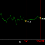 Would wish to have the orange dots transparent.
Would you please help.
Thank in advance.
MAGALI K.
- Kilosa Magali asked 8 years ago
- last active 8 years ago
Is there a recommended way to add a border to a chart’s surface (not the entire chart)? In v3.x the chart surface rendered its own “built-in” border, but after upgrading to v6.x it no longer does this.
In our products we usually disable all grid lines and bands too, so there is no “visual style” to help differentiate the chart surface from the surrounding page/window, hence the need for a border around it.
I’ve tried adding a border to the GridLinesPanelStyle but this has no effect. I can add a border to the SciChartSurface, but this gets rendered “on top”, obscuring any points or lines that sit on the very edge of the surface, e.g. in a line chart where several of the points might be Y=0, resulting in them being hidden behind the border’s bottom edge. Although this can be mitigated by adding a “GrowBy”, it’s not always practical/desirable.
- Andrew Stephens asked 2 years ago
- last active 2 years ago
Dear all,
I have a chart where I display threshold, min and max line annotation as define below :
 <s:SciChartSurface.Annotations>
                <!--Display fix average value cursor annotation-->
                <s:HorizontalLineAnnotation x:Name="_avg" HorizontalAlignment="Stretch"
                                        IsEditable="False" LabelPlacement="Axis"
                                        LabelTextFormatting="0.00"
                                        ShowLabel="True"
                                        Style="{DynamicResource AvgAnnotationStyle}"
                                        Y1="{Binding Average,UpdateSourceTrigger=PropertyChanged,
                                                     FallbackValue=0}"  />

                <s:HorizontalLineAnnotation x:Name="_sigmaHight" HorizontalAlignment="Stretch"
                                        LabelPlacement="Axis"
                                        LabelTextFormatting="0.00" ShowLabel="True"
                                        Style="{DynamicResource SigmaAnnotationStyle}"
                                        Y1="{Binding SigmaHigh,
                                            UpdateSourceTrigger=PropertyChanged,
                                            FallbackValue=0}" />

                <s:HorizontalLineAnnotation x:Name="_sigmaLow" HorizontalAlignment="Stretch"
                                        LabelPlacement="Axis"
                                        LabelTextFormatting="0.00" ShowLabel="True"
                                        Style="{DynamicResource SigmaAnnotationStyle}"
                                        Y1="{Binding SigmaLow,
                                            UpdateSourceTrigger=PropertyChanged,
                                            FallbackValue=0}" />

                <s:HorizontalLineAnnotation x:Name="_threshold" HorizontalAlignment="Stretch"
                                        LabelPlacement="Axis"
                                        LabelTextFormatting="0.00" ShowLabel="True"
                                        Style="{DynamicResource ThresholdAnnotationStyle}"
                                        Y1="{Binding LiveThreshold,
                                            UpdateSourceTrigger=PropertyChanged,
                                            FallbackValue=0}" />

            </s:SciChartSurface.Annotations>
These works really nicely when I display my chart with Line series.
Then I am using the same component to display my data series as an Histogram with label as defined in your histogram sample.
But the issue I have is that labels for Histogram in your sample show the creation of those dynamically by creating for each bar a TextAnnotation .
Due to that when I change my graph type and try to display the labels, while I have already some annotation define in my XAML for the chart, my histogram labels are not displayed.
If I remove completely the annotation section of my chart then histogram labels gets display but I cannot have anymore my Horizontal line threshold at same time.
What is the best way to get a combination of both ?
Thanks for help
regards
- sc sc asked 6 years ago
- last active 6 years ago
Hi,
I am getting an error for “Data has been Appended to a DataSeries which is unsorted in the X-Direction” and trying “to disable this warning and allow unsorted data, by seting DataSeries.AcceptsUnsortedData = true”. I am trying to place this is Data series but its not working. Can you please guide me where I can set this and it doesnot throw an error for unsorted data.
- Kinjal Patel asked 1 year ago
- last active 1 year ago
To whom this may concern:
I am following up to an issue that I posted a few years ago: https://www.scichart.com/questions/wpf/resizing-custom-annotations
I’ve attached a sample project that outlines what I am trying to accomplish. It is a simple scatter chart with randomized points in which I am trying to draw a rotatable ellipse annotation around the points.
The annotation inherits the “BoxAnnotation” class and replaces it’s template with an ellipse that is shaped to within the bounds of the annotation. This ellipse can be rotated by dragging the ellipse with the right-click button of the mouse. Upon doing so, in order to ensure the ellipse still maintains its shape when zooming in, the ellipse is converted to a geometric path. (Shown when the color of the ellipse changes from red to green.) Like this, when re-sizing the ellipse, it maintains its shape. After re-sizing, if the user wants to rotate the ellipse again, the original Ellipse UIElement re-surfaces and the Path UIElement is hidden. The user can then rotate the ellipse, which is in turn rendered back to a Path UIElement once again. The bounds of the annotation are modified to ensure the ellipse and its geometric path maintains its shape when switching between the Ellipse and the Path UIElements.
The issue is when re-sizing the annotation, and then attempting to rotate the ellipse again, the ellipse is clipped by the bounds of the annotation, even though “ClipToBounds” is set to false (in the code-behind). Unfortunately, I can’t find a pattern for which this occurs, and I have no solution to this issue. Examples of the clipped and non-clipped ellipses are shown in the attached images.
Hopefully the attached project is easy to understand. Can you please advise?
Thank you kindly!
— Ari
EDIT: Code attached as .ZIP file
- Ari Sagiv asked 4 years ago
- last active 4 years ago
I use SciChart.5.4.0.12119.
If VisibleRangeLimit is set, pan will also cause zoom.
I want to stop zoom.
Is there any way to solve this problem?
- Yuki Tabata asked 3 years ago
- last active 3 years ago
What are the different ways to smooth data in an IDataSeries? Is there an already implemented Rolling Average or Median method somewhere within the library?
- Ryan Woods asked 8 years ago
- last active 8 years ago
Hi,
I have to display an image on a SciChartSurface using direct draw. I have seen on the forum that it can be done using ITexture2D and DrawTexture by i can’t achieve it.
Could you provide a small piece of code for that ?
Best regards,
Valentin
- Valentin Gies asked 4 years ago
- last active 4 years ago
Hi,
I am facing a issue with RolloverModifier. I have multiple charts in single window. For some points the lines over the chart are missing.
Please find the attached images for some examples and the code for reproduce the issue. on the attachment you can see that the line on some chart is missing when mouse on left and right corner area of the chart.
Posting again because on latest version also the same issue not resolved.
https://www.scichart.com/questions/js/rollovermodifier-in-multiple-chart-line-missing-on-some-areas
- Arun Surendran asked 2 years ago
- last active 2 years ago
I have a simple line renderable series in iOS with an SCIDateTimeAxis for X and an SCINumericAxis for Y. At this point all I’m trying to do is format the Y-axis labels and cursor labels as currency. According to the documentation, this should be as simple as:
yAxis.textFormatting = "$%f"
But it does not appear to properly use this formatting. The Y-axis is showing values like “$%f1400” when formatting a value for 14.
So, I instead attempted creating my own label provider by overriding SCINumericLabelProvider:
class CurrencyLabelProvider: SCINumericLabelProvider {

static let formatter: NumberFormatter = {
    let formatter = NumberFormatter()
    formatter.numberStyle = .currency
    return formatter
}()

override func formatLabel(_ dataValue: SCIGenericType) -> NSAttributedString! {
    let value = dataValue.doubleData
    let string = CurrencyLabelProvider.formatter.string(from: NSNumber(value: value))!
    return NSAttributedString(string: string)
}
}
Then assigning:
yAxis.labelProvider = CurrencyLabelProvider()
This works to properly format the axis labels. So, I also override SCINumericLabelProvider to provide the cursor labels:
 override func formatCursorLabel(_ dataValue: SCIGenericType) -> NSAttributedString! {
    let value = dataValue.doubleData
    let string = CurrencyLabelFormatter.formatter.string(from: NSNumber(value: value))!
    return NSAttributedString(string: string)
}
This then properly formats the cursor label for the Y-axis- but it also formats the X-axis cursor:

At this point, the X-axis is already assigned an SCIDateTimeLabelProvider- the X-axis is not assigned CurrencyLabelProvider. But it seems to be overridden by the Y-axis label provider or simply unused. The X-axis labels are formatted as dates properly, but X-axis cursor values are just numbers when not being interfered with by the Y-axis label provider.
Am I misunderstanding something or are these all bugs in the iOS SDK? We’re currently evaluating whether this package will meet our needs and it certainly appears to be riddled with issues.
- Sean Young asked 5 years ago
- last active 5 years ago
Hello,
I’m struggling to remove the default chess-like background pattern of the surface to have a completely white panel with grid lines.
GridLinePanelStyle doesn’t seem to do the trick since it’s background property only changes the color but not the pattern.
I know there are many good SciChart tutorials but in this one particular matter they don’t seem to help me.
The funny thing is I already customized so many styles and templates, extended modifiers and annotations and now I’m failing at changing two colors.
Thanks in advance.
- Sven A. asked 7 years ago
- last active 7 years ago
I have a chart that has Real Time updates. I would like to create a custom legend modifier to display the latest value in the legend as well as other information. Is it possible to do this and if so where can I find an example?
- Clifford Bateman asked 6 years ago
I need a legend that don’t show particular serieses. I used the following example:
<sci_chart:SciChartSurface Name="sciChart" >

        <sci_chart:SciChartSurface.ChartModifier>
            <sci_chart:ModifierGroup>
                <sci_chart:LegendModifier x:Name="legendModifier" ShowLegend="False" Orientation="Vertical" Background="#FFA6A7AC"
                                      ShowVisibilityCheckboxes="False"  GetLegendDataFor="AllVisibleSeries"
                                      HorizontalAlignment="Right" VerticalAlignment="Top" Margin="10" FontSize="10" />

                <local:SimpleLegendModifier x:Name="simpleLegendModifier" HorizontalAlignment="Right" Margin="10"/>

            </sci_chart:ModifierGroup>
        </sci_chart:SciChartSurface.ChartModifier>


    </sci_chart:SciChartSurface>

    <sci_chart:SciChartLegend Name="chartLegend"  FontSize="10"
                    Margin="10" HorizontalAlignment="Right"
                    ScrollViewer.VerticalScrollBarVisibility="Hidden"
                    LegendData="{Binding ElementName=simpleLegendModifier, Path=LegendData}"/>
I want chartLegend to be inside the chart, but I can’t find how to do it…
The legend modifier have the placement property, but the SciChartLegend don’t. Is there a way to do it?
- Smadar Tsdaka asked 7 years ago
- last active 7 years ago
I’m trying to plot a FIFO series but nothing is rendering. I’m using a timer to append a new point to the series every 0.5 seconds – the X-value is simply an incrementing integer, while the Y-value often stays the same, or might change once every few seconds or so. I would therefore have expected to see a flat-line being plotted, or a “staircase” pattern (in the latter scenario), but I get nothing at all. It uses a timer and continuously appends the same Y value (line 38 in MainWindow.xaml.cs) – I don’t see anything being plotted on the chart. If I comment out that line and uncomment the one above it (to generate random Y values), then the chart does plot.
If I randomly generate the Y-value then it does plot – it’s as though the FIFO chart/series only works if each newly appended Y-value is different from the previous one? Is this expected behaviour or a problem?
Thanks in advance
Andrew
- andyste1 asked 12 years ago
Hello,
I have created some ChartModifiers in a ModifierGroup in my ViewModel class (using Caliburn.Micro as MVVM framework, not code behind) and bound the group to my SciChartSurface in xaml. Now I want to apply some styles to my modfiers in xaml. Just creating styles with the specific target types don’t work so how do I do this?
- Roland D asked 5 years ago
- last active 5 years ago
Hi
I’ve been developing an application which monitors parameters such as pressure and temperature in real time over serial communications. The data is displayed with SciChart in realtime, the user can configure what is displayed, change the time periods being viewed and the sample time amongst other settings.
The performance problem I’m experiencing appears to be from the drawing to SciChartSurface. I have tried a number of different approaches though I’m not sure I’m using the most efficient.
I have 5 FastLineRenderableSeries and 5 corresponding IDataSeries<DateTime, double> with the DateTime used as the x axis. The serial comms running separately is on a cycle time of approximately 100mS. The sample time for data appended to the data series can be set between 0.5 and 2 seconds.
As a means to monitor the performance of the application I have a separate serial comms application running on a different computer listening and displaying the data, from this data streaming on the screen it is easy to see when the performance is slowing.
Initially I had the series scrolling from left to right with all new data causing the x axis VisibleRange to be recalculated. This gives a scrolling effect with the whole chart shifting to the left but concerned the VisibleRange recalculation was causing too much of a processing overhead I changed it. Now data starts from the center of the x axis and only recalculates the x axis VisibleRange when the series reaches the far right of the graph similar to the ECG example.
The results were the same every time data was appended without any x axis VisibleRange recalculated there would be a pregnant pause on the serial data around 400mS (this is proportional to the length of time running and number of series being displayed).
I also set it up to use FIFO series although I don’t want to lose data I thought I’d try it. This obviously just restricts the performance hit by limiting the buffer size and is not practical unless using an exceptionally small FIFO size.
Not sure whether it was the appending or drawing process I allowed the two to be separated. Allowing the user to stop when data is appended and manually trigger when a redraw is performed with InvalidateElement().
Initially I let the application run for a minute to store some data then prevented the addition of any more data. It was then evident triggering when a redraw was performed would cause the slowing of serial data.
Additionally I have tried the other performance tips and tricks with little effect. If this is the best configuration I will have to open up the sample time to 2 seconds and limit the buffer size using FIFO series as the application could be running for days at a time.
Many Thanks
Miles
- Miles Merckel asked 11 years ago
Hi guys,
I want to show x value on chart bar itself as shown in the attached image along with this query. I tried using annotation where I need to give x and y value each time and it look not appropriate in the 2 data series column chart using, instead of that I need easy way to represent label of bar value on graph bar.
please suggest if any.
Thanks in advance.
- ananya rai asked 3 years ago
- last active 3 years ago
I’m seeing the following exception:
E/Exception: null
    java.lang.ArrayIndexOutOfBoundsException: length=0; index=-1
        at com.scichart.core.model.DoubleValues.get(SourceFile:167)
        at com.scichart.charting.numerics.tickProviders.LogarithmicNumericTickProvider.updateTicks(SourceFile:94)
        at com.scichart.charting.numerics.tickProviders.TickProvider.update(SourceFile:59)
        at com.scichart.charting.numerics.tickProviders.DeltaTickProvider.update(SourceFile:81)
        at com.scichart.charting.visuals.axes.AxisBase.onUpdateMeasure(SourceFile:957)
        at com.scichart.charting.visuals.axes.AxisBase.updateAxisMeasurements(SourceFile:936)
        at com.scichart.charting.layoutManagers.RightAlignmentOuterAxisLayoutStrategy.measureAxes(SourceFile:39)
        at com.scichart.charting.layoutManagers.DefaultLayoutManager.onLayoutChart(SourceFile:235)
        at com.scichart.charting.visuals.rendering.RenderSurfaceRenderer.a(SourceFile:207)
        at com.scichart.charting.visuals.rendering.RenderSurfaceRenderer.a(SourceFile:132)
        at com.scichart.charting.visuals.rendering.RenderSurfaceRenderer.onDraw(SourceFile:123)
        at com.scichart.drawing.opengl.RenderSurfaceGL$a.onDraw(SourceFile:234)
        at com.scichart.drawing.opengl.MyGLRenderer.b(SourceFile:299)
        at com.scichart.drawing.opengl.MyGLRenderer.onDrawFrame(SourceFile:283)
        at android.opengl.GLSurfaceView$GLThread.guardedRun(GLSurfaceView.java:1571)
        at android.opengl.GLSurfaceView$GLThread.run(GLSurfaceView.java:1270)
I’m initializing my chart as follows:
SciChartBuilder.init(context)
builder = SciChartBuilder.instance()

...

val xAxis = builder.newCategoryDateAxis()
                            .withGrowBy(0.0, 0.05)
                            .withAxisAlignment(AxisAlignment.Bottom)
                            .withVisibleRange(sharedXRange)
                            .withDrawMinorGridLines(true)
                            .withDrawMajorGridLines(true)
                            .build()
val yAxis = builder.newLogarithmicNumericAxis()
                            .withTextFormatting("#.#E+0")
                            .withScientificNotation(ScientificNotation.LogarithmicBase)
                            .withLogarithmicBase(2.0)
                            .build()
val seriesData = builder.newXyDataSeries(Date::class.java, Double::class.javaObjectType)
                            .withSeriesName("Series A")
                            .build()
seriesData.append(data.dateData, data.yData)
series = builder.newLineSeries()
                            .withDataSeries(seriesData)
                            .build()

UpdateSuspender.using(surface) {
                Collections.addAll(surface.xAxes, xAxis)
                Collections.addAll(surface.yAxes, yAxis)
                Collections.addAll(surface.renderableSeries, series)
}
data object has about 300 valid data points.
Any ideas what’s going on? I tried running this on a new activity. If I swap LogarithmicNumericAxis for a NumericAxis, everything works fine. I looked at the decompiled .class file where the crash was occurring (I don’t have the source for SciChart), and it seems like the crash occurs when major ticks fail to get generated (majorTicks.size == 0). I tried disabling all minor/major ticks but no joy.
for(int var22 = majorTicks.size(); var22 >= 0; --var22) {
            double var23 = var4.fromExponent(var11);
            double var25 = var22 < majorTicks.size() ? majorTicks.get(var22) : majorTicks.get(var22 - 1) * var23;
- Mike Liu asked 6 years ago
- last active 6 years ago
I have the following code and want to move this portion to code-behind but have problems understanding how I can programmatically set the properties in Style:
<s:SciChartSurface.ChartModifier>
                <!-- Provides Interactivity -->
                <s:RubberBandXyZoomModifier IsAnimated = "False" IsXAxisOnly = "True" ExecuteOn = "MouseRightButton"/>
                <s:ZoomPanModifier XyDirection="XYDirection" ClipModeX = "ClipAtExtents" ExecuteOn ="MouseLeftButton" />
                <s:MouseWheelZoomModifier XyDirection = "XYDirection"/>
                <s:ZoomExtentsModifier IsAnimated = "False" ExecuteOn = "MouseDoubleClick" />
                <s:XAxisDragModifier  DragMode = "Scale"/>
                <s:CursorModifier SourceMode="AllSeries"  UseInterpolation="True"/>

                <!-- Provides selection of series and custom styling to the selected series -->
                <s:SeriesSelectionModifier ReceiveHandledEvents="True" SelectionChanged="SeriesSelectionModifier_OnSelectionChanged">
                    <s:SeriesSelectionModifier.SelectedSeriesStyle>
                        <Style TargetType="s:BaseRenderableSeries">
                            <Setter Property="SeriesColor" Value="White"/>
                            <Setter Property="PointMarkerTemplate">
                                <Setter.Value>
                                    <ControlTemplate>
                                        <s:EllipsePointMarker Fill="#FF00DC" Stroke="White" Width="7" Height="7"/>
                                    </ControlTemplate>
                                </Setter.Value>
                            </Setter>
                        </Style>
                    </s:SeriesSelectionModifier.SelectedSeriesStyle>
                </s:SeriesSelectionModifier>

                <!-- Provides a data source for the legend control -->
                <s:LegendModifier ShowLegend="True" GetLegendDataFor="SelectedSeries" Margin="10"/>

            </s:ModifierGroup>
        </s:SciChartSurface.ChartModifier>
Particularly the SeriesSelectionModifier and its property setters seem difficult for me to implement in code-behind. Can you please provide some sample code how I would actually implement the SeriesSelectionModifier with above Property Setters above in C# code rather than in XAML?
Thanks
- bbmat asked 9 years ago
- last active 9 years ago
Hi
I would like to do some logic after zooming in but can not find to witch event I should subscribe or overwrite ?
- Unisense A/S Tueager asked 11 years ago
(Copied from GitHub issue)
Issue:
In an attempt to wrap the SciChart Server Licensing shared object using java (JNA), I ended up with strange behavior when calling any function which returns char *. In Java, the returned pointer memory does not start at the correct offset which holds the string value and therefore invalid characters are returned.
Hypothesis:
My guess, after evaluation, is that either the function is returning some std::string object, or that it is actually returning say str.c_str() where str is an std::string. The issue is that returning str.c_str() causes the reference to be dropped once it is out of scope, this means that a dangling pointer is returned. I ended up needing to wrap the function calls in another extern C layer to get the desired functionality in Java, see link below for snippets and attached zip files for source.
- Jonathan Lake asked 2 weeks ago
