iOS & macOS charts - Examples
Please note! These examples are new to SciChart iOS v4 release! SciChart’s OpenGL ES and Metal iOS and Metal macOS Chart library ships with hundred of Objective-C and Swift iOS & macOS Chart Examples which you can browse, play with and view the source-code. All of this is possible with the new and improved SciChart iOS Examples Suite and demo application for Mac, which ships as part of the SciChart SDK.

The PopulationChartView example demonstrates how to implement custom label providers in combination with the SCIVerticallyStackedColumnsCollection and SCIStackedColumnRenderableSeries. This chart visualizes population data using stacked columns. By utilizing a custom label provider, the chart allows for dynamic and customizable labeling of the stacked segments.
Please refer to the label provider here.
The Swift and Objective-C source code for the iOS and macOS Population Pyramid Chart example is included below (Scroll down!).
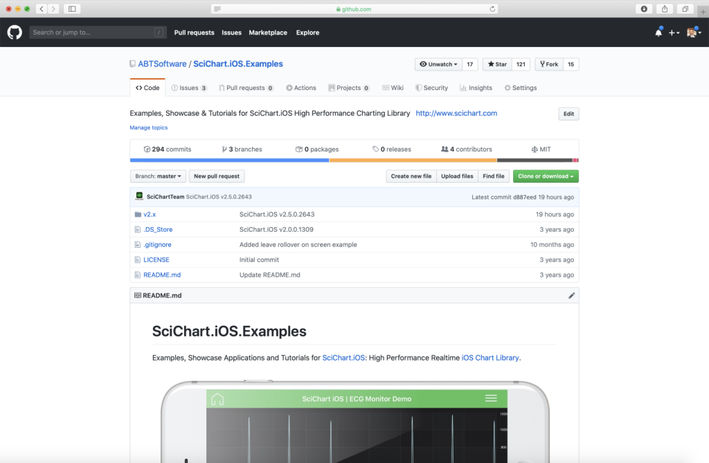
Did you know that we have the source code for all our example available for free on Github?
Clone the SciChart.iOS.Examples from Github.
Also the SciChart iOS and Scichart macOS Trials contain the full source for the examples (link below).
PopulationChartView.swift
View source code//******************************************************************************
// SCICHART® Copyright SciChart Ltd. 2011-2022. All rights reserved.
//
// Web: http://www.scichart.com
// Support: support@scichart.com
// Sales: sales@scichart.com
//
// PopulationChartView.swift is part of the SCICHART® Examples. Permission is hereby granted
// to modify, create derivative works, distribute and publish any part of this source
// code whether for commercial, private or personal use.
//
// The SCICHART® examples are distributed in the hope that they will be useful, but
// without any warranty. It is provided "AS IS" without warranty of any kind, either
// expressed or implied.
//******************************************************************************
import Foundation
class PopulationChartView: SCDSingleChartViewController<SCIChartSurface> {
override var associatedType: AnyClass { return SCIChartSurface.self }
let axisLabelAnnotation = SCIAxisLabelAnnotation()
override func initExample() {
axisLabelAnnotation.fontStyle = SCIFontStyle(fontSize: 20, andTextColorCode: 0xffff9a2e)
var mandata = [1782,2069,2164,2042,2047,2251,2319,2216,2156,1978,2205,2264,2045,1706,1505,1342,791,456,176,37,3]
mandata = mandata.reversed()
var womenData = [1694,1963,2056,1930,1915,2127,2265,2257,2210,2012,2280,2353,2142,1814,1655,1534,999,661,319,92,13]
womenData = womenData.reversed()
let ds1 = SCIXyDataSeries(xType: .long, yType: .double)
let ds2 = SCIXyDataSeries(xType: .double, yType: .double)
ds1.seriesName = "Man"
ds2.seriesName = "Women"
let data = 0
//Age above 65
for i in 0 ..< mandata.count {
let xValue = data + i;
if i <= 7 {
ds1.append(x: xValue, y: mandata[i])
ds2.append(x: xValue, y: (womenData[i] * -1))
}
else { break }
}
let verticalCollection1 = SCIVerticallyStackedColumnsCollection()
verticalCollection1.add(getRenderableSeriesWith(dataSeries: ds1, fillColor: 0xffc43360))
verticalCollection1.add(getRenderableSeriesWith(dataSeries: ds2, fillColor: 0xffc43360))
//Age from 19 to 65
let ds3 = SCIXyDataSeries(xType: .double, yType: .double)
let ds4 = SCIXyDataSeries(xType: .double, yType: .double)
ds3.seriesName = "Man"
ds4.seriesName = "Women"
for i in 7 ..< mandata.count {
let xValue = data + i;
if i <= 16{
ds3.append(x: xValue, y: mandata[i])
ds4.append(x: xValue, y: (womenData[i] * -1))
}
else { break }
}
let verticalCollection2 = SCIVerticallyStackedColumnsCollection()
verticalCollection2.add(getRenderableSeriesWith(dataSeries: ds3, fillColor: 0xFF34c19c))
verticalCollection2.add(getRenderableSeriesWith(dataSeries: ds4 , fillColor: 0xFF34c19c))
//Age below 19
let ds5 = SCIXyDataSeries(xType: .double, yType: .double)
let ds6 = SCIXyDataSeries(xType: .double, yType: .double)
ds5.seriesName = "Man"
ds6.seriesName = "Women"
for i in 17 ..< mandata.count {
let xValue = data + i;
ds5.append(x: xValue, y: mandata[i])
ds6.append(x: xValue, y: (womenData[i] * -1))
}
let verticalCollection3 = SCIVerticallyStackedColumnsCollection()
verticalCollection3.add(getRenderableSeriesWith(dataSeries: ds5, fillColor: 0xffe8c667))
verticalCollection3.add(getRenderableSeriesWith(dataSeries: ds6, fillColor: 0xffe8c667))
SCIUpdateSuspender.usingWith(surface) {
let xAxis = SCINumericAxis()
xAxis.axisAlignment = .left
xAxis.labelProvider = SCDPopulationLabelProvider()
let yAxis = SCINumericAxis()
yAxis.axisAlignment = .bottom
self.surface.xAxes.add(xAxis)
self.surface.yAxes.add(yAxis)
self.surface.renderableSeries.add(verticalCollection1)
self.surface.renderableSeries.add(verticalCollection2)
self.surface.renderableSeries.add(verticalCollection3)
self.surface.chartModifiers.add(items: SCIZoomExtentsModifier(), SCIRolloverModifier())
}
}
fileprivate func getRenderableSeriesWith(dataSeries: SCIXyDataSeries, fillColor: UInt32) -> SCIStackedColumnRenderableSeries {
let rSeries = SCIStackedColumnRenderableSeries()
rSeries.dataSeries = dataSeries
rSeries.fillBrushStyle = SCISolidBrushStyle(color: fillColor)
rSeries.strokeStyle = SCISolidPenStyle(color: fillColor, thickness: 0.5)
SCIAnimations.wave(rSeries, duration: 3.0, andEasingFunction: SCICubicEase())
return rSeries
}
}
