SciChart® the market leader in Fast WPF Charts, WPF 3D Charts, iOS Chart, Android Chart and JavaScript Chart Components
SciChart WPF ships with hundreds of WPF Chart Examples which you can browse, play with, view the source-code and even export each WPF Chart Example to a stand-alone Visual Studio solution. All of this is possible with the new and improved SciChart WPF Examples Suite, which ships as part of the SciChart WPF SDK.
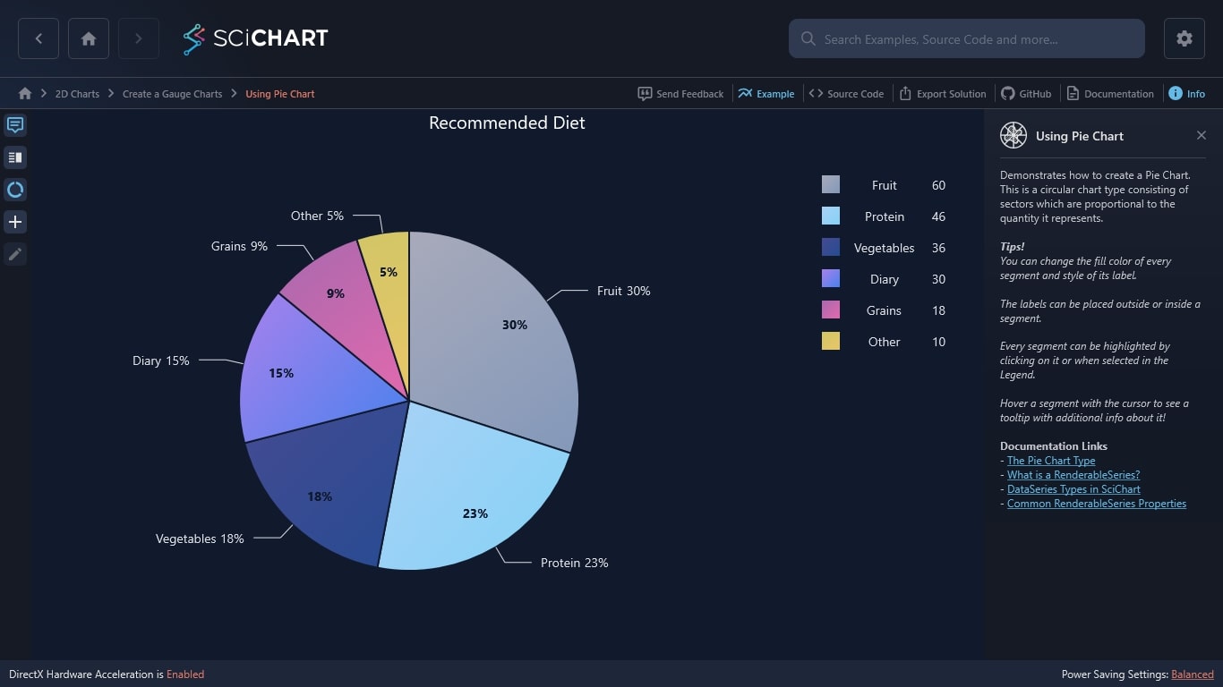
Demonstrates how to create a Pie Chart. This is a circular chart type consisting of sectors which are proportional to the quantity it represents.
Tips!
You can change the fill color of every segment and style of its label.
The labels can be placed outside or inside a segment.
Every segment can be highlighted by clicking on it or when selected in the Legend.
Hover a segment with the cursor to see a tooltip with additional info about it!
Documentation Links
– The Pie Chart Type
– What is a RenderableSeries?
– DataSeries Types in SciChart
– Common RenderableSeries Properties
The C#/WPF source code for the WPF Pie Chart example is included below (Scroll down!).
Did you know you can also view the source code from one of the following sources as well?
<UserControl x:Class="SciChart.Examples.Examples.CreateGaugeCharts.UsingPieChartExampleView"
xmlns="http://schemas.microsoft.com/winfx/2006/xaml/presentation"
xmlns:x="http://schemas.microsoft.com/winfx/2006/xaml"
xmlns:d="http://schemas.microsoft.com/expression/blend/2008"
xmlns:ext="http://schemas.abtsoftware.co.uk/scichart/exampleExternals"
xmlns:mc="http://schemas.openxmlformats.org/markup-compatibility/2006"
xmlns:s="http://schemas.abtsoftware.co.uk/scichart"
xmlns:gauge="clr-namespace:SciChart.Examples.Examples.CreateGaugeCharts"
xmlns:i="http://schemas.microsoft.com/xaml/behaviors"
d:DesignHeight="400"
d:DesignWidth="600"
mc:Ignorable="d">
<UserControl.Resources>
<ResourceDictionary>
<ResourceDictionary.MergedDictionaries>
<ResourceDictionary Source="/SciChart.Examples.ExternalDependencies;component/Resources/Styles/MergedResources.xaml" />
<ResourceDictionary Source="/SciChart.Examples.ExternalDependencies;component/Resources/Styles/ToolbarButtonsCommon.xaml" />
</ResourceDictionary.MergedDictionaries>
<gauge:LegendPlacementToOrientationConverter x:Key="LegendPlacementToOrientationConverter"/>
<Style x:Key="PieChartListBoxForegroundStyle" TargetType="ListBox">
<Setter Property="MinWidth" Value="160"/>
<Setter Property="Margin" Value="30"/>
<Setter Property="HorizontalAlignment" Value="Center"/>
<Setter Property="BorderThickness" Value="0"/>
<Setter Property="Foreground" Value="#FFDFE0E6" />
<Setter Property="ItemsPanel">
<Setter.Value>
<ItemsPanelTemplate>
<StackPanel Orientation="{Binding LegendPlacement, Source={x:Reference pieSurface}, Converter={StaticResource LegendPlacementToOrientationConverter}}"/>
</ItemsPanelTemplate>
</Setter.Value>
</Setter>
</Style>
<DataTemplate x:Key="OutsideLabelDataTemplate" DataType="s:IPieSegmentViewModel">
<StackPanel Orientation="Horizontal">
<TextBlock FontSize="14"
Foreground="#FFDFE0E6"
Text="{Binding Name}" />
<TextBlock Margin="5 0 0 0"
FontSize="14"
Foreground="#FFDFE0E6"
Text="{Binding Percentage,
StringFormat={}{0:#.##}%}" />
</StackPanel>
</DataTemplate>
<DataTemplate x:Key="InsideLabelDataTemplate" DataType="s:IPieSegmentViewModel">
<TextBlock FontSize="14"
FontWeight="Bold"
Foreground="#FF1C1C1F"
Text="{Binding Percentage,
StringFormat={}{0:#.##}%}" />
</DataTemplate>
</ResourceDictionary>
</UserControl.Resources>
<Grid>
<Grid.ColumnDefinitions>
<ColumnDefinition Width="Auto" />
<ColumnDefinition Width="*" />
</Grid.ColumnDefinitions>
<s:SciChartPieSurface x:Name="pieSurface"
Grid.Column="1"
Background="#FF1C1C1F"
ChartTitle="Recommended Diet"
FontSize="20"
Foreground="#FFDFE0E6"
SegmentSpacing="4"
InsideLabelTemplate="{StaticResource InsideLabelDataTemplate}"
LegendListStyle="{StaticResource PieChartListBoxForegroundStyle}"
OutsideLabelTemplate="{StaticResource OutsideLabelDataTemplate}"
ItemsSource="{Binding SegmentsDataCollection}">
<i:Interaction.Behaviors>
<!-- Note: To use this in your own application, grab from github at https://github.com/ABTSoftware/SciChart.WPF.Examples/tree/master/v5.x/Examples/SciChart.Examples.ExternalDependencies/Behaviors -->
<ext:EventToCommandBehavior Command="{Binding SegmentSelectionCommand}" Event="SelectionChanged" PassArguments="True" />
</i:Interaction.Behaviors>
<s:SciChartPieSurface.ItemTemplate>
<DataTemplate DataType="gauge:PieSegmentViewModel">
<s:PieSegment Fill="{Binding Fill, Mode=TwoWay}" SegmentValue="{Binding Path=Value, Mode=TwoWay}" Text="{Binding Path=Name, Mode=TwoWay}" IsSelected="{Binding IsSelected, Mode=TwoWay}" />
</DataTemplate>
</s:SciChartPieSurface.ItemTemplate>
<!-- Brushes are per segment. If you do not specify brushes, SciChart will choose random brushes -->
<!-- you can specify SolidColorBrush, or GradientBrushes to give your pie chart a slightly less flat appearance -->
<s:SciChartPieSurface.BrushesCollection>
<LinearGradientBrush>
<GradientStop Color="#FF8E01" Offset="0"/>
<GradientStop Color="#A85D01" Offset="1"/>
</LinearGradientBrush>
<LinearGradientBrush>
<GradientStop Color="#339933" Offset="0"/>
<GradientStop Color="#226622" Offset="1"/>
</LinearGradientBrush>
<LinearGradientBrush>
<GradientStop Color="#00AAFF" Offset="0"/>
<GradientStop Color="#006599" Offset="1"/>
</LinearGradientBrush>
<LinearGradientBrush>
<GradientStop Color="#818183" Offset="0"/>
<GradientStop Color="#4B4B4C" Offset="1"/>
</LinearGradientBrush>
<LinearGradientBrush>
<GradientStop Color="Firebrick" Offset="0"/>
<GradientStop Color="#7C1818" Offset="1"/>
</LinearGradientBrush>
<LinearGradientBrush>
<GradientStop Color="DarkSalmon" Offset="0"/>
<GradientStop Color="#C97A60" Offset="1"/>
</LinearGradientBrush>
</s:SciChartPieSurface.BrushesCollection>
<s:SciChartPieSurface.InfoLinesStyle>
<Style TargetType="Line">
<Setter Property="Stroke" Value="#FFDFE0E6" />
</Style>
</s:SciChartPieSurface.InfoLinesStyle>
<s:SciChartPieSurface.SegmentTooltipTemplate>
<DataTemplate DataType="s:IPieSegmentViewModel">
<Grid Margin="3" HorizontalAlignment="Stretch">
<Grid.ColumnDefinitions>
<ColumnDefinition />
</Grid.ColumnDefinitions>
<Grid.RowDefinitions>
<RowDefinition />
<RowDefinition />
</Grid.RowDefinitions>
<TextBlock Grid.Row="0"
Grid.Column="0"
Margin="3"
VerticalAlignment="Center"
FontSize="14"
Text="Name: " />
<TextBlock Grid.Row="0"
Grid.Column="1"
Margin="3"
VerticalAlignment="Center"
FontSize="14"
Text="{Binding Name}" />
<TextBlock Grid.Row="1"
Grid.Column="0"
Margin="3"
VerticalAlignment="Center"
FontSize="14"
Text="Value: " />
<TextBlock Grid.Row="1"
Grid.Column="1"
Margin="3"
VerticalAlignment="Center"
FontSize="14"
Text="{Binding Value}" />
</Grid>
</DataTemplate>
</s:SciChartPieSurface.SegmentTooltipTemplate>
</s:SciChartPieSurface>
<Border Panel.ZIndex="9999"
Background="#FF232426"
BorderBrush="#323539"
BorderThickness="0,0,2,0">
<WrapPanel HorizontalAlignment="Left" Orientation="Vertical">
<ToggleButton HorizontalAlignment="Left"
Content="Tooltip"
ContentTemplate="{StaticResource TooltipIconContentTemplate}"
IsChecked="{Binding Source={x:Reference Name=pieSurface}, Path=ShowTooltip, Mode=TwoWay}"
Style="{StaticResource DefaultToggleButtonStyle}"
ToolTipService.ToolTip="Tooltip" />
<ext:FlyoutMenuButton HorizontalAlignment="Left"
Content="Leg"
Style="{StaticResource FlyoutMenuButtonStyle}"
ToolTipService.ToolTip="Legend placement">
<ext:FlyoutMenuButton.PopupContent>
<StackPanel MinWidth="150" Orientation="Vertical">
<TextBlock Text="Legend placement" />
<ComboBox ItemsSource="{Binding Source={ext:EnumValues {x:Type s:LegendPlacement}}}" SelectedItem="{Binding Source={x:Reference pieSurface}, Path=LegendPlacement, Mode=TwoWay, Converter={StaticResource SelectedEnumValueConverter}}" />
<ext:FlyoutSeparator />
<CheckBox Margin="3"
VerticalAlignment="Center"
Content="Show legend"
IsChecked="{Binding ShowLegend, Mode=TwoWay, Source={x:Reference pieSurface}}" />
</StackPanel>
</ext:FlyoutMenuButton.PopupContent>
</ext:FlyoutMenuButton>
<ToggleButton HorizontalAlignment="Left"
Content="MSel"
FontSize="9"
IsChecked="{Binding Source={x:Reference Name=pieSurface}, Path=AllowMultiSelect, Mode=TwoWay}"
Style="{StaticResource DefaultToggleButtonStyle}"
ToolTipService.ToolTip="Allow multi select" />
<ext:FlyoutMenuButton HorizontalAlignment="Left"
Content="Add"
FontSize="11"
Padding="0"
Style="{StaticResource FlyoutMenuButtonStyle}"
ToolTipService.ToolTip="Add new item">
<ext:FlyoutMenuButton.PopupContent>
<StackPanel MinWidth="150" Orientation="Vertical">
<TextBlock HorizontalAlignment="Center" FontSize="14" Text="Add new pie segment" />
<ext:FlyoutSeparator />
<Grid>
<Grid.RowDefinitions>
<RowDefinition />
<RowDefinition />
<RowDefinition />
</Grid.RowDefinitions>
<Grid.ColumnDefinitions>
<ColumnDefinition />
</Grid.ColumnDefinitions>
<TextBlock Margin="3" FontSize="14" Text="Text: " />
<TextBox Margin="3" Grid.Column="1" Width="200" Height="20" HorizontalAlignment="Left" Text="{Binding NewSegmentText, Mode=OneWayToSource}" />
<TextBlock Margin="3" Grid.Row="1" FontSize="14" Text="Value:" />
<TextBox PreviewTextInput="UIElement_OnPreviewTextInput" Margin="3" Grid.Row="1" Grid.Column="1" Height="20" Width="200" HorizontalAlignment="Left" Text="{Binding NewSegmentValue, Mode=OneWayToSource}" />
<TextBlock Margin="3" Grid.Row="2" FontSize="14" Text="Fill:" />
<ComboBox Grid.Row="2"
Grid.Column="1"
Width="200"
Margin="3"
Background="#FF1C1C1F"
ItemsSource="{Binding AllBrushes}"
SelectedIndex="1"
SelectedItem="{Binding NewSegmentBrush, Mode=OneWayToSource}">
<ComboBox.ItemTemplate>
<DataTemplate DataType="gauge:PieBrushesModel">
<StackPanel Orientation="Horizontal">
<Rectangle Width="18"
Height="{Binding RelativeSource={RelativeSource Mode=Self},
Path=Width}"
Margin="3 0"
Fill="{Binding Brush}"
RadiusX="2"
RadiusY="2" />
<TextBlock Margin="3 0"
VerticalAlignment="Center"
FontSize="14"
Foreground="White"
Text="{Binding BrushName}" />
</StackPanel>
</DataTemplate>
</ComboBox.ItemTemplate>
</ComboBox>
</Grid>
<ext:FlyoutSeparator />
<Button Width="80"
Margin="3"
HorizontalAlignment="Right"
Command="{Binding AddNewItem}"
Content="Add" />
</StackPanel>
</ext:FlyoutMenuButton.PopupContent>
</ext:FlyoutMenuButton>
<ext:FlyoutMenuButton HorizontalAlignment="Left"
Content="Edit"
FontSize="11"
Padding="0"
Style="{StaticResource FlyoutMenuButtonStyle}"
ToolTipService.ToolTip="Edit selected segment">
<ext:FlyoutMenuButton.PopupContent>
<StackPanel MinWidth="150" Orientation="Vertical">
<TextBlock HorizontalAlignment="Center" FontSize="14" Text="Edit last selected pie segment"/>
<ext:FlyoutSeparator />
<Grid>
<Grid.RowDefinitions>
<RowDefinition />
<RowDefinition />
</Grid.RowDefinitions>
<Grid.ColumnDefinitions>
<ColumnDefinition />
</Grid.ColumnDefinitions>
<TextBlock Margin="3" FontSize="14" Text="Text: " />
<TextBox Margin="3" Grid.Column="1" Width="200" Height="20" HorizontalAlignment="Left" Text="{Binding SelectedSegment.Name, Mode=TwoWay, UpdateSourceTrigger=PropertyChanged}" />
<TextBlock Margin="3" Grid.Row="1" FontSize="14" Text="Value:" />
<TextBox PreviewTextInput="UIElement_OnPreviewTextInput" Margin="3" Grid.Row="1" Grid.Column="1" Height="20" Width="200" HorizontalAlignment="Left" Text="{Binding SelectedSegment.Value, Mode=TwoWay, UpdateSourceTrigger=PropertyChanged}" />
</Grid>
</StackPanel>
</ext:FlyoutMenuButton.PopupContent>
</ext:FlyoutMenuButton>
</WrapPanel>
</Border>
</Grid>
</UserControl>
// *************************************************************************************
// SCICHART® Copyright SciChart Ltd. 2011-2021. All rights reserved.
//
// Web: http://www.scichart.com
// Support: support@scichart.com
// Sales: sales@scichart.com
//
// UsingDonutChartExampleView.xaml.cs is part of the SCICHART® Examples. Permission is hereby granted
// to modify, create derivative works, distribute and publish any part of this source
// code whether for commercial, private or personal use.
//
// The SCICHART® examples are distributed in the hope that they will be useful, but
// without any warranty. It is provided "AS IS" without warranty of any kind, either
// expressed or implied.
// *************************************************************************************
using System.Text.RegularExpressions;
using System.Windows.Controls;
using System.Windows.Input;
namespace SciChart.Examples.Examples.CreateGaugeCharts
{
/// <summary>
/// Interaction logic for UsingPieChartExampleView.xaml
/// </summary>
public partial class UsingPieChartExampleView : UserControl
{
public UsingPieChartExampleView()
{
InitializeComponent();
}
private void UIElement_OnPreviewTextInput(object sender, TextCompositionEventArgs e)
{
Regex regex = new Regex("[^0-9]+");
e.Handled = regex.IsMatch(e.Text);
}
}
}
// *************************************************************************************
// SCICHART® Copyright SciChart Ltd. 2011-2021. All rights reserved.
//
// Web: http://www.scichart.com
// Support: support@scichart.com
// Sales: sales@scichart.com
//
// UsingPieChartExampleViewModel.cs is part of the SCICHART® Examples. Permission is hereby granted
// to modify, create derivative works, distribute and publish any part of this source
// code whether for commercial, private or personal use.
//
// The SCICHART® examples are distributed in the hope that they will be useful, but
// without any warranty. It is provided "AS IS" without warranty of any kind, either
// expressed or implied.
// *************************************************************************************
using System.Collections;
using System.Collections.Generic;
using System.Collections.ObjectModel;
using System.Collections.Specialized;
using System.Linq;
using System.Windows.Media;
using SciChart.Charting.Common.Helpers;
using SciChart.Charting.Visuals;
using SciChart.Core.Extensions;
using SciChart.Examples.ExternalDependencies.Common;
using Brush = System.Windows.Media.Brush;
using Brushes = System.Windows.Media.Brushes;
namespace SciChart.Examples.Examples.CreateGaugeCharts
{
public class UsingPieChartExampleViewModel : BaseViewModel
{
private IPieSegmentViewModel _oneSelectedSegment;
public UsingPieChartExampleViewModel()
{
_oneSelectedSegment = new PieSegmentViewModel {Value = 60, Name = "Fruit", IsSelected = true};
SegmentsDataCollection = new ObservableCollection<IPieSegmentViewModel>
{
_oneSelectedSegment,
new PieSegmentViewModel {Value = 46, Name = "Protein"},
new PieSegmentViewModel {Value = 36, Name = "Vegetables"},
new PieSegmentViewModel {Value = 30, Name = "Diary" },
new PieSegmentViewModel {Value = 18, Name = "Grains" },
new PieSegmentViewModel {Value = 10, Name = "Other" },
};
SelectedSegment = _oneSelectedSegment;
AddNewItem = new ActionCommand(() =>
{
SegmentsDataCollection.Add(new PieSegmentViewModel
{
Value = NewSegmentValue.ToDouble(),
Name = NewSegmentText,
Fill = ToGradient(((SolidColorBrush)NewSegmentBrush.Brush).Color),
Stroke = ToShade(((SolidColorBrush)NewSegmentBrush.Brush).Color, 0.8),
IsSelected = true,
});
}, () =>
{
return !NewSegmentText.IsNullOrEmpty() && (!NewSegmentValue.IsNullOrEmpty() && NewSegmentValue.ToDouble() > 0) && NewSegmentBrush != null;
});
DeleteSegment = new ActionCommand(() => { SegmentsDataCollection.RemoveAt(0);});
SegmentSelectionCommand = new ActionCommand<NotifyCollectionChangedEventArgs>(OnSegmentSelectionExecute);
}
private void OnSegmentSelectionExecute(NotifyCollectionChangedEventArgs e)
{
if (!e.NewItems.IsNullOrEmptyList() && e.NewItems[0] != null)
{
SelectedSegment = (IPieSegmentViewModel) e.NewItems[0];
}
}
public ObservableCollection<IPieSegmentViewModel> SegmentsDataCollection { get; set; }
// Populates combo box for choosing color of new item to add
public List<PieBrushesModel> AllBrushes
{
get { return typeof (Brushes).GetProperties().Select(x => new PieBrushesModel {BrushName = x.Name, Brush = (Brush) x.GetValue(null, null)}).ToList(); }
}
// For managing 'Add New Segment'
private PieBrushesModel _newSegmentBrush;
private string _newSegmentText;
private IPieSegmentViewModel _selectedSegment;
private string _newSegmentValue;
public PieBrushesModel NewSegmentBrush
{
get { return _newSegmentBrush; }
set
{
_newSegmentBrush = value;
AddNewItem.RaiseCanExecuteChanged();
}
}
public IPieSegmentViewModel SelectedSegment
{
get { return _selectedSegment; }
set
{
_selectedSegment = value;
OnPropertyChanged("SelectedSegment");
}
}
public string NewSegmentText
{
get { return _newSegmentText; }
set
{
_newSegmentText = value;
AddNewItem.RaiseCanExecuteChanged();
}
}
public string NewSegmentValue
{
get { return _newSegmentValue; }
set
{
_newSegmentValue = value;
AddNewItem.RaiseCanExecuteChanged();
}
}
public ActionCommand AddNewItem { get; set; }
public ActionCommand DeleteSegment { get; set; }
public ActionCommand<NotifyCollectionChangedEventArgs> SegmentSelectionCommand { get; set; }
// Helper functions to create nice brushes out of colors
private Brush ToGradient(Color baseColor)
{
return new LinearGradientBrush(new GradientStopCollection()
{
new GradientStop(baseColor, 0.0),
new GradientStop(ToShade(baseColor, 0.7).Color, 1.0),
});
}
private SolidColorBrush ToShade(Color baseColor, double shade)
{
return new SolidColorBrush(Color.FromArgb(baseColor.A, (byte)(baseColor.R * shade), (byte)(baseColor.G * shade), (byte)(baseColor.B * shade)));
}
}
public class PieBrushesModel
{
public Brush Brush { get; set; }
public string BrushName { get; set; }
}
public class PieSegmentViewModel : BaseViewModel, IPieSegmentViewModel
{
public double _Value;
public double _Percentage;
public bool _IsSelected;
public string _Name;
public Brush _Fill;
public Brush _Stroke;
public double Value
{
get
{
return _Value;
}
set
{
_Value = value;
OnPropertyChanged("Value");
}
}
public double Percentage
{
get
{
return _Percentage;
}
set
{
_Percentage = value;
OnPropertyChanged("Percentage");
}
}
public bool IsSelected
{
get
{
return _IsSelected;
}
set
{
_IsSelected = value;
OnPropertyChanged("IsSelected");
}
}
public string Name
{
get
{
return _Name;
}
set
{
_Name = value;
OnPropertyChanged("Name");
}
}
public Brush Fill
{
get
{
return _Fill;
}
set
{
_Fill = value;
OnPropertyChanged("Fill");
}
}
public Brush Stroke
{
get
{
return _Stroke;
}
set
{
_Stroke = value;
OnPropertyChanged("Stroke");
}
}
}
}