WPF Chart - Examples
SciChart WPF ships with hundreds of WPF Chart Examples which you can browse, play with, view the source-code and even export each WPF Chart Example to a stand-alone Visual Studio solution. All of this is possible with the new and improved SciChart WPF Examples Suite, which ships as part of the SciChart WPF SDK.
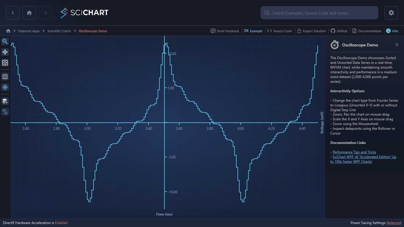
The Oscilloscope Demo showcases Sorted and Unsorted Data Series in a real-time, MVVM chart, while maintaining smooth interactivity and performance in a medium sized dataset (2,000-4,000 points per series).
Interactivity Options
– Change the chart type from Fourier Series to Lissajous (Unsorted X-Y) with or without Digital Step Line
– Zoom, Pan the chart on mouse-drag
– Scale the X and Y Axes on mouse-drag
– Zoom using the Mousewheel
– Inspect datapoints using the Rollover or Cursor
Documentation Links
– Performance Tips and Tricks
– SciChart WPF v6 ‘Xccelerated Edition’ Up to 100x Faster WPF Charts!
The C#/WPF source code for the WPF Chart Realtime Oscilloscope Demo example is included below (Scroll down!).
Did you know you can also view the source code from one of the following sources as well?
- Clone the SciChart.WPF.Examples from Github.
- Or, view source in the SciChart WPF Examples suite.
- Also the SciChart WPF Trial contains the full source for the examples (link below).
OscilloscopeView.xaml
View source code<UserControl x:Class="SciChart.Examples.Examples.SeeFeaturedApplication.Oscilloscope.OscilloscopeView"
xmlns="http://schemas.microsoft.com/winfx/2006/xaml/presentation"
xmlns:x="http://schemas.microsoft.com/winfx/2006/xaml"
xmlns:d="http://schemas.microsoft.com/expression/blend/2008"
xmlns:ext="http://schemas.abtsoftware.co.uk/scichart/exampleExternals"
xmlns:i="http://schemas.microsoft.com/xaml/behaviors"
xmlns:local="clr-namespace:SciChart.Examples.Examples.SeeFeaturedApplication.Oscilloscope"
xmlns:mc="http://schemas.openxmlformats.org/markup-compatibility/2006"
xmlns:s="http://schemas.abtsoftware.co.uk/scichart"
xmlns:system="clr-namespace:System;assembly=mscorlib"
d:DesignHeight="400"
d:DesignWidth="600"
mc:Ignorable="d">
<i:Interaction.Triggers>
<i:EventTrigger EventName="Loaded">
<i:InvokeCommandAction Command="{Binding StartCommand}" />
</i:EventTrigger>
<i:EventTrigger EventName="Unloaded">
<i:InvokeCommandAction Command="{Binding StopCommand}" />
</i:EventTrigger>
</i:Interaction.Triggers>
<UserControl.Resources>
<ResourceDictionary>
<ResourceDictionary.MergedDictionaries>
<ResourceDictionary Source="/SciChart.Examples.ExternalDependencies;component/Resources/Styles/MergedResources.xaml" />
<ResourceDictionary Source="/SciChart.Examples.ExternalDependencies;component/Resources/Styles/ToolbarButtonsCommon.xaml" />
</ResourceDictionary.MergedDictionaries>
<s:BooleanToVisibilityConverter x:Key="BooleanToVisibilityConverter"/>
<Style x:Key="TextBlockStyle" TargetType="TextBlock">
<Setter Property="Foreground" Value="White" />
<Setter Property="FontWeight" Value="Bold" />
<Setter Property="FontFamily" Value="Arial" />
<Setter Property="FontSize" Value="10" />
<Setter Property="Margin" Value="3,2,2,2" />
</Style>
<Style x:Key="HintDataItemsStyle"
BasedOn="{StaticResource TextBlockStyle}"
TargetType="TextBlock">
<Setter Property="FontSize" Value="13" />
</Style>
<Style x:Key="ChartDataItemsStyle"
BasedOn="{StaticResource TextBlockStyle}"
TargetType="TextBlock">
<Setter Property="Foreground" Value="#FF93F2C1" />
</Style>
<!-- Set the style for the series -->
<Style x:Key="LineSeriesStyle" TargetType="s:FastLineRenderableSeries">
<Setter Property="StrokeThickness" Value="2" />
<Setter Property="AntiAliasing" Value="True" />
<Setter Property="Stroke" Value="#FFA3FFC9" />
<Setter Property="RolloverMarkerTemplate">
<Setter.Value>
<ControlTemplate>
<Ellipse Width="9"
Height="9"
Fill="#7793F2C1"
Stroke="#FFA3FFC9"
StrokeThickness="2" />
</ControlTemplate>
</Setter.Value>
</Setter>
</Style>
<DataTemplate x:Key="ChartDataTemplate">
<Grid>
<Grid.ColumnDefinitions>
<ColumnDefinition />
<ColumnDefinition />
<ColumnDefinition />
</Grid.ColumnDefinitions>
<TextBlock Grid.Column="0"
Style="{StaticResource ChartDataItemsStyle}"
Text="{Binding SeriesName}" />
<TextBlock Grid.Column="1"
Margin="0,2,2,2"
Style="{StaticResource ChartDataItemsStyle}"
Text=":" />
<TextBlock Grid.Column="2"
Margin="3,2,20,2"
Style="{StaticResource ChartDataItemsStyle}"
Text="{Binding Value, StringFormat=\{0:0.0000\}}" />
</Grid>
</DataTemplate>
<!-- Template for the CursorModifier tooltip to display AxisInfo collection (result of hit test) -->
<DataTemplate x:Key="CursorAxisLabelTemplate" DataType="s:AxisInfo">
<Border Background="#33FFFFFF"
BorderBrush="#FFFFFFFF"
BorderThickness="1"
CornerRadius="5">
<TextBlock Style="{StaticResource HintDataItemsStyle}" Text="{Binding AxisFormattedDataValue}" />
</Border>
</DataTemplate>
<DataTemplate x:Key="EmptyDataTemplate" DataType="s:AxisInfo" />
<!-- Template for the CursorModifier tooltip to display AxisInfo collection (result of hit test) -->
<local:CustomAxisInfoTemplateSelector x:Key="TemplateSelector"
EmptyDataTemplate="{StaticResource EmptyDataTemplate}"
XAxisDataTemplate="{StaticResource CursorAxisLabelTemplate}"
YAxisDataTemplate="{StaticResource CursorAxisLabelTemplate}" />
<!-- Template for the RolloverModifier tooltip to display AxisInfo collection (result of hit test) -->
<Style x:Key="TooltipStyle" TargetType="s:TooltipControl">
<Setter Property="Template">
<Setter.Value>
<ControlTemplate TargetType="s:TooltipControl">
<Border Background="#33FFFFFF"
BorderBrush="#FFFFFFFF"
BorderThickness="1"
CornerRadius="5">
<ContentControl Content="{TemplateBinding DataContext}" ContentTemplate="{TemplateBinding ContentTemplate}" />
</Border>
</ControlTemplate>
</Setter.Value>
</Setter>
</Style>
<DataTemplate x:Key="TooltipDataTemplate" DataType="s:SeriesInfo">
<StackPanel>
<TextBlock Style="{StaticResource HintDataItemsStyle}" Text="{Binding SeriesName}" />
<TextBlock Style="{StaticResource HintDataItemsStyle}" Text="{Binding Value}" />
</StackPanel>
</DataTemplate>
<ItemsPanelTemplate x:Key="template">
<Canvas s:ClipToBoundsHelper.ClipToBounds="True" />
</ItemsPanelTemplate>
<Style TargetType="s:NumericAxis">
<Setter Property="GrowBy" Value="0.1, 0.1" />
<Setter Property="BorderBrush" Value="#FFAAFFAA" />
<Setter Property="MajorTickLineStyle">
<Setter.Value>
<Style TargetType="Line">
<Setter Property="Stroke" Value="#FFAAFFAA" />
<Setter Property="StrokeThickness" Value="2" />
<Setter Property="StrokeEndLineCap" Value="Square" />
<Setter Property="X2" Value="6" />
<Setter Property="Y2" Value="6" />
</Style>
</Setter.Value>
</Setter>
</Style>
<Style x:Key="IsStepLineButtonStyle"
BasedOn="{StaticResource DefaultToggleButtonStyle}"
TargetType="ToggleButton">
<Setter Property="ToolTipService.ToolTip" Value="Is Step Line" />
<Setter Property="ContentTemplate">
<Setter.Value>
<DataTemplate>
<Border Background="{Binding Path=(ext:TextElementEx.Foreground), RelativeSource={RelativeSource FindAncestor, AncestorType=ContentPresenter}}">
<Image Source="/SciChart.Examples;component/Resources/Images/step_line.png" Stretch="None" />
</Border>
</DataTemplate>
</Setter.Value>
</Setter>
</Style>
<Style x:Key="CursorAxisLabelStyle" TargetType="s:AxisLabelControl">
<Setter Property="Visibility" Value="Collapsed" />
</Style>
<ext:EnumValueToStringConverter x:Key="SelectedEnumValueConverter" />
</ResourceDictionary>
</UserControl.Resources>
<Grid>
<Grid.ColumnDefinitions>
<ColumnDefinition Width="Auto" />
<ColumnDefinition Width="*" />
</Grid.ColumnDefinitions>
<s:SciChartSurface x:Name="oscilloscopeChart"
Grid.Column="1"
CenterXAxesPanelTemplate="{StaticResource template}"
CenterYAxesPanelTemplate="{StaticResource template}"
RenderPriority="Low">
<i:Interaction.Behaviors>
<local:ShiftedAxesBehavior XAxisPosition="0"
XMode="Absolute"
YAxisPosition="0.5"
YMode="Relative" />
</i:Interaction.Behaviors>
<!-- Declare RenderableSeries, which map 1:1 to DataSet series and in order -->
<s:SciChartSurface.RenderableSeries>
<s:FastLineRenderableSeries DataSeries="{Binding ChartData}"
IsDigitalLine="{Binding IsDigitalLine, Mode=TwoWay}"
ResamplingMode="{Binding SeriesResamplingMode}"
Style="{StaticResource LineSeriesStyle}"
s:CursorModifier.SnapToSeries="True"
s:RolloverModifier.TooltipContainerStyle="{StaticResource TooltipStyle}"
s:RolloverModifier.TooltipTemplate="{StaticResource TooltipDataTemplate}" />
</s:SciChartSurface.RenderableSeries>
<!-- Create default X and Y axes. Optional bands give a cool look and feel for minimal performance impact -->
<s:SciChartSurface.XAxes>
<s:NumericAxis AnimatedVisibleRange="{Binding XVisibleRange,
Mode=TwoWay}"
BorderThickness="0,2,0,0"
DrawMajorBands="True"
IsCenterAxis="True"
TextFormatting="0.00;-0.00; "
VisibleRangeLimit="{Binding XLimit}" />
<s:NumericAxis AxisTitle="Time (ms)"
DrawLabels="False"
DrawMajorTicks="False"
DrawMinorTicks="False"
Id="xid"
s:RolloverModifier.AxisLabelContainerStyle="{StaticResource CursorAxisLabelStyle}"
s:CursorModifier.AxisLabelContainerStyle="{StaticResource CursorAxisLabelStyle}" />
</s:SciChartSurface.XAxes>
<s:SciChartSurface.YAxes>
<s:NumericAxis AnimatedVisibleRange="{Binding YVisibleRange, Mode=TwoWay}"
BorderThickness="2,0,0,0"
GrowBy="0.1, 0.1"
IsCenterAxis="True"
TextFormatting="0.00;-0.00; "
VisibleRangeLimit="{Binding YLimit}" />
<s:NumericAxis AxisTitle="Voltage (mV)"
DrawLabels="False"
DrawMajorTicks="False"
DrawMinorTicks="False"
Id="yid"
s:CursorModifier.AxisLabelContainerStyle="{StaticResource CursorAxisLabelStyle}" />
</s:SciChartSurface.YAxes>
<!-- Create ChartModifiers, which are enabled or disabled from the ViewModel -->
<s:SciChartSurface.ChartModifier>
<s:ModifierGroup>
<s:RolloverModifier x:Name="rolloverModifier" IsEnabled="{Binding IsRolloverSelected, Mode=OneWay}" ShowTooltipOn="Always" />
<s:CursorModifier x:Name="cursorModifier" IsEnabled="{Binding IsCursorSelected, Mode=OneWay}" ShowTooltip="True"/>
<s:MouseWheelZoomModifier />
<s:ZoomExtentsModifier />
<s:ZoomPanModifier x:Name="ZoomPanModifier" IsEnabled="False" />
<s:RubberBandXyZoomModifier x:Name="RubberBandModifier" />
</s:ModifierGroup>
</s:SciChartSurface.ChartModifier>
</s:SciChartSurface>
<!-- Define the overlay panel to show start and to dates, chart values -->
<Grid Grid.Column="1"
Margin="35,35,15,0"
DataContext="{Binding Source={x:Reference Name=oscilloscopeChart}, Path=ChartModifier[RolloverModifier]}"
Visibility="{Binding Source={x:Reference Name=oscilloscopeChart}, Path=DataContext.IsRolloverSelected,
Converter={StaticResource BooleanToVisibilityConverter}}">
<ItemsControl MinHeight="24"
VerticalAlignment="Top"
ItemTemplate="{StaticResource ChartDataTemplate}"
ItemsSource="{Binding SeriesData.SeriesInfo}">
<ItemsControl.ItemsPanel>
<ItemsPanelTemplate>
<StackPanel Orientation="Horizontal" />
</ItemsPanelTemplate>
</ItemsControl.ItemsPanel>
</ItemsControl>
</Grid>
<!-- This toolbar adds zoom, pan, zoom extents and other functionality -->
<!-- to the chart and is included for example purposes. -->
<!-- If you wish to know how to zoom and pan a chart then do a search for Zoom Pan in the Examples suite! -->
<Border Grid.Column="0"
Panel.ZIndex="9999"
Background="#FF232426"
BorderBrush="#323539"
BorderThickness="0,0,2,0">
<WrapPanel HorizontalAlignment="Left" Orientation="Vertical">
<ToggleButton HorizontalAlignment="Left"
Content="Zoom"
IsChecked="{Binding Source={x:Reference Name=RubberBandModifier},
Path=IsEnabled,
Mode=TwoWay}"
Style="{StaticResource ZoomButtonStyle}"
ToolTipService.ToolTip="Toggle Rubber-Band Zoom"
s:ToggleButtonExtensions.GroupName="ZoomPanSelectionGroup" />
<ToggleButton HorizontalAlignment="Left"
Content="Pan"
IsChecked="{Binding Source={x:Reference Name=ZoomPanModifier},
Path=IsEnabled,
Mode=TwoWay}"
Style="{StaticResource PanButtonStyle}"
ToolTipService.ToolTip="Toggle Zoom-Pan"
s:ToggleButtonExtensions.GroupName="ZoomPanSelectionGroup" />
<Button HorizontalAlignment="Left"
Command="{Binding Source={x:Reference Name=oscilloscopeChart},
Path=AnimateZoomExtentsCommand}"
Content="Zoom Extents"
Style="{StaticResource ZoomExtentsButtonStyle}"
ToolTipService.ToolTip="Zoom to Extents" />
<ext:FlyoutSeparator />
<ext:FlyoutMenuButton x:Name="OscilloscopeDataSourceExample"
HorizontalAlignment="Left"
Content="DS"
Style="{StaticResource FlyoutMenuButtonStyle}"
ToolTipService.ToolTip="Data Source">
<ext:FlyoutMenuButton.PopupContent>
<StackPanel MinWidth="150" Orientation="Vertical">
<TextBlock Text="Data Source:" />
<ComboBox SelectedItem="{Binding SelectedDataSource, Mode=TwoWay}">
<ComboBox.Items>
<system:String>Fourier Series</system:String>
<system:String>Lissajous</system:String>
</ComboBox.Items>
</ComboBox>
</StackPanel>
</ext:FlyoutMenuButton.PopupContent>
</ext:FlyoutMenuButton>
<ext:FlyoutSeparator />
<ext:FlyoutMenuToggleButton HorizontalAlignment="Left"
Content="ROLL"
HorizontalContentAlignment="Center"
IsChecked="{Binding IsRolloverSelected, Mode=TwoWay}"
IsEnabled="{Binding CanExecuteRollover, Mode=OneWay}"
Style="{StaticResource FlyoutMenuToggleButtonStyle}"
FontSize="10"
Padding="0"
ToolTipService.ToolTip="Rollover"
s:ToggleButtonExtensions.GroupName="RollCursorTooltipSelectionGroup">
<ext:FlyoutMenuToggleButton.PopupContent>
<StackPanel MinWidth="150" Orientation="Vertical">
<TextBlock FontSize="12" Text="Rollover mode" />
<ComboBox FontSize="12"
ItemsSource="{Binding Source={ext:EnumValues {x:Type s:SourceMode}}}"
SelectedItem="{Binding Source={x:Reference Name=rolloverModifier}, Path=SourceMode, Mode=TwoWay, Converter={StaticResource SelectedEnumValueConverter}}" />
<ext:FlyoutSeparator />
<TextBlock FontSize="12" Text="Show tooltip mode" />
<ComboBox FontSize="12"
ItemsSource="{Binding Source={ext:EnumValues {x:Type s:ShowTooltipOptions}}}"
SelectedItem="{Binding Source={x:Reference Name=rolloverModifier}, Path=ShowTooltipOn, Mode=TwoWay, Converter={StaticResource SelectedEnumValueConverter}}" />
<ext:FlyoutSeparator />
<CheckBox Margin="3"
FontSize="12"
VerticalAlignment="Center"
Content="Show axis label"
IsChecked="{Binding Source={x:Reference Name=rolloverModifier}, Path=ShowAxisLabels, Mode=TwoWay}" />
</StackPanel>
</ext:FlyoutMenuToggleButton.PopupContent>
</ext:FlyoutMenuToggleButton>
<ext:FlyoutMenuToggleButton HorizontalAlignment="Left"
Content="CUR"
IsChecked="{Binding IsCursorSelected, Mode=TwoWay}"
HorizontalContentAlignment="Center"
Style="{StaticResource CursorButtonStyle}"
FontSize="11"
Padding="0"
s:ToggleButtonExtensions.GroupName="RollCursorTooltipSelectionGroup">
<ext:FlyoutMenuToggleButton.PopupContent>
<StackPanel MinWidth="150" Orientation="Vertical">
<StackPanel.Resources>
<ext:SnappingModeToVisibilityConverter x:Key="SnappingModeToVisibilityConverter" />
</StackPanel.Resources>
<TextBlock FontSize="12" Text="Cursor mode" />
<ComboBox FontSize="12" ItemsSource="{Binding Source={ext:EnumValues {x:Type s:SourceMode}}}" SelectedItem="{Binding Source={x:Reference Name=cursorModifier}, Path=SourceMode, Mode=TwoWay, Converter={StaticResource SelectedEnumValueConverter}}" />
<ext:FlyoutSeparator />
<TextBlock FontSize="12" Text="Show tooltip mode" />
<ComboBox FontSize="12" ItemsSource="{Binding Source={ext:EnumValues {x:Type s:ShowTooltipOptions}}}" SelectedItem="{Binding Source={x:Reference Name=cursorModifier}, Path=ShowTooltipOn, Mode=TwoWay, Converter={StaticResource SelectedEnumValueConverter}}" />
<ext:FlyoutSeparator />
<TextBlock FontSize="12" Text="Snapping mode" />
<ComboBox FontSize="12"
ItemsSource="{Binding Source={ext:EnumValues {x:Type s:CursorSnappingMode}}}"
SelectedItem="{Binding Source={x:Reference Name=cursorModifier}, Path=SnappingMode, Mode=TwoWay, Converter={StaticResource SelectedEnumValueConverter}}" />
<ext:FlyoutSeparator />
<CheckBox Margin="3"
FontSize="12"
VerticalAlignment="Center"
Content="Show axis label"
IsChecked="{Binding Source={x:Reference Name=cursorModifier}, Path=ShowAxisLabels, Mode=TwoWay}" />
<CheckBox Margin="3"
FontSize="12"
VerticalAlignment="Center"
Content="Show tooltip"
IsChecked="{Binding Source={x:Reference Name=cursorModifier}, Path=ShowTooltip, Mode=TwoWay}" />
</StackPanel>
</ext:FlyoutMenuToggleButton.PopupContent>
</ext:FlyoutMenuToggleButton>
<ext:FlyoutSeparator />
<ToggleButton HorizontalAlignment="Left"
Command="{Binding SetDigitalLineCommand}"
IsChecked="{Binding IsDigitalLine, Mode=OneWay}"
Style="{StaticResource IsStepLineButtonStyle}" />
</WrapPanel>
</Border>
</Grid>
</UserControl>OscilloscopeView.xaml.cs
View source code// *************************************************************************************
// SCICHART® Copyright SciChart Ltd. 2011-2022. All rights reserved.
//
// Web: http://www.scichart.com
// Support: support@scichart.com
// Sales: sales@scichart.com
//
// OscilloscopeView.xaml.cs is part of the SCICHART® Examples. Permission is hereby granted
// to modify, create derivative works, distribute and publish any part of this source
// code whether for commercial, private or personal use.
//
// The SCICHART® examples are distributed in the hope that they will be useful, but
// without any warranty. It is provided "AS IS" without warranty of any kind, either
// expressed or implied.
// *************************************************************************************
using System.Windows.Controls;
namespace SciChart.Examples.Examples.SeeFeaturedApplication.Oscilloscope
{
/// <summary>
/// Interaction logic for OscilloscopeView.xaml
/// </summary>
public partial class OscilloscopeView : UserControl
{
public OscilloscopeView()
{
InitializeComponent();
}
}
}
OscilloscopeViewModel.cs
View source code// *************************************************************************************
// SCICHART® Copyright SciChart Ltd. 2011-2022. All rights reserved.
//
// Web: http://www.scichart.com
// Support: support@scichart.com
// Sales: sales@scichart.com
//
// OscilloscopeViewModel.cs is part of the SCICHART® Examples. Permission is hereby granted
// to modify, create derivative works, distribute and publish any part of this source
// code whether for commercial, private or personal use.
//
// The SCICHART® examples are distributed in the hope that they will be useful, but
// without any warranty. It is provided "AS IS" without warranty of any kind, either
// expressed or implied.
// *************************************************************************************
using System;
using System.Timers;
using System.Windows.Input;
using SciChart.Charting.Common.Helpers;
using SciChart.Charting.Model.DataSeries;
using SciChart.Data.Model;
using SciChart.Data.Numerics;
using SciChart.Examples.ExternalDependencies.Common;
using SciChart.Examples.ExternalDependencies.Data;
namespace SciChart.Examples.Examples.SeeFeaturedApplication.Oscilloscope
{
public class OscilloscopeViewModel : BaseViewModel
{
private DoubleRange _xVisibleRange;
private DoubleRange _yVisibleRange;
private DoubleRange _xLimit;
private DoubleRange _yLimit;
private double _phase0;
private double _phase1;
private double _phaseIncrement;
private bool _isRolloverSelected;
private bool _isCursorSelected;
private ResamplingMode _resamplingMode;
private IXyDataSeries<double, double> _series0;
private string _selectedDataSource;
private bool _isDigitalLine = true;
private bool _canExecuteRollover;
private Timer _timer;
private const double TimerIntervalMs = 20;
private readonly object _tickLocker = new object();
public OscilloscopeViewModel()
{
// For chart data setup, see OnExampleEnter()
StartCommand = new ActionCommand(OnExampleEnter);
StopCommand = new ActionCommand(OnExampleExit);
SetDigitalLineCommand = new ActionCommand(() => IsDigitalLine = !IsDigitalLine);
}
public ICommand StartCommand { get; }
public ICommand StopCommand { get; }
public ICommand SetDigitalLineCommand { get; }
public bool IsRolloverSelected
{
get => _isRolloverSelected;
set
{
if (_isRolloverSelected != value)
{
_isRolloverSelected = value;
OnPropertyChanged(nameof(IsRolloverSelected));
}
}
}
public bool IsCursorSelected
{
get => _isCursorSelected;
set
{
if (_isCursorSelected != value)
{
_isCursorSelected = value;
OnPropertyChanged(nameof(IsCursorSelected));
}
}
}
public bool CanExecuteRollover
{
get => _canExecuteRollover;
set
{
if (_canExecuteRollover != value)
{
_canExecuteRollover = value;
OnPropertyChanged(nameof(CanExecuteRollover));
}
}
}
public IXyDataSeries<double, double> ChartData
{
get => _series0;
set
{
_series0 = value;
OnPropertyChanged(nameof(ChartData));
}
}
public string SelectedDataSource
{
get => _selectedDataSource;
set
{
if (_selectedDataSource == value)
{
return;
}
_selectedDataSource = value;
lock (_tickLocker)
{
if (_selectedDataSource == "Lissajous")
{
// For Lissajous plots, we must use an UnsortedXyDataSeries
// and we cannot use the Rollover. Currently HitTest/Rollover is not implemented
// for UnsortedXyDataSeries. Also this series type does not currently support resampling
_phaseIncrement = Math.PI * 0.02;
_series0 = new XyDataSeries<double, double>
{
AcceptsUnsortedData = true
};
IsDigitalLine = false;
SeriesResamplingMode = ResamplingMode.None;
CanExecuteRollover = false;
IsRolloverSelected = false;
}
else
{
// For FourierSeries plots, we can use the faster sorted XyDataSeries,
// which supports the Rollover, HitTest and Resamplingd
_phaseIncrement = Math.PI * 0.1;
_series0 = new XyDataSeries<double, double>();
IsDigitalLine = true;
SeriesResamplingMode = ResamplingMode.MinMax;
CanExecuteRollover = true;
}
// Setup the Zoom Limit (affects double click to zoom extents)
ResetZoom();
// Add the new dataseries and reset counters. See OnTick where data is appended
_series0.SeriesName = _selectedDataSource;
_series0.Clear();
ChartData = _series0;
_phase0 = 0;
_phase1 = 0.15;
}
OnPropertyChanged(nameof(SelectedDataSource));
}
}
private void ResetZoom()
{
if (_selectedDataSource == "Lissajous")
{
XLimit = new DoubleRange(-1.2, 1.2);
YLimit = new DoubleRange(-1.2, 1.2);
}
else
{
XLimit = new DoubleRange(2.5, 4.5);
YLimit = new DoubleRange(-12.5, 12.5);
}
XVisibleRange = (DoubleRange)XLimit.Clone();
YVisibleRange = (DoubleRange)YLimit.Clone();
}
public bool IsDigitalLine
{
get => _isDigitalLine;
set
{
if (_isDigitalLine != value)
{
_isDigitalLine = value;
OnPropertyChanged(nameof(IsDigitalLine));
}
}
}
public DoubleRange XVisibleRange
{
get => _xVisibleRange;
set
{
if (_xVisibleRange != value)
{
_xVisibleRange = value;
OnPropertyChanged(nameof(XVisibleRange));
}
}
}
public DoubleRange YVisibleRange
{
get => _yVisibleRange;
set
{
if (_yVisibleRange != value)
{
_yVisibleRange = value;
OnPropertyChanged(nameof(YVisibleRange));
}
}
}
public DoubleRange XLimit
{
get => _xLimit;
set
{
if (_xLimit != value)
{
_xLimit = value;
OnPropertyChanged(nameof(XLimit));
}
}
}
public DoubleRange YLimit
{
get => _yLimit;
set
{
if (_yLimit != value)
{
_yLimit = value;
OnPropertyChanged(nameof(YLimit));
}
}
}
public ResamplingMode SeriesResamplingMode
{
get => _resamplingMode;
set
{
if (_resamplingMode != value)
{
_resamplingMode = value;
OnPropertyChanged(nameof(SeriesResamplingMode));
}
}
}
// Reset state when example exits
public void OnExampleExit()
{
lock (_tickLocker)
{
if (_timer != null)
{
_timer.Stop();
_timer.Elapsed -= OnTick;
_timer = null;
}
// Null to clear memory
_xVisibleRange = null;
_yVisibleRange = null;
ChartData = null;
}
}
// Setup start condition when the example enters
public void OnExampleEnter()
{
ChartData = new XyDataSeries<double, double>();
SelectedDataSource = "Fourier Series";
IsCursorSelected = true;
_timer = new Timer(TimerIntervalMs) { AutoReset = true };
_timer.Elapsed += OnTick;
_timer.Start();
}
private void OnTick(object sender, EventArgs e)
{
lock (_tickLocker)
{
// Generate data at this phase depending on data source type
DoubleSeries dataSource = SelectedDataSource == "Lissajous"
? DataManager.Instance.GetLissajousCurve(0.12, _phase1, _phase0, 2500)
: DataManager.Instance.GetFourierSeries(2.0, _phase0, 1000);
_phase0 += _phaseIncrement;
_phase1 += _phaseIncrement * 0.005;
// Lock the data-series and clear / re-add new data
using (ChartData.SuspendUpdates())
{
_series0.Clear();
_series0.Append(dataSource.XData, dataSource.YData);
}
}
}
}
}CustomAxisInfoTemplateSelector.cs
View source code// *************************************************************************************
// SCICHART® Copyright SciChart Ltd. 2011-2022. All rights reserved.
//
// Web: http://www.scichart.com
// Support: support@scichart.com
// Sales: sales@scichart.com
//
// CustomAxisInfoTemplateSelector.cs is part of the SCICHART® Examples. Permission is hereby granted
// to modify, create derivative works, distribute and publish any part of this source
// code whether for commercial, private or personal use.
//
// The SCICHART® examples are distributed in the hope that they will be useful, but
// without any warranty. It is provided "AS IS" without warranty of any kind, either
// expressed or implied.
// *************************************************************************************
using System.Windows;
using SciChart.Charting.Common.Helpers;
using SciChart.Charting.Visuals.RenderableSeries;
namespace SciChart.Examples.Examples.SeeFeaturedApplication.Oscilloscope
{
public class CustomAxisInfoTemplateSelector : AxisInfoTemplateSelector
{
public static readonly DependencyProperty EmptyDataTemplateProperty = DependencyProperty.Register("EmptyDataTemplate", typeof(DataTemplate), typeof(CustomAxisInfoTemplateSelector), new PropertyMetadata(OnDefautlTemplateDependencyPropertyChanged));
public DataTemplate EmptyDataTemplate
{
get { return (DataTemplate) GetValue(EmptyDataTemplateProperty); }
set { SetValue(EmptyDataTemplateProperty, value); }
}
public override DataTemplate SelectTemplate(object item, DependencyObject container)
{
var axisInfo = item as AxisInfo;
var dataTemplate = base.SelectTemplate(item, container);
if (axisInfo != null)
{
if (axisInfo.AxisId == "DefaultAxisId")
{
dataTemplate = axisInfo.IsXAxis ? XAxisDataTemplate : YAxisDataTemplate;
}
else
{
dataTemplate = EmptyDataTemplate;
}
}
return dataTemplate;
}
}
}ShiftedAxesBehavior.cs
View source code
