WPF Chart - Examples
SciChart WPF ships with hundreds of WPF Chart Examples which you can browse, play with, view the source-code and even export each WPF Chart Example to a stand-alone Visual Studio solution. All of this is possible with the new and improved SciChart WPF Examples Suite, which ships as part of the SciChart WPF SDK.
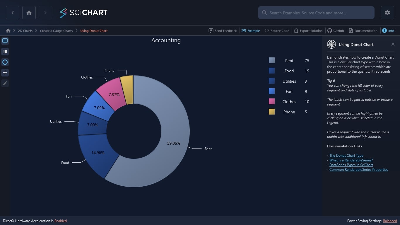
Our WPF charting library can demonstrate how to create a Donut Chart. This is a circular chart type with a hole in the center consisting of sectors which are proportional to the quantity it represents.
Tips!
You can change the fill color of every segment and style of its label.
The labels can be placed outside or inside a segment.
Every segment can be highlighted by clicking on it or when selected in the Legend.
Hover a segment with the cursor to see a tooltip with additional info about it!
Documentation Links
– The Donut Chart Type
– What is a RenderableSeries?
– DataSeries Types in SciChart
– Common RenderableSeries Properties
The C#/WPF source code for the WPF Donut Chart example is included below (Scroll down!).
Did you know you can also view the source code from one of the following sources as well?
- Clone the SciChart.WPF.Examples from Github.
- Or, view source in the SciChart WPF Examples suite.
- Also the SciChart WPF Trial contains the full source for the examples (link below).
UsingDonutChartExampleView.xaml
View source code<UserControl x:Class="SciChart.Examples.Examples.CreateGaugeCharts.UsingDonutChartExampleView"
xmlns="http://schemas.microsoft.com/winfx/2006/xaml/presentation"
xmlns:x="http://schemas.microsoft.com/winfx/2006/xaml"
xmlns:d="http://schemas.microsoft.com/expression/blend/2008"
xmlns:mc="http://schemas.openxmlformats.org/markup-compatibility/2006"
xmlns:s="http://schemas.abtsoftware.co.uk/scichart"
xmlns:ext="http://schemas.abtsoftware.co.uk/scichart/exampleExternals"
xmlns:gauge="clr-namespace:SciChart.Examples.Examples.CreateGaugeCharts"
xmlns:i="http://schemas.microsoft.com/xaml/behaviors"
d:DesignHeight="400"
d:DesignWidth="600"
mc:Ignorable="d">
<UserControl.Resources>
<ResourceDictionary>
<ResourceDictionary.MergedDictionaries>
<ResourceDictionary Source="/SciChart.Examples.ExternalDependencies;component/Resources/Styles/MergedResources.xaml" />
<ResourceDictionary Source="/SciChart.Examples.ExternalDependencies;component/Resources/Styles/ToolbarButtonsCommon.xaml" />
</ResourceDictionary.MergedDictionaries>
<gauge:LegendPlacementToOrientationConverter x:Key="LegendPlacementToOrientationConverter"/>
<Style x:Key="PieChartListBoxForegroundStyle" TargetType="ListBox">
<Setter Property="MinWidth" Value="160"/>
<Setter Property="Margin" Value="30"/>
<Setter Property="HorizontalAlignment" Value="Center"/>
<Setter Property="BorderThickness" Value="0"/>
<Setter Property="Foreground" Value="#FFDFE0E6" />
<Setter Property="ItemsPanel">
<Setter.Value>
<ItemsPanelTemplate>
<StackPanel Orientation="{Binding LegendPlacement, Source={x:Reference donutSurface}, Converter={StaticResource LegendPlacementToOrientationConverter}}"/>
</ItemsPanelTemplate>
</Setter.Value>
</Setter>
</Style>
<DataTemplate x:Key="OutsideLabelDataTemplate" DataType="s:IPieSegmentViewModel">
<TextBlock Foreground="#FFDFE0E6" FontSize="14" Text="{Binding Name}"/>
</DataTemplate>
<DataTemplate x:Key="InsideLabelDataTemplate" DataType="s:IPieSegmentViewModel">
<TextBlock Foreground="Black" FontSize="14" Text="{Binding Percentage, StringFormat={}{0:#.##}%}"/>
</DataTemplate>
</ResourceDictionary>
</UserControl.Resources>
<Grid>
<Grid.ColumnDefinitions>
<ColumnDefinition Width="Auto" />
<ColumnDefinition Width="*" />
</Grid.ColumnDefinitions>
<s:SciChartDonutSurface x:Name="donutSurface"
Grid.Column="1"
Background="#FF1C1C1F"
ChartTitle="Accounting"
FontSize="20"
SegmentSpacing="4"
Foreground="#FFDFE0E6"
ItemsSource="{Binding DonutModels}"
InsideLabelTemplate="{StaticResource InsideLabelDataTemplate}"
LegendListStyle="{StaticResource PieChartListBoxForegroundStyle}">
<i:Interaction.Behaviors>
<!-- Note: To use this in your own application, grab from github at https://github.com/ABTSoftware/SciChart.WPF.Examples/tree/master/v5.x/Examples/SciChart.Examples.ExternalDependencies/Behaviors -->
<ext:EventToCommandBehavior Command="{Binding SegmentSelectionCommand}" Event="SelectionChanged" PassArguments="True" />
</i:Interaction.Behaviors>
<s:SciChartDonutSurface.ItemTemplate>
<DataTemplate DataType="gauge:DonutSegmentViewModel">
<s:DonutSegment Fill="{Binding Fill, Mode=TwoWay}" IsSelected="{Binding IsSelected, Mode=TwoWay}" SegmentValue="{Binding Value, Mode=TwoWay}" Text="{Binding Name, Mode=TwoWay}" Stroke="{Binding Stroke, Mode=TwoWay}" StrokeThickness="{Binding StrokeThickness, Mode=TwoWay}" />
</DataTemplate>
</s:SciChartDonutSurface.ItemTemplate>
<s:SciChartDonutSurface.InfoLinesStyle>
<Style TargetType="Line">
<Setter Property="Stroke" Value="#FFDFE0E6" />
</Style>
</s:SciChartDonutSurface.InfoLinesStyle>
<s:SciChartDonutSurface.SegmentTooltipTemplate>
<DataTemplate DataType="s:IPieSegmentViewModel">
<Grid Margin="3" HorizontalAlignment="Stretch">
<Grid.ColumnDefinitions>
<ColumnDefinition />
<ColumnDefinition />
</Grid.ColumnDefinitions>
<Grid.RowDefinitions>
<RowDefinition />
<RowDefinition />
</Grid.RowDefinitions>
<TextBlock Grid.Row="0"
Grid.Column="0"
Margin="3"
VerticalAlignment="Center"
FontSize="14"
Text="Name: " />
<TextBlock Grid.Row="0"
Grid.Column="1"
Margin="3"
VerticalAlignment="Center"
FontSize="14"
Text="{Binding Name}" />
<TextBlock Grid.Row="1"
Grid.Column="0"
Margin="3"
VerticalAlignment="Center"
FontSize="14"
Text="Value: " />
<TextBlock Grid.Row="1"
Grid.Column="1"
Margin="3"
VerticalAlignment="Center"
FontSize="14"
Text="{Binding Value}" />
</Grid>
</DataTemplate>
</s:SciChartDonutSurface.SegmentTooltipTemplate>
</s:SciChartDonutSurface>
<Border Panel.ZIndex="9999"
Background="#FF232426"
BorderBrush="#323539"
BorderThickness="0,0,2,0">
<WrapPanel HorizontalAlignment="Left" Orientation="Vertical">
<ToggleButton HorizontalAlignment="Left"
Content="Tooltip"
ContentTemplate="{StaticResource TooltipIconContentTemplate}"
IsChecked="{Binding Source={x:Reference Name=donutSurface}, Path=ShowTooltip, Mode=TwoWay}"
Style="{StaticResource DefaultToggleButtonStyle}"
ToolTipService.ToolTip="Tooltip" />
<ext:FlyoutMenuButton HorizontalAlignment="Left"
Content="Leg"
Style="{StaticResource FlyoutMenuButtonStyle}"
ToolTipService.ToolTip="Legend placement">
<ext:FlyoutMenuButton.PopupContent>
<StackPanel MinWidth="150" Orientation="Vertical">
<TextBlock Text="Legend placement" />
<ComboBox ItemsSource="{Binding Source={ext:EnumValues {x:Type s:LegendPlacement}}}" SelectedItem="{Binding Source={x:Reference donutSurface}, Path=LegendPlacement, Mode=TwoWay, Converter={StaticResource SelectedEnumValueConverter}}" />
<ext:FlyoutSeparator />
<CheckBox Margin="3"
VerticalAlignment="Center"
Content="Show legend"
IsChecked="{Binding ShowLegend, Mode=TwoWay, Source={x:Reference donutSurface}}" />
</StackPanel>
</ext:FlyoutMenuButton.PopupContent>
</ext:FlyoutMenuButton>
<ToggleButton HorizontalAlignment="Left"
Content="MSel"
FontSize="9"
IsChecked="{Binding Source={x:Reference Name=donutSurface}, Path=AllowMultiSelect, Mode=TwoWay}"
Style="{StaticResource DefaultToggleButtonStyle}"
ToolTipService.ToolTip="Allow multi select" />
<ext:FlyoutMenuButton HorizontalAlignment="Left"
Content="Add"
FontSize="11"
Padding="0"
Style="{StaticResource FlyoutMenuButtonStyle}"
ToolTipService.ToolTip="Add new item">
<ext:FlyoutMenuButton.PopupContent>
<StackPanel MinWidth="150" Orientation="Vertical">
<TextBlock HorizontalAlignment="Center" FontSize="14" Text="Add new donut segment" />
<ext:FlyoutSeparator />
<Grid>
<Grid.RowDefinitions>
<RowDefinition />
<RowDefinition />
<RowDefinition />
</Grid.RowDefinitions>
<Grid.ColumnDefinitions>
<ColumnDefinition />
<ColumnDefinition />
</Grid.ColumnDefinitions>
<TextBlock Margin="3" FontSize="14" Text="Text: " />
<TextBox x:Name="NewTextTBox" Text="{Binding NewSegmentText, Mode=TwoWay}" Margin="3" Grid.Column="1" Width="200" Height="20" HorizontalAlignment="Left" />
<TextBlock Margin="3" Grid.Row="1" FontSize="14" Text="Value:" />
<TextBox PreviewTextInput="NewValueTBox_OnPreviewTextInput" Text="{Binding NewSegmentValue, Mode=TwoWay}" x:Name="NewValueTBox" Margin="3" Grid.Row="1" Grid.Column="1" Height="20" Width="200" HorizontalAlignment="Left" />
<TextBlock Margin="3" Grid.Row="2" FontSize="14" Text="Fill:" />
<ComboBox Grid.Row="2"
x:Name="BrushesComboBox"
Grid.Column="1"
Width="200"
Margin="3"
Background="#FF1C1C1F"
ItemsSource="{Binding AllBrushes}"
SelectedIndex="1"
SelectedItem="{Binding NewSegmentBrush, Mode=OneWayToSource}">
<ComboBox.ItemTemplate>
<DataTemplate DataType="gauge:DonutBrushesModel">
<StackPanel Orientation="Horizontal">
<Rectangle Width="18"
Height="{Binding RelativeSource={RelativeSource Mode=Self},
Path=Width}"
Margin="3 0"
Fill="{Binding Brush}"
RadiusX="2"
RadiusY="2" />
<TextBlock Margin="3 0"
VerticalAlignment="Center"
FontSize="14"
Foreground="White"
Text="{Binding BrushName}" />
</StackPanel>
</DataTemplate>
</ComboBox.ItemTemplate>
</ComboBox>
</Grid>
<ext:FlyoutSeparator />
<Button Width="80"
Margin="3"
HorizontalAlignment="Right"
Command="{Binding AddNewItemCommand}"
Content="Add" />
</StackPanel>
</ext:FlyoutMenuButton.PopupContent>
</ext:FlyoutMenuButton>
<ext:FlyoutMenuButton HorizontalAlignment="Left"
Content="Edit"
FontSize="11"
Padding="0"
Style="{StaticResource FlyoutMenuButtonStyle}"
ToolTipService.ToolTip="Edit selected segment">
<ext:FlyoutMenuButton.PopupContent>
<StackPanel MinWidth="150" Orientation="Vertical">
<TextBlock HorizontalAlignment="Center" FontSize="14" Text="Edit last selected pie segment"/>
<ext:FlyoutSeparator />
<Grid>
<Grid.RowDefinitions>
<RowDefinition />
<RowDefinition />
</Grid.RowDefinitions>
<Grid.ColumnDefinitions>
<ColumnDefinition />
<ColumnDefinition />
</Grid.ColumnDefinitions>
<TextBlock Margin="3" FontSize="14" Text="Text: " />
<TextBox Margin="3" Grid.Column="1" Width="200" Height="20" HorizontalAlignment="Left" Text="{Binding SelectedSegment.Name, Mode=TwoWay, UpdateSourceTrigger=PropertyChanged}" />
<TextBlock Margin="3" Grid.Row="1" FontSize="14" Text="Value:" />
<TextBox PreviewTextInput="NewValueTBox_OnPreviewTextInput" Margin="3" Grid.Row="1" Grid.Column="1" Height="20" Width="200" HorizontalAlignment="Left" Text="{Binding SelectedSegment.Value, Mode=TwoWay, UpdateSourceTrigger=PropertyChanged}" />
</Grid>
</StackPanel>
</ext:FlyoutMenuButton.PopupContent>
</ext:FlyoutMenuButton>
</WrapPanel>
</Border>
</Grid>
</UserControl>
UsingDonutChartExampleView.xaml.cs
View source code// *************************************************************************************
// SCICHART® Copyright SciChart Ltd. 2011-2022. All rights reserved.
//
// Web: http://www.scichart.com
// Support: support@scichart.com
// Sales: sales@scichart.com
//
// UsingDonutChartExampleView.xaml.cs is part of the SCICHART® Examples. Permission is hereby granted
// to modify, create derivative works, distribute and publish any part of this source
// code whether for commercial, private or personal use.
//
// The SCICHART® examples are distributed in the hope that they will be useful, but
// without any warranty. It is provided "AS IS" without warranty of any kind, either
// expressed or implied.
// *************************************************************************************
using System.Collections.ObjectModel;
using System.Text.RegularExpressions;
using System.Windows.Controls;
using System.Windows.Input;
using SciChart.Charting.Visuals;
namespace SciChart.Examples.Examples.CreateGaugeCharts
{
public partial class UsingDonutChartExampleView : UserControl
{
private ObservableCollection<IPieSegmentViewModel> _donutModels;
public UsingDonutChartExampleView()
{
InitializeComponent();
}
private void NewValueTBox_OnPreviewTextInput(object sender, TextCompositionEventArgs e)
{
Regex regex = new Regex("[^0-9]+");
e.Handled = regex.IsMatch(e.Text);
}
}
}
UsingDonutChartExampleViewModel.cs
View source code// *************************************************************************************
// SCICHART® Copyright SciChart Ltd. 2011-2022. All rights reserved.
//
// Web: http://www.scichart.com
// Support: support@scichart.com
// Sales: sales@scichart.com
//
// UsingDonutChartExampleViewModel.cs is part of the SCICHART® Examples. Permission is hereby granted
// to modify, create derivative works, distribute and publish any part of this source
// code whether for commercial, private or personal use.
//
// The SCICHART® examples are distributed in the hope that they will be useful, but
// without any warranty. It is provided "AS IS" without warranty of any kind, either
// expressed or implied.
// *************************************************************************************
using System;
using System.Collections;
using System.Collections.Generic;
using System.Collections.ObjectModel;
using System.Collections.Specialized;
using System.Linq;
using System.Windows;
using System.Windows.Media;
using SciChart.Charting.Common.Helpers;
using SciChart.Charting.Visuals;
using SciChart.Core.Extensions;
using SciChart.Examples.ExternalDependencies.Common;
namespace SciChart.Examples.Examples.CreateGaugeCharts
{
public class UsingDonutChartExampleViewModel : BaseViewModel
{
private readonly ObservableCollection<IPieSegmentViewModel> _donutModels;
public UsingDonutChartExampleViewModel()
{
_donutModels = new ObservableCollection<IPieSegmentViewModel>
{
new DonutSegmentViewModel {Value = 75, Name = "Rent", Stroke = ToShade(Colors.Orange, 0.8), Fill = ToGradient(Colors.Orange), StrokeThickness = 2},
new DonutSegmentViewModel {Value = 19, Name = "Food", Stroke = ToShade(Colors.Green, 0.8), Fill = ToGradient(Colors.Green), StrokeThickness = 2},
new DonutSegmentViewModel {Value = 9, Name = "Utilities", Stroke = ToShade(Colors.DodgerBlue, 0.8), Fill = ToGradient(Colors.DodgerBlue), StrokeThickness = 2},
new DonutSegmentViewModel {Value = 9, Name = "Fun", Stroke = ToShade(Colors.Gray, 0.8), Fill = ToGradient(Colors.Gray), StrokeThickness = 2},
new DonutSegmentViewModel {Value = 10, Name = "Clothes", Stroke = ToShade(Colors.Firebrick, 0.8), Fill = ToGradient(Colors.Firebrick), StrokeThickness = 2},
new DonutSegmentViewModel {Value = 5, Name = "Phone", Stroke = ToShade(Colors.DarkSalmon, 0.8), Fill = ToGradient(Colors.DarkSalmon), StrokeThickness = 2}
};
AddNewItemCommand = new ActionCommand(() =>
{
_donutModels.Add(new DonutSegmentViewModel
{
Value = NewSegmentValue.ToDouble(),
Name = NewSegmentText,
Fill = ToGradient(((SolidColorBrush) NewSegmentBrush.Brush).Color),
Stroke = ToShade(((SolidColorBrush) NewSegmentBrush.Brush).Color, 0.8)
});
}, () =>
{
return !NewSegmentText.IsNullOrEmpty() && (!NewSegmentValue.IsNullOrEmpty() && NewSegmentValue.ToDouble() > 0) && NewSegmentBrush != null ;
});
SegmentSelectionCommand = new ActionCommand<NotifyCollectionChangedEventArgs>(OnSegmentSelectionExecute);
}
private void OnSegmentSelectionExecute(NotifyCollectionChangedEventArgs e)
{
if (!e.NewItems.IsNullOrEmptyList() && e.NewItems[0] != null)
{
var selectedSegment = e.NewItems[0];
SelectedSegment = (IPieSegmentViewModel) selectedSegment;
}
}
private IPieSegmentViewModel _selectedSegment;
public IPieSegmentViewModel SelectedSegment
{
get { return _selectedSegment; }
set
{
_selectedSegment = value;
OnPropertyChanged("SelectedSegment");
}
}
// Binds to ItemsSource of Donut Chart
public ObservableCollection<IPieSegmentViewModel> DonutModels { get { return _donutModels; } }
// For managing Addition of new segments
public ActionCommand AddNewItemCommand { get; set; }
public ActionCommand<NotifyCollectionChangedEventArgs> SegmentSelectionCommand { get; set; }
// Populates combo box for choosing color of new item to add
public List<DonutBrushesModel> AllBrushes
{
get { return typeof(Brushes).GetProperties().Select(x => new DonutBrushesModel { BrushName = x.Name, Brush = (Brush)x.GetValue(null, null) }).ToList(); }
}
// For managing 'Add New Segment'
private DonutBrushesModel _newSegmentBrush;
private string _newSegmentText;
private string _newSegmentValue;
public DonutBrushesModel NewSegmentBrush
{
get { return _newSegmentBrush; }
set
{
_newSegmentBrush = value;
AddNewItemCommand.RaiseCanExecuteChanged();
}
}
public string NewSegmentText
{
get { return _newSegmentText; }
set
{
_newSegmentText = value;
AddNewItemCommand.RaiseCanExecuteChanged();
}
}
public string NewSegmentValue
{
get { return _newSegmentValue; }
set
{
_newSegmentValue = value;
AddNewItemCommand.RaiseCanExecuteChanged();
}
}
// Helper functions to create nice brushes out of colors
private Brush ToGradient(Color baseColor)
{
return new LinearGradientBrush(new GradientStopCollection()
{
new GradientStop(baseColor, 0.0),
new GradientStop(ToShade(baseColor, 0.7).Color, 1.0),
});
}
private SolidColorBrush ToShade(Color baseColor, double shade)
{
return new SolidColorBrush(Color.FromArgb(baseColor.A, (byte)(baseColor.R * shade), (byte)(baseColor.G * shade), (byte)(baseColor.B * shade)));
}
}
public class DonutBrushesModel
{
public Brush Brush { get; set; }
public string BrushName { get; set; }
}
public class DonutSegmentViewModel : BaseViewModel, IPieSegmentViewModel
{
public double _Value;
public double _Percentage;
public bool _IsSelected;
public string _Name;
public Brush _Fill;
public Brush _Stroke;
public double _strokeThickness;
public double StrokeThickness
{
get
{
return _strokeThickness;
}
set
{
_strokeThickness = value;
OnPropertyChanged("StrokeThickness");
}
}
public double Value
{
get
{
return _Value;
}
set
{
_Value = value;
OnPropertyChanged("Value");
}
}
public double Percentage
{
get
{
return _Percentage;
}
set
{
_Percentage = value;
OnPropertyChanged("Percentage");
}
}
public bool IsSelected
{
get
{
return _IsSelected;
}
set
{
_IsSelected = value;
OnPropertyChanged("IsSelected");
}
}
public string Name
{
get
{
return _Name;
}
set
{
_Name = value;
OnPropertyChanged("Name");
}
}
public Brush Fill
{
get
{
return _Fill;
}
set
{
_Fill = value;
OnPropertyChanged("Fill");
}
}
public Brush Stroke
{
get
{
return _Stroke;
}
set
{
_Stroke = value;
OnPropertyChanged("Stroke");
}
}
}
}
