WPF Chart - Examples
SciChart WPF ships with hundreds of WPF Chart Examples which you can browse, play with, view the source-code and even export each WPF Chart Example to a stand-alone Visual Studio solution. All of this is possible with the new and improved SciChart WPF Examples Suite, which ships as part of the SciChart WPF SDK.
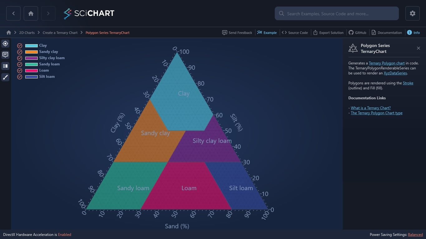
You can use our WPF Chart library to generate a Ternary Polygon chart in code. The TernaryPolygonRenderableSeries can be used to render an XyzDataSeries.
Polygons are rendered using the Stroke (outline) and Fill (fill).
Documentation Links
The C#/WPF source code for the WPF Polygon Series Ternary Chart example is included below (Scroll down!).
Did you know you can also view the source code from one of the following sources as well?
- Clone the SciChart.WPF.Examples from Github.
- Or, view source in the SciChart WPF Examples suite.
- Also the SciChart WPF Trial contains the full source for the examples (link below).
PolygonSeriesTernaryChartExampleView.xaml
View source code<UserControl x:Class="SciChart.Examples.Examples.CreateTernaryChart.PolygonSeriesTernaryChartExampleView"
xmlns="http://schemas.microsoft.com/winfx/2006/xaml/presentation"
xmlns:x="http://schemas.microsoft.com/winfx/2006/xaml"
xmlns:d="http://schemas.microsoft.com/expression/blend/2008"
xmlns:ext="http://schemas.abtsoftware.co.uk/scichart/exampleExternals"
xmlns:local="clr-namespace:SciChart.Examples.Examples.CreateTernaryChart"
xmlns:mc="http://schemas.openxmlformats.org/markup-compatibility/2006"
xmlns:s="http://schemas.abtsoftware.co.uk/scichart"
d:DesignHeight="400"
d:DesignWidth="600"
mc:Ignorable="d">
<UserControl.Resources>
<ResourceDictionary>
<ResourceDictionary.MergedDictionaries>
<ResourceDictionary Source="/SciChart.Examples.ExternalDependencies;component/Resources/Styles/MergedResources.xaml" />
<ResourceDictionary Source="/SciChart.Examples.ExternalDependencies;component/Resources/Styles/ToolbarButtonsCommon.xaml" />
</ResourceDictionary.MergedDictionaries>
<ext:EnumValueToStringConverter x:Key="SelectedEnumValueConverter" />
</ResourceDictionary>
</UserControl.Resources>
<Grid>
<Grid.ColumnDefinitions>
<ColumnDefinition Width="Auto" />
<ColumnDefinition Width="*" />
</Grid.ColumnDefinitions>
<!-- This toolbar adds cursor, tooltip, legend and theme change functionality -->
<Border Panel.ZIndex="9999"
Background="#FF232426"
BorderBrush="#323539"
BorderThickness="0,0,2,0">
<WrapPanel HorizontalAlignment="Left" Orientation="Vertical">
<ToggleButton x:Name="cursorModButton"
HorizontalAlignment="Left"
Content="Cursor"
IsChecked="{Binding Source={x:Reference Name=cursorTernaryModifier}, Path=IsEnabled, Mode=TwoWay}"
Style="{StaticResource CursorTernaryButtonStyle}"
ToolTipService.ToolTip="Cursor Ternary Modifier" />
<ToggleButton x:Name="tooltipModButton"
HorizontalAlignment="Left"
Content="Tooltip"
ContentTemplate="{StaticResource TooltipIconContentTemplate}"
IsChecked="{Binding Source={x:Reference Name=tooltipTernaryModifier}, Path=IsEnabled, Mode=TwoWay}"
Style="{StaticResource DefaultToggleButtonStyle}"
ToolTipService.ToolTip="tooltip Ternary Modifier" />
<ext:FlyoutMenuButton HorizontalAlignment="Left"
Content="Leg"
Style="{StaticResource FlyoutMenuButtonStyle}"
ToolTipService.ToolTip="Legend">
<ext:FlyoutMenuButton.PopupContent>
<StackPanel MinWidth="150" Orientation="Vertical">
<TextBlock Text="Legend source" />
<ComboBox ItemsSource="{Binding Source={ext:EnumValues {x:Type s:SourceMode}}}"
SelectedItem="{Binding Path=GetLegendDataFor,
Source={x:Reference ternaryLegendModifier},
Mode=TwoWay,
Converter={StaticResource SelectedEnumValueConverter}}" />
<ext:FlyoutSeparator />
<TextBlock Text="Legend placement" />
<ComboBox ItemsSource="{Binding Source={ext:EnumValues {x:Type s:LegendPlacement}}}"
SelectedItem="{Binding Path=LegendPlacement,
Source={x:Reference ternaryLegendModifier},
Mode=TwoWay,
Converter={StaticResource SelectedEnumValueConverter}}" />
<ext:FlyoutSeparator />
<TextBlock Text="Legend orientation" />
<ComboBox ItemsSource="{Binding Source={ext:EnumValues {x:Type Orientation}}}"
SelectedItem="{Binding Path=Orientation,
Source={x:Reference ternaryLegendModifier},
Mode=TwoWay,
Converter={StaticResource SelectedEnumValueConverter}}" />
<ext:FlyoutSeparator />
<CheckBox Margin="3"
VerticalAlignment="Center"
Content="Show legend"
IsChecked="{Binding Path=ShowLegend,
Source={x:Reference ternaryLegendModifier},
Mode=TwoWay}" />
<CheckBox Margin="3"
VerticalAlignment="Center"
Content="Show checkboxes"
IsChecked="{Binding Path=ShowVisibilityCheckboxes,
Source={x:Reference ternaryLegendModifier},
Mode=TwoWay}" />
<CheckBox Margin="3"
VerticalAlignment="Center"
Content="Show series markers"
IsChecked="{Binding Path=ShowSeriesMarkers,
Source={x:Reference ternaryLegendModifier},
Mode=TwoWay}" />
</StackPanel>
</ext:FlyoutMenuButton.PopupContent>
</ext:FlyoutMenuButton>
<ext:FlyoutMenuButton HorizontalAlignment="Left"
HorizontalContentAlignment="Center"
Content="THM"
FontSize="10"
Padding="0"
Style="{StaticResource FlyoutMenuButtonStyle}"
ToolTipService.ToolTip="Theme changing">
<ext:FlyoutMenuButton.PopupContent>
<StackPanel MinWidth="150" Orientation="Vertical">
<TextBlock FontSize="12" Text="Update Theme" />
<ext:FlyoutSeparator />
<ComboBox FontSize="12"
ItemsSource="{Binding Source={x:Static s:ThemeManager.AllThemes}}"
SelectedItem="{Binding Path=(s:ThemeManager.Theme),
Source={x:Reference sciTernaryChart},
Mode=TwoWay}" />
</StackPanel>
</ext:FlyoutMenuButton.PopupContent>
</ext:FlyoutMenuButton>
</WrapPanel>
</Border>
<s:SciChartTernarySurface x:Name="sciTernaryChart"
Grid.Column="1"
s:ThemeManager.Theme="SciChartv4Dark">
<s:SciChartTernarySurface.RenderableSeries>
<s:TernaryPolygonRenderableSeries x:Name="polygonSeries"
Fill="DarkKhaki"
Opacity="0.6"
Stroke="white"
StrokeThickness="1" />
<s:TernaryPolygonRenderableSeries x:Name="polygonSeries1"
Fill="Red"
Opacity="0.6"
Stroke="white"
StrokeThickness="1" />
<s:TernaryPolygonRenderableSeries x:Name="polygonSeries2"
Fill="Green"
Opacity="0.6"
Stroke="white"
StrokeThickness="1" />
<s:TernaryPolygonRenderableSeries x:Name="polygonSeries3"
Fill="CornflowerBlue"
Opacity="0.6"
Stroke="white"
StrokeThickness="1" />
<s:TernaryPolygonRenderableSeries x:Name="polygonSeries4"
Fill="Coral"
Opacity="0.6"
Stroke="white"
StrokeThickness="1" />
<s:TernaryPolygonRenderableSeries x:Name="polygonSeries5"
Fill="LawnGreen"
Opacity="0.6"
Stroke="white"
StrokeThickness="1" />
</s:SciChartTernarySurface.RenderableSeries>
<s:SciChartTernarySurface.XAxisStyle>
<Style TargetType="s:TernaryNumericAxis">
<Setter Property="AxisTitle" Value="Sand (%)" />
<Setter Property="TitleFontSize" Value="20" />
</Style>
</s:SciChartTernarySurface.XAxisStyle>
<s:SciChartTernarySurface.YAxisStyle>
<Style TargetType="s:TernaryNumericAxis">
<Setter Property="AxisTitle" Value="Silt (%)" />
<Setter Property="TitleFontSize" Value="20" />
</Style>
</s:SciChartTernarySurface.YAxisStyle>
<s:SciChartTernarySurface.ZAxisStyle>
<Style TargetType="s:TernaryNumericAxis">
<Setter Property="AxisTitle" Value="Clay (%)" />
<Setter Property="TitleFontSize" Value="20" />
</Style>
</s:SciChartTernarySurface.ZAxisStyle>
<s:SciChartTernarySurface.ChartModifier>
<s:TernaryModifierGroup>
<s:TernaryCursorModifier x:Name="cursorTernaryModifier" />
<s:TernaryTooltipModifier x:Name="tooltipTernaryModifier" />
<s:TernaryLegendModifier x:Name="ternaryLegendModifier"
Margin="10"
Orientation="Vertical"
ShowLegend="True" />
</s:TernaryModifierGroup>
</s:SciChartTernarySurface.ChartModifier>
</s:SciChartTernarySurface>
</Grid>
</UserControl>
PolygonSeriesTernaryChartExampleView.xaml.cs
View source codeusing System.Windows.Controls;
using SciChart.Charting.Model.DataSeries;
namespace SciChart.Examples.Examples.CreateTernaryChart
{
/// <summary>
/// Interaction logic for PolygonSeriesTernaryChartExampleView.xaml
/// </summary>
public partial class PolygonSeriesTernaryChartExampleView : UserControl
{
public PolygonSeriesTernaryChartExampleView()
{
InitializeComponent();
cursorModButton.IsChecked = false;
tooltipModButton.IsChecked = false;
// Filled areas
var polygonDataSeries1 = new XyzDataSeries<double> { AcceptsUnsortedData = true, SeriesName = "Clay" };
var polygonDataSeries2 = new XyzDataSeries<double> { AcceptsUnsortedData = true, SeriesName = "Sandy clay" };
var polygonDataSeries3 = new XyzDataSeries<double> { AcceptsUnsortedData = true, SeriesName = "Silty clay loam" };
var polygonDataSeries4 = new XyzDataSeries<double> { AcceptsUnsortedData = true, SeriesName = "Sandy loam" };
var polygonDataSeries5 = new XyzDataSeries<double> { AcceptsUnsortedData = true, SeriesName = "Loam" };
var polygonDataSeries6 = new XyzDataSeries<double> { AcceptsUnsortedData = true, SeriesName = "Silt loam" };
// Сlay series
polygonDataSeries1.Append(0, 100, 0);
polygonDataSeries1.Append(40, 60, 0);
polygonDataSeries1.Append(40, 50, 10);
polygonDataSeries1.Append(20, 50, 30);
polygonDataSeries1.Append(0, 70, 30);
// Sandy clay series
polygonDataSeries2.Append(0, 70, 30);
polygonDataSeries2.Append(20, 50, 30);
polygonDataSeries2.Append(30, 50, 20);
polygonDataSeries2.Append(30, 30, 40);
polygonDataSeries2.Append(0, 30, 70);
// Silty clay loam series
polygonDataSeries3.Append(30, 50, 20);
polygonDataSeries3.Append(40, 50, 10);
polygonDataSeries3.Append(40, 60, 0);
polygonDataSeries3.Append(70, 30, 0);
polygonDataSeries3.Append(30, 30, 40);
// Sandy loam series
polygonDataSeries4.Append(30, 30, 40);
polygonDataSeries4.Append(30, 0, 70);
polygonDataSeries4.Append(0, 0, 100);
polygonDataSeries4.Append(0, 30, 70);
// Loam series
polygonDataSeries5.Append(30, 30, 40);
polygonDataSeries5.Append(50, 30, 20);
polygonDataSeries5.Append(80, 0, 20);
polygonDataSeries5.Append(30, 0, 70);
// Silt loam series
polygonDataSeries6.Append(50, 30, 20);
polygonDataSeries6.Append(70, 30, 0);
polygonDataSeries6.Append(100, 0, 0);
polygonDataSeries6.Append(80, 0, 20);
polygonSeries.DataSeries = polygonDataSeries1;
polygonSeries1.DataSeries = polygonDataSeries2;
polygonSeries2.DataSeries = polygonDataSeries3;
polygonSeries3.DataSeries = polygonDataSeries4;
polygonSeries4.DataSeries = polygonDataSeries5;
polygonSeries5.DataSeries = polygonDataSeries6;
}
}
}
